Android基础知识之控件系列(2)——Button及自定义背景
2016-03-12 15:43
796 查看
这一次,我倾尽所有,换你一世陪伴。
今天这篇列出常用控件Button的几种样式,只是简单列几个属性的,其他的自己研究吧。废话不多说,直接上效果图加代码。
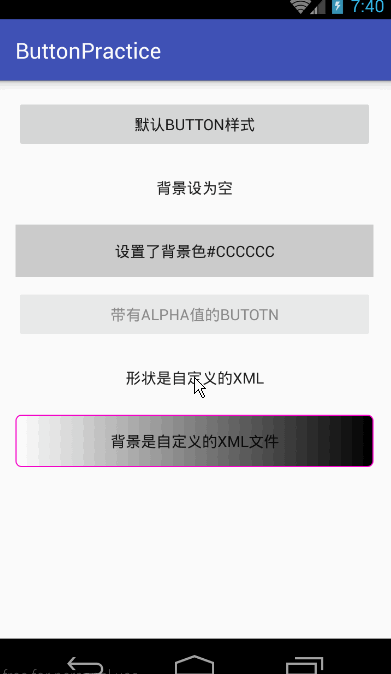
activity_main.xml
其中有两个Button的background是自定义的两个xml下面给出来,这两个xml是放在drawable文件目录下的。
button_style.xml
circle_btn_shape
部分内容摘自()。
可关注微信公众号(zhudekoudai 、smart_android)
QQ群号: 413589216
专注Android分享:http://www.codernote.top/
今天这篇列出常用控件Button的几种样式,只是简单列几个属性的,其他的自己研究吧。废话不多说,直接上效果图加代码。
activity_main.xml
<?xml version="1.0" encoding="utf-8"?>
<ScrollView
android:layout_width="fill_parent"
android:layout_height="wrap_content"
xmlns:android="http://schemas.android.com/apk/res/android">
<LinearLayout
xmlns:tools="http://schemas.android.com/tools"
android:layout_width="match_parent"
android:layout_height="match_parent"
android:paddingLeft="@dimen/activity_horizontal_margin"
android:paddingRight="@dimen/activity_horizontal_margin"
android:paddingTop="@dimen/activity_vertical_margin"
android:paddingBottom="@dimen/activity_vertical_margin"
android:orientation="vertical"
tools:context=".MainActivity">

<Button
android:text="默认Button样式"
android:layout_width="fill_parent"
android:layout_height="wrap_content"
android:layout_marginBottom="10dp"/>

<Button
android:text="背景设为空"
android:layout_width="fill_parent"
android:layout_height="wrap_content"
android:background="@null"
android:layout_marginBottom="10dp"/>

<Button
android:text="设置了背景色#CCCCCC"
android:layout_width="fill_parent"
android:layout_height="wrap_content"
android:background="#CCCCCC"
android:layout_marginBottom="10dp"/>
<Button
android:text="带有alpha值的Butotn"
android:layout_width="fill_parent"
android:layout_height="wrap_content"
android:alpha="0.5"
android:layout_marginBottom="10dp"/>

<Button
android:text="形状是自定义的xml"
android:layout_width="fill_parent"
android:layout_height="wrap_content"
android:background="@drawable/circle_btn_shape"
android:layout_marginBottom="10dp"/>

<Button
android:text="背景是自定义的xml文件"
android:layout_width="fill_parent"
android:layout_height="wrap_content"
android:background="@drawable/button_style"
android:layout_marginBottom="10dp"/>

</LinearLayout>
</ScrollView>
其中有两个Button的background是自定义的两个xml下面给出来,这两个xml是放在drawable文件目录下的。
button_style.xml
<?xml version="1.0" encoding="utf-8"?>
<selector xmlns:android="http://schemas.android.com/apk/res/android">
<item android:state_pressed="true">
<shape>
<gradient
android:startColor="#0d76e1"
android:endColor="#0d76e1"
android:angle="270" />
<stroke
android:width="1dip"
android:color="#f403c9" />
<corners
android:radius="2dp" />
<padding
android:left="10dp"
android:top="10dp"
android:right="10dp"
android:bottom="10dp" />
</shape>
</item>

<item android:state_focused="true">
<shape>
<gradient
android:startColor="#ffc2b7"
android:endColor="#ffc2b7"
android:angle="270" />
<stroke
android:width="1dip"
android:color="#f403c9" />
<corners
android:radius="2dp" />
<padding
android:left="10dp"
android:top="10dp"
android:right="10dp"
android:bottom="10dp" />
</shape>
</item>

<item>
<shape>
<gradient
android:startColor="#000000"
android:endColor="#ffffff"
android:angle="180" />
<stroke
android:width="1dip"
android:color="#f403c9" />
<corners
android:radius="5dip" />
<padding
android:left="10dp"
android:top="10dp"
android:right="10dp"
android:bottom="10dp" />
</shape>
</item>
</selector>
circle_btn_shape
<?xml version="1.0" encoding="utf-8"?>
<shape

xmlns:android="http://schemas.android.com/apk/res/android"

android:shape="oval">

<!-- 填充的颜色 -->

<solid android:color="#FFFFFF"/>

<!-- 设置按钮的四个角为弧形 -->

<!-- android:radius 弧形的半径 -->

<corners android:radius="360dip"/>

<!-- padding: Button 里面的文字与Button边界的间隔 -->

<padding

android:left="10dp"

android:top="10dp"

android:right="10dp"

android:bottom="10dp"

/>

</shape>
部分内容摘自()。
可关注微信公众号(zhudekoudai 、smart_android)
QQ群号: 413589216
专注Android分享:http://www.codernote.top/

相关文章推荐
- 使用C++实现JNI接口需要注意的事项
- Android IPC进程间通讯机制
- Android Manifest 用法
- [转载]Activity中ConfigChanges属性的用法
- Android之获取手机上的图片和视频缩略图thumbnails
- Android之使用Http协议实现文件上传功能
- Android学习笔记(二九):嵌入浏览器
- android string.xml文件中的整型和string型代替
- i-jetty环境搭配与编译
- android之定时器AlarmManager
- android wifi 无线调试
- Android Native 绘图方法
- Android java 与 javascript互访(相互调用)的方法例子
- android 代码实现控件之间的间距
- android FragmentPagerAdapter的“标准”配置
- Android"解决"onTouch和onClick的冲突问题
- android:installLocation简析
- android searchView的关闭事件
- SourceProvider.getJniDirectories