Android Shape 笔记
2016-03-01 16:08
501 查看
Shape 笔记
官网地址:http://developer.android.com/guide/topics/resources/drawable-resource.html#Shape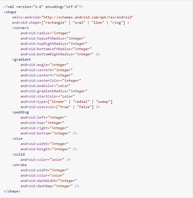
“rectangle”: 矩形,默认值
“oval”: 椭圆
“line”: 水平线
“ring”: 环形
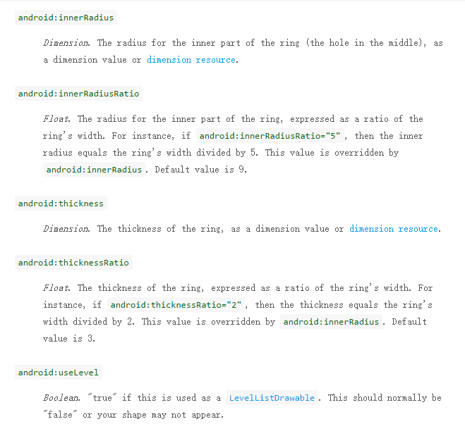
下面几个属性仅用于android:shape=”ring”,没用过
corners 创建圆角的形状。仅适用于当形状为长方形。
属性:
android:radius : 四个角的圆角半径
android:topLeftRadius : 左上角半径
android:topRightRadius : 又上角半径
android:bottomLeftRadius : 左下角半径
android:bottomRightRadius : 右下角半径
注意:如果五个只属性都设置则radius失效,还要特别注意下面情况容易出错,下面的分开写了4个corners只有最后一个生效,效果为右下5dp的圆角。上面的是把四个属性写到一个corners是正常的,应该这样写。
<corners
android:topLeftRadius="3dp"
android:topRightRadius="3dp"
android:bottomLeftRadius="5dp"
android:bottomRightRadius="5dp"/>
<corners android:topLeftRadius="3dp" />
<corners android:topRightRadius="3dp" />
<corners android:bottomLeftRadius="5dp" />
<corners android:bottomRightRadius="5dp" />
gradient 渐变
属性:
android:angle : 渐变的角度。0为从左到右,90是底部至顶部,必须为45的倍数,默认0。当设置填充颜色后,无渐变效果。该属性只有在type=linear情况下起作用。
android:centerX : 相对X的渐变位置。
android:centerY : 相对Y的渐变位置。这两个属性只有在type不为linear情况下起作用。
android:centerColor : 颜色渐变的中间颜色,主要用于多彩。
android:endColor : 结束颜色
android:gradientRadius : 渐变的颜色,android:type=”radial”时用到,如果android:type=”radial”,没有设置android:gradientRadius,将会报错,error inflating class。
android:startColor : 起始颜色
android:type : 渐变的类型,默认linear。”linear”:线性渐变,”radial”:圆形渐变,起始颜色从cenralX,centralY点开始。”sweep”:A sweeping line gradient。
android:useLevel : LevelListDrawable时用true,其他情况都是false。
padding 定义内容离边界的距离(用来控制控件的位置不是形状),用法和android布局中用法一致。
属性:
android:left : 距左边距的距离
android:top : …
android:right : …
android:bottom : …
size shape 形状的大小
属性:
android:height : shape的高
android:width : 宽
TextView中用加背景效果后,用padding,字多的时候背景拉长,字不会被挡住,用size背景大小固定,但字会看不到。size一般用在ImageView配合ScaleType属性使用。
solid 填充颜色,可以当作背景色
属性:
android:color : 颜色值
storke 描边
属性:
android:width : 边的宽度
android:color : 边的颜色
android:dashGap : 虚线的宽度
android:dashWidth : 虚线的间隔的宽度
dashWidth和dashGap属性,只要其中一个设置为0dp,则边框为实线边框
用法
创建xml保存到 res/drawable/gradient_box.xml:
<?xml version="1.0" encoding="utf-8"?>
<shape xmlns:android="http://schemas.android.com/apk/res/android"
android:shape="rectangle">
<gradient
android:startColor="#FFFF0000"
android:endColor="#80FF00FF"
android:angle="45"/>
<padding android:left="7dp"
android:top="7dp"
android:right="7dp"
android:bottom="7dp" />
<corners android:radius="8dp" />
</shape>
在布局中:
<TextView
android:background="@drawable/gradient_box"
android:layout_height="wrap_content"
android:text="TextView"
android:layout_width="wrap_content" />
在java代码中:
Resources res = getResources();
Drawable shape = res. getDrawable(R.drawable.gradient_box);

TextView tv = (TextView)findViewByID(R.id.textview);
tv.setBackground(shape);
Example:
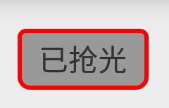
<TextView
android:layout_width="wrap_content"
android:layout_height="wrap_content"
android:background="@drawable/shape_text"
android:text="圆角" />

<?xml version="1.0" encoding="UTF-8"?>
<shape xmlns:android="http://schemas.android.com/apk/res/android"
android:shape="rectangle" >

<!-- 背景 -->
<solid android:color="#999999" />

<!-- 边框 -->
<stroke
android:width="2dp"
android:color="#ff0000"/>

<!-- 圆角 -->
<corners
android:bottomLeftRadius="5dp"
android:bottomRightRadius="5dp"
android:topLeftRadius="3dp"
android:topRightRadius="3dp" />

<!-- 边距 -->
<padding
android:bottom="5dp"
android:left="10dp"
android:right="10dp"
android:top="5dp" />

</shape>
效果:
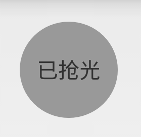
<TextView
android:layout_width="wrap_content"
android:layout_height="wrap_content"
android:background="@drawable/shape_circle"
android:gravity="center"
android:text="已抢光" />

<?xml version="1.0" encoding="utf-8"?>
<shape xmlns:android="http://schemas.android.com/apk/res/android"
android:shape="oval"
android:useLevel="false" >

<solid android:color="#999999" />

<size
android:width="65dp"
android:height="65dp" />

</shape>
效果:
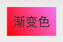
<TextView
android:layout_width="wrap_content"
android:layout_height="wrap_content"
android:background="@drawable/shape_radius"
android:text="渐变色" />

<?xml version="1.0" encoding="utf-8"?>
<shape xmlns:android="http://schemas.android.com/apk/res/android"
android:shape="rectangle" >

<gradient
android:angle="45"
android:endColor="#80FF00FF"
android:startColor="#FFFF0000" />

<padding
android:bottom="7dp"
android:left="7dp"
android:right="7dp"
android:top="7dp" />

</shape>
效果:
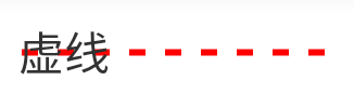
<TextView
android:layout_width="wrap_content"
android:layout_height="wrap_content"
android:background="@drawable/shape_dotted_line"
android:text="虚线" />

<?xml version="1.0" encoding="utf-8"?>
<shape xmlns:android="http://schemas.android.com/apk/res/android"
android:shape="line" >

<!-- width虚线的厚度可以理解为高度
dashWidth虚线的宽
dashGap虚线的间隔
-->
<stroke
android:dashGap="6dp"
android:dashWidth="5dp"
android:width="2dp"
android:color="#ff0000" />

<!-- 为了效果设长了,所以线在文字外面了,可以去掉size属性 -->
<size android:width="100dp"/>

</shape>
效果:
特别注意:从android3.0开始,安卓关闭了硬件加速功能,所以就不能显示了,所以就是在 AndroidManifest.xml中设置android:hardwareAccelerated=”false”,或者在Activity中设置view.setLayerType(View.LAYER_TYPE_SOFTWARE, null);把硬件加速的功能关掉就可以了。

相关文章推荐
- 使用C++实现JNI接口需要注意的事项
- Android IPC进程间通讯机制
- Android Manifest 用法
- [转载]Activity中ConfigChanges属性的用法
- Android之获取手机上的图片和视频缩略图thumbnails
- Android之使用Http协议实现文件上传功能
- Android学习笔记(二九):嵌入浏览器
- android string.xml文件中的整型和string型代替
- i-jetty环境搭配与编译
- android之定时器AlarmManager
- android wifi 无线调试
- Android Native 绘图方法
- Android java 与 javascript互访(相互调用)的方法例子
- android 代码实现控件之间的间距
- android FragmentPagerAdapter的“标准”配置
- Android"解决"onTouch和onClick的冲突问题
- android:installLocation简析
- android searchView的关闭事件
- SourceProvider.getJniDirectories