cubic-bezier贝塞尔曲线css3动画工具
2016-02-26 22:15
549 查看
今天在一本叫《HTML5触摸界面设计与开发》上看到一个做弹跳球的复杂动画效果,首先加速下降,停止,然后弹起时逐渐减速。是用cubic-bezier贝塞尔曲线来完成的。所以特地去学习了一下关于cubic-bezier贝塞尔曲线。
cubic-bezier比较少用,因为PC端中,有浏览器不兼容。但是手机端中,可以使用并带来炫酷的动画及体验。
缓动函数:http://www.xuanfengge.com/easeing/easeing/
cubic-bezier:http://cubic-bezier.com/
cubic-bezier是贝塞尔曲线中的绘制方法。
css3中常用的几个动画效果:
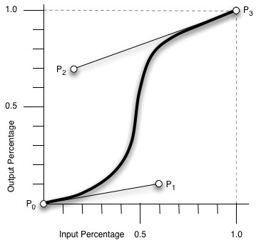
贝塞尔曲线通过四个点来定义一条曲线。这四个值描述了控制点的位置p1,p2,其他两个点永远是p0(0,0)p3(1,1)。控制点是控制图中的曲线,这些曲线会让球在弹起和下落的过程中,给予(正或负)加速度。(0,.27,.32,1)在上升过程中起作用,(1,0,0.96,0.91)在下降中起作用。
我们现在已经大概了解了一点贝塞尔曲线,接下来就看一个弹跳球的例子。
HTML部分:
CSS部分:
检测正确的制造商前缀:
cubic-bezier比较少用,因为PC端中,有浏览器不兼容。但是手机端中,可以使用并带来炫酷的动画及体验。
缓动函数:http://www.xuanfengge.com/easeing/easeing/
cubic-bezier:http://cubic-bezier.com/
cubic-bezier是贝塞尔曲线中的绘制方法。
css3中常用的几个动画效果:
ease: cubic-bezier(0.25, 0.1, 0.25, 1.0)
linear: cubic-bezier(0.0, 0.0, 1.0, 1.0)
ease-in: cubic-bezier(0.42, 0, 1.0, 1.0)
ease-out: cubic-bezier(0, 0, 0.58, 1.0)
ease-in-out: cubic-bezier(0.42, 0, 0.58, 1.0)
贝塞尔曲线通过四个点来定义一条曲线。这四个值描述了控制点的位置p1,p2,其他两个点永远是p0(0,0)p3(1,1)。控制点是控制图中的曲线,这些曲线会让球在弹起和下落的过程中,给予(正或负)加速度。(0,.27,.32,1)在上升过程中起作用,(1,0,0.96,0.91)在下降中起作用。
我们现在已经大概了解了一点贝塞尔曲线,接下来就看一个弹跳球的例子。
HTML部分:
<div id="ball"></div>
<div id="floor></div>
CSS部分:
body{margin:0;padding:0;}
#ball{
background:red;
height:100px;
width:100px;
position:absolute;
top:10px;
left:20px;
border-radius:50px;
}
#floor{
position:absolute;
bottom:10px;
left:0px;
width:350px;
height:1px;
border-top:5px solid brown;
}
检测正确的制造商前缀:
(function(){

var down=false;
trans='transition';
eventName='transitionend';
if(typeof document.body.style.webkitTransition==='string'){
trans='webkitTransition';
eventName='webkitTransitionEnd';
}elseif(typedof document.body.style.MozTransition==='string'){
trans='MozTransition';
}
})();
document.body.style.webkitTransition获取以webkit为前缀的transition 在WebKit引擎的浏览器中,当css3的transition动画执行结束时,触发webkitTransitionEnd事件。 下面是一个反弹函数:
var ball=document.getElementById('ball');
floor=document.getElementById('floor');

function bounce(){
if(down){
ball.style[trans]="Top 1s cubic-bezier(0,.27,.32,1)";
ball.style.top='10px';
down=false;
}else{
ball.style[trans]="Top 1s cubic-bezier(1,0,0.96,0.91)";
ball.style.top=(floor.offsetTop-100)+'px';
down=true;
}
}

ball.addEventListener(eventName,bounce);
bounce();
})();
相关文章推荐
- CSS---弹性布局
- Form表单中的各种样式
- css中的BFC
- css sprites
- dedecms导航判断当前选中样式的方法
- 【转】 为SeekBar滑块设置固定值以及自定义Seekbar,progressbar样式--不错
- Css中的盒模型及盒模型宽度计算
- CSS3 关于@font-face引用中文字体解决办法
- Xcode 修改系统的代码块样式 Code Snippet
- Magento修改css样式
- css3 布局
- CSS动态实现文本框清除按钮的隐藏与显示
- 自定义TabHost,TabWidget样式 .
- html入门/元素/属性/格式化/样式
- CSS水平方向自适应布局方法小结
- 平台中配置网格列表样式报:ORA-01461错误
- css引用图片的方法
- 平台中配置网格列表样式报:ORA-01461错误
- CSS 知识小积累
- 浅谈外边距的叠加