常见的响应式表格
2016-02-24 12:59
801 查看
简单自适应表格
通过给表格的外面加了一个.table-container的标签.table-container
{
width: 100%;
overflow-y: auto;
_overflow: auto;
margin: 0 0 1em;
}
table{border:0; border-collapse:collapse;}
table td,table th{border:1px solid #999; padding:.5em 1em}
//添加IOS下滚动条
.table-container::-webkit-scrollbar
{
-webkit-appearance: none;
width: 14px;
height: 14px;
}
.table-container::-webkit-scrollbar-thumb
{
border-radius: 8px;
border: 3px solid #fff;
background-color: rgba(0, 0, 0, .3);
}演示1
bootstrap3自适应表格
Bootstrap3.0也类似这样子的简单自适应,当屏幕小于767像素时,表格就会自适应,多的隐藏可以滚动。@media (max-width: 767px) {
.table-responsive {
width: 100%;
margin-bottom: 15px;
overflow-x: scroll;
overflow-y: hidden;
border: 1px solid #dddddd;
-ms-overflow-style: -ms-autohiding-scrollbar;
-webkit-overflow-scrolling: touch;
}
.table-responsive > .table {
margin-bottom: 0;
}
.table-responsive > .table > thead > tr > th,
.table-responsive > .table > tbody > tr > th,
.table-responsive > .table > tfoot > tr > th,
.table-responsive > .table > thead > tr > td,
.table-responsive > .table > tbody > tr > td,
.table-responsive > .table > tfoot > tr > td {
white-space: nowrap;
}隐藏表格栏目
随着屏幕宽度变小而删除一些内容@media only screen and (max-width: 800px) {
#unseen table td:nth-child(2),
#unseen table th:nth-child(2) {display: none;}
}
@media only screen and (max-width: 640px) {
#unseen table td:nth-child(4),
#unseen table th:nth-child(4),
#unseen table td:nth-child(7),
#unseen table th:nth-child(7),
#unseen table td:nth-child(8),
#unseen table th:nth-child(8){display: none;}
}翻转滚动表格
当屏幕宽度小于800时,表格内容则会发生翻转,表头的内容会放在左边。右边则是会出现滚动,超出的隐藏。这个要求是表格比较完整,不然不是很好看。在表格的外面加个#flip-scroll,该技术来源于这里table tr td, table tr th{white-space:nowrap;}
@media only screen and (max-width: 800px) {
#flip-scroll .cf:after { visibility: hidden; display: block; font-size: 0; content: " "; clear: both; height: 0; }
#flip-scroll * html .cf { zoom: 1; }
#flip-scroll *:first-child+html .cf { zoom: 1; }
#flip-scroll table { width: 100%; border-collapse: collapse; border-spacing: 0; }
#flip-scroll th,
#flip-scroll td { margin: 0; vertical-align: top; }
#flip-scroll th { text-align: left; }
#flip-scroll table { display: block; position: relative; width: 100%; }
#flip-scroll thead { display: block; float: left; }
#flip-scroll tbody { display: block; width: auto; position: relative; overflow-x: auto; white-space: nowrap; }
#flip-scroll thead tr { display: block; }
#flip-scroll th { display: block; text-align: right; }
#flip-scroll tbody tr { display:
e185
inline-block; vertical-align: top; }
#flip-scroll td { display: block; min-height: 1.25em; text-align: left; }
/* sort out borders */
#flip-scroll th { border-bottom: 0; border-left: 0; }
#flip-scroll td { border-left: 0; border-right: 0; border-bottom: 0; }
#flip-scroll tbody tr { border-left: 1px solid #babcbf; }
#flip-scroll th:last-child,
#flip-scroll td:last-child { border-bottom: 1px solid #babcbf; }
}没有更多的表格
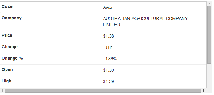
该项技术在这里靠的是使用HTML5的数据属性(data)和CSS来让他们显示在表头里面。另一个就是直接在CSS里面写文字,但我们知道这个对于CSS来说是一个巨大禁忌。<!doctype html>
<html>
<head>
<link id="bootstrap_221" rel="stylesheet" type="text/css" class="library" href="/js/sandbox/bootstrap-2.2.1/css/bootstrap.min.css">
<script id="jquery_172" type="text/javascript" class="library" src="/js/sandbox/jquery/jquery-1.7.2.min.js"></script>
<script id="bootstrap_221" type="text/javascript" class="library" src="/js/sandbox/bootstrap-2.2.1/js/bootstrap.min.js"></script>
</head>
<body>
<div id="no-more-tables">
<table class="table table-bordered">
<thead>
<tr>
<th>Code</th>
<th>Company</th>
<th class="numeric">Price</th>
<th class="numeric">Change</th>
<th class="numeric">Change %</th>
<th class="numeric">Open</th>
<th class="numeric">High</th>
<th class="numeric">Low</th>
<th class="numeric">Volume</th>
</tr>
</thead>
<tbody>
<tr>
<td data-title="Code">AAC</td>
<td data-title="Company">AUSTRALIAN AGRICULTURAL COMPANY LIMITED.</td>
<td data-title="Price" class="numeric">$1.38</td>
<td data-title="Change" class="numeric">-0.01</td>
<td data-title="Change %" class="numeric">-0.36%</td>
<td data-title="Open" class="numeric">$1.39</td>
<td data-title="High" class="numeric">$1.39</td>
<td data-title="Low" class="numeric">$1.38</td>
<td data-title="Volume" class="numeric">9,395</td>
</tr>
</tbody>
</table>
</div>
</body>
</html>
@media only screen and (max-width: 800px) {
/* Force table to not be like tables anymore */
#no-more-tables table,
#no-more-tables thead,
#no-more-tables tbody,
#no-more-tables th,
#no-more-tables td,
#no-more-tables tr {
display: block;
}
/* Hide table headers (but not display: none;, for accessibility) */
#no-more-tables thead tr {
position: absolute;
top: -9999px;
left: -9999px;
}
#no-more-tables tr { border: 1px solid #ccc; }
#no-more-tables td {
/* Behave like a "row" */
border: none;
border-bottom: 1px solid #eee;
position: relative;
padding-left: 50%;
white-space: normal;
text-align:left;
}
#no-more-tables td:before {
/* Now like a table header */
position: absolute;
/* Top/left values mimic padding */
top: 6px;
left: 6px;
width: 45%;
padding-right: 10px;
white-space: nowrap;
text-align:left;
font-weight: bold;
}
/*
Label the data
*/
#no-more-tables td:before { content: attr(data-title); }
}
另外还发现了一些结合了JS使用的表格。
foundation的自适应表格
演示地址原文来自:http://caibaojian.com/responsive-tables.html

相关文章推荐
- bootstrap初试进度条
- Bootstrap 3.3.4 发布,Web 前端 UI 框架
- 异步流程控制:7 行代码学会 co 模块
- [译] React 入门
- angular 指令简述
- 如何优雅处理前端异常?
- 表格标签table深入了解
- table 隔列(行)换色效果让表格结构更清淅
- table高级应用把表格进行到底(必看)
- VB返回记录集结果到HTML表格的方法
- 表格高级使用技巧_把表格进行到底(必看)
- C#实例代码之抽奖升级版可以经表格数据导入数据库,抽奖设置,补抽
- C#实现动态生成表格的方法
- Bootstrap每天必学之前端开发框架
- 深入探讨前端框架react
- JS组件中bootstrap multiselect两大组件较量
- 基于Bootstrap的网页设计实例
- JS实现控制表格行文本对齐的方法
- JS动态显示表格上下frame的方法