利用css的before和after属性,实现类似QQ对话框效果
2016-02-17 17:27
816 查看
实现效果如下:
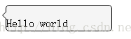
前面的小三角形的原理是利用两个三角形,一个是黑色,一个白色,利用index属性,让白色的三角形覆盖黑色的三角形,白色三角形比黑色三角形靠右1px。下面是代码:
<!DOCTYPE html>
<html lang="en">
<head>
<meta charset="UTF-8">
<title>Document</title>
<style type="text/css">
p:before{content: "H"}
p:after{content: "d"}
.test-div{
position: relative;
width: 150px;
height: 36px;
border-radius: 5px;
border: 1px solid black;
background: rgba(245, 245, 245, 1);
}
.test-div:before, .test-div:after {
content: "";
display:block;
position: absolute;
top: 8px;
width: 0;
height: 0;
border: 6px solid transparent;
}
.test-div:before {
left: -11px;
border-right-color: rgba(245, 245, 245, 1);
z-index: 1;
}
.test-div:after {
left: -12px;
border-right-color: rgba(0, 0, 0, 1);
z-index: 0;
}
</style>
</head>
<body>
<div class="test-div"><p>ello worl</p></div>
</body>
</html>

相关文章推荐
- Web布局连载——两栏固定布局(五)
- [div+css]晒晒最新制作专题推广页模板
- 在Windows 8.1的IE 11中屏蔽双击放大功能
- 设计更快的网页(三):字体和 CSS 调整
- 纯CSS制作的新闻网站中的文章列表
- 10条影响CSS渲染速度的写法与使用建议第1/3页
- MooBox 基于Mootools的对话框插件
- 通过Mootools 1.2来操纵HTML DOM元素
- BS项目中的CSS架构_仅加载自己需要的CSS
- 很不错的 CSS Hack 又学了一招
- 发一个css比较清爽的写法
- CSS expression控制图片自动缩放效果代码[兼容 IE,Firefox]
- css布局网页水平居中常用方法
- CSS经典技巧十则第1/2页
- css 兼容性问题this.style.cursor=''hand''
- IE6不能正常解析CSS文件问题的解决方法及原因分析
- 欲练CSS ,必先解决IE的一些细节分析
- CSS文字截取功能实现代码
- 支持IE6 IE7 Firefox 的纯CSS的下拉菜单