利用 CSS 进行网页布局
2016-01-22 13:33
531 查看
这里主要主要介绍如何利用 CSS 来进行网页的一栏,两栏,三栏和混合布局
效果:
效果:
如果要使左右两列的宽度自适应大小,只要将 class 等于 right 和 left 的两个 div 的宽度设置为百分比的形式就好了,不要固定宽度。例如:
效果:
如果我们在这里只是简单的设定 right, left 和 middle 的 div 的宽度的话,middle div 里面的内容会显示在一行,然后自己撑开了,使 right, left 和 middle 不在同一行,所以这里用到了
效果:
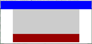
1. 一列布局
<html>
<head>
<style type="text/css">
body{margin:0;padding:0}
.top{height: 100px; background: blue;}
.main{width: 800px; height: 300px; background: #ccc; margin: 0 auto; }
.foot{width: 800px; height: 100px; background: #900; margin: 0 auto;}
</style>
</head>
<body>
<div class="top"> </div>
<div class="main"> </div>
<div class="foot"> </div>
</body>
</html>
效果:
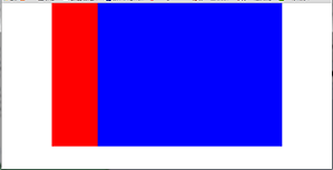
2. 两列布局
<html>
<head>
<style type="text/css">
body{margin: 0; padding: 0}
.main{width: 800px; margin: 0 auto;}
.left{width:160px; height: 500px; float:left; background: red;}
.right{width: 640px; height: 500px; float:right; background: blue;}
</style>
</head>
<body>
<div class="main">
<div class="left"> </div>
<div class="right"> </div>
</div>
</body>
</html>
效果:
如果要使左右两列的宽度自适应大小,只要将 class 等于 right 和 left 的两个 div 的宽度设置为百分比的形式就好了,不要固定宽度。例如:
.left{width:20%; }
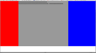
.right{width: 80%; }3. 三列布局
设计要求:左右两列的宽度是固定大小的,中间一列的宽度是根据内容自适应大小的。<html>
<head>
<style type="text/css">
body{margin:0; padding:0}
.left{width:200px; height:500px; background:red; position:absolute; left:0; top:0;}
.middle{height:500px; background:#999; margin:0 300px 0 200px;}
.right{width:300px; height:500px; background:blue; position:absolute; right:0; top:0;}
</style>
</head>
<body>
<div class="left"> </div>
<div class="middle">
aaaaaaaaaaaaaaaaaaaaaaaaaaaaaaaaaaaaaaa
aaaaaaaaaaaaaaaaaaaaaaaaaaaaaaaaaaaaaaaaa
aaaaaaaaaaaaaaaaaaa
</div>
<div class="right"> </div>
</body>
</html>效果:
如果我们在这里只是简单的设定 right, left 和 middle 的 div 的宽度的话,middle div 里面的内容会显示在一行,然后自己撑开了,使 right, left 和 middle 不在同一行,所以这里用到了
position:absolute从而使 middle div 里面的根据内容自适应宽度。
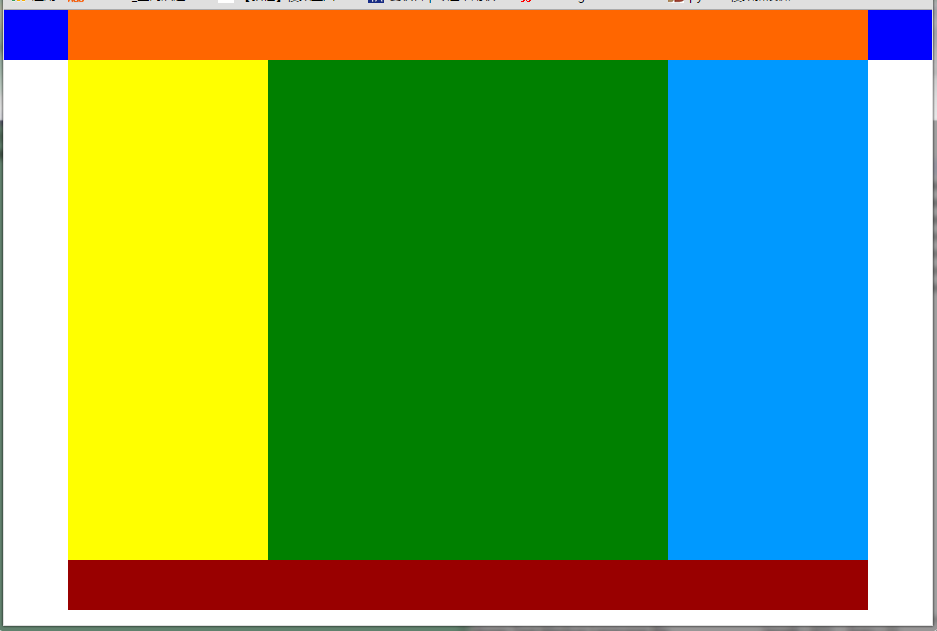
4. 混合布局
<html>
<head>
<style type="text/css">
body{margin:0; padding:0}
.top{height:50px; background:blue;}
.head{height:50px; width:800px; background:#f60; margin: 0 auto;}
.main{height:500px; width:800px; background:#cc; margin:0 auto;}
.left{height:500px; width:200px; background:yellow; float:left;}
.right{height:500px; width:600px; background:369; float:right;}
.sub_l{height:500px; width:400px; background:green; float:left;}
.sub_r{height:500px; width:200px; background:#09f; float:right;}
.foot{height:50px; width:800px; background:#900; margin: 0 auto;}
</style>
</head>
<body>
<div class="top">
<div class="head">  </div>
</div>
<div class="main">
<div class="left">  </div>
<div class="right">
<div class="sub_l">  </div>
<div class="sub_r">  </div>
</div>
</div>
<div class="foot">  </div>
</body>
</html>
效果:

相关文章推荐
- Android布局的小窍门?
- Web布局连载——两栏固定布局(五)
- [div+css]晒晒最新制作专题推广页模板
- 设计更快的网页(三):字体和 CSS 调整
- 纯CSS制作的新闻网站中的文章列表
- 10条影响CSS渲染速度的写法与使用建议第1/3页
- BS项目中的CSS架构_仅加载自己需要的CSS
- 很不错的 CSS Hack 又学了一招
- 发一个css比较清爽的写法
- CSS expression控制图片自动缩放效果代码[兼容 IE,Firefox]
- css布局网页水平居中常用方法
- CSS经典技巧十则第1/2页
- css 兼容性问题this.style.cursor=''hand''
- IE6不能正常解析CSS文件问题的解决方法及原因分析
- 欲练CSS ,必先解决IE的一些细节分析
- CSS文字截取功能实现代码
- 支持IE6 IE7 Firefox 的纯CSS的下拉菜单
- 不同版本IE使用不同css(css条件注释语句用法)
- css类选择器的使用方法详解