Android:自定义ToggleButton
2016-01-19 12:27
309 查看
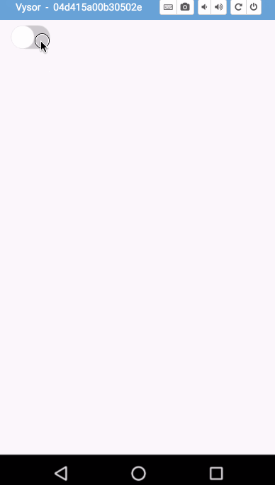
先看效果:
实现思路 :
仿照系统自带的ToggleButton控件,继承系统CompoundButton类,然后重写onDraw方法代码如下:
public class ToggleButton extends CompoundButton {
private static final String TAG = "ToggleButton";
//背景画笔(画下面的背景)
private Paint backgroundPaint = new Paint(Paint.ANTI_ALIAS_FLAG);
//开关画笔(画上面的小圆)
private Paint togglePaint = new Paint(Paint.ANTI_ALIAS_FLAG);
//背景路径
private Path backgroundPath = new Path();
//打开时上面圆的路径
private Path togglePath_on = new Path();
//关闭时上面圆的路径
private Path togglePath_off = new Path();
//上面圆和底部背景之间的间距
private float padding =1;
//onDraw时的路径
private Path toggleDrawPath = new Path();
//打开的颜色
private int onColor;
//关闭的颜色
private int offColor;

public ToggleButton(Context context) {
this(context, null);
}

public ToggleButton(Context context, AttributeSet attrs) {
this(context, attrs, 0);
}

public void setOffColor(int offColor) {
this.offColor = offColor;
}

public void setOnColor(int onColor) {
this.onColor = onColor;
}

public void setPadding(int padding) {
this.padding = padding;
}

public ToggleButton(Context context, AttributeSet attrs, int defStyleAttr) {
super(context, attrs, defStyleAttr);
//设置可点击
this.setClickable(true);
initAttrs(attrs);
initPaints();
}

/**
* 初始化画笔
*/
private void initPaints() {
togglePaint.setColor(Color.WHITE);
}

/**
* 初始化attrs
* @param attrs
*/
private void initAttrs(AttributeSet attrs){
TypedArray a = getContext().obtainStyledAttributes(attrs, R.styleable.ToggleButton);
onColor = a.getColor(R.styleable.ToggleButton_onColor,Color.GREEN);
offColor = a.getColor(R.styleable.ToggleButton_offColor, Color.LTGRAY);
a.recycle();
}

/**
* 初始化Paths
*/
private void initPath() {
int height = getHeight();
int width = getWidth();
if (height > 0 && width > 0) {
int radius = Math.min(width, height) / 2;
backgroundPath.reset();
togglePath_on.reset();
togglePath_off.reset();
RectF left = new RectF(0, 0, 2 * radius, 2 * radius);
RectF right = new RectF(width - 2 * radius, 0, width, height);
backgroundPath.addArc(left, 90, 180);
backgroundPath.addRect(radius, 0, width - radius, height, Path.Direction.CCW);
backgroundPath.addArc(right, 270, 180);

RectF on = new RectF(width - 2 * radius - padding, padding, width - padding, height - padding);
RectF off = new RectF(padding, padding, 2 * radius - padding, 2 * radius - padding);
togglePath_on.addArc(on, 90, 360);
togglePath_off.addArc(off, 90, 360);
toggleDrawPath.set(isChecked()?togglePath_on : togglePath_off);
}

}

@Override
protected void onDraw(Canvas canvas) {
super.onDraw(canvas);
backgroundPaint.setColor(isChecked() ? onColor : offColor);
canvas.drawPath(backgroundPath, backgroundPaint);
canvas.drawPath(toggleDrawPath, togglePaint);
}

@Override
protected void onMeasure(int widthMeasureSpec, int heightMeasureSpec) {
int widthMode = MeasureSpec.getMode(widthMeasureSpec);
int heightMode = MeasureSpec.getMode(heightMeasureSpec);

int widthSize = MeasureSpec.getSize(widthMeasureSpec);
int heightSize = MeasureSpec.getSize(heightMeasureSpec);

DisplayMetrics displayMetrics = getResources().getDisplayMetrics();
if(widthMode != MeasureSpec.EXACTL
4000
Y){
widthSize = (int) TypedValue.applyDimension(TypedValue.COMPLEX_UNIT_DIP, 50, displayMetrics);
widthMeasureSpec = MeasureSpec.makeMeasureSpec(widthSize, MeasureSpec.EXACTLY);
}

if(heightMode != MeasureSpec.EXACTLY){
heightSize = (int) TypedValue.applyDimension(TypedValue.COMPLEX_UNIT_DIP, 30, displayMetrics);
heightMeasureSpec = MeasureSpec.makeMeasureSpec(heightSize, MeasureSpec.EXACTLY);
}
super.onMeasure(widthMeasureSpec, heightMeasureSpec);
initPath();
}

@Override
public void setChecked(boolean checked) {
super.setChecked(checked);
boolean isChecked = isChecked();
if (toggleDrawPath != null) {
toggleDrawPath.reset();
toggleDrawPath.set(isChecked?togglePath_on : togglePath_off);
}
invalidate();
}
}
添加监听 :
ToggleButton toggleButton = (ToggleButton) findViewById(R.id.toggleButton);
toggleButton.setOnCheckedChangeListener(new CompoundButton.OnCheckedChangeListener() {
@Override
public void onCheckedChanged(CompoundButton buttonView, boolean isChecked) {
// do something
});
自定义属性 :
<declare-styleable name="ToggleButton">
<attr name="onColor" format="color|reference"/>
<attr name="offColor" format="color|reference"/>
</declare-styleable>

相关文章推荐
- 使用C++实现JNI接口需要注意的事项
- Android IPC进程间通讯机制
- Android Manifest 用法
- [转载]Activity中ConfigChanges属性的用法
- Android之获取手机上的图片和视频缩略图thumbnails
- Android之使用Http协议实现文件上传功能
- Android学习笔记(二九):嵌入浏览器
- android string.xml文件中的整型和string型代替
- i-jetty环境搭配与编译
- android之定时器AlarmManager
- android wifi 无线调试
- Android Native 绘图方法
- Android java 与 javascript互访(相互调用)的方法例子
- android 代码实现控件之间的间距
- android FragmentPagerAdapter的“标准”配置
- Android"解决"onTouch和onClick的冲突问题
- android:installLocation简析
- android searchView的关闭事件
- SourceProvider.getJniDirectories