深挖 NGUI 基础 之UIRoot (一)
当你开始使用NGUI的时候,简单的从项目视图 中一个”Control”预设体 拖拽到场景视图中,你将会发现 Hierarchy层次面板中会出现以下层次结构:


- 其中 UI Root作为根节点,是每个NGUI元素的顶级父节点
- 在Unity中,每个元素都具有最基本的Transform属性,这也叫基元属性;
- UI Root是用于管理和处理UI的变化和缩放
- Camera其实是一个独立的UICamera,负责渲染UI对象到视图中,作为UI Root的子节点存在
- 剩下的蓝色文字的物体就是最关键的UI部分.
(一) UI Root缩放方式之 Scaling Style
- NGUI中 UI Root 缩放方式有三种,默认为Flexible
public enum Scaling
{
Flexible,
Constrained,
ConstrainedOnMobiles,
}
public Scaling scalingStyle = Scaling.Flexible;
Flexible style lets your UI always be in pixels, and a 300x200 widget will always take 300 by 200 pixels on the screen. This also means that viewing your UI on a low-res device will make your widgets appear rather large in size, and viewing your UI on a high-res device will make your widgets appear small. On the plus side, with this setting your UI will always remain as crisp as possible.
译:Flexible style 灵活的方式让你操作UI.比如你设置300*200 px的UI Root Fiexible,那么你的UI 元素将永远保持在300 * 200 像素,并且不会进行任何缩放.也就是说在低分辨率的设备下你的UI画面中的元素将会显得非常大,而在高分辨率的设备中,你的UI画面元素将会变得非常小. 唯一的好处就是这个UI将会保持这个分辨率,不会随着画面和设备而改变.当选择这个选项的时候,不要忘记手动设置高度.


public Scaling activeScaling
{
get
{
Scaling scaling = scalingStyle;

if (scaling == Scaling.ConstrainedOnMobiles)
#if UNITY_EDITOR || UNITY_IPHONE || UNITY_ANDROID || UNITY_WP8 || UNITY_WP_8_1 || UNITY_BLACKBERRY
return Scaling.Constrained;
#else
return Scaling.Flexible;
#endif
return scaling;
}
}
他们之间的关系是:默认为Flexible,若手动选 Scaling.ConstrainedOnMobiles,应该符合的平台是编辑器,IPhone,安卓,Window Phone8或者Unity_WP_8_1,或者黑莓.那么这些情况将把UI Root缩放方式变为Scaling.Constrained,其他时候设置无效,将会默认为Flexible固定缩放,也就是说当你发布在网页平台的时候设置为ConstrainedOnMobiles为无效操作.
Flexible 意味着保持原有像素,不进行缩放.分辨率的变化不影响UI的像素.
Unity默认按照UI Root Minimum Height 最小高度限制来设定 该UI元素的实际高度.
而且UI Root脚本中 默认最小高度为720px,最大高度为1280px
并且限定范围为320px <= Height <= 1536px


比如当我们把屏幕的宽高度设置为1280 * 7200 px
那么在固定缩放的情况下,Scaling.Flexible中,实际高度activeHeight是怎么计算的呢?
if (scaling == Scaling.Flexible)
{
Vector2 screen = NGUITools.screenSize;
float aspect = screen.x / screen.y;

if (screen.y < minimumHeight)
{
screen.y = minimumHeight;
screen.x = screen.y * aspect;
}
else if (screen.y > maximumHeight)
{
screen.y = maximumHeight;
screen.x = screen.y * aspect;
}

// Portrait mode uses the maximum of width or height to shrink the UI
int height = Mathf.RoundToInt((shrinkPortraitUI && screen.y > screen.x) ? screen.y / aspect : screen.y);

// Adjust the final value by the DPI setting
return adjustByDPI ? NGUIMath.AdjustByDPI(height) : height;
}
从脚本中我们可以得知,首先通过NGUITools.screenSize获取实际屏幕宽高,然后求出宽高比aspect;
然后根据实际屏幕高度的与minimumHeight和maximumHeight相比取得限定范围内合适的值
- 实际屏幕高度比最小高度小,设定实际屏幕高度为最小高度,然后根据比例aspect求出最终宽度;
- 实际屏幕高度比最大高度大,设定实际屏幕高度为最大高度,然后根据比例aspect求出最终宽度;
- 若实际屏幕高度在最大高度和最小高度之间,则不进行改变.
- 若收缩shrinkPortraitUI 且屏幕高度大于宽度,则进行比例压缩,真实高度 = screen.y / aspect ,否则保持不变.
- 返回最终结果.
好奇的是,NGUITools.screenSize是怎么获取到我们设定的屏幕大小的呢?
#if UNITY_EDITOR
static int mSizeFrame = -1;
static System.Reflection.MethodInfo s_GetSizeOfMainGameView;
static Vector2 mGameSize = Vector2.one;

/// <summary>
/// Size of the game view cannot be retrieved from Screen.width and Screen.height when the game view is hidden.
/// </summary>

static public Vector2 screenSize
{
get
{
int frame = Time.frameCount;

if (mSizeFrame != frame || !Application.isPlaying)
{
mSizeFrame = frame;

if (s_GetSizeOfMainGameView == null)
{
System.Type type = System.Type.GetType("UnityEditor.GameView,UnityEditor");
s_GetSizeOfMainGameView = type.GetMethod("GetSizeOfMainGameView",
System.Reflection.BindingFlags.NonPublic | System.Reflection.BindingFlags.Static);
}
mGameSize = (Vector2)s_GetSizeOfMainGameView.Invoke(null, null);
}
return mGameSize;
}
}
原来在编辑器模式中,通过反射获取到类型 System.Type.GetType("UnityEditor.GameView,UnityEditor"); 通过类型获取到方法 type.GetMethod("GetSizeOfMainGameView", 最后调用方法得到屏幕大小.

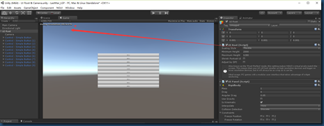
接下来我们用案例来看UI实际情况:首先设置屏幕大小为1270*720ox


把UI Root 的最小Minimum 设置为 720px,也就是以此 UI Root为画布的元素(画布和屏幕大小一致),默认与画布的比例是自身元素高度 : 720px


如我们把Button设置的宽高设置为72 px * 1280 px,那么刚好 10个Button元素就能把画面填充满


最顶部Button元素的坐标Y轴是324,那么它是怎么来的呢?
计算:屏幕高度 / 2 - 元素高度 /2 = 720/2 – 72/2 = 324 px
这在做网格类游戏很有用哦:比如三消游戏或者SLG游戏等
(二) UI Root缩放方式之 Constrained
- Constrained is the exact opposite of that. When the UIRoot is set to this setting, your screen will always remain the same size as far as NGUI is concerned, regardless of the actual screen size. This means that if a 300x200 widget takes 25% of your screen with the resolution of 1920x1080, it will still take 25% of the screen when you drop your resolution to 1280x720. If you don't want to worry about how your UI will look at different screen sizes and you don't care much about making it as crisp as possible, choose this setting. Don't forget to set the Content dimensions setting when choosing this option.
- You can further refine the constrain by choosing whether the content will Fit on the screen or whether it will Fill the screen (when 'fit' is off). Think of it as your Desktop wallpaper. When you choose the Fit method, the wallpaper will always be fully visible on the screen, where if you go with a Fill method, it will always completely fill the screen while maintaining its aspect ratio. Same idea here. See the attached image for more information.
- 译:Constrained 约束缩放方式正好相反,无论你的屏幕分辨率是多少,UI元素将会保持着最适合的缩放方式渲染在屏幕中,元素的大小看起来无论在任何分辨率的设备都是一致的. 只是在低分辨率的设备中,元素会压缩而变得更清晰,但是在高分辨率的设备中,为了保持同等大小,可能会进行拉伸而显得没那么清晰.
- 你可以进一步约束,使得它填充满屏幕,并且宽高比不变(也就是说部分元素会溢出在屏幕之外) 根据百分比缩放,大小可能会失真.
(三) UI Root缩放方式之 ConstrainedOnMobiles
- ConstrainedOnMobiles setting is a combination of the two. It will behave as if the setting was "Flexible" on desktop builds, and it will act as if the size was "Constrained" when targeting mobile platforms.
- ConstrainedOnMobiles设置是两者的结合。它将表现得好像设置桌面构建“灵活”,它的“约束”只是针对移动平台。
UI Root 广播机制
static void UIRoot.Broadcast    (    string     funcName    )
static
Broadcast the specified message to the entire UI.

static void UIRoot.Broadcast    (    string     funcName,
object     param
)
static
Broadcast the specified message to the entire UI.
对UI的显示有影响的不只是UI Root的缩放方式,UI 元素的大小,锚点的设置,还有摄像机的Size哦
- 对于相同的元素,默认摄像机大小Size为1,UI摄像机使用的是正交投射方式,Size控制正交摄像机的视窗口大小
- 当画布大小为1280*720 ,正好铺满画布的元素大小为 1280*720,在Size为1 的摄像机中完美的渲染到屏幕中,不产生任何裁剪和填充
- 当我们更改正交摄像机的Size为0.5时,情况是怎样的呢?

- 这是为什么呢?因为摄像机在Size为1的时候,能渲染1280*720的像素,当Size减小为一半的时候,意味着摄像机视窗口能渲染的东西少了一半,也就是只有640*320像素元素了,这反而看起来是摄像机Size小了,元素反而还变大了…
- 在下节中会详细的介绍Unity中的摄像机,谢谢关注


- 检测到有潜在危险的 request.form 值
- Android酷炫实用的开源框架——UI框架(转)
- 导航条的使用 UINavigationBar
- 自定义UICollectionViewLayout 实现瀑布流
- String.valueOf() 方法的使用
- UGUI 动手制作字体
- easyui combobox 省市区 三级联动
- h2 DB的一个问题,关于类型--Numeric value out of range
- 多线程之NSOperation和NSOperationQueue
- UIWindow & UIWindowLevel详解
- UILabel宽度固定, 字体大小自适应
- Chapter9-3.Interrupt handling schemes 《ARM system developer's guide》
- request.getscheme()的使用方法!
- FluentNHibernate当数据库设置默认值时,使用插入操作,导致默认值没有写入问题
- 遍历HashMap取出所有的Key和Value
- iOS-给UIView添加点击事件
- ios中ui九宫格作图
- I meet this issue too
- EasyUi 手机号码,邮箱,remote验证
- Android酷炫实用的开源框架(UI框架)