css3制作立体导航
2016-01-10 15:07
731 查看
慕课网学到的用css3制作立体导航,受益匪浅,配合前段时间学的二级导航,有空试,哈哈!
内容简单,但伪类after的使用需要注意!
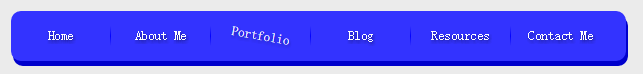
经过修改的最终效果图:
涉及css3的知识点包括:
4@S12RYT8[~WT.png)
送上一张配色图:
内容简单,但伪类after的使用需要注意!
经过修改的最终效果图:
涉及css3的知识点包括:
圆角特效:border-radius: 10px;
盒子阴影:box-shadow: 2px 5px 0px #0000cc;
文字阴影:text-shadow:1px 2px 4px rgba(0,0,0,.5);
动画过渡:transition: all 0.2s ease-in;
动画效果-旋转:transform:rotate(10deg);
颜色线性渐变背景:background:linear-gradient(to bottom,#3333ff,#0000ff,#3333ff);
<!doctype html>
<html lang="en">
<head>
<meta charset="UTF-8">
<title>CSS制作立体导航</title>
<style>
body{
background: #ebebeb;
}
*{margin: 0;padding: 0;}
.nav{
text-align: center;
width: 615px;
height: 50px;
margin:40px auto 0;
background: #3333ff;
border-radius: 10px;
box-shadow: 2px 5px 0px #0000cc;
}
.nav li{
height: 50px;
line-height: 50px;
width: 100px;
float: left;
list-style: none;
position:relative;
display:inline-block;
font-size: 13px;
text-shadow:1px 2px 4px rgba(0,0,0,.5);
}
.nav a{
display: inline-block;
text-decoration: none;
-webkit-transition: all 0.2s ease-in;
-moz-transition: all 0.2s ease-in;
-o-transition: all 0.2s ease-in;
-ms-transition: all 0.2s ease-in;
transition: all 0.2s ease-in;
}
.nav a:hover{
-webkit-transform:rotate(10deg);
-moz-transform:rotate(10deg);
-o-transform:rotate(10deg);
-ms-transform:rotate(10deg);
transform:rotate(10deg);
}
.nav li:after{
content: "";
position: absolute;
height: 20px;
top:15px;
width: 1px;
right: 0px;
-webkit-background:linear-gradient(to bottom,#3333ff,#0000ff,#3333ff);
-moz-background:linear-gradient(to bottom,#3333ff,#0000ff,#3333ff);
-o-background:linear-gradient(to bottom,#3333ff,#0000ff,#3333ff);
-ms-background:linear-gradient(to bottom,#3333ff,#0000ff,#3333ff);
background:linear-gradient(to bottom,#3333ff,#0000ff,#3333ff);
}
.nav li:last-child:after{
background: none;
}
.nav a,
.nav a:hover{
color:#fff;
text-decoration: none;
}
</style>
</head>
<body>
<ul class="nav">
<li><a href="">Home</a></li>
<li><a href="">About Me</a></li>
<li><a href="">Portfolio</a></li>
<li><a href="">Blog</a></li>
<li><a href="">Resources</a></li>
<li><a href="">Contact Me</a></li>
</ul>
</body>
</html>
送上一张配色图:

相关文章推荐
- 【CSS3】CSS3 滤镜实现
- 燕十八视频--CSS
- 燕十八---CSS画三角形
- css3实现图片旋转效果
- css中margin、padding等属性的简写方式解读
- 初学DIV+CSS需要注意的6个问题
- 如何书写可维护的CSS代码
- CSS代码书写顺序
- css中margin、padding等属性的简写方式解读
- 初学DIV+CSS需要注意的6个问题
- 如何书写可维护的CSS代码
- CSS代码书写顺序
- css display inline block 兼容性问题写法
- CSS 弹性布局如何实现
- 缩短浏览器上页面渲染
- CSS-Day02-样式表的分类
- 【WEB前端】3.CSS内联元素和块元素
- 【WEB前端】2.CSS定位相关
- 【WEB前端】1.CSS浮动相关
- css3样式前缀:-ms -moz -webkit -o