用纯css做环形进度条
2015-12-30 14:59
721 查看
效果如下:
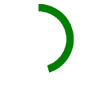

先来讲一下原理吧,说先画一个圆环,圆环的画法有很多,就不说了。然后用clip切掉一半的圆环。clip怎么用?一、clip属性必须和定位属性postion一起使用才能生效。二、clip裁切的计算坐标都是以左上角即(0,0)点开始计算,rect ( number number number number ) : 依据上-右-下-左的顺序提供自对象左上角为(0,0)坐标计算的四个偏移数值,其中任一数值都可用 auto 替换,即此边不剪切 。
切了一半然后怎么办?怎么让它显示少于50%的情况?
在切掉的那一边放一个矩形的遮罩层,然后用rotate把半圆环进行旋转,即能得到小于50%的了。
半个是很简单,那整个的呢?这个就需要比较扎实的css3功底了。我也是在看了大神的代码后才豁然开朗。
先贴代码:
可以看到,他采用了两个半圆环,让两个圆环在前3s一起转出来,然后在第3s时让一个圆环进行anmation-delay,另外用0.01s让遮罩层被裁掉,对的用clip。
然后后面的3s让另一个半圆环再转过来,就实现了整个动画过程。
不要整个?按比例换算下时间就够了~~
先来讲一下原理吧,说先画一个圆环,圆环的画法有很多,就不说了。然后用clip切掉一半的圆环。clip怎么用?一、clip属性必须和定位属性postion一起使用才能生效。二、clip裁切的计算坐标都是以左上角即(0,0)点开始计算,rect ( number number number number ) : 依据上-右-下-左的顺序提供自对象左上角为(0,0)坐标计算的四个偏移数值,其中任一数值都可用 auto 替换,即此边不剪切 。
切了一半然后怎么办?怎么让它显示少于50%的情况?
在切掉的那一边放一个矩形的遮罩层,然后用rotate把半圆环进行旋转,即能得到小于50%的了。
半个是很简单,那整个的呢?这个就需要比较扎实的css3功底了。我也是在看了大神的代码后才豁然开朗。
先贴代码:
<!--
Author: Meta Luo
Date: 2015/10/15
-->

<!DOCTYPE html>
<html>
<head lang="en">
<meta charset="UTF-8">
<title></title>
<style>
.wrapper {
width: 100px; /* Set the size of the progress bar */
height: 100px;
position: absolute; /* Enable clipping */
clip: rect(0px, 100px, 100px, 50px); /* Hide half of the progress bar */
}
/* Set the sizes of the elements that make up the progress bar */
.circle {
width: 80px;
height: 80px;
border: 10px solid green;
border-radius: 50px;
position: absolute;
clip: rect(0px, 50px, 100px, 0px);
}
/* Using the data attributes for the animation selectors. */
/* Base settings for all animated elements */
div[data-anim~=base] {
-webkit-animation-iteration-count: 1;  /* Only run once */
-webkit-animation-fill-mode: forwards; /* Hold the last keyframe */
-webkit-animation-timing-function:linear; /* Linear animation */
}

.wrapper[data-anim~=wrapper] {
-webkit-animation-duration: 0.01s; /* Complete keyframes asap */
-webkit-animation-delay: 3s; /* Wait half of the animation */
-webkit-animation-name: close-wrapper; /* Keyframes name */
}

.circle[data-anim~=left] {
-webkit-animation-duration: 6s; /* Full animation time */
-webkit-animation-name: left-spin;
}

.circle[data-anim~=right] {
-webkit-animation-duration: 3s; /* Half animation time */
-webkit-animation-name: right-spin;
}
/* Rotate the right side of the progress bar from 0 to 180 degrees */
@-webkit-keyframes right-spin {
from {
-webkit-transform: rotate(0deg);
}
to {
-webkit-transform: rotate(180deg);
}
}
/* Rotate the left side of the progress bar from 0 to 360 degrees */
@-webkit-keyframes left-spin {
from {
-webkit-transform: rotate(0deg);
}
to {
-webkit-transform: rotate(360deg);
}
}
/* Set the wrapper clip to auto, effectively removing the clip */
@-webkit-keyframes close-wrapper {
to {
clip: rect(auto, auto, auto, auto);
}
}
</style>
</head>
<body>
<div class="wrapper" data-anim="base wrapper">
<div class="circle" data-anim="base left"></div>
<div class="circle" data-anim="base right"></div>
</div>
</body>
</html>
可以看到,他采用了两个半圆环,让两个圆环在前3s一起转出来,然后在第3s时让一个圆环进行anmation-delay,另外用0.01s让遮罩层被裁掉,对的用clip。
然后后面的3s让另一个半圆环再转过来,就实现了整个动画过程。
不要整个?按比例换算下时间就够了~~

相关文章推荐
- CSS3属性教程与案例分享
- CSS3属性教程与案例分享
- CSS3的calc()使用
- 使用CSS3的appearance属性改变元素的外观
- Web布局连载——两栏固定布局(五)
- CSS3美化图片
- CSS3质感分析——表面线性渐变
- 分析选项卡底部内凹圆角制作
- 细说百度图片栏目——图片展示效果
- 8个实用的响应式设计框架
- 20+ Animation Scripts, Libraries and Plugins
- [div+css]晒晒最新制作专题推广页模板
- 设计更快的网页(三):字体和 CSS 调整
- 纯CSS制作的新闻网站中的文章列表
- 10条影响CSS渲染速度的写法与使用建议第1/3页
- BS项目中的CSS架构_仅加载自己需要的CSS
- 很不错的 CSS Hack 又学了一招
- 发一个css比较清爽的写法
- CSS expression控制图片自动缩放效果代码[兼容 IE,Firefox]
- 如何使用CSS3画出一个叮当猫