[CSS3] Transform Function
2015-12-24 16:32
651 查看
X/Y:  translateX() translateY()  scaleX()  scaleY() skewX() skewY()

CSS3 2D: translate() scale() rotate() skew()

CSS3 3D: rotateX() rotateY() rotate3d()   translateZ() translate3d() scaleZ() scale3d()
(1) 2D transfrom function
translate()移动元素
scale() 放大和缩小元素
rotate() 旋转
skew() 倾斜
matrix() 矩阵变形
translate
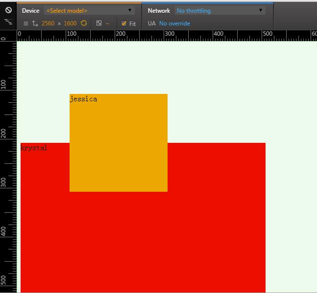
<div class="j">jessica</div>
<div class="k">krystal</div>
div{
width:200px;
height:200px;
background: orange;
}
.j{
transform:translate(100px,100px);
-webkit-transform:translate(100px,100px);
}
.k{
width: 500px;
height:500px;
background: red;
}
scale
.j{
transform:scale(0.5,0.5);
}
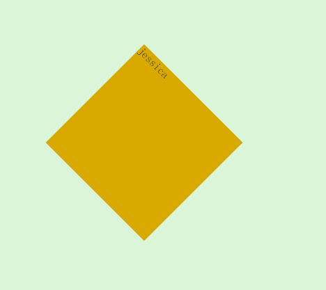
rotate
.j{
transform:translate(100px,100px) rotate(45deg);
}
skew
.j{
transform:skew(45deg,10deg) translate(100px,0);
}
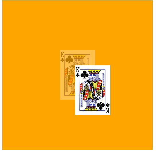
(2) 3D transfrom function
Reference: Clike Here<div class="stage"> <div class="container"> <img src="http://www.w3cplus.com/sites/default/files/blogs/2013/1311/cardKingClub.png" alt="" width="70" height="100" /> <img src="http://www.w3cplus.com/sites/default/files/blogs/2013/1311/cardKingClub.png" alt="" width="70" height="100" /> </div> </div>
.stage{
position: relative;
width: 300px;
height: 300px;
background:orange;
}
.container{
position: relative;
left:50%;
top:50%;
}
.container img{
position: absolute;
margin-top:-50px;
margin-left:-35px;
}

.container img:nth-child(1){
z-index:1;
opacity: 0.3;
}

.container img:nth-child(2){
z-index:2;
-webkit-transform: translate3d(30px,30px,200px);
-moz-transform: translate3d(30px,30px,200px);
-ms-transform: translate3d(30px,30px,200px);
-o-transform: translate3d(30px,30px,200px);
transform: translate3d(30px,30px,200px);
}

相关文章推荐
- CSS3属性教程与案例分享
- CSS3属性教程与案例分享
- CSS3的calc()使用
- 使用CSS3的appearance属性改变元素的外观
- CSS3美化图片
- CSS3质感分析——表面线性渐变
- 分析选项卡底部内凹圆角制作
- 细说百度图片栏目——图片展示效果
- 8个实用的响应式设计框架
- 20+ Animation Scripts, Libraries and Plugins
- 如何使用CSS3画出一个叮当猫
- 基于Jquery和CSS3制作数字时钟附源码下载(CSS3篇)
- 3D设计 Adobe Acrobat 3D 8.1.0 英文版 下载
- CSS3实例分享之多重背景的实现(Multiple backgrounds)
- 低版本IE正常运行HTML5+CSS3网站的3种解决方案
- CSS3中Transition属性详解以及示例分享
- 基于jQuery和CSS3制作响应式水平时间轴附源码下载
- jquery+CSS3模拟Path2.0动画菜单效果代码
- jquery带翻页动画的电子杂志代码分享
- jquery 3D 标签云示例代码