css3太极图效果+自动旋转
2015-11-16 15:22
661 查看
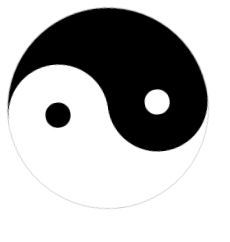
主要使用border-radius属性实现圆,半圆,定位坐标覆盖部分模块。
半圆:
width: 50%; height: 100%;
border-radius:100% 0 0 100% /50% 0 0 50%;
<!DOCTYPE html>
<html>
<head>
<meta charset="UTF-8">
<title>太极图</title>
<style type="text/css">
.taiji{position: relative; width: 200px; height: 200px; border-radius: 50%; background-color: #fff;border:solid 1px #ccc;    animation: spin 6s linear infinite;/*动画设置*/}
.tj_1{position: absolute; top: 0px; width: 50%; height: 100%;}
.tj_big1{left: 0px; border-radius:100% 0 0 100% /50% 0 0 50%; background: #000;}
.tj_big2{right: 0px; border-radius:0 100% 100% 0 / 0 50% 50% 0; background: #fff;}
.tj_2{position: absolute; width: 50%; height: 50%; left: 25%; border-radius: 50%;}
.tj_s1{bottom: 0px; background: #fff;}
.tj_s2{top: 0px; background: #000;}
.tj_ss{position: absolute; width: 25%; height: 25%; left: 37.5%;border-radius: 50%;}
.tj_w{top:37.5%;background: #000;}
.tj_b{top:37.5%;background: #fff;}
/*动画方法*/
@keyframes spin {
0% {
transform:rotate(0deg);
}
100% {
transform:rotate(360deg);
}
}
</style>
</head>
<body>

<div class="taiji">
<div class="tj_1 tj_big1"></div>
<div class="tj_1 tj_big2"></div>
<div class="tj_2 tj_s1">
<div class="tj_ss tj_w"></div>
</div>
<div class="tj_2 tj_s2">
<div class="tj_ss tj_b"></div>
</div>

</div>
</body>
</html>
实例源码

相关文章推荐
- CSS让3个块级元素同行且中间元素居中
- css文字过多以点点省略
- css文字过多以点点省略
- 用php脚本给html中引用的js和css路径打上版本
- Css background背景语法
- css:中文词不断开,整体换行
- css3:user-select属性
- html css常识
- css 创建水平导航条
- Web学习篇之---css基础知识(三)
- css 定制Suckerfish下拉菜单
- CSS背景图拉伸自适应尺寸,全浏览器兼容
- 一波CSS的Checkbox复选框样式代码分享
- css(1)
- JSP中修改alert,comfire样式
- CSS3 经典教程系列:CSS3 圆角(border-radius)详解
- 几个CSS的黑科技
- 12 个 CSS 高级技巧汇总
- OpenLayers 3 之 map样式(ol.style)详解
- WPF自定义控件与样式(2)-自定义按钮FButton