Android 中的Drawable资源
2015-08-15 21:29
423 查看
在Android应用中,常常会用到Drawable资源,比如图片资源等,在Android开发中我们是用Drawable类来Drawable类型资源的。
Drawable资源一般存储在应用程序目录的\res\drawable目录下,当然依据分辨率的高低可以分别存储不同分辨率的资源到如下几个目录:
\res\drawable-hdpi
\res\drawable-ldpi
\res\drawable-mdpi
\res\drawable-xdpi
其SDK文档中声明如下:

我们看到Drawable是一个抽象类(abstract class),它有好多子类(SubClass)来操作具体类型的资源,比如BitmapDrawable是用来操作位图,ColorDrawable用来操作颜色,
ClipDrawable用来操作剪切板等。
图片资源
图片资源是简单的Drawable资源,目前Android支持的图片格式有:gif、png、jpg等。我们只需要把图片资源放置到\res\drawable目中,那么在编译后的R.java类中就会生成图片资源的资源ID
我们在程序中就可以通过调用相关的方法来获取图片资源(程序中如果要访问drawable_resource_file_name,那么可以如此:[packagename].R.drawable.drawable_resource_file_name)。
注:Android中drawable中的资源名称有约束,必须是: [a-z0-9_.](即:只能是字母数字及_和.),而且不能以数字开头,否则编译会报错: Invalid file name: must contain only [a-z0-9_.]
以下代码片段演示了如何访问一个图片资源(资源名称drawablefilename):
StateListDrawable资源
StateListDrawable内可以分配一组Drawable资源,StateListDrawable 被定义在一个XML文件中,以
当StatListDrawable资源作为组件的背景或者前景Drawable资源时,可以随着组件状态的变更而自动切换相对应的资源,例如,一个Button可以处于不同的状态(按钮按下、获取焦点)
我们可以使用一个StateListDrawable资源,来提供不同的背景图片对于每一个状态。,当组件的状态变更时,会自定向下遍历StateListDrawable对应的xml文件来查找第一个匹配的Item。
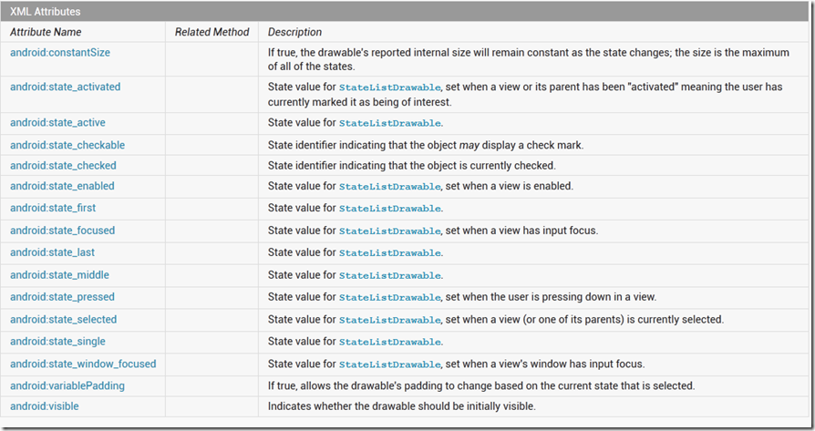
StatListDrawable资源所支持的组件状态如下图所示:
以下代码片段是一个StateListDrawable资源的XML文件描述样例:
XML 文件存储在:
以下是Button的Layout文件:
当然我们也可以通过代码来设置Button的背景图片:
ShapeDrawable资源
ShapeDrawable资源绘制一个特定的形状,比如矩形、椭圆等。如果你想自己动态的绘制二位图形,那么我们就可以使用ShapeDrawable资源对象,用ShapeDrawable,我们可以绘制我们所能想象的形状。。一个ShapeDrawable 需要一个Shape对象来管理呈现资源到UI Screen,如果没有Shape设置,那么会默认使用RectShape对象。
ShapeDrawable 被定义在一个XML文件中,以
我们可以用ShapeDrawable 来设置组件的背景色(用
我们构建自定义形状的View时,由于ShapeDrawable 有其自己的draw()方法,我们可以构建一个View视图的子类,然后override View.onDraw()方法,如下代码片段是一个样例:
基于上述代码我们可以在我们的Activity中编程的构建自定义视图:
当然我们也可以使用XML文件来描述:自定义的Drawable类必须重载view (Context, AttributeSet) 构造函数。接着我们添加Layout文件如下:
ClipDrawable
ClipDrawable资源定义在一个XML中,表示裁剪(Clips)一个其他资源基于ClipDrawable资源的Level。你可以控制裁剪的Drawable的宽度高度及gravity属性,ClipDrawable常常被用来作为一个progressbars的实现。
以下样例是一个ClipDrawable资源:
下面的ImageView布局文件应用Clipdrawable资源:
当然我们可以使用一个Timer来实现图片的渐增显示。

注意: 默认的Level值是0,表示图片被这个裁剪,故图片是不可见的。当值达到10000是代码裁剪为0,图片可以完全显示。
AnimationDrawable
AnimationDrawable通过定义一系列的Drawable对象构建一个基于帧的动画(frame-by-frame animations),可以被用来作为视图的背景色。
最简单的构建一个帧动画是在XML文件中构建一个动画,我们可以设定动画作为视图的背景色,通过调用AnimationDrawable.start()方法来运行动画。
如下代码片段是一个AnimationDrawable资源的XML文件,资源文件位置:res\drawable\spin_animation.xml
我们可以看到,AnimationDrawable资源文件以
我们可以通过编码来加载播放动画:
结束语
至此我们的Drawable资源就介绍完了,当然还有好多的Drawable子类未进行介绍,感兴趣的可以关注SDK文档。
Drawable资源一般存储在应用程序目录的\res\drawable目录下,当然依据分辨率的高低可以分别存储不同分辨率的资源到如下几个目录:
\res\drawable-hdpi
\res\drawable-ldpi
\res\drawable-mdpi
\res\drawable-xdpi
其SDK文档中声明如下:
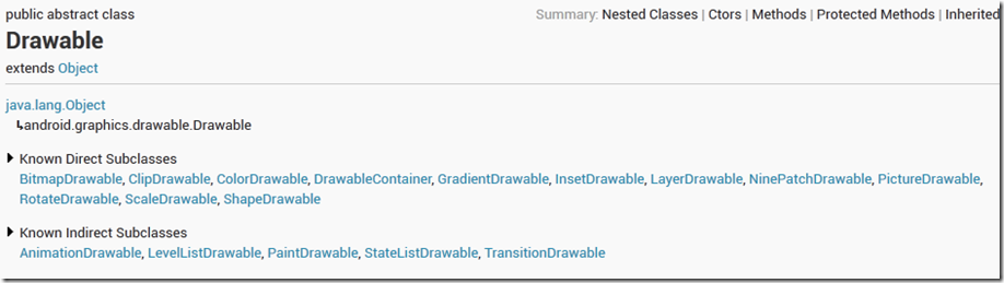
我们看到Drawable是一个抽象类(abstract class),它有好多子类(SubClass)来操作具体类型的资源,比如BitmapDrawable是用来操作位图,ColorDrawable用来操作颜色,
ClipDrawable用来操作剪切板等。
图片资源
图片资源是简单的Drawable资源,目前Android支持的图片格式有:gif、png、jpg等。我们只需要把图片资源放置到\res\drawable目中,那么在编译后的R.java类中就会生成图片资源的资源ID
我们在程序中就可以通过调用相关的方法来获取图片资源(程序中如果要访问drawable_resource_file_name,那么可以如此:[packagename].R.drawable.drawable_resource_file_name)。
注:Android中drawable中的资源名称有约束,必须是: [a-z0-9_.](即:只能是字母数字及_和.),而且不能以数字开头,否则编译会报错: Invalid file name: must contain only [a-z0-9_.]
以下代码片段演示了如何访问一个图片资源(资源名称drawablefilename):
ImageView imageView=(ImageView)findViewById(com.jeriffe.app.R.id.ImageView1);
imageView.setImageResource(com.jeriffe.app.R.drawable.drawablefilename);
StateListDrawable资源
StateListDrawable内可以分配一组Drawable资源,StateListDrawable 被定义在一个XML文件中,以
<selector>元素起始。其内部的每一个Drawable资源内嵌在
<item>元素中。
当StatListDrawable资源作为组件的背景或者前景Drawable资源时,可以随着组件状态的变更而自动切换相对应的资源,例如,一个Button可以处于不同的状态(按钮按下、获取焦点)
我们可以使用一个StateListDrawable资源,来提供不同的背景图片对于每一个状态。,当组件的状态变更时,会自定向下遍历StateListDrawable对应的xml文件来查找第一个匹配的Item。
StatListDrawable资源所支持的组件状态如下图所示:

以下代码片段是一个StateListDrawable资源的XML文件描述样例:
XML 文件存储在:
res/drawable/button_statelist.xml:
<span class="kwrd" style="color: rgb(0, 0, 255);"><?</span><span class="html" style="color: rgb(128, 0, 0);">xml</span> <span class="attr" style="color: rgb(255, 0, 0);">version</span><span class="kwrd" style="color: rgb(0, 0, 255);">="1.0"</span> <span class="attr" style="color: rgb(255, 0, 0);">encoding</span><span class="kwrd" style="color: rgb(0, 0, 255);">="utf-8"</span>?<span class="kwrd" style="color: rgb(0, 0, 255);">></span>
<span class="kwrd" style="color: rgb(0, 0, 255);"><</span><span class="html" style="color: rgb(128, 0, 0);">selector</span> <span class="attr" style="color: rgb(255, 0, 0);">xmlns:android</span><span class="kwrd" style="color: rgb(0, 0, 255);">="http://schemas.android.com/apk/res/android"</span><span class="kwrd" style="color: rgb(0, 0, 255);">></span>
    <span class="kwrd" style="color: rgb(0, 0, 255);"><</span><span class="html" style="color: rgb(128, 0, 0);">item</span> <span class="attr" style="color: rgb(255, 0, 0);">android:state_pressed</span><span class="kwrd" style="color: rgb(0, 0, 255);">="true"</span>
          <span class="attr" style="color: rgb(255, 0, 0);">android:drawable</span><span class="kwrd" style="color: rgb(0, 0, 255);">="@drawable/button_pressed"</span> <span class="kwrd" style="color: rgb(0, 0, 255);">/></span> <span class="rem" style="color: rgb(0, 128, 0);"><!-- pressed --></span>
    <span class="kwrd" style="color: rgb(0, 0, 255);"><</span><span class="html" style="color: rgb(128, 0, 0);">item</span> <span class="attr" style="color: rgb(255, 0, 0);">android:state_focused</span><span class="kwrd" style="color: rgb(0, 0, 255);">="true"</span>
          <span class="attr" style="color: rgb(255, 0, 0);">android:drawable</span><span class="kwrd" style="color: rgb(0, 0, 255);">="@drawable/button_focused"</span> <span class="kwrd" style="color: rgb(0, 0, 255);">/></span> <span class="rem" style="color: rgb(0, 128, 0);"><!-- focused --></span>
    <span class="kwrd" style="color: rgb(0, 0, 255);"><</span><span class="html" style="color: rgb(128, 0, 0);">item</span> <span class="attr" style="color: rgb(255, 0, 0);">android:state_hovered</span><span class="kwrd" style="color: rgb(0, 0, 255);">="true"</span>
          <span class="attr" style="color: rgb(255, 0, 0);">android:drawable</span><span class="kwrd" style="color: rgb(0, 0, 255);">="@drawable/button_focused"</span> <span class="kwrd" style="color: rgb(0, 0, 255);">/></span> <span class="rem" style="color: rgb(0, 128, 0);"><!-- hovered --></span>
    <span class="kwrd" style="color: rgb(0, 0, 255);"><</span><span class="html" style="color: rgb(128, 0, 0);">item</span> <span class="attr" style="color: rgb(255, 0, 0);">android:drawable</span><span class="kwrd" style="color: rgb(0, 0, 255);">="@drawable/button_normal"</span> <span class="kwrd" style="color: rgb(0, 0, 255);">/></span> <span class="rem" style="color: rgb(0, 128, 0);"><!-- default --></span>
<span class="kwrd" style="color: rgb(0, 0, 255);"></</span><span class="html" style="color: rgb(128, 0, 0);">selector</span><span class="kwrd" style="color: rgb(0, 0, 255);">></span>
以下是Button的Layout文件:
<span class="kwrd" style="color: rgb(0, 0, 255);"><</span><span class="html" style="color: rgb(128, 0, 0);">Button</span>
    <span class="attr" style="color: rgb(255, 0, 0);">android:layout_height</span><span class="kwrd" style="color: rgb(0, 0, 255);">="wrap_content"</span>
    <span class="attr" style="color: rgb(255, 0, 0);">android:layout_width</span><span class="kwrd" style="color: rgb(0, 0, 255);">="wrap_content"</span>
    <span class="attr" style="color: rgb(255, 0, 0);">android:background</span><span class="kwrd" style="color: rgb(0, 0, 255);">="@drawable/button"</span> <span class="kwrd" style="color: rgb(0, 0, 255);">/></span>
当然我们也可以通过代码来设置Button的背景图片:
Button imageButton=(Button)findViewById(R.id.imageButton);

imageButton.setBackgroundResource(com.jeriffe.app.R.drawable.button_statelist);
ShapeDrawable资源
ShapeDrawable资源绘制一个特定的形状,比如矩形、椭圆等。如果你想自己动态的绘制二位图形,那么我们就可以使用ShapeDrawable资源对象,用ShapeDrawable,我们可以绘制我们所能想象的形状。。一个ShapeDrawable 需要一个Shape对象来管理呈现资源到UI Screen,如果没有Shape设置,那么会默认使用RectShape对象。
ShapeDrawable 被定义在一个XML文件中,以
<shape>元素起始。其内部的每一个Drawable资源内嵌在
<item>元素中
以下代码片段便是一个ShapeDrawable的XML定义
<span class="kwrd" style="color: rgb(0, 0, 255);"><?</span><span class="html" style="color: rgb(128, 0, 0);">xml</span> <span class="attr" style="color: rgb(255, 0, 0);">version</span><span class="kwrd" style="color: rgb(0, 0, 255);">="1.0"</span> <span class="attr" style="color: rgb(255, 0, 0);">encoding</span><span class="kwrd" style="color: rgb(0, 0, 255);">="UTF-8"</span>?<span class="kwrd" style="color: rgb(0, 0, 255);">></span>
<span class="kwrd" style="color: rgb(0, 0, 255);"><</span><span class="html" style="color: rgb(128, 0, 0);">shape</span> <span class="attr" style="color: rgb(255, 0, 0);">xmlns:android</span><span class="kwrd" style="color: rgb(0, 0, 255);">="http://schemas.android.com/apk/res/android"</span>
    <span class="attr" style="color: rgb(255, 0, 0);">android:shape</span><span class="kwrd" style="color: rgb(0, 0, 255);">="oval"</span><span class="kwrd" style="color: rgb(0, 0, 255);">></span>
    <span class="rem" style="color: rgb(0, 128, 0);"><!-- 定义填充渐变颜色 --></span>
    <span class="kwrd" style="color: rgb(0, 0, 255);"><</span><span class="html" style="color: rgb(128, 0, 0);">gradient</span>
        <span class="attr" style="color: rgb(255, 0, 0);">android:startColor</span><span class="kwrd" style="color: rgb(0, 0, 255);">="#00f"</span>
        <span class="attr" style="color: rgb(255, 0, 0);">android:endColor</span><span class="kwrd" style="color: rgb(0, 0, 255);">="#00f"</span>
        <span class="attr" style="color: rgb(255, 0, 0);">android:angle</span><span class="kwrd" style="color: rgb(0, 0, 255);">="45"</span>
        <span class="attr" style="color: rgb(255, 0, 0);">android:type</span><span class="kwrd" style="color: rgb(0, 0, 255);">="sweep"</span><span class="kwrd" style="color: rgb(0, 0, 255);">/></span>
    <span class="rem" style="color: rgb(0, 128, 0);"><!-- 设置内填充 --></span>
    <span class="kwrd" style="color: rgb(0, 0, 255);"><</span><span class="html" style="color: rgb(128, 0, 0);">padding</span> <span class="attr" style="color: rgb(255, 0, 0);">android:left</span><span class="kwrd" style="color: rgb(0, 0, 255);">="7dp"</span>
        <span class="attr" style="color: rgb(255, 0, 0);">android:top</span><span class="kwrd" style="color: rgb(0, 0, 255);">="7dp"</span>
        <span class="attr" style="color: rgb(255, 0, 0);">android:right</span><span class="kwrd" style="color: rgb(0, 0, 255);">="7dp"</span>
        <span class="attr" style="color: rgb(255, 0, 0);">android:bottom</span><span class="kwrd" style="color: rgb(0, 0, 255);">="7dp"</span> <span class="kwrd" style="color: rgb(0, 0, 255);">/></span>
    <span class="rem" style="color: rgb(0, 128, 0);"><!-- 设置圆角矩形 --></span>
    <span class="kwrd" style="color: rgb(0, 0, 255);"><</span><span class="html" style="color: rgb(128, 0, 0);">corners</span> <span class="attr" style="color: rgb(255, 0, 0);">android:radius</span><span class="kwrd" style="color: rgb(0, 0, 255);">="8dp"</span> <span class="kwrd" style="color: rgb(0, 0, 255);">/></span>
<span class="kwrd" style="color: rgb(0, 0, 255);"></</span><span class="html" style="color: rgb(128, 0, 0);">shape</span><span class="kwrd" style="color: rgb(0, 0, 255);">></span>
我们可以用ShapeDrawable 来设置组件的背景色(用
setBackgroundDrawable()方法),如上的代码片段可设置一个TextEdit的背景色为蓝色的椭圆形状。当然我们也可以绘制自定义的View
我们构建自定义形状的View时,由于ShapeDrawable 有其自己的draw()方法,我们可以构建一个View视图的子类,然后override View.onDraw()方法,如下代码片段是一个样例:
<span class="kwrd" style="color: rgb(0, 0, 255);">public</span> <span class="kwrd" style="color: rgb(0, 0, 255);">class</span> CustomDrawableView extends View {
      <span class="kwrd" style="color: rgb(0, 0, 255);">private</span> ShapeDrawable mDrawable;

      <span class="kwrd" style="color: rgb(0, 0, 255);">public</span> CustomDrawableView(Context context) {
      super(context);

      <span class="kwrd" style="color: rgb(0, 0, 255);">int</span> x = 10;
      <span class="kwrd" style="color: rgb(0, 0, 255);">int</span> y = 10;
      <span class="kwrd" style="color: rgb(0, 0, 255);">int</span> width = 300;
      <span class="kwrd" style="color: rgb(0, 0, 255);">int</span> height = 50;

      mDrawable = <span class="kwrd" style="color: rgb(0, 0, 255);">new</span> ShapeDrawable(<span class="kwrd" style="color: rgb(0, 0, 255);">new</span> OvalShape());
      mDrawable.getPaint().setColor(0xff74AC23);
      mDrawable.setBounds(x, y, x + width, y + height);
      }

      <span class="kwrd" style="color: rgb(0, 0, 255);">protected</span> <span class="kwrd" style="color: rgb(0, 0, 255);">void</span> onDraw(Canvas canvas) {
      mDrawable.draw(canvas);
      }
    }
基于上述代码我们可以在我们的Activity中编程的构建自定义视图:
CustomDrawableView mCustomDrawableView;

      <span class="kwrd" style="color: rgb(0, 0, 255);">protected</span> <span class="kwrd" style="color: rgb(0, 0, 255);">void</span> onCreate(Bundle savedInstanceState) {
      super.onCreate(savedInstanceState);
      mCustomDrawableView = <span class="kwrd" style="color: rgb(0, 0, 255);">new</span> CustomDrawableView(<span class="kwrd" style="color: rgb(0, 0, 255);">this</span>);

      setContentView(mCustomDrawableView);
      }
当然我们也可以使用XML文件来描述:自定义的Drawable类必须重载view (Context, AttributeSet) 构造函数。接着我们添加Layout文件如下:
<span class="kwrd" style="color: rgb(0, 0, 255);"><</span><span class="html" style="color: rgb(128, 0, 0);">com.example.shapedrawable.CustomDrawableView</span>
      android:layout_width="fill_parent"
      android:layout_height="wrap_content"
      <span class="kwrd" style="color: rgb(0, 0, 255);">/></span>
ClipDrawable
ClipDrawable资源定义在一个XML中,表示裁剪(Clips)一个其他资源基于ClipDrawable资源的Level。你可以控制裁剪的Drawable的宽度高度及gravity属性,ClipDrawable常常被用来作为一个progressbars的实现。
以下样例是一个ClipDrawable资源:
<span class="kwrd" style="color: rgb(0, 0, 255);"><?</span><span class="html" style="color: rgb(128, 0, 0);">xml</span> <span class="attr" style="color: rgb(255, 0, 0);">version</span><span class="kwrd" style="color: rgb(0, 0, 255);">="1.0"</span> <span class="attr" style="color: rgb(255, 0, 0);">encoding</span><span class="kwrd" style="color: rgb(0, 0, 255);">="utf-8"</span>?<span class="kwrd" style="color: rgb(0, 0, 255);">></span>

<span class="kwrd" style="color: rgb(0, 0, 255);"><</span><span class="html" style="color: rgb(128, 0, 0);">clip</span> <span class="attr" style="color: rgb(255, 0, 0);">xmlns:android</span><span class="kwrd" style="color: rgb(0, 0, 255);">="http://schemas.android.com/apk/res/android"</span>

<span class="attr" style="color: rgb(255, 0, 0);">android:drawable</span><span class="kwrd" style="color: rgb(0, 0, 255);">="@drawable/android"</span>

<span class="attr" style="color: rgb(255, 0, 0);">android:clipOrientation</span><span class="kwrd" style="color: rgb(0, 0, 255);">="horizontal"</span>

<span class="attr" style="color: rgb(255, 0, 0);">android:gravity</span><span class="kwrd" style="color: rgb(0, 0, 255);">="left"</span> <span class="kwrd" style="color: rgb(0, 0, 255);">/></span>
下面的ImageView布局文件应用Clipdrawable资源:
<span class="kwrd" style="color: rgb(0, 0, 255);"><</span><span class="html" style="color: rgb(128, 0, 0);">ImageView</span>

<span class="attr" style="color: rgb(255, 0, 0);">android:id</span><span class="kwrd" style="color: rgb(0, 0, 255);">="@+id/image"</span>

<span class="attr" style="color: rgb(255, 0, 0);">android:background</span><span class="kwrd" style="color: rgb(0, 0, 255);">="@drawable/clip"</span>

<span class="attr" style="color: rgb(255, 0, 0);">android:layout_height</span><span class="kwrd" style="color: rgb(0, 0, 255);">="wrap_content"</span>

<span class="attr" style="color: rgb(255, 0, 0);">android:layout_width</span><span class="kwrd" style="color: rgb(0, 0, 255);">="wrap_content"</span> <span class="kwrd" style="color: rgb(0, 0, 255);">/></span>
下面的代码获取drawable并且增加其裁剪,以便于渐增的显示图像
ImageView imageview = (ImageView) findViewById(R.id.image);

ClipDrawable drawable = (ClipDrawable) imageview.getDrawable();

drawable.setLevel(drawable.getLevel() + 1000);
当然我们可以使用一个Timer来实现图片的渐增显示。

注意: 默认的Level值是0,表示图片被这个裁剪,故图片是不可见的。当值达到10000是代码裁剪为0,图片可以完全显示。
AnimationDrawable
AnimationDrawableAnimationDrawable通过定义一系列的Drawable对象构建一个基于帧的动画(frame-by-frame animations),可以被用来作为视图的背景色。
最简单的构建一个帧动画是在XML文件中构建一个动画,我们可以设定动画作为视图的背景色,通过调用AnimationDrawable.start()方法来运行动画。
如下代码片段是一个AnimationDrawable资源的XML文件,资源文件位置:res\drawable\spin_animation.xml
<span class="kwrd" style="color: rgb(0, 0, 255);"><</span><span class="html" style="color: rgb(128, 0, 0);">animation-list</span> <span class="attr" style="color: rgb(255, 0, 0);">xmlns:android</span><span class="kwrd" style="color: rgb(0, 0, 255);">="http://schemas.android.com/apk/res/android"</span>
    <span class="attr" style="color: rgb(255, 0, 0);">android:oneshot</span><span class="kwrd" style="color: rgb(0, 0, 255);">="true"</span><span class="kwrd" style="color: rgb(0, 0, 255);">></span>
    <span class="kwrd" style="color: rgb(0, 0, 255);"><</span><span class="html" style="color: rgb(128, 0, 0);">item</span> <span class="attr" style="color: rgb(255, 0, 0);">android:drawable</span><span class="kwrd" style="color: rgb(0, 0, 255);">="@drawable/rocket_thrust1"</span> <span class="attr" style="color: rgb(255, 0, 0);">android:duration</span><span class="kwrd" style="color: rgb(0, 0, 255);">="200"</span> <span class="kwrd" style="color: rgb(0, 0, 255);">/></span>
    <span class="kwrd" style="color: rgb(0, 0, 255);"><</span><span class="html" style="color: rgb(128, 0, 0);">item</span> <span class="attr" style="color: rgb(255, 0, 0);">android:drawable</span><span class="kwrd" style="color: rgb(0, 0, 255);">="@drawable/rocket_thrust2"</span> <span class="attr" style="color: rgb(255, 0, 0);">android:duration</span><span class="kwrd" style="color: rgb(0, 0, 255);">="200"</span> <span class="kwrd" style="color: rgb(0, 0, 255);">/></span>
    <span class="kwrd" style="color: rgb(0, 0, 255);"><</span><span class="html" style="color: rgb(128, 0, 0);">item</span> <span class="attr" style="color: rgb(255, 0, 0);">android:drawable</span><span class="kwrd" style="color: rgb(0, 0, 255);">="@drawable/rocket_thrust3"</span> <span class="attr" style="color: rgb(255, 0, 0);">android:duration</span><span class="kwrd" style="color: rgb(0, 0, 255);">="200"</span> <span class="kwrd" style="color: rgb(0, 0, 255);">/></span>
<span class="kwrd" style="color: rgb(0, 0, 255);"></</span><span class="html" style="color: rgb(128, 0, 0);">animation-list</span><span class="kwrd" style="color: rgb(0, 0, 255);">></span>
我们可以看到,AnimationDrawable资源文件以
<animation-list>元素为根,包含一系列的<Item>节点,每一个节点定义了一个帧(frame)及持续时常。
上述动画运行了3个帧,通过设置android:oneshot属性(attribute)为true,动画会循环一次并停留在最后一帧,如果为false那么会轮询(loop)的运行动画
我们可以通过编码来加载播放动画:
<span class="rem" style="color: rgb(0, 128, 0);">// Load the ImageView that will host the animation and</span>
 <span class="rem" style="color: rgb(0, 128, 0);">// set its background to our AnimationDrawable XML resource.</span>
 ImageView img = (ImageView)findViewById(R.id.spinning_wheel_image);
 img.setBackgroundResource(R.drawable.spin_animation);

 <span class="rem" style="color: rgb(0, 128, 0);">// Get the background, which has been compiled to an AnimationDrawable object.</span>
 AnimationDrawable frameAnimation = (AnimationDrawable) img.getBackground();

 <span class="rem" style="color: rgb(0, 128, 0);">// Start the animation (looped playback by default).</span>
 frameAnimation.start();
注意:AnimationDrawable. start()方法不能够在Activity的onCreate()方法中调用,因为AnimationDrawable还未完全的附加(attached)到Window,如果你不需要交互而立即播放动画,那么可以在onWindowFocusChanged() 方法中,这个方法会在你的Activity Windows获取焦点是触发。
结束语
至此我们的Drawable资源就介绍完了,当然还有好多的Drawable子类未进行介绍,感兴趣的可以关注SDK文档。

相关文章推荐
- javah无法访问android.app.service 找不到android.app.service
- Android通用对话框组件设计
- 基于Android MPAndroidChart实现腾讯QQ群数据统计报表核心功能
- android解决内存溢出的问题
- Android Studio系列教程二--基本设置与运行
- android studio 使用AIDL实现IPC
- 关于Android长按出现复制粘贴栏在顶部占位问题解决方法
- Android底层原理之从Binder源码分析Android进程间通信过程
- Android 真机连接本地PC服务器
- Android之Intent
- android---adapter的刷新
- Android 仿支付宝9.0芝麻信用分效果
- Android之AsyncTask源码解析
- Mac 安装Android Studio
- Android 之ExpandableListView使用
- Android中的Selector
- Android LaunchMode的详解
- android No enclosing instance of type BasicActivity is accessible. Must qualify the allocation with
- Android消息机制详解
- Android layout适配4种方式笔记小结