ADNROID XML图像资源文件详细讲解(五)
2015-08-12 15:44
423 查看
前言
本篇主要介绍Scale Drawable和Shape Drawable。在实际开发中,Shape Drawable使用的也是非常频繁的。还有一个使用比较频繁的是State List Drawable。一、Scale Drawable
此对象可以修改Drawable对象的尺寸-----以百分比的形式。比如:ImageView作为Drawable的容器,ImageView大小视为100%,Scale Drawable可以让Drawable对象只占父容器ImageView的80%。语法格式
<?xml version="1.0" encoding="utf-8"?>
<scale
xmlns:android="http://schemas.android.com/apk/res/android"
android:drawable="@drawable/drawable_resource"
android:scaleGravity=["top" | "bottom" | "left" | "right" | "center_vertical" |
"fill_vertical" | "center_horizontal" | "fill_horizontal" |
"center" | "fill" | "clip_vertical" | "clip_horizontal"]
android:scaleHeight="percentage"
android:scaleWidth="percentage" />
语法解析
android:scaleGravity 当尺寸大小改变后的Drawable,在容器中显示的位置。取值可以是top\left\bottom\center等等(如果有多个值,可以用"|"分隔)。android:scaleHeight 取值为百分比,比如25%。如果取值为20%,则Drawable的大小为1-20%=80%。
android:scaleWidth 取值为百分比,比如25%。同上。
例子
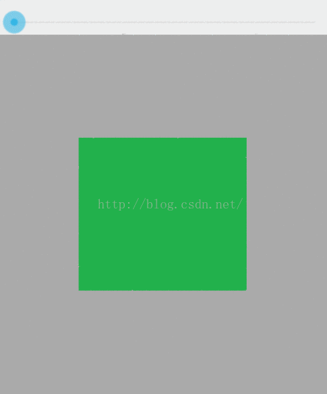
res/drawable/scale.xml:<?xml version="1.0" encoding="utf-8"?> <scale xmlns:android="http://schemas.android.com/apk/res/android" android:drawable="@drawable/green" android:scaleHeight="50%" android:scaleWidth="50%" android:scaleGravity="center"> </scale>
green.png

layout.xml中的代码:
<ImageView
android:id="@+id/image02"
android:layout_width="match_parent"
android:layout_height="match_parent"
android:src="@drawable/scale"<!--对应的scale.xml -->
android:background="@android:color/darker_gray"/>
activity中的使用代码:
下面代码中的SeekBar只是为了控制Level变化。为了辅助看效果而写的。主要代码还是在第7行、8行、13行。
@Override
protected void onCreate(Bundle savedInstanceState) {
super.onCreate(savedInstanceState);
setContentView(R.layout.activity_main);
SeekBar seekBar = (SeekBar) findViewById(R.id.progressbar01);
ImageView imageView2 = (ImageView) findViewById(R.id.image02);
final  ScaleDrawable scaleDrawable = (ScaleDrawable) imageView2.getDrawable();
scaleDrawable.setLevel(1);//只有level赋值大于0时,Drawable才能显示出来。
for (int i=0;i<10000;i++) {
seekBar.setOnSeekBarChangeListener(new SeekBar.OnSeekBarChangeListener() {
@Override
public void onProgressChanged(SeekBar seekBar, int progress, boolean fromUser) {
scaleDrawable.setLevel(progress);//level取值增加,Drawable的大小也随之变大。
}

@Override
public void onStartTrackingTouch(SeekBar seekBar) {

}

@Override
public void onStopTrackingTouch(SeekBar seekBar) {

}
});
}
}
效果如下:
二、Shape Drawable
这是一个可以自定义形状的对象。比如圆角,颜色渐变等等效果。语法格式
<?xml version="1.0" encoding="utf-8"?>
<shape
xmlns:android="http://schemas.android.com/apk/res/android"
android:shape=["rectangle" | "oval" | "line" | "ring"] >
<corners
android:radius="integer"
android:topLeftRadius="integer"
android:topRightRadius="integer"
android:bottomLeftRadius="integer"
android:bottomRightRadius="integer" />
<gradient
android:angle="integer"
android:centerX="integer"
android:centerY="integer"
android:centerColor="integer"
android:endColor="color"
android:gradientRadius="integer"
android:startColor="color"
android:type=["linear" | "radial" | "sweep"]
android:useLevel=["true" | "false"] />
<padding
android:left="integer"
android:top="integer"
android:right="integer"
android:bottom="integer" />
<size
android:width="integer"
android:height="integer" />
<solid
android:color="color" />
<stroke
android:width="integer"
android:color="color"
android:dashWidth="integer"
android:dashGap="integer" />
</shape>
语法解析
<shape>标签的属性:android:shape 定义形状。分别有矩形rectangle、椭圆形oval、线形line、环形ring。
| rectangle | 默认值。矩形 |
| oval | 椭圆形 |
| line | 一条横线。需要<stroke>标签来控制线的属性 |
| ring | 环形 |
2、<gradient> :设置填充颜色的渐变效果
3、<padding>:边距
4、<size> shape的大小
5、<solid> 填充颜色
6、<stoke> 边线的颜色和宽度,实线或者虚线。
1、Ring--环形
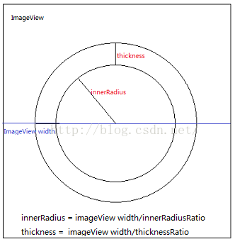
以下关于<shape>的属性,仅仅适用于当android:shape为ring的情况。android:innerRadius:内部半径。环形的内半径。
android:innerRadiusRatio 环形内部半径比例。比如:ImageView的width为200dp,innerRadiusRatio=2,则环形的内部半径为100dp。
android:thickness 环形厚度。
android:thicknessratio 环形厚度比例,相对于父容器的宽度而言。
如下图:
android:useLevel 取值true或者false。当想作为类似LevelListDrawable使用的时候,useLevel为true。反之为false。当shape为ring时,此属性最好给其一个值。因为在不同版本的手机系统中此属性的默认值可能不同。
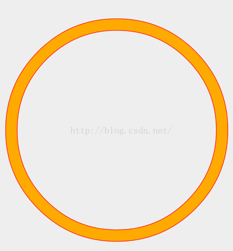
useLevel为false的时候,效果如下(是一整个环形):
useLevel为true的时候,效果如下:
Ring的例子
res/drawable/shape.xml代码:<?xml version="1.0" encoding="utf-8"?> <shape xmlns:android="http://schemas.android.com/apk/res/android" android:shape="ring" android:innerRadius="80dp" android:thicknessRatio="20" android:useLevel="true"> <stroke android:width="1dp" android:color="#ff0000" /> <solid android:color="@color/yellow" /> </shape>res/layout/activity_main.xml:
<!-- 此SeekBar用户辅助完成Shape的效果-->
<SeekBar
android:id="@+id/progressbar01"
android:layout_width="match_parent"
android:layout_height="wrap_content"
android:layout_marginTop="20dp"
android:max="10000"/>
<TextView
android:id="@+id/image03"
android:layout_width="match_parent"
android:layout_height="match_parent"
android:text="shape drawable"
android:background="@drawable/shape"/>
activity的代码:
@Override
protected void onCreate(Bundle savedInstanceState) {
super.onCreate(savedInstanceState);
setContentView(R.layout.activity_main);
SeekBar seekBar = (SeekBar) findViewById(R.id.progressbar01);
TextView ringImage = (TextView) findViewById(R.id.image03);
//Shape对应的Java类是GradientDrawable
final GradientDrawable levelListDrawable = (GradientDrawable) ringImage.getBackground();

seekBar.setOnSeekBarChangeListener(new SeekBar.OnSeekBarChangeListener() {
@Override
public void onProgressChanged(SeekBar seekBar, int progress, boolean fromUser) {
levelListDrawable.setLevel(progress);
}

@Override
public void onStartTrackingTouch(SeekBar seekBar) {

}

@Override
public void onStopTrackingTouch(SeekBar seekBar) {

}
});
}以上是shape为ring的图像的属性和用例。2、line--直线
此对象,需要stroke标签协助完成其显示效果。例如:

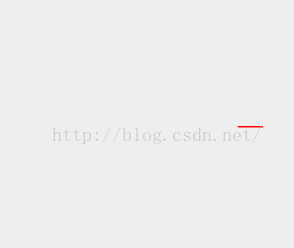
实线 厚度为4dp,颜色为红色:
<?xml version="1.0" encoding="utf-8"?>
<shape xmlns:android="http://schemas.android.com/apk/res/android"
android:shape="line">
<stroke android:width="4dp"  android:color="#ff0000"/>
</shape>

虚线:
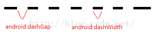
<?xml version="1.0" encoding="utf-8"?>
<shape xmlns:android="http://schemas.android.com/apk/res/android"
android:shape="line">
<stroke android:width="4dp"  android:color="#ff0000"
android:dashGap="10dp"
android:dashWidth="9dp"/>
</shape>
android:dashGap和android:dashWidth含义如下图:
3、ractangle--矩形
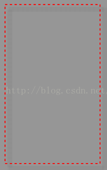
需要注意的是<corners>标签效果只在矩形状态下有效。虚线直角矩形:
<?xml version="1.0" encoding="utf-8"?>
<shape xmlns:android="http://schemas.android.com/apk/res/android"
android:shape="rectangle">
<stroke android:width="4dp"  android:color="#ff0000"
android:dashGap="10dp"
android:dashWidth="9dp"/>
<solid android:color="@android:color/transparent"/>
</shape>
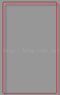
圆角矩形:
<?xml version="1.0" encoding="utf-8"?>
<shape xmlns:android="http://schemas.android.com/apk/res/android"
android:shape="rectangle">
<stroke android:width="4dp"  android:color="#ff0000" />
<solid android:color="@android:color/transparent"/>
<corners android:bottomLeftRadius="10dp" android:bottomRightRadius="10dp"
android:topLeftRadius="10dp" android:topRightRadius="10dp"/>
其中corners的四个角的取值必须是一致的。
4、Gradient标签---渐变
此标签特地拿出来单独说明一下,因为其中有些需要注意的点。渐变有3种类型:Linear,radial,sweep。
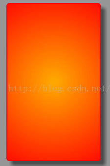
radial类型:
此类型有一个特有的属性android:gradientRadius。渐变的半径。
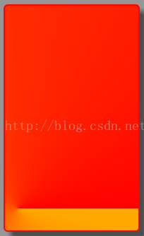
<?xml version="1.0" encoding="utf-8"?>
<shape xmlns:android="http://schemas.android.com/apk/res/android"
android:shape="rectangle">
<stroke android:width="4dp"  android:color="#ff0000" />
<!-- <solid android:color="@android:color/transparent"/>-->
<corners android:bottomLeftRadius="10dp" android:bottomRightRadius="10dp"
android:topLeftRadius="10dp" android:topRightRadius="10dp"/>
<gradient android:startColor="@color/yellow"
android:endColor="@color/red"
android:type="radial"
android:gradientRadius="400dp"/>
</shape>
效果:
Linear类型:
此类为从左到右,或者从下到上的渐变。android:angle属性控制渐变方向。取值必须是45的倍数。比如0就是从左到右,90是从下到上。
<?xml version="1.0" encoding="utf-8"?>
<shape xmlns:android="http://schemas.android.com/apk/res/android"
android:shape="rectangle">
<stroke android:width="4dp" android:color="#ff0000" />
<!-- <solid android:color="@android:color/transparent"/>-->
<corners android:bottomLeftRadius="10dp" android:bottomRightRadius="10dp"
android:topLeftRadius="10dp" android:topRightRadius="10dp"/>
<gradient android:startColor="@color/yellow"
android:endColor="@color/red"
android:type="linear"
android:angle="90"/>
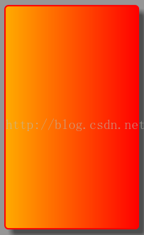
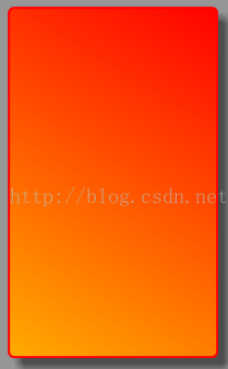
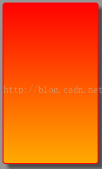
效果如下:从左到有分别是angle为0、45、90的效果。
3、Sweep类型
此类型也有2个为之服务的属性:android:centerY和android:centerX,此2个属性的取值是0-1。描述的扫描中心的相对位置。代码:
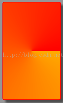
<?xml version="1.0" encoding="utf-8"?>
<shape xmlns:android="http://schemas.android.com/apk/res/android"
android:shape="rectangle">
<stroke android:width="4dp"  android:color="#ff0000" />
<!-- <solid android:color="@android:color/transparent"/>-->
<corners android:bottomLeftRadius="10dp" android:bottomRightRadius="10dp"
android:topLeftRadius="10dp" android:topRightRadius="10dp"/>
<gradient android:startColor="@color/yellow"
android:endColor="@color/red"
android:type="sweep"
android:centerX="0.5"
android:centerY="0.5"/>
当centerX和centerY都是0.5时,效果如下:
当centerX=0.1和centerY=0.9时,效果如下:
4、oval--椭圆形
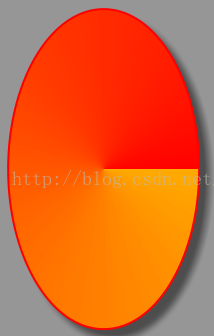
椭圆形的使用跟矩形有点类似。除了不能使用corners标签---当然也没有必要使用,毕竟这是椭圆。<?xml version="1.0" encoding="utf-8"?> <shape xmlns:android="http://schemas.android.com/apk/res/android" android:shape="oval"> <stroke android:width="4dp" android:color="#ff0000" /> <!-- <solid android:color="@android:color/transparent"/>--> <corners android:bottomLeftRadius="10dp" android:bottomRightRadius="10dp" android:topLeftRadius="10dp" android:topRightRadius="10dp"/> <gradient android:startColor="@color/yellow" android:endColor="@color/red" android:type="sweep" android:centerX="0.5" android:centerY="0.5"/> </shape>效果:
总结
此篇讲述了Scale和shape。其中shape包含的主要属性或者标签都进行了说明。还有部分一看就懂的标签或者属性,由于篇幅的原因就没有详细说明。此篇为止,android XML图像资源中的所有类型都介绍完了。后面将会写一些在实际开发中使用这些资源的案例。

相关文章推荐
- Android中的Shape和Selector的结合使用实例
- Android Selector和Shape的使用方法
- pgbench在9.3中的一个改动
- android之shape使用
- android:shape的使用
- Android 简单的图片缩放方法
- OVAL 场景验证
- Android shape属性介绍
- android shape 的属性
- WPF学习(一)绘制图形的三种方法及区别
- WPF学习(一)绘制图形的三种方法及区别
- 安卓控件增加自定义点击效果
- Animation动画中rotate scale的 pivot属性
- IE10~11中animation使用scale出现闪烁问题
- CSS3动画@keyframes中translate和scale混用出错问题
- Android 如何使用shape绘制只有一个圆角的矩形
- EXCEL数据根据XY坐标导入ArcGIS
- Android Shape详解
- Android开发之Shape自定义圆角按钮
- Drawable资源之shape drawable