Android初学习 - 4.0以后支持的Switch按钮
2015-08-04 14:50
549 查看
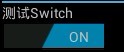
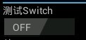
在android4.0里面,添加了一个和这个类似的控件:Switch,很形象,开关。效果图如下:
其类关系图如下:
父类:compoundButton。
类的概述:
Switch是一个可以在两种状态切换的开关控件。用户可以拖动"thumb"来回选择,也可以像选择复选框一样点击切换Switch的状态。
主要方法:
在TextView中的源码:
[java] view
plaincopy
public int getCompoundDrawablePadding() {
final Drawables dr = mDrawables;
return dr != null ? dr.mDrawablePadding : 0;
}
jumpDrawableToCurrentState():在与Switch相关的Drawable操作时调用 Drawable.jumpToCurrentState()这个方法。
getTextOff()、getTextOn()、 setTextOff()、setTextOn()这四个方法比较简单,就是设定和获取非选中和选中状态下的文本值。
onMeasure():测量控件宽高,供绘图时使用。
onTouchEvent(MotionEvent ev)实现这一方法传递触摸屏运动事件。
setChecked()设置Switch的状态(选中,非选中)
setSwitchTextAppearance()设置字体大小
setSwitchTextTypefaces设置字体格式
google官方在/frameworks/base/core/res/res/values/styles.xml的一个定义:
[java] view
plaincopy
<style name="Widget.Holo.CompoundButton.Switch">
<item name="android:track">@android:drawable/switch_track_holo_dark</item>
<item name="android:thumb">@android:drawable/switch_inner_holo_dark</item>
<item name="android:switchTextAppearance">@android:style/TextAppearance.Holo.Widget.Switch</item>
<item name="android:textOn">@android:string/capital_on</item>
<item name="android:textOff">@android:string/capital_off</item>
<item name="android:thumbTextPadding">12dip</item>
<item name="android:switchMinWidth">96dip</item>
<item name="android:switchPadding">16dip</item>
</style>
可以在main.xml中这样定义:
[java] view
plaincopy
<Switch
android:id="@+id/demo_switch"
android:layout_width="wrap_content"
android:layout_height="wrap_content"
android:layout_below="@+id/textView"
android:textOn="开"
android:textOff="关"
/>
当Switch状态切换时:
[java] view
plaincopy
mSwitch.setOnCheckedChangeListener(new OnCheckedChangeListener() {
@Override
public void onCheckedChanged(CompoundButton buttonView, boolean isChecked) {
if(isChecked) {
//选中时 do some thing
statusText.setText("开");
} else {
//非选中时 do some thing
statusText.setText("关");
}
}
});
/////////////////////////////////////////////////////////////////////////////////////////////////////////////////////////////////////
google官方在/frameworks/base/core/res/res/values/styles.xml的一个定义:
[java] view
plaincopy
<style name="Widget.Holo.CompoundButton.Switch">
<item name="android:track">@android:drawable/switch_track_holo_dark</item>
<item name="android:thumb">@android:drawable/switch_inner_holo_dark</item>
<item name="android:switchTextAppearance">@android:style/TextAppearance.Holo.Widget.Switch</item>
<item name="android:textOn">@android:string/capital_on</item>
<item name="android:textOff">@android:string/capital_off</item>
<item name="android:thumbTextPadding">12dip</item>
<item name="android:switchMinWidth">96dip</item>
<item name="android:switchPadding">16dip</item>
</style>
其中,switchMinWidth用于指定开关按钮的最小宽度,thumbTextPadding用于指定滑块打开时的大小,switchPadding用于指定收起滑块时的大小
其类关系图如下:
| java.lang.Object | |||||
| ↳ | android.view.View | ||||
| ↳ | android.widget.TextView | ||||
| ↳ | android.widget.Button | ||||
| ↳ | android.widget.CompoundButton | ||||
| ↳ | android.widget.Switch |
类的概述:
Switch是一个可以在两种状态切换的开关控件。用户可以拖动"thumb"来回选择,也可以像选择复选框一样点击切换Switch的状态。
主要方法:
| Public Methods | |
|---|---|
| int | getCompoundPaddingRight()Returns the right padding of the view, plus space for the right Drawable if any. |
| CharSequence | getTextOff()Returns the text displayed when the button is not in the checked state. |
| CharSequence | getTextOn()Returns the text displayed when the button is in the checked state. |
| void | jumpDrawablesToCurrentState()Call Drawable.jumpToCurrentState()on all Drawable objects associated with this view. |
| void | onMeasure(int widthMeasureSpec, int heightMeasureSpec) Measure the view and its content to determine the measured width and the measured height. |
| void | onPopulateAccessibilityEvent(AccessibilityEvent event)Called from dispatchPopulateAccessibilityEvent(AccessibilityEvent) giving a chance to this View to populate the accessibility event with its text content. |
| boolean | onTouchEvent(MotionEvent ev)Implement this method to handle touch screen motion events. |
| void | setChecked(boolean checked) Changes the checked state of this button. |
| void | setSwitchTextAppearance(Context context, int resid)Sets the switch text color, size, style, hint color, and highlight color from the specified TextAppearance resource. |
| void | setSwitchTypeface(Typeface tf, int style)Sets the typeface and style in which the text should be displayed on the switch, and turns on the fake bold and italic bits in the Paint if the Typeface that you provided does not have all the bits in the style that you specified. |
| void | setSwitchTypeface(Typeface tf)Sets the typeface in which the text should be displayed on the switch. |
| void | setTextOff(CharSequence textOff)Sets the text displayed when the button is not in the checked state. |
| void | setTextOn(CharSequence textOn)Sets the text displayed when the button is in the checked state. |
[java] view
plaincopy
public int getCompoundDrawablePadding() {
final Drawables dr = mDrawables;
return dr != null ? dr.mDrawablePadding : 0;
}
jumpDrawableToCurrentState():在与Switch相关的Drawable操作时调用 Drawable.jumpToCurrentState()这个方法。
getTextOff()、getTextOn()、 setTextOff()、setTextOn()这四个方法比较简单,就是设定和获取非选中和选中状态下的文本值。
onMeasure():测量控件宽高,供绘图时使用。
onTouchEvent(MotionEvent ev)实现这一方法传递触摸屏运动事件。
setChecked()设置Switch的状态(选中,非选中)
setSwitchTextAppearance()设置字体大小
setSwitchTextTypefaces设置字体格式
google官方在/frameworks/base/core/res/res/values/styles.xml的一个定义:
[java] view
plaincopy
<style name="Widget.Holo.CompoundButton.Switch">
<item name="android:track">@android:drawable/switch_track_holo_dark</item>
<item name="android:thumb">@android:drawable/switch_inner_holo_dark</item>
<item name="android:switchTextAppearance">@android:style/TextAppearance.Holo.Widget.Switch</item>
<item name="android:textOn">@android:string/capital_on</item>
<item name="android:textOff">@android:string/capital_off</item>
<item name="android:thumbTextPadding">12dip</item>
<item name="android:switchMinWidth">96dip</item>
<item name="android:switchPadding">16dip</item>
</style>
可以在main.xml中这样定义:
[java] view
plaincopy
<Switch
android:id="@+id/demo_switch"
android:layout_width="wrap_content"
android:layout_height="wrap_content"
android:layout_below="@+id/textView"
android:textOn="开"
android:textOff="关"
/>
当Switch状态切换时:
[java] view
plaincopy
mSwitch.setOnCheckedChangeListener(new OnCheckedChangeListener() {
@Override
public void onCheckedChanged(CompoundButton buttonView, boolean isChecked) {
if(isChecked) {
//选中时 do some thing
statusText.setText("开");
} else {
//非选中时 do some thing
statusText.setText("关");
}
}
});
/////////////////////////////////////////////////////////////////////////////////////////////////////////////////////////////////////
google官方在/frameworks/base/core/res/res/values/styles.xml的一个定义:
[java] view
plaincopy
<style name="Widget.Holo.CompoundButton.Switch">
<item name="android:track">@android:drawable/switch_track_holo_dark</item>
<item name="android:thumb">@android:drawable/switch_inner_holo_dark</item>
<item name="android:switchTextAppearance">@android:style/TextAppearance.Holo.Widget.Switch</item>
<item name="android:textOn">@android:string/capital_on</item>
<item name="android:textOff">@android:string/capital_off</item>
<item name="android:thumbTextPadding">12dip</item>
<item name="android:switchMinWidth">96dip</item>
<item name="android:switchPadding">16dip</item>
</style>
其中,switchMinWidth用于指定开关按钮的最小宽度,thumbTextPadding用于指定滑块打开时的大小,switchPadding用于指定收起滑块时的大小

相关文章推荐
- Android屏幕适配
- AndroidStudio虚拟机启动失败
- Android BatteryStatsHelper深入理解(and5.1)
- Android 电量监控、关机、重启功能的实现
- Android 自定义ViewGroup 实现FlowLayout,动态添加布局
- android登陆
- Android 扩大view点击范围
- Android实现抽奖转盘
- Android 存储学习之SQLite数据库的基本操作
- android相关报错之<Wrong orientation? No orientation specified, and the default is horizontal。。
- Android本地消息推送
- android强迫症头像BadgeView
- 推荐4个Android引导页控件
- 推荐3个Android筛选器控件
- android平台,利用ffmpeg对android摄像头采集编码
- 百度——地图API——Android—应用集成离线地图
- android压力测试工具monkey
- 总结Android Studio导入项目的几种方法
- Android开发:自己开发的一款通用弹窗库
- Android目录结构