bootstrap charisma 入门学习笔记
2015-08-03 23:34
726 查看
Bootstrap,来自 Twitter,是目前最受欢迎的前端框架。Bootstrap 是基于 HTML、CSS、JAVASCRIPT 的,它简洁灵活,使得 Web 开发更加快捷。 它由Twitter的设计师Mark Otto和Jacob Thornton合作开发,是一个CSS/HTML框架。而Charisma是一套全功能的,免费,会员质量的响应式HTML5管理员界面模板,基于"Bootstrap",拥有了9套不同的主题颜色内容,可以满足你的不同需要!Bootstrap主题风格可在http://bootswatch.com/免费下载,同时它也是charisma主题来源。上面有部分主题charisma未收录
注:charisma在开发中最大的作用还是起到参考作用,里面有很多bootstrap与jquery例子,所以我这里并没引入js/charisma.js,有需要者自行添加引用代码
本篇主要说说charisma的简单应用。首先,官网。我对官网的东西做了一定的精简。在这里下载。有些东西不属于charisma的,为了方便,我将其放在一个目录下。其次是我精简的里面除了皮肤css外,其他所有css和js都需要引用。另外我对皮肤css做了一定修改,具体修改为,在每个css最后加了几个类,比如设置背景色、边框等。
注:这框架不兼容IE6(官方不打算支持的),在IE8、9下显示有少量问题,IE-Edge与chrome、ff等可以达到最佳显示效果。视情况使用。
另外简单说说响应式编程与非响应式编程的区别。响应式意思就是根据屏幕的宽度来动态调整元素的位置,一般用于兼容多种屏幕与手机浏览器。非响应式就是各种屏幕看到的效果一样(小屏幕容易导致文字溢出等问题)。使用响应式编程,使用响应式编程,使用响应式编程,重要的事情说三遍。在宽屏浏览器中响应式编程完全不会影响显示效果,在窄屏浏览器中也可以达到最佳显示效果。并且两者难度相当。所以,你懂得。
进入正题。首先我给出一个响应式charisma框架代码,页面可以直接在框架代码基础上开发。
简单解释下。第一行。由于Bootstrap基于HTML5,所以这行不能变。
head标签内部:除了关键的声明、自定义风格外,还有必要的css文件。其中id为bs_css的这个为皮肤,目录下有8个类似名称的css文件。直接jquery改href属性即可实现动态换肤。自定义风格第一个为去掉a标签的下划线,其他的为响应式编程必须用的,估计是设置显示宽度。
由于IE8不兼容HTML5标签,所以需要在低版本IE中引入这两个js文件。最后两个js文件必须引用。
框架说完了,说说使用。使用上直接参照官网的例子,Chrome下审查元素,想实现啥就直接复制那一堆代码,就ok了。
例子看完之后,我说说我对bootstrap皮肤的改动:
class="bg-normal" 这个表示设置背景色(用于层叠元素时非常有用)
class="bg-border" 这个用于设置边框(当源框架无法实现需求时)
class="text" 这个用来设置前景色(除了文字外还可以用来设置其他的)
class="frame" chass="framechild" 这两个用来设计自定义表格(比如LIST表格,可以用这个实现)
class="border-xxx" 这个用来设置显示哪个边框(有时候只想显示一个边框,可以试试这个)
上面几个css支持全部8种皮肤风格(网上说的9种,不知道最后一种是啥),可以直接使用。
另外 charisma的input输入框与select选择框不太给力。设置黑色风格后还是白色背景。这时可以这样:
【前三个类为我加的自定义】。然后,颜色风格就与整体统一了。整体风格为slate的效果图:

下面列出几个常见布局的案例:
首先是最常用的弹出式窗口,配合 jquery.simplemodal.js
使用,当然也可以像官网上面的那种布局。示例代码如下:
调用代码: $('#test_dlg').modal();
效果如下:
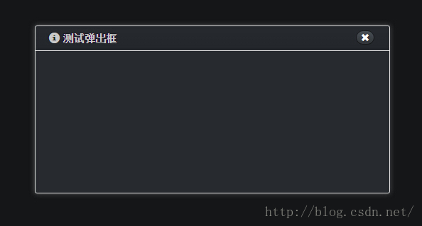
内部显示些啥可自定义编辑,根据源码差不多就能看出来这个是如何实现的。
除了使用simplemodal外,bootstrap还提供一种弹窗模式,用于类似alert或confirm的消息弹窗,不过经过测试与simplemodal不兼容。效果如下:

具体实现如下:
然后,需要一个按钮里面加入data-toggle与data-target,示例:
即可实现弹出对话框。在对话框中的按钮加上data-dismiss="modal"表示关闭对话框,如果需要处理后再决定是否关闭对话框,那么需要如下调用方式:
这个与simplemodal的modal函数重复,导致bootstrap或simplemodal的modal函数总有一个用不上。看需要再决定如何使用
然后,说一个右下角消息提示的实现。
第一步:引入头文件、js文件
第二步:body内加入一行代码,用于确定显示方位
第三步:由于这个定位有点问题,不知道是不是我的错……于是加入定位代码:
第四步:这个提示的调用相对来说还是比较麻烦,这儿封装一个
第五步:调用之
下面分别是效果图:
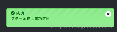

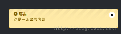
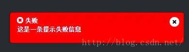
效果挺高大上的。关于消息显示时间延迟,可修改我封装的那个js代码。noty框架给出的接口是传入html代码,意味着在消息提示框中插入图片也未尝不可。实际上那个关闭的符号就是图片的实现。
注:charisma在开发中最大的作用还是起到参考作用,里面有很多bootstrap与jquery例子,所以我这里并没引入js/charisma.js,有需要者自行添加引用代码
本篇主要说说charisma的简单应用。首先,官网。我对官网的东西做了一定的精简。在这里下载。有些东西不属于charisma的,为了方便,我将其放在一个目录下。其次是我精简的里面除了皮肤css外,其他所有css和js都需要引用。另外我对皮肤css做了一定修改,具体修改为,在每个css最后加了几个类,比如设置背景色、边框等。
注:这框架不兼容IE6(官方不打算支持的),在IE8、9下显示有少量问题,IE-Edge与chrome、ff等可以达到最佳显示效果。视情况使用。
另外简单说说响应式编程与非响应式编程的区别。响应式意思就是根据屏幕的宽度来动态调整元素的位置,一般用于兼容多种屏幕与手机浏览器。非响应式就是各种屏幕看到的效果一样(小屏幕容易导致文字溢出等问题)。使用响应式编程,使用响应式编程,使用响应式编程,重要的事情说三遍。在宽屏浏览器中响应式编程完全不会影响显示效果,在窄屏浏览器中也可以达到最佳显示效果。并且两者难度相当。所以,你懂得。
进入正题。首先我给出一个响应式charisma框架代码,页面可以直接在框架代码基础上开发。
<!DOCTYPE html>
<html lang="en">
<head>
<meta http-equiv="Content-Type" content="text/html; charset=utf-8" />
<meta http-equiv="X-UA-Compatible" content="IE=edge">
<meta name="viewport" content="width=device-width, initial-scale=1.0" />
<link id="bs_css" rel="stylesheet" href="charisma/css/bootstrap-slate.min.css" />
<link rel="stylesheet" href="charisma/css/charisma-app.css" />
<link rel="stylesheet" href="charisma/css/animate.min.css" />
<title>响应式Charisma框架</title>
<style type="text/css">
a { text-decoration: none !important; }
@-webkit-viewport { width: device-width; }
@-moz-viewport { width: device-width; }
@-ms-viewport { width: device-width; }
@-o-viewport { width: device-width; }
@viewport { width: device-width; }
</style>
</head>
<body>
<form></form>
<!--[if lt IE 9]>
<script type="text/javascript" src="charisma/js/html5shiv.js"></script>
<script type="text/javascript" src="charisma/js/respond.min.js"></script>
<![endif]-->
<script type="text/javascript" src="charisma/js/jquery.js"></script>
<script type="text/javascript" src="charisma/js/bootstrap.min.js"></script>
</body>
</html>
简单解释下。第一行。由于Bootstrap基于HTML5,所以这行不能变。
head标签内部:除了关键的声明、自定义风格外,还有必要的css文件。其中id为bs_css的这个为皮肤,目录下有8个类似名称的css文件。直接jquery改href属性即可实现动态换肤。自定义风格第一个为去掉a标签的下划线,其他的为响应式编程必须用的,估计是设置显示宽度。
由于IE8不兼容HTML5标签,所以需要在低版本IE中引入这两个js文件。最后两个js文件必须引用。
框架说完了,说说使用。使用上直接参照官网的例子,Chrome下审查元素,想实现啥就直接复制那一堆代码,就ok了。
例子看完之后,我说说我对bootstrap皮肤的改动:
class="bg-normal" 这个表示设置背景色(用于层叠元素时非常有用)
class="bg-border" 这个用于设置边框(当源框架无法实现需求时)
class="text" 这个用来设置前景色(除了文字外还可以用来设置其他的)
class="frame" chass="framechild" 这两个用来设计自定义表格(比如LIST表格,可以用这个实现)
class="border-xxx" 这个用来设置显示哪个边框(有时候只想显示一个边框,可以试试这个)
上面几个css支持全部8种皮肤风格(网上说的9种,不知道最后一种是啥),可以直接使用。
另外 charisma的input输入框与select选择框不太给力。设置黑色风格后还是白色背景。这时可以这样:
<input type="text" class="text bg-normal bg-border form-control" />
【前三个类为我加的自定义】。然后,颜色风格就与整体统一了。整体风格为slate的效果图:
下面列出几个常见布局的案例:
首先是最常用的弹出式窗口,配合 jquery.simplemodal.js
使用,当然也可以像官网上面的那种布局。示例代码如下:
<div id="test_dlg" class="box bg-normal" style="display: none; position: relative; width: 500px;">
<div class="box-inner">
<div class="box-header well">
<h2><i class="glyphicon glyphicon-info-sign"></i><span> 测试弹出框</span></h2>
<div class="box-icon">
<a href="javascript:void(0)" class="btn btn-round btn-default" onclick="$.modal.close();" title="关闭">
<i class="glyphicon glyphicon-remove"></i>
</a>
</div>
</div>
<div class="box-content" style="height: 200px;">
</div>
</div>
</div>
调用代码: $('#test_dlg').modal();
效果如下:
内部显示些啥可自定义编辑,根据源码差不多就能看出来这个是如何实现的。
除了使用simplemodal外,bootstrap还提供一种弹窗模式,用于类似alert或confirm的消息弹窗,不过经过测试与simplemodal不兼容。效果如下:
具体实现如下:
<div id="test_dlg2" class="modal fade" aria-hidden="true">
<div class="modal-dialog" style="width: 300px;">
<div class="modal-content">
<div class="modal-header">
<h4>时间选择</h4>
</div>
<div class="modal-body">
<span>aaaaaaaaaaaaaaa</span><br />
<span>aaaaaaaaaaaaaaa</span><br />
<span>aaaaaaaaaaaaaaa</span><br />
<span>aaaaaaaaaaaaaaa</span><br />
<span>aaaaaaaaaaaaaaa</span>
</div>
<div class="modal-footer">
<button type="button" class="btn btn-default" onclick="$('#test_dlg2').modal('hide')">确定</button>
<button type="button" class="btn btn-default" data-dismiss="modal">取消</button>
</div>
</div>
</div>
</div>
然后,需要一个按钮里面加入data-toggle与data-target,示例:
<button type="button" class="btn btn-default" data-toggle="modal" data-target="#test_dlg2">弹出对话框</button>
即可实现弹出对话框。在对话框中的按钮加上data-dismiss="modal"表示关闭对话框,如果需要处理后再决定是否关闭对话框,那么需要如下调用方式:
$('#test_dlg2').modal('hide');这个与simplemodal的modal函数重复,导致bootstrap或simplemodal的modal函数总有一个用不上。看需要再决定如何使用
然后,说一个右下角消息提示的实现。
第一步:引入头文件、js文件
<link rel="stylesheet" href="charisma/css/noty_theme_default.css" />
<script type="text/javascript" src="charisma/js/jquery.noty.js"></script>
第二步:body内加入一行代码,用于确定显示方位
<ul class="noty noty_cont noty_layout_bottomRight"></ul>
第三步:由于这个定位有点问题,不知道是不是我的错……于是加入定位代码:
/*noty提示相关*/
.noty { position: fixed; right: 10px; bottom: 10px; width: 400px; list-style: none; overflow: hidden; }
.noty > li, .noty .noty_close { margin-top: 5px; }
第四步:这个提示的调用相对来说还是比较麻烦,这儿封装一个
var _notyContent = {
'text': '',
'type': '',
'timeout': 10000,
'layout': 'bottomRight',
'animateOpen': { "opacity": "show" },
'closeButton': 'true'
};
//显示提示消息
//通常只需要前面2个参数就足够
//type参数:success information warning error
function notyAlert(title, desc, type, timeout, icon) {
title = title || '';
desc = desc || '';
type = type || 'warning';
var text = '<strong><i class="glyphicon ';
if (icon != undefined) {
text += icon;
} else if (type == 'success') {
text += 'glyphicon-ok-sign';
} else if (type == 'information') {
text += 'glyphicon-info-sign';
} else if (type == 'warning') {
text += 'glyphicon-exclamation-sign';
} else if (type == 'error') {
text += 'glyphicon-remove-sign';
}
//获取提示HTML
_notyContent.text = text + '"></i> ' + title + '</strong><br /><p>' + desc + '</p>';
//获取提示类型
_notyContent.type = type;
//获取响应时间
_notyContent.timeout = timeout || 10000;
noty(_notyContent);
}
第五步:调用之
notyAlert('成功', '这是一条提示成功信息', 'success');
notyAlert('提示', '这是一条消息提示信息', 'information');
notyAlert('警告', '这是一条警告信息', 'warning');
notyAlert('失败', '这是一条提示失败信息', 'error');
下面分别是效果图:
效果挺高大上的。关于消息显示时间延迟,可修改我封装的那个js代码。noty框架给出的接口是传入html代码,意味着在消息提示框中插入图片也未尝不可。实际上那个关闭的符号就是图片的实现。

相关文章推荐
- Web布局连载——两栏固定布局(五)
- bootstrap初试进度条
- Bootstrap 3.3.4 发布,Web 前端 UI 框架
- [div+css]晒晒最新制作专题推广页模板
- 在Windows 8.1的IE 11中屏蔽双击放大功能
- 纯CSS制作的新闻网站中的文章列表
- 10条影响CSS渲染速度的写法与使用建议第1/3页
- 通过Mootools 1.2来操纵HTML DOM元素
- BS项目中的CSS架构_仅加载自己需要的CSS
- 很不错的 CSS Hack 又学了一招
- 发一个css比较清爽的写法
- CSS expression控制图片自动缩放效果代码[兼容 IE,Firefox]
- css布局网页水平居中常用方法
- CSS经典技巧十则第1/2页
- css 兼容性问题this.style.cursor=''hand''
- IE6不能正常解析CSS文件问题的解决方法及原因分析
- 欲练CSS ,必先解决IE的一些细节分析
- CSS文字截取功能实现代码
- 支持IE6 IE7 Firefox 的纯CSS的下拉菜单