SASS用法指南
2015-07-22 14:27
681 查看
光看是没用的,过不了多久就忘光光,所以还是记录一下吧。
首先windows还是离不开我,所以还是环境还是windows..
一、SASS环境安装配置
SASS是ruby写的,所以要想将sass编译成css文件,就给配上ruby环境。
windows下载装个 rubyinstaller 就行了,注意要保证 配置好环境变量。
比如 E:\Ruby22-x64\bin 配置到系统环境变量 path中
cmd命令行执行 ruby -v 正确则安装配置正确
接下来是使用gem给我们装上sass
一般的做法是直接
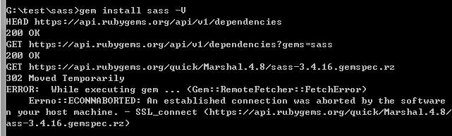
但很多时候回报错,也许是国内网络太差被封杀了.. 通过 -V 参数可以看到具体信息
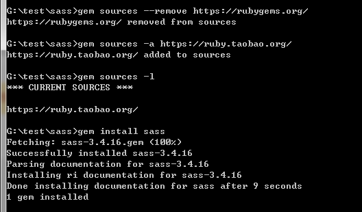
一般来说,淘宝团队都提供了很多镜像,去看看~
使用简单的命令,切换源就行
sass安装成功,先来体验一下吧~
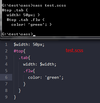
在sass目录下新建一个test.scss文件,写入几句,直接执行看看。
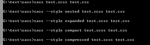
可使用 sass test.scss test.css 将scss文件直接编译成css文件
二、SASS用法:
如上例test.scss文件,我可以定义编译后css代码的风格。
* nested:嵌套缩进的css代码,它是默认值。
* expanded:没有缩进的、扩展的css代码。
* compact:简洁格式的css代码。
* compressed:压缩后的css代码。


也可以直接定义监听文件的改动,修改scss文件,css将会得到同步更新

接下来,谈谈sass的各语法
1.像css那样,直接定义
2.使用变量,变量有$标识符,如果要定义默认变量值,则在后方加上 !default即可。
如果变量要放在字符串里头,就用 #{}包含.可以使用计算功能
3.嵌套。sass可以进行选择器的嵌套,表示层级关系,看起来很优雅整齐。如果要使用父类,就用&符,如常见的 a:hover
4.混入(Mixins). 类似于定义一个宏/函数,然后在需要的地方调用
5.导入其他scss或css文件 @import , 导入scss文件会自动编译展开,导入css则原样置入
6.继承/扩展 使用 @extend
7.颜色函数,sass内置了许多颜色函数,例如加亮、变暗、颜色梯度等。
如:
lighten(#cc3, 10%) // #d6d65c
darken(#cc3, 10%) // #a3a329
grayscale(#cc3) // #808080
complement(#cc3) // #33c
更多颜色函数
8.其他比较少用到的方法
1] 变量也可以有多个值:类似于一个数组
2]可以用map做key-value关系 用@each遍历(类似于php语法)
3] 跳出选择器嵌套 @at-root 不过应该很少用到,如果要跳出媒体的嵌套例如 @media .block-1{}的,type就选media|all
语法为 @at-root (without: type) type有四种:
4]条件判断和循环等
5]当然了,也可以定义个函数,然后调用~
逐增width 这css越来越像编程了..
首先windows还是离不开我,所以还是环境还是windows..
一、SASS环境安装配置
SASS是ruby写的,所以要想将sass编译成css文件,就给配上ruby环境。
windows下载装个 rubyinstaller 就行了,注意要保证 配置好环境变量。
比如 E:\Ruby22-x64\bin 配置到系统环境变量 path中
cmd命令行执行 ruby -v 正确则安装配置正确
接下来是使用gem给我们装上sass
一般的做法是直接
gem install sass
但很多时候回报错,也许是国内网络太差被封杀了.. 通过 -V 参数可以看到具体信息
一般来说,淘宝团队都提供了很多镜像,去看看~
使用简单的命令,切换源就行
gem sources --remove https://rubygems.org/ gem sources -a https://ruby.taobao.org/ gem sources -l
*** CURRENT SOURCES ***
 https://ruby.taobao.org # 请确保只有 ruby.taobao.org
gem install rails
sass安装成功,先来体验一下吧~
在sass目录下新建一个test.scss文件,写入几句,直接执行看看。
可使用 sass test.scss test.css 将scss文件直接编译成css文件
二、SASS用法:
如上例test.scss文件,我可以定义编译后css代码的风格。
* nested:嵌套缩进的css代码,它是默认值。
* expanded:没有缩进的、扩展的css代码。
* compact:简洁格式的css代码。
* compressed:压缩后的css代码。
也可以直接定义监听文件的改动,修改scss文件,css将会得到同步更新
接下来,谈谈sass的各语法
1.像css那样,直接定义
div{width:50px;}2.使用变量,变量有$标识符,如果要定义默认变量值,则在后方加上 !default即可。
如果变量要放在字符串里头,就用 #{}包含.可以使用计算功能
$width: 500px;
$height: 300px !default;
$side: right;
div{
border-#{$side}-width: $width / 5;
}

|
|
|

div {
border-right-width: 100px;
}3.嵌套。sass可以进行选择器的嵌套,表示层级关系,看起来很优雅整齐。如果要使用父类,就用&符,如常见的 a:hover
$width: 500px;
div{
width: $width;
.answer a{
&:hover{text-decoration:none;}
}
}

|
|
|

div {
width: 500px;
}
div .answer a:hover {
text-decoration: none;
}
4.混入(Mixins). 类似于定义一个宏/函数,然后在需要的地方调用
// *.scss

$width: 500px;
@mixin right($color: '#0f0'){
font-weight: bold;
color: $color;
}

div{
width: $width;
.answer{
@include right();
}
}

//---------------------------------------
// *.css

div {
width: 500px;
}
div .answer {
font-weight: bold;
color: "#0f0";
}
5.导入其他scss或css文件 @import , 导入scss文件会自动编译展开,导入css则原样置入
//test.scss
$width: 500px;
div{
width: $width;
.answer a{
&:hover{text-decoration:none;}
}
}
@import './test1.css';
@import './test1.scss';
p{width: $width / 10;}

//test1.css
p.new{
color: red;
}

//test1.scss
$width: 200px;
#nav{
width: $width;
}

//最后,test.css  可以看到,$width变量的值已经更新
@import url(./test1.css);
div {
width: 500px;
}
div .answer a:hover {
text-decoration: none;
}

#nav {
width: 200px;
}

p {
width: 20px;
}
6.继承/扩展 使用 @extend
// *.scss
$width: 100px;

.block{
color: #333;
border-left: 1px;
}
.block-1{
@extend .block;
width: $width / 2;
}
.block-2{
@extend .block-1;
background-color: green;
}

//  *.css
.block, .block-1, .block-2 {
color: #333;
border-left: 1px;
}

.block-1, .block-2 {
width: 50px;
}

.block-2 {
background-color: green;
}7.颜色函数,sass内置了许多颜色函数,例如加亮、变暗、颜色梯度等。
如:
lighten(#cc3, 10%) // #d6d65c
darken(#cc3, 10%) // #a3a329
grayscale(#cc3) // #808080
complement(#cc3) // #33c
更多颜色函数
8.其他比较少用到的方法
1] 变量也可以有多个值:类似于一个数组
// *.scss
$px : 1px 2px 3px 4px;

div{
border-left: nth($px,2);
}

// *.css
div {
border-left: 2px;
}
2]可以用map做key-value关系 用@each遍历(类似于php语法)
// *.scss
$headings : (h1: 12px,h2:13px,h3:14px);
@each $header,$size in $headings{
#{$header}{
font-size: $size;
}
}

// *.css
h1 {
font-size: 12px;
}

h2 {
font-size: 13px;
}

h3 {
font-size: 14px;
}
3] 跳出选择器嵌套 @at-root 不过应该很少用到,如果要跳出媒体的嵌套例如 @media .block-1{}的,type就选media|all
语法为 @at-root (without: type) type有四种:
all(所有),
rule(常规css,默认),
media(media),
support(support)
// *.scss
.block-1{
border-left:1px;
.flw{
color: red;
@at-root{
.today{
font-size: 14px;
}
}
}
@at-root .tomo{
font-size: 12px;
}
}

// *.css
.block-1 {
border-left: 1px;
}
.block-1 .flw {
color: red;
}
.today {
font-size: 14px;
}
.tomo {
font-size: 12px;
}
4]条件判断和循环等
// *.scss
$width: 25px;
.block-5{
width: 50px;
}
// 现在不包含4,如果是froms 1 through 4 ,就会包含4
@for $i from 1 to 4{
.block-#{$i}{
@if $i % 2 == 0 { width: $width;}
@else {width: 50px;}
}
}

// *.css
.block-5 {
width: 50px;
}

.block-1 {
width: 50px;
}

.block-2 {
width: 25px;
}

.block-3 {
width: 50px;
}
5]当然了,也可以定义个函数,然后调用~
逐增width 这css越来越像编程了..
// *.scss
$width: 25px;

.block-5{
width: 50px;
}
@function inc($num){
@return $num + 1;
}
@for $i from 1 through 4{
.block-#{$i}{
@if $i % 2 == 0 {
$width: inc($width);
width: $width;
}
@else {width: 50px;}
}
}

// *.css
.block-5 {
width: 50px;
}

.block-1 {
width: 50px;
}

.block-2 {
width: 26px;
}

.block-3 {
width: 50px;
}

.block-4 {
width: 27px;
}

相关文章推荐
- 反射代理集群
- 2015 Multi-University Training Contest 1 - 1002 Assignment
- UNIX网络编程卷一:第二章 传输层:TCP、UDP
- Storyboard中的UIScrollView使用自动布局,使其能够滚动
- Swift开发教程--设置UIViewController的背景透明
- ubuntu+apache+php
- Junit Assert
- GRE写作必备句型
- Python串口编程
- ACM学习历程—HDU 2112 HDU Today(map && spfa && 优先队列)
- TCP/IP详解学习笔记(11)-TCP交互数据流,成块数据流
- Android控件对齐方式
- PAT (Advanced Level) 1021. Deepest Root (25) 并查集+DFS
- oc c 多文件编译
- 波特率
- eclipse使用maven插件打包JAR包
- android adb常用指令
- mysql online ddl
- 引用与指针有什么区别
- TCP/IP详解学习笔记(10)-TCP连接的建立与中止