CSS3——gradient渐变
2015-07-08 12:33
585 查看
<!DOCTYPE html>
<html lang="en">
<head>
<meta charset="UTF-8">
<title>Document</title>
<style>
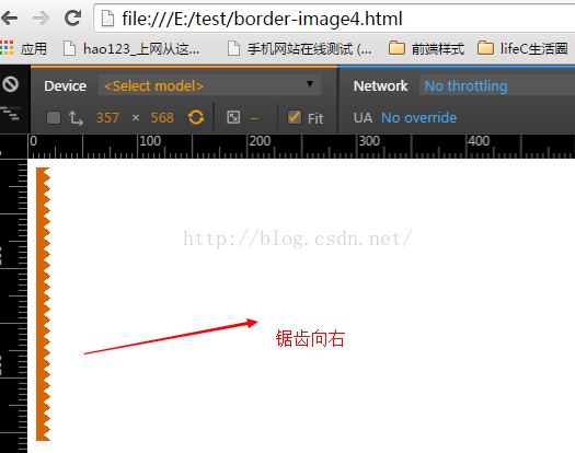
.bg{
width:300px;
height:250px;
background-image:-webkit-gradient(linear,14% 48%,35% 0%,
from(#d86707),
color-stop(.5,#d86707),
color-stop(.5,transparent),
to(transparent)
),
-webkit-gradient(linear,48% 0,62% 35%,
from(#d86707),
color-stop(.5,#d86707),
color-stop(.5,transparent),
to(transparent)
);
background-size: 19px 10px;
background-repeat:repeat-y;
background-position:0 100%;
}
</style>
</head>
<body>
<div class="bg"></div>
</body>
</html>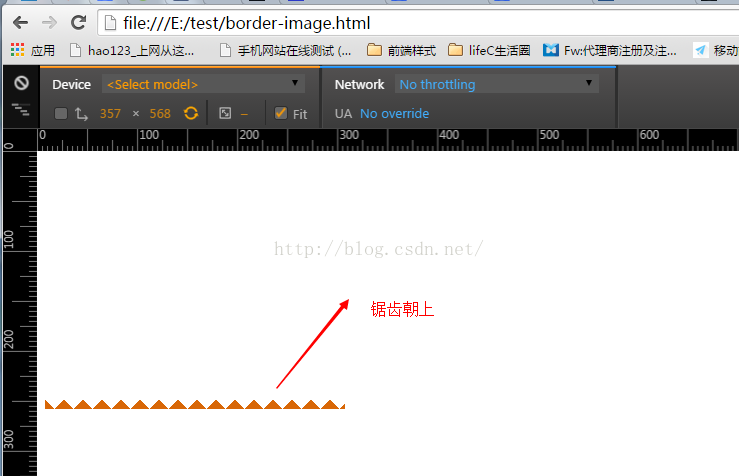
<!DOCTYPE html>
<html lang="en">
<head>
<meta charset="UTF-8">
<title>Document</title>
<style>
.bg{
width:300px;
height:250px;
background-image:-webkit-gradient(linear,50% 0,0 100%,
from(transparent),
color-stop(.5,transparent),
color-stop(.5,#d86707),
to(#d86707)
),
-webkit-gradient(linear,50% 0,100% 100%,
from(transparent),
color-stop(.5,transparent),
color-stop(.5,#d86707),
to(#d86707)
);
background-image:-moz-linear-gradient(50% 0,0 100%,
from(transparent),
color-stop(.5,transparent),
color-stop(.5,#d86707),
to(#d86707)
),
-moz-linear-gradient(50% 0,100% 100%,
from(transparent),
color-stop(.5,transparent),
color-stop(.5,#d86707),
to(#d86707)
);
background-size: 19px 10px;
background-repeat:repeat-x;
background-position:0 100%;
}
</style>
</head>
<body>
<div class="bg"></div>
</body>
</html>

相关文章推荐
- css 样式文字溢出显示省略号
- css3三维动画菜单上下翻转
- 【实用代码】选项卡切换——带标题底纹样式
- CSS之 :before && :after
- html css文件宏观调控-外部样式表
- 样式,主题和动画
- CSS3学习笔记
- CSS3选择器详解
- element.style覆盖了我的样式!!
- css样式表
- 项目中如果管理前端文件CSS和JS
- CSS 文本常用的换行方法
- CSS基础 - 页面布局
- DIV+CSS解决IE6,IE7,IE8,FF兼容问题
- HTML+CSS - 搜索 And 高级搜索
- java 中Date的格式化样式
- css三角形的实现
- 关于友好性测试中鼠标样式的修改
- 雅虎工程师初始化css
- CSS简单理解与应用