Kaggle Bike Sharing Demand Prediction – How I got in top 5 percentile of participants?
2015-06-27 19:00
525 查看
Kaggle Bike Sharing Demand Prediction – How I got in top 5 percentile of participants?
Introduction
There are three types of people who take part in a Kaggle Competition:Type 1: Who are experts in machine learning and their motivation is to compete with the best data scientists across the globe. They aim to achieve the highest accuracy
Type 2: Who aren’t experts exactly, but participate to get better at machine learning. These people aim to learn from the experts and the discussions happening and hope to become better with time.
Type 3: Who are new to data science and still choose to participate and gain experience of solving a data science problem.
If you think you fall in Type 2 and Type 3, go ahead and check how I got close to rank 150. I would strongly recommend you to type out the code and follow the article as you go. This will help you develop your data science muscles and they will be in better shape in the next challenge. The more you practice, the faster you’ll learn.
And if you are a Type 1 player, please feel free to drop your approach applied in this competition in the comments section below. I would like to learn from you!
Kaggle Bike Sharing Competition went live for 366 days and ended on 29th May 2015. My efforts would have been incomplete, had I not been supported by Aditya Sharma, IIT Guwahati (doing internship at Analytics Vidhya) in solving this competition.

Before you start – warming up to participate in Kaggle Competition
Here’s a quick approach to solve any Kaggle competition:Acquire basic data science skills (Statistics + Basic Algorithms)
Get friendly with 7 steps of Data Exploration
Become proficient with any one of the language Python, R or SAS (or the tool of your choice).
Identify the right competition first according to your skills. Here’s a good read: Kaggle Competitions: How and where to begin?
Kaggle Bike Sharing Demand Challenge
In Kaggle knowledge competition – Bike Sharing Demand, the participants are asked to forecast bike rental demand of Bike sharing program in Washington, D.C based on historical usage patterns in relation with weather, time and other data.Using these Bike Sharing systems, people rent a bike from one location and return it to a different or same place on need basis. People can rent a bike through membership (mostly regular users) or on demand basis (mostly casual users). This process is controlled by a network of automated kiosk across the city.
Solution
Here is the step by step solution of this competition:Step 1. Hypothesis Generation
Before exploring the data to understand the relationship between variables, I’d recommend you to focus on hypothesis generation first. Now, this might sound counter-intuitive for solving a data science problem, but if there is one thing I have learnt over years, it is this. Before exploring data, you should spend some time thinking about the business problem, gaining the domain knowledge and may be gaining first hand experience of the problem (only if I could travel to North America!)How does it help? This practice usually helps you form better features later on, which are not biased by the data available in the dataset. At this stage, you are expected to posses structured thinking i.e. a thinking process which takes into consideration all the possible aspects of a particular problem.
Here are some of the hypothesis which I thought could influence the demand of bikes:
Hourly trend: There must be high demand during office timings. Early morning and late evening can have different trend (cyclist) and low demand during 10:00 pm to 4:00 am.
Daily Trend: Registered users demand more bike on weekdays as compared to weekend or holiday.
Rain: The demand of bikes will be lower on a rainy day as compared to a sunny day. Similarly, higher humidity will cause to lower the demand and vice versa.
Temperature: In India, temperature has negative correlation with bike demand. But, after looking at Washington’s temperature graph, I presume it may have positive correlation.
Pollution: If the pollution level in a city starts soaring, people may start using Bike (it may be influenced by government / company policies or increased awareness).
Time: Total demand should have higher contribution of registered user as compared to casual because registered user base would increase over time.
Traffic: Itcan be positively correlated with Bike demand. Higher traffic may force people to use bike as compared to other road transport medium like car, taxi etc
2. Understanding the Data Set
The dataset shows hourly rental data for two years (2011 and 2012). The training data set is for the first 19 days of each month. The test dataset is from 20th day to month’s end. We are required to predict the total count of bikes rented during each hour covered by the test set.In the training data set, they have separately given bike demand by registered, casual users and sum of both is given as count.
Training data set has 12 variables (see below) and Test has 9 (excluding registered, casual and count).
Independent Variables
datetime:   date and hour in "mm/dd/yyyy hh:mm" format
season:     Four categories-> 1 = spring, 2 = summer, 3 = fall, 4 = winter
holiday:    whether the day is a holiday or not (1/0)
workingday: whether the day is neither a weekend nor holiday (1/0)
weather:    Four Categories of weather
1-> Clear, Few clouds, Partly cloudy, Partly cloudy
2-> Mist + Cloudy, Mist + Broken clouds, Mist + Few clouds, Mist
3-> Light Snow and Rain + Thunderstorm + Scattered clouds, Light Rain + Scattered clouds
4-> Heavy Rain + Ice Pallets + Thunderstorm + Mist, Snow + Fog
temp:       hourly temperature in Celsius
atemp:      "feels like" temperature in Celsius
humidity:   relative humidity
windspeed:  wind speed
Dependent Variables
registered: number of registered user
casual:     number of non-registered user
count:      number of total rentals (registered + casual)
3. Importing Data set and Basic Data Exploration
For this solution, I have used R (R Studio 0.99.442) in Windows Environment.Below are the steps to import and perform data exploration. If you are new to this concept, you can refer this guide on Data Exploration in R
Import Train and Test Data Set
setwd("E:/kaggle data/bike sharing")
train=read.csv("train_bike.csv")
test=read.csv("test_bike.csv")
Combine both Train and Test Data set (to understand the distribution of independent variable together).
test$registered=0
test$casual=0
test$count=0
data=rbind(train,test)
Before combing test and train data set, I have made the structure similar for both.
Variable Type Identification
str(data)
'data.frame':  17379 obs. of  12 variables:
$ datetime  : Factor w/ 17379 levels "2011-01-01 00:00:00",..: 1 2 3 4 5 6 7 8 9 10 ...
$ season    : int  1 1 1 1 1 1 1 1 1 1 ...
$ holiday   : int  0 0 0 0 0 0 0 0 0 0 ...
$ workingday: int  0 0 0 0 0 0 0 0 0 0 ...
$ weather   : int  1 1 1 1 1 2 1 1 1 1 ...
$ temp      : num  9.84 9.02 9.02 9.84 9.84 ...
$ atemp     : num  14.4 13.6 13.6 14.4 14.4 ...
$ humidity  : int  81 80 80 75 75 75 80 86 75 76 ...
$ windspeed : num  0 0 0 0 0 ...
$ casual    : num  3 8 5 3 0 0 2 1 1 8 ...
$ registered: num  13 32 27 10 1 1 0 2 7 6 ...
$ count     : num  16 40 32 13 1 1 2 3 8 14 ...
Find missing values in data set if any.
table(is.na(data))

FALSE
208548
Above you can see that it has returned no missing values in the data frame.
Understand the distribution of numerical variables and generate a frequency table for numeric variables. Now, I’ll test and plot a histogram for each numerical variables and analyze the distribution.
par(mfrow=c(4,2))
par(mar = rep(2, 4))
hist(data$season)
hist(data$weather)
hist(data$humidity)
hist(data$holiday)
hist(data$workingday)
hist(data$temp)
hist(data$atemp)
hist(data$windspeed)
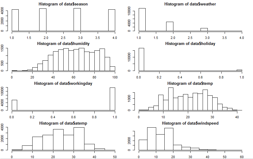
Few inferences can be drawn by looking at the these histograms:
Season has four categories of almost equal distribution
Weather 1 has higher contribution i.e. mostly clear weather.
prop.table(table(data$weather))
1     2      3      4
0.66  0.26   0.08   0.00
As expected, mostly working days and variable holiday is also showing a similar inference. You can use the code above to look at the distribution in detail. Here you can generate a variable for weekday using holiday and working day. Incase, if both have zero values, then it must be a working day.
Variables temp, atemp, humidity and windspeed looks naturally distributed.
Convert discrete variables into factor (season, weather, holiday, workingday)
data$season=as.factor(data$season)
data$weather=as.factor(data$weather)
data$holiday=as.factor(data$holiday)
data$workingday=as.factor(data$workingday)
4. Hypothesis Testing (using multivariate analysis)
Till now, we have got a fair understanding of the data set. Now, let’s test the hypothesis which we had generated earlier. Here I have added some additional hypothesis from the dataset. Let’s test them one by one:Hourly trend: We don’t have the variable ‘hour’ with us right now. But we can extract it using the datetime column.
data$hour=substr(data$datetime,12,13)
data$hour=as.factor(data$hour)
Let’s plot the hourly trend of count over hours and check if our hypothesis is correct or not. We will separate train and test data set from combined one.
train=data[as.integer(substr(data$datetime,9,10))<20,]
test=data[as.integer(substr(data$datetime,9,10))>19,]

boxplot(train$count~train$hour,xlab="hour", ylab="count of users")
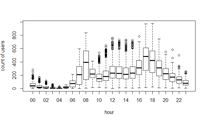
Above, you can see the trend of bike demand over hours. Quickly, I’ll segregate the bike demand in three categories:
High : 7-9 and 17-19 hours
Average : 10-16 hours
Low : 0-6 and 20-24 hours
Here I have analyzed the distribution of total bike demand. Let’s look at the distribution of registered and casual users separately.
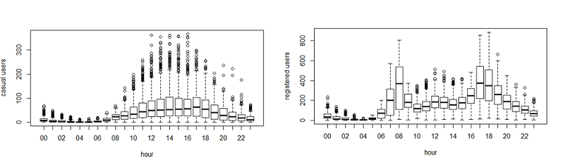
Above you can see that registered users have similar trend as count. Whereas, casual users have different trend. Thus, we can say that ‘hour’ is significant variable and our hypothesis is ‘true’.
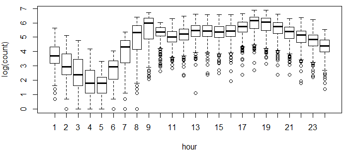
You might have noticed that there are a lot of outliers while plotting the count of registered and casual users. These values are not generated due to error, so we consider them as natural outliers. They might be a result of groups of people taking up cycling (who are not registered). To treat such outliers, we will use logarithm transformation. Let’s look at the similar plot after log transformation.
boxplot(log(train$count)~train$hour,xlab="hour",ylab="log(count)")
Daily Trend: Like Hour, we will generate a variable for day from datetime variable and after that we’ll plot it.
date=substr(data$datetime,1,10)
days<-weekdays(as.Date(date))
data$day=days
Plot shows registered and casual users’ demand over days.
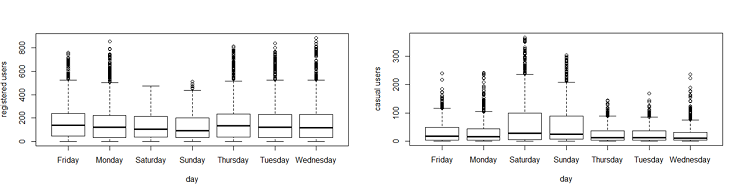
While looking at the plot, I can say that the demand of causal users increases over weekend.
Rain: We don’t have the ‘rain’ variable with us but have ‘weather’ which is sufficient to test our hypothesis. As per variable description, weather 3 represents light rain and weather 4 represents heavy rain. Take a look at the plot:
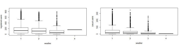
It is clearly satisfying our hypothesis.
Temperature, Windspeed and Humidity: These are continuous variables so we can look at the correlation factor to validate hypothesis.
sub=data.frame(train$registered,train$casual,train$count,train$temp,train$humidity,train$atemp,train$windspeed)
cor(sub)
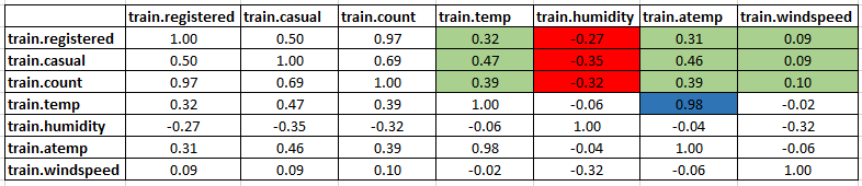
Here are a few inferences you can draw by looking at the above histograms:
Variable temp is positively correlated with dependent variables (casual is more compare to registered)
Variable atemp is highly correlated with temp.
Windspeed has lower correlation as compared to temp and humidity
Time: Let’s extract year of each observation from the datetime column and see the trend of bike demand over year.
data$year=substr(data$datetime,1,4)
data$year=as.factor(data$year)
train=data[as.integer(substr(data$datetime,9,10))<20,]
test=data[as.integer(substr(data$datetime,9,10))>19,]
boxplot(train$count~train$year,xlab="year", ylab="count")
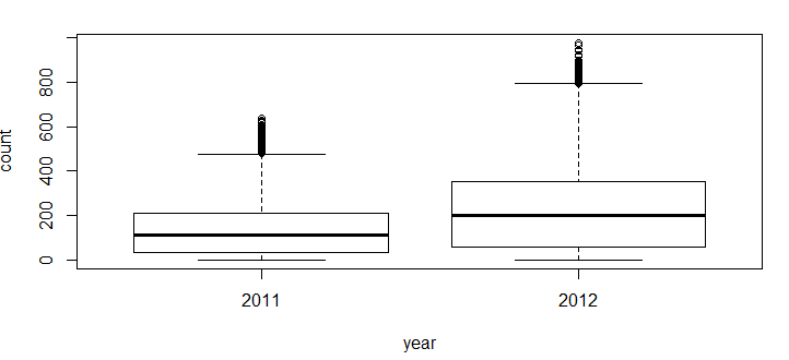
You can see that 2012 has higher bike demand as compared to 2011.
Pollution & Traffic: We don’t have the variable related with these metrics in our data set so we cannot test this hypothesis.
5. Feature Engineering
In addition to existing independent variables, we will create new variables to improve the prediction power of model. Initially, you must have noticed that we generated new variables like hour, month, day and year.Here we will create more variables, let’s look at the some of these:
Hour Bins: Initially, we have broadly categorize the hour into three categories. Let’s create bins for the hour variable separately for casual and registered users. Here we will use decision tree to find the accurate bins.
train$hour=as.integer(train$hour) # convert hour to integer
test$hour=as.integer(test$hour) # modifying in both train and test data set
We use the library rpart for decision tree algorithm.
library(rpart)
library(rattle) #these libraries will be used to get a good visual plot for the decision tree model.
library(rpart.plot)
library(RColorBrewer)
d=rpart(registered~hour,data=train)
fancyRpartPlot(d)
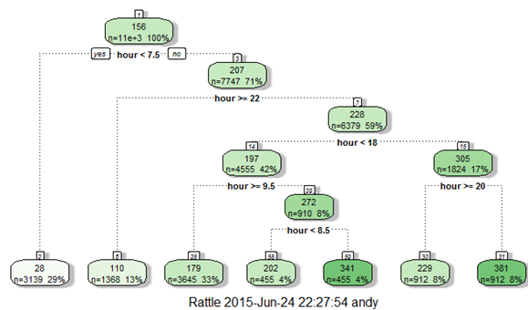
Now, looking at the nodes we can create different hour bucket for registered users.
data=rbind(train,test)
data$dp_reg=0
data$dp_reg[data$hour<8]=1
data$dp_reg[data$hour>=22]=2
data$dp_reg[data$hour>9 & data$hour<18]=3
data$dp_reg[data$hour==8]=4
data$dp_reg[data$hour==9]=5
data$dp_reg[data$hour==20 | data$hour==21]=6
data$dp_reg[data$hour==19 | data$hour==18]=7
Similarly, we can create day_part for casual users also (dp_cas).
Temp Bins: Using similar methods, we have created bins for temperature for both registered and casuals users. Variables created are (temp_reg and temp_cas).
Year Bins: We had a hypothesis that bike demand will increase over time and we have proved it also. Here I have created 8 bins (quarterly) for two years. Jan-Mar 2011 as 1 …..Oct-Dec2012 as 8.
data$year_part[data$year=='2011']=1
data$year_part[data$year=='2011' & data$month>3]=2
data$year_part[data$year=='2011' & data$month>6]=3
data$year_part[data$year=='2011' & data$month>9]=4
data$year_part[data$year=='2012']=5
data$year_part[data$year=='2012' & data$month>3]=6
data$year_part[data$year=='2012' & data$month>6]=7
data$year_part[data$year=='2012' & data$month>9]=8
table(data$year_part)
Day Type: Created a variable having categories like “weekday”, “weekend” and “holiday”.
data$day_type=""
data$day_type[data$holiday==0 & data$workingday==0]="weekend"
data$day_type[data$holiday==1]="holiday"
data$day_type[data$holiday==0 & data$workingday==1]="working day"
Weekend: Created a separate variable for weekend (0/1)
data$weekend=0
data$weekend[data$day=="Sunday" | data$day=="Saturday" ]=1
6. Model Building
As this was our first attempt, we applied decision tree, conditional inference tree and random forest algorithms and found that random forest is performing the best. You can also go with regression, boosted regression, neural network and find which one is working well for you.Before executing the random forest model code, I have followed following steps:
Convert discrete variables into factor (weather, season, hour, holiday, working day, month, day)
train$hour=as.factor(train$hour)
test$hour=as.factor(test$hour)
As we know that dependent variables have natural outliers so we will predict log of dependent variables.
Predict bike demand registered and casual users separately.
y1=log(casual+1) and y2=log(registered+1), Here we have added 1 to deal with zero values in the casual and registered columns.
#predicting the log of registered users.
set.seed(415)
fit1 <- randomForest(logreg ~ hour +workingday+day+holiday+ day_type +temp_reg+humidity+atemp+windspeed+season+weather+dp_reg+weekend+year+year_part, data=train,importance=TRUE, ntree=250)
pred1=predict(fit1,test)
test$logreg=pred1
#predicting the log of casual users.
set.seed(415)
fit2 <- randomForest(logcas ~hour + day_type+day+humidity+atemp+temp_cas+windspeed+season+weather+holiday+workingday+dp_cas+weekend+year+year_part, data=train,importance=TRUE, ntree=250)
pred2=predict(fit2,test)
test$logcas=pred2
Re-transforming the predicted variables and then writing the output of count to the file submit.csv
test$registered=exp(test$logreg)-1
test$casual=exp(test$logcas)-1
test$count=test$casual+test$registered
s<-data.frame(datetime=test$datetime,count=test$count)
write.csv(s,file="submit.csv",row.names=FALSE)
After following the steps mentioned above, you can score 0.38675 on Kaggle leaderboard i.e. top 5 percentile of total participants. As you might have seen, we have not applied any extraordinary science in getting to this level. But, the real competition starts here. I would like to see, if I can improve this further by use of more features and some more advanced modeling techniques.
End Notes
In this article, we have looked at structured approach of problem solving and how this method can help you to improve performance. I would recommend you to generate hypothesis before you deep dive in the data set as this technique will not limit your thought process. You can improve your performance by applying advanced techniques (or ensemble methods) and understand your data trend better.You can find the complete solution here : GitHub Link
Have you participated in any Kaggle problem? Did you see any significant benefits by doing the same? Do let us know your thoughts about this guide in the comments section below.

相关文章推荐
- linux程序设计——make命令和makefile文件(第九章)
- 11个超棒的iOS开发学习网站
- Linux 下终端 C 语言控制光标的技巧
- CentOS7 (64位) 下QT5.5 连接MySQL数据库(driver not loaded)
- 虚拟机Linux----Ubuntu1204----设置固定Ip
- Linux1.0内核中断体系的建立
- Tomcat的配置
- 一些免费的WebService的服务网站
- Linux 下crontab简单使用
- Linux访问受限,访问Linux总是Forbidden
- Linux中强制结束一个进程的终极方法
- OOP之基本技能训练-Chapter 1-千里之行,始于足下
- ShellExecuteEx提升子进程权限
- Linux虚拟机与外面系统ping不通,或者连不上网
- Linux cp 命令
- Linux入门篇之五:使用的克隆虚拟机
- 开发Apache服务器上的CGI程序
- Step by Step:Linux C多线程编程入门(基本API及多线程的同步与互斥)
- MacBook 连接Centos服务器
- php的入门第一个例子(包括linux的环境安装与包括页面跳转,以及curl命令的调用)