An Easy Way to Make a Treemap
2015-01-20 18:48
337 查看
By NATHAN
YAU
If your data is a hierarchy, a treemap is a good way to show all the values at once and keep the structure in the visual. This is a quick way to make a treemap in R.
Back in 1990, Ben
Shneiderman, of the University of Maryland, wanted
to visualize what was going on in his always-full hard drive. He wanted to know what was taking up so much space. Given the hierarchical structure of directories and files, he first tried a tree
diagram. It got too big too fast to be useful though. Too many nodes. Too many branches.
The treemap was
his solution. It's an area-based visualization where the size of each rectangle represents a metric since made popular by Martin Wattenberg's Map
of the Market and Marcos Weskamp's newsmap.
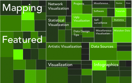
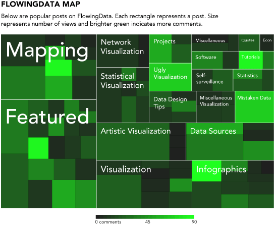
Here's a really easy way to make your own treemap in just a couple lines of code. We're looking to make something like the above.
Like before, we're going to use R, so you'll want to get it before going any further. Download it for Windows, Mac,
or Linux.
Don't let the out-dated site full you. You can get a lot done with the free software.
We'll use data covering a hundred popular posts on FlowingData. Here it is in CSV
format. You don't have to download it though. We'll just load it directly into R. The main thing to take note of is what is there. There's post id, number of views, number of comments, and category.
Okay, let's load it into R using
Loading
data in CSV format into R.
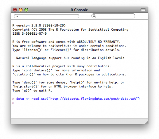
Easy enough. We just used the
to load data from a URL. If your data is on your computer, you could also do something like
Only a few more lines of code, and you've got a treemap. It's so easy, because we're going to use the
in R. First, you have to install it. You can either install the library via the "Package Installer" or you can do it through the command line. Let's do the latter. Type this in the console to install
Once installed, load it into R:
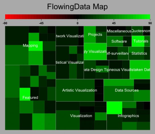
It's time to make the treemap with
Type this in the console:
Tada. You should get something like this:
The
default treemap uses a red-green color scale.
To sum up, we did this with four lines of code:
Now maybe you want to modify something like color. The cool thing about R is that you can see the code for all the functions, edit it, and then use your customized version. If the green and red scheme isn't for you or you don't care about the positive/negative
cutoff, then you can change the code to do that. I won't go into detail, but if you type
the console, you'll see the function. You can change color or cutoff around lines 36-46.
For example, you can do a black and white color scheme:
You
don't have to stick to the default color scale though.

I was alright with the green for this, so I saved it as a PDF and then loaded it into Illustrator as usual. I numbed the green some, cleaned up the labels with a new font and layout, and updated the legend.
Touched
up version of treemap with black-green color scale.
And there you go - a treemap with just a few lines of code in our all-trusty R. Rinse and repeat with your own data.
YAU
If your data is a hierarchy, a treemap is a good way to show all the values at once and keep the structure in the visual. This is a quick way to make a treemap in R.
Back in 1990, Ben
Shneiderman, of the University of Maryland, wanted
to visualize what was going on in his always-full hard drive. He wanted to know what was taking up so much space. Given the hierarchical structure of directories and files, he first tried a tree
diagram. It got too big too fast to be useful though. Too many nodes. Too many branches.
The treemap was
his solution. It's an area-based visualization where the size of each rectangle represents a metric since made popular by Martin Wattenberg's Map
of the Market and Marcos Weskamp's newsmap.
Here's a really easy way to make your own treemap in just a couple lines of code. We're looking to make something like the above.
Step 0. Download R
Like before, we're going to use R, so you'll want to get it before going any further. Download it for Windows, Mac,or Linux.
Don't let the out-dated site full you. You can get a lot done with the free software.
Step 1. Load the Data
We'll use data covering a hundred popular posts on FlowingData. Here it is in CSVformat. You don't have to download it though. We'll just load it directly into R. The main thing to take note of is what is there. There's post id, number of views, number of comments, and category.
Okay, let's load it into R using
read.csv():
data <- read.csv("http://datasets.flowingdata.com/post-data.txt")Loading
data in CSV format into R.
Easy enough. We just used the
read.csv()function
to load data from a URL. If your data is on your computer, you could also do something like
data
<- read.csv("post-data.txt")
. Just make sure the data file is in your current working directory, which you can change via the "Miscellaneous" menu.
Step 2. Load the Portfolio package
Only a few more lines of code, and you've got a treemap. It's so easy, because we're going to use the portfoliolibrary
in R. First, you have to install it. You can either install the library via the "Package Installer" or you can do it through the command line. Let's do the latter. Type this in the console to install
portfolio:
install.packages("portfolio")Once installed, load it into R:
library(portfolio)
Step 3. Make the Treemap
It's time to make the treemap with map.market().
Type this in the console:
map.market(id=data$id, area=data$views, group=data$category,
color=data$comments, main="FlowingData Map")
Tada. You should get something like this:
The
default treemap uses a red-green color scale.
To sum up, we did this with four lines of code:
data <- read.csv("http://datasets.flowingdata.com/post-data.txt")

install.packages("portfolio")

library(portfolio)

map.market(id=data$id, area=data$views, group=data$category, color=data$comments, main="FlowingData Map")
Step 4. Customize
Now maybe you want to modify something like color. The cool thing about R is that you can see the code for all the functions, edit it, and then use your customized version. If the green and red scheme isn't for you or you don't care about the positive/negativecutoff, then you can change the code to do that. I won't go into detail, but if you type
map.marketin
the console, you'll see the function. You can change color or cutoff around lines 36-46.
For example, you can do a black and white color scheme:
You
don't have to stick to the default color scale though.
I was alright with the green for this, so I saved it as a PDF and then loaded it into Illustrator as usual. I numbed the green some, cleaned up the labels with a new font and layout, and updated the legend.
Touched
up version of treemap with black-green color scale.
And there you go - a treemap with just a few lines of code in our all-trusty R. Rinse and repeat with your own data.

相关文章推荐
- An easy way to customize a scrollbar for a control
- An easy way to track state of network connection using Perl
- CJBorderView 一种iOS开发中常用的虚线边框View------* An easy way to init a view with dotted line border
- An easy way to update (patch) Linux kernel using yum
- an easy way to debug windows service in .net
- Mac OS X: Best Way to Make an ISO from a CD or DVD
- An easy way to install and uninstall .Net Windows Service
- An easy way to setup a screaming server on Windows
- An easy way to create transparent button
- An easy way to syncTime using C#
- Mac: An easy way to crack Sublime Text 2.0.2
- An easy way to change colour in text control
- Android Run Time: An Easy Hack To Make Your Phone Faster And Its Battery Last Longer
- An easy way to customize a scrollbar for a control
- Core - Provide an easy way to store administrator and user model differences in a custom store (e.g., in a database)
- 条款18:让接口容易被正确使用,不易被误用(Make interface easy to use correctly and hard to use incorrectly)
- how to make a authorware file in an environment without authorware
- This application has requested the Runtime to terminate it in an unusual way
- Easy way to backup redmine