一款基于jquery的喜欢动画按钮
2014-12-18 14:46
801 查看
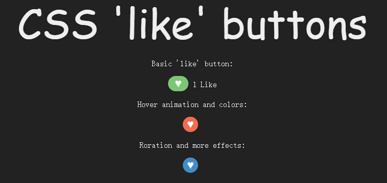
今天给大家带来一款基于jquery的喜欢动画按钮。这个实例中给了三种动画特效。效果图如下:
在线预览 源码下载
实现的代码。
html代码:
css代码:
via:/article/1211499.html
在线预览 源码下载
实现的代码。
html代码:
<p class='heading'>
CSS 'like' buttons
</p>
<p>
Basic 'like' button:</p>
<div class='like'>
<button class='like-toggle basic'>
♥</button>
<span class='hidden'>1 Like</span>
</div>
<p>
Hover animation and colors:</p>
<div class='like'>
<button class='like-toggle basic2'>
♥</button>
<span class='hidden'>I like this</span>
</div>
<p>
Roration and more effects:</p>
<div class='like'>
<button class='like-toggle basic3'>
♥</button>
<span class='hidden'>10 Likes</span>
</div>
<script src='jquery.js'></script>
<script>
$(function () {
$('.like-toggle').click(function () {
$(this).toggleClass('like-active');
$(this).next().toggleClass('hidden');
});
});
//@ sourceURL=pen.js
</script>
css代码:
*
{
transition: all 0.3s linear;
}

body
{
background: #222;
color: #eee;
text-align: center;
}

.hidden
{
font-size: 0;
}

.heading
{
font-family: 'Amatic SC' , cursive;
font-size: 5em;
margin: 0;
}

.like, p
{
font-family: 'Open Sans';
}

.like-toggle
{
outline: none;
box-shadow: none;
border: none;
width: 40px;
height: 30px;
font-size: 1.3em;
border-radius: 100px;
}

.like-active.basic
{
background: #7CC576;
color: white;
}

.like-toggle.basic2
{
border: none;
width: 30px;
height: 30px;
font-size: 1.3em;
border-radius: 100px;
background: #F26C4F;
color: #fff;
}

.like-active.basic2
{
background: #F06EA9;
}

.like-toggle.basic2:not(.like-active):hover
{
background: #438CCA;
width: 60px;
}

.like-toggle.basic3
{
border: none;
width: 30px;
height: 30px;
font-size: 1.3em;
border-radius: 100px;
background: #438CCA;
color: #fff;
margin-bottom: 10px;
}

.like-active.basic3
{
background: #7CC576;
transform: rotate(-360deg);
}

.like-toggle.basic3:not(.like-active):hover
{
background: #F26C4F;
transform: rotate(90deg);
}via:/article/1211499.html

相关文章推荐
- 一款基于jquery的喜欢动画按钮
- 分享一款基于jquery的圆形动画按钮
- 一款基于css3和jquery实现的动画显示弹出层按钮教程
- 分享一款基于jquery的圆形动画按钮
- 一款基于css3的动画按钮
- 一款基于jQuery可自动播放动画的焦点图插件
- 一款基于jQuery的超酷动画幻灯片
- 基于jQuery点击加载动画按钮特效
- 一款基于jQuery的超酷动画幻灯片
- 一款基于css3和jquery实现的动画弹出层
- 一款基于css3的动画按钮代码教程
- 一款基于HTML5和jquery小球跳舞的时间动画
- 不错的一款基于CSS 3的按钮动画库Animate.css
- 一款基于css3和jquery实现的动画弹出层
- 一款基于jquery漂亮的按钮
- 一款基于jquery和css3实现的摩天轮式分享按钮
- 一款基于jQuery的超酷动画幻灯片