纯CSS画的基本图形(矩形、圆形、三角形、多边形、爱心、八卦等),里面很多涉及到CSS3的一些属性。
2014-11-29 10:27
821 查看
今天在css-tricks上看到一篇文章,那篇文章让我不禁心头一震,强大的CSS啊,居然能画出这么多基本的图形。图形包括基本的矩形、圆形、 椭圆、三角形、多边形,也包括稍微复杂一点的爱心、钻石、阴阳八卦等。当然有一些需要用到CSS3的属性,所以在你打开这篇文章的时候,我希望你用的是 firefox或者chrome,当然IE也能看一部分的。那好,下面就一起来看看我们是如何用纯CSS来画这些图形的,如果你也觉得很震撼,推荐给你的 朋友吧。是不是我在博客园的权限不够,后台编辑器中不能加style标签,所以就用图片替代实际的效果图了,当然,想看实际效果的朋友可以移驾至我的另一
个博客,这篇文章两边是同步的,那边是实际的效果,原文:http://www.itivy.com/ivy/archive/2012/1/16/css-shape.html
1、正方形
最终效果:

CSS代码如下:
2、长方形
最终效果:

CSS代码如下:
3、圆形
最终效果:
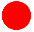
CSS代码如下:
4、椭圆
最终效果:
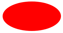
CSS代码如下:
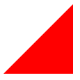
5、上三角
最终效果:
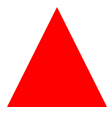
CSS代码如下:
6、下三角
最终效果:

CSS代码如下:
7、左三角
最终效果:
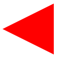
CSS代码如下:
8、右三角
最终效果:

CSS代码如下:
9、左上三角
最终效果:
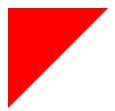
CSS代码如下:
10、右上三角
最终效果:

CSS代码如下:
11、左下三角
最终效果:

CSS代码如下:
12、右下三角
最终效果:
CSS代码如下:
13、平行四边形
最终效果:
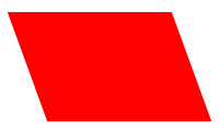
CSS代码如下:
14、梯形
最终效果:
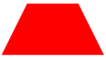
CSS代码如下:
15、六角星
最终效果:
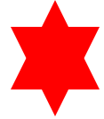
CSS代码如下:
16、五角星
最终效果:

CSS代码如下:
17、五角大楼
最终效果:

CSS代码如下:
18、六边形
最终效果:

CSS代码如下:
19、八角形
最终效果:
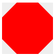
CSS代码如下:
20、爱心
最终效果:
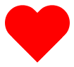
CSS代码如下:
21、无穷大符号
最终效果:
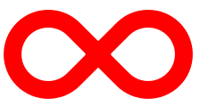
CSS代码如下:
22、鸡蛋
最终效果
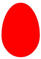
CSS代码如下:
23、食逗人(Pac-Man)
最终效果:
24、提示对话框
最终效果:

CSS代码如下:
25、12角星
最终效果:
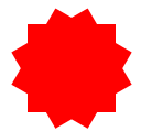
CSS代码如下:
26、8角星
最终效果:

CSS代码如下:
27、钻石
最终效果:
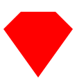
CSS代码如下:
28、阴阳八卦(霸气的这个)

CSS代码如下:
个博客,这篇文章两边是同步的,那边是实际的效果,原文:http://www.itivy.com/ivy/archive/2012/1/16/css-shape.html
1、正方形
最终效果:

CSS代码如下:
#square { width: 100px; height: 100px; background: red; }2、长方形
最终效果:

CSS代码如下:
#rectangle { width: 200px; height: 100px; background: red; }3、圆形
最终效果:

CSS代码如下:
#circle {     width: 100px;     height: 100px;     background: red;     -moz-border-radius: 50px;     -webkit-border-radius: 50px;
border-radius: 50px; }
4、椭圆
最终效果:

CSS代码如下:
#oval {     width: 200px;     height: 100px;     background: red;     -moz-border-radius: 100px / 50px;
-webkit-border-radius: 100px / 50px;     border-radius: 100px / 50px; }
5、上三角
最终效果:

CSS代码如下:
#triangle-up {     width: 0;     height: 0;     border-left: 50px solid transparent;     border-right: 50px solid transparent;
border-bottom: 100px solid red; }
6、下三角
最终效果:

CSS代码如下:
#triangle-down {     width: 0;     height: 0;     border-left: 50px solid transparent;     border-right: 50px solid transparent;
border-top: 100px solid red; }
7、左三角
最终效果:

CSS代码如下:
#triangle-left {     width: 0;     height: 0;     border-top: 50px solid transparent;     border-right: 100px solid red;
border-bottom: 50px solid transparent; }
8、右三角
最终效果:

CSS代码如下:
#triangle-right {     width: 0;     height: 0;     border-top: 50px solid transparent;     border-left: 100px solid red;
border-bottom: 50px solid transparent; }
9、左上三角
最终效果:

CSS代码如下:
#triangle-topleft { width: 0; height: 0; border-top: 100px solid red; border-right: 100px solid transparent; }10、右上三角
最终效果:

CSS代码如下:
#triangle-topright { width: 0; height: 0; border-top: 100px solid red; border-left: 100px solid transparent; }11、左下三角
最终效果:

CSS代码如下:
#triangle-bottomleft { width: 0; height: 0; border-bottom: 100px solid red; border-right: 100px solid transparent; }12、右下三角
最终效果:

CSS代码如下:
#triangle-bottomright { width: 0; height: 0; border-bottom: 100px solid red; border-left: 100px solid transparent; }13、平行四边形
最终效果:

CSS代码如下:
#parallelogram {     width: 150px;     height: 100px;         margin-left:20px;     -webkit-transform: skew(20deg);
-moz-transform: skew(20deg);          -o-transform: skew(20deg);     background: red; }
14、梯形
最终效果:

CSS代码如下:
#trapezoid {     border-bottom: 100px solid red;     border-left: 50px solid transparent;     border-right: 50px solid transparent;
height: 0;     width: 100px; }
15、六角星
最终效果:

CSS代码如下:
#star-six {     width: 0;     height: 0;     border-left: 50px solid transparent;     border-right: 50px solid transparent;
border-bottom: 100px solid red;     position: relative; }
 #star-six:after {     width: 0;     height: 0;     border-left: 50px solid transparent;     border-right: 50px solid transparent;
border-top: 100px solid red;     position: absolute;     content: "";     top: 30px;     left: -50px; }
16、五角星
最终效果:

CSS代码如下:
#star-five {    margin: 50px 0;    position: relative;    display: block;    color: red;    width: 0px;    height: 0px;
border-right:  100px solid transparent;    border-bottom: 70px  solid red;    border-left:   100px solid transparent;
-moz-transform:    rotate(35deg);    -webkit-transform: rotate(35deg);    -ms-transform:     rotate(35deg);
-o-transform:      rotate(35deg); }
#star-five:before {    border-bottom: 80px solid red;    border-left: 30px solid transparent;
border-right: 30px solid transparent;    position: absolute;    height: 0;    width: 0;    top: -45px;    left: -65px;
display: block;    content: '';    -webkit-transform: rotate(-35deg);    -moz-transform:    rotate(-35deg);
-ms-transform:     rotate(-35deg);    -o-transform:      rotate(-35deg);      }
 #star-five:after {    position: absolute;    display: block;    color: red;    top: 3px;    left: -105px;    width: 0px;    height: 0px;
border-right: 100px solid transparent;    border-bottom: 70px solid red;    border-left: 100px solid transparent;
-webkit-transform: rotate(-70deg);    -moz-transform:    rotate(-70deg);    -ms-transform:     rotate(-70deg);
-o-transform:      rotate(-70deg);    content: ''; }
17、五角大楼
最终效果:

CSS代码如下:
#pentagon {     position: relative;     width: 54px;     border-width: 50px 18px 0;     border-style: solid;
border-color: red transparent; }
#pentagon:before {     content: "";     position: absolute;     height: 0;     width: 0;     top: -85px;     left: -18px;
border-width: 0 45px 35px;     border-style: solid;     border-color: transparent transparent red; }
18、六边形
最终效果:

CSS代码如下:
#hexagon {     width: 100px;     height: 55px;     background: red;     position: relative; }
#hexagon:before {     content: "";     position: absolute;     top: -25px;      left: 0;     width: 0;     height: 0;
border-left: 50px solid transparent;     border-right: 50px solid transparent;     border-bottom: 25px solid red; }
 #hexagon:after {     content: "";     position: absolute;     bottom: -25px;      left: 0;     width: 0;     height: 0;
border-left: 50px solid transparent;     border-right: 50px solid transparent;     border-top: 25px solid red; }
19、八角形
最终效果:

CSS代码如下:
#octagon {     width: 100px;     height: 100px;     background: red;     position: relative; }
#octagon:before {     content: "";     position: absolute;     top: 0;     left: 0;         border-bottom: 29px solid red;
border-left: 29px solid #eee;     border-right: 29px solid #eee;     width: 42px;     height: 0; }
#octagon:after {     content: "";     position: absolute;     bottom: 0;     left: 0;         border-top: 29px solid red;
border-left: 29px solid #eee;     border-right: 29px solid #eee;     width: 42px;     height: 0; }
20、爱心
最终效果:

CSS代码如下:
#heart {     position: relative;     width: 100px;     height: 90px; }
#heart:before, #heart:after {     position: absolute;     content: "";     left: 50px;     top: 0;     width: 50px;     height: 80px;
background: red;     -moz-border-radius: 50px 50px 0 0;     border-radius: 50px 50px 0 0;
-webkit-transform: rotate(-45deg);        -moz-transform: rotate(-45deg);         -ms-transform: rotate(-45deg);
-o-transform: rotate(-45deg);             transform: rotate(-45deg);     -webkit-transform-origin: 0 100%;
-moz-transform-origin: 0 100%;         -ms-transform-origin: 0 100%;          -o-transform-origin: 0 100%;
transform-origin: 0 100%; }
#heart:after {     left: 0;     -webkit-transform: rotate(45deg);        -moz-transform: rotate(45deg);
-ms-transform: rotate(45deg);          -o-transform: rotate(45deg);             transform: rotate(45deg);
-webkit-transform-origin: 100% 100%;        -moz-transform-origin: 100% 100%;         -ms-transform-origin: 100% 100%;
-o-transform-origin: 100% 100%;             transform-origin :100% 100%; }
21、无穷大符号
最终效果:

CSS代码如下:
#infinity {     position: relative;     width: 212px;     height: 100px; }
#infinity:before, #infinity:after {     content: "";     position: absolute;     top: 0;     left: 0;     width: 60px;     height: 60px;
border: 20px solid red;     -moz-border-radius: 50px 50px 0 50px;          border-radius: 50px 50px 0 50px;
-webkit-transform: rotate(-45deg);        -moz-transform: rotate(-45deg);         -ms-transform: rotate(-45deg);
-o-transform: rotate(-45deg);             transform: rotate(-45deg); }
#infinity:after {     left: auto;     right: 0;     -moz-border-radius: 50px 50px 50px 0;          border-radius: 50px 50px 50px 0;
-webkit-transform: rotate(45deg);        -moz-transform: rotate(45deg);         -ms-transform: rotate(45deg);
-o-transform: rotate(45deg);             transform: rotate(45deg); }
22、鸡蛋
最终效果

CSS代码如下:
#egg {    display:block;    width: 126px;     height: 180px;    background-color: red;
-webkit-border-radius: 63px 63px 63px 63px / 108px 108px 72px 72px;
border-radius:        50%   50%  50%  50%  / 60%   60%   40%  40%; }
23、食逗人(Pac-Man)
最终效果:
CSS代码如下:
#pacman {   width: 0px;   height: 0px;   border-right: 60px solid transparent;   border-top: 60px solid red;
border-left: 60px solid red;   border-bottom: 60px solid red;   border-top-left-radius: 60px;   border-top-right-radius: 60px;
border-bottom-left-radius: 60px;   border-bottom-right-radius: 60px; }
24、提示对话框
最终效果:

CSS代码如下:
#talkbubble {    width: 120px;     height: 80px;     background: red;    position: relative;    -moz-border-radius:    10px;
-webkit-border-radius: 10px;     border-radius:         10px; }
 #talkbubble:before {    content:"";    position: absolute;    right: 100%;    top: 26px;    width: 0;    height: 0;
border-top: 13px solid transparent;    border-right: 26px solid red;    border-bottom: 13px solid transparent; }
25、12角星
最终效果:

CSS代码如下:
#burst-12 {     background: red;     width: 80px;     height: 80px;     position: relative;     text-align: center; }
#burst-12:before, #burst-12:after {     content: "";     position: absolute;     top: 0;     left: 0;     height: 80px;     width: 80px;
background: red; }
#burst-12:before {     -webkit-transform: rotate(30deg);        -moz-transform: rotate(30deg);
-ms-transform: rotate(30deg);          -o-transform: rotate(30deg);             transform: rotate(30deg); }
#burst-12:after {     -webkit-transform: rotate(60deg);        -moz-transform: rotate(60deg);
-ms-transform: rotate(60deg);          -o-transform: rotate(60deg);             transform: rotate(60deg); }
26、8角星
最终效果:

CSS代码如下:
#burst-8 {     background: red;     width: 80px;     height: 80px;     position: relative;     text-align: center;
-webkit-transform: rotate(20deg);        -moz-transform: rotate(20deg);         -ms-transform: rotate(20deg);
-o-transform: rotate(20eg);             transform: rotate(20deg); }
#burst-8:before {     content: "";     position: absolute;     top: 0;     left: 0;     height: 80px;     width: 80px;     background: red;
-webkit-transform: rotate(135deg);        -moz-transform: rotate(135deg);         -ms-transform: rotate(135deg);
-o-transform: rotate(135deg);             transform: rotate(135deg); }
27、钻石
最终效果:

CSS代码如下:
#cut-diamond {     border-style: solid;     border-color: transparent transparent red transparent;
border-width: 0 25px 25px 25px;     height: 0;     width: 50px;     position: relative;     margin: 20px 0 50px 0; }
 #cut-diamond:after {     content: "";     position: absolute;     top: 25px;     left: -25px;     width: 0;     height: 0;
border-style: solid;     border-color: red transparent transparent transparent;     border-width: 70px 50px 0 50px; }
28、阴阳八卦(霸气的这个)

CSS代码如下:
#yin-yang {     width: 96px;     height: 48px;     background: #eee;     border-color: red;     border-style: solid;
border-width: 2px 2px 50px 2px;     border-radius: 100%;     position: relative; }
#yin-yang:before {     content: "";     position: absolute;     top: 50%;     left: 0;     background: #eee;
border: 18px solid red;     border-radius: 100%;     width: 12px;     height: 12px; }
#yin-yang:after {     content: "";     position: absolute;     top: 50%;     left: 50%;     background: red;
border: 18px solid #eee;     border-radius:100%;     width: 12px;     height: 12px; }

相关文章推荐
- 纯CSS画的基本图形(矩形、圆形、三角形、多边形、爱心、八卦等),里面很多涉及到CSS3的一些属性。
- CSS画的基本图形(矩形、圆形、三角形、多边形、爱心、八卦等),里面很多涉及到CSS3的一些属性
- 纯CSS画的基本图形(矩形、圆形、三角形、多边形、爱心、八卦等)
- 纯CSS画的基本图形(矩形、圆形、三角形、多边形、爱心、八卦等)
- 纯CSS画的基本图形(矩形、圆形、三角形、多边形、爱心、八卦
- 【转】纯CSS画的基本图形(矩形、圆形、三角形、多边形、爱心、八卦等),NB么
- 纯CSS画的基本图形(矩形、圆形、三角形、多边形、爱心、八卦等)
- 纯CSS画的基本图形技巧绘制(矩形、圆形、三角形、多边形、爱心、八卦等)
- 纯CSS画的基本图形(矩形、圆形、三角形、多边形、爱心、八卦等)
- 纯CSS画的基本图形(矩形、圆形、三角形、多边形、爱心、八卦等),碉堡了!
- 纯CSS画的基本图形(矩形、圆形、三角形、多边形、爱心、八卦等)
- 纯CSS画的基本图形(矩形、圆形、三角形、多边形、爱心、八卦等)
- 纯CSS画的基本图形(矩形、圆形、三角形、多边形、爱心、八卦等)
- 纯CSS画的基本图形(矩形、圆形、三角形、多边形、爱心、八卦等)
- 纯CSS画的基本图形(矩形、圆形、三角形、多边形、爱心、八卦等)
- 纯CSS画的基本图形(矩形、圆形、三角形、多边形、爱心、八卦等)
- 纯CSS画的基本图形(矩形、圆形、三角形、多边形、爱心、八卦等),NB么?
- 纯CSS画的基本图形(矩形、圆形、三角形、多边形、爱心、八卦等)很不错哟~~
- 纯CSS画的基本图形(矩形、圆形、三角形、多边形、爱心、八卦等)
- 纯CSS画的基本图形(矩形、圆形、三角形、多边形、爱心、八卦等)