一款纯css3实现的机器人看书动画效果
2014-10-14 08:49
796 查看
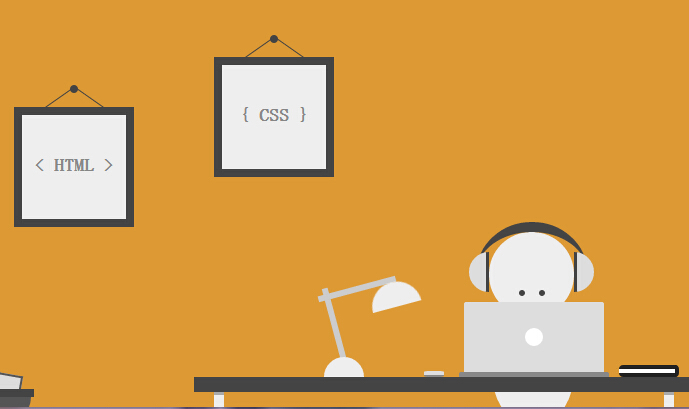
今天要给大家介绍一款纯css3实现的机器人看书动画效果。整个画面完全由css3实现的绘制,没有使用任何图片元素。机器人的眼睛使用了动画元素。我们一起看下效果图:
在线预览 源码下载
实现的代码。
html代码:
css代码:
注:本文爱编程原创文章,转载请注明原文地址:/article/1211800.html
在线预览 源码下载
实现的代码。
html代码:
<div class='szene'>
<div class='image i1'>
< HTML >
<div class='nail'>
</div>
</div>
<div class='image i2'>
{ CSS }
<div class='nail'>
</div>
</div>
<div class='head'>
<div class='eyes'>
</div>
</div>
<div class='body'>
</div>
<div class='table'>
</div>
<div class='laptop'>
</div>
<div class='mouse'>
</div>
<div class='notes'>
</div>
<div class='lamp'>
<div class='top'>
</div>
</div>
<div class='headphones'>
</div>
<div class='trash'>
<div class='paper p1'>
</div>
<div class='paper p2'>
</div>
<div class='paper p3'>
</div>
<div class='paper p4'>
</div>
</div>
</div>
css代码:
* {
margin: 0;
padding: 0;
-moz-box-sizing: border-box;
box-sizing: border-box;
}

*:before, *:after {
content: '';
display: block;
position: absolute;
-moz-box-sizing: border-box;
box-sizing: border-box;
}

html, body {
height: 100%;
}

body {
background: #d93;
}

.szene {
position: absolute;
left: 50%;
bottom: 0;
width: 800px;
height: 400px;
margin-left: -400px;
overflow: hidden;
}

.szene div {
position: absolute;
}

.image {
width: 120px;
height: 120px;
line-height: 100px;
text-align: center;
font-family: 'Open Sans', sans-serif;
font-size: 18px;
font-weight: 700;
color: #888;
border: 8px solid #444;
background: #eee;
}

.image.i1 { top: 100px; left: 100px; }
.image.i2 { top: 50px; left: 300px; }

.image .nail {
top: -30px;
left: 50%;
width: 8px;
height: 8px;
margin-left: -4px;
border-radius: 50%;
background: #444;
}

.image .nail:before,
.image .nail:after {
top: -5px;
width: 1px;
height: 35px;
background: #444;
}

.image .nail:before { left: -11px; -webkit-transform: rotate(55deg); -ms-transform: rotate(55deg); transform: rotate(55deg); }
.image .nail:after { left: 19px; -webkit-transform: rotate(-55deg); -ms-transform: rotate(-55deg); transform: rotate(-55deg); }

.head {
bottom: 90px;
left: 575px;
width: 85px;
height: 85px;
border-radius: 50%;
background: #eee;
}

.head .eyes {
top: 58px;
left: 30px;
width: 6px;
height: 6px;
border-radius: 50%;
background: #444;
box-shadow: 20px 0 0 #444;
-webkit-animation: 8s eyes ease infinite;
animation: 8s eyes ease infinite;
}

@-webkit-keyframes eyes {
0% { -webkit-transform: translate3d(0,0,0); transform: translate3d(0,0,0); }
5% { -webkit-transform: translate3d(0,-18px,0); transform: translate3d(0,-18px,0); }
10% { -webkit-transform: translate3d(0,-19px,0); transform: translate3d(0,-19px,0); }
15% { -webkit-transform: translate3d(-15px,-18px,0); transform: translate3d(-15px,-18px,0); }
20% { -webkit-transform: translate3d(-15px,-18px,0); transform: translate3d(-15px,-18px,0); }
25% { -webkit-transform: translate3d(15px,-18px,0); transform: translate3d(15px,-18px,0); }
30% { -webkit-transform: translate3d(15px,-18px,0); transform: translate3d(15px,-18px,0); }
35% { -webkit-transform: translate3d(0,-18px,0); transform: translate3d(0,-18px,0); }
40% { -webkit-transform: translate3d(0,-18px,0); transform: translate3d(0,-18px,0); }
45% { -webkit-transform: translate3d(0,0,0); transform: translate3d(0,0,0); }
100% { -webkit-transform: translate3d(0,0,0); transform: translate3d(0,0,0); }
}

@keyframes eyes {
0% { -webkit-transform: translate3d(0,0,0); transform: translate3d(0,0,0); }
5% { -webkit-transform: translate3d(0,-18px,0); transform: translate3d(0,-18px,0); }
10% { -webkit-transform: translate3d(0,-19px,0); transform: translate3d(0,-19px,0); }
15% { -webkit-transform: translate3d(-15px,-18px,0); transform: translate3d(-15px,-18px,0); }
20% { -webkit-transform: translate3d(-15px,-18px,0); transform: translate3d(-15px,-18px,0); }
25% { -webkit-transform: translate3d(15px,-18px,0); transform: translate3d(15px,-18px,0); }
30% { -webkit-transform: translate3d(15px,-18px,0); transform: translate3d(15px,-18px,0); }
35% { -webkit-transform: translate3d(0,-18px,0); transform: translate3d(0,-18px,0); }
40% { -webkit-transform: translate3d(0,-18px,0); transform: translate3d(0,-18px,0); }
45% { -webkit-transform: translate3d(0,0,0); transform: translate3d(0,0,0); }
100% { -webkit-transform: translate3d(0,0,0); transform: translate3d(0,0,0); }
}

.body {
bottom: -20px;
left: 578px;
width: 82px;
height: 110px;
border-radius: 0 0 50% 50%;
background: #eee;
}

.table {
bottom: 15px;
left: 280px;
width: 500px;
height: 15px;
background: #444;
}

.table:before,
.table:after {
top: 15px;
width: 10px;
height: 20px;
border-top: 3px solid #aaa;
background: #eee;
}

.table:before { left: 20px; }
.table:after { right: 20px; }

.laptop {
bottom: 35px;
left: 550px;
width: 140px;
height: 70px;
border-radius: 2px 2px 0 0;
background: #ddd;
}

.laptop:before {
top: 50%;
left: 50%;
width: 18px;
height: 18px;
margin: -9px 0 0 -9px;
border-radius: 50%;
background: #fff;
}

.laptop:after {
top: 70px;
left: -5px;
width: 150px;
height: 5px;
border-radius: 2px 2px 0 0;
background: #888;
}

.mouse {
bottom: 30px;
left: 510px;
width: 20px;
height: 6px;
border-bottom: 2px solid #888;
border-radius: 25%;
background: #ddd;
}

.notes {
bottom: 30px;
left: 705px;
width: 60px;
height: 12px;
background: #fff;
border: 4px solid #222;
border-radius: 4px;
border-left: 0;
}

.lamp {
bottom: 30px;
left: 410px;
width: 40px;
height: 20px;
border-radius: 80px 80px 0 0;
background: #eee;
}

.lamp:before,
.lamp:after {
z-index: -1;
width: 6px;
height: 80px;
background: #ccc;
}

.lamp:before { top: -70px; left: 8px; -webkit-transform: rotate(-15deg); -ms-transform: rotate(-15deg); transform: rotate(-15deg); }
.lamp:after { top: -108px; left: 30px; -webkit-transform: rotate(75deg); -ms-transform: rotate(75deg); transform: rotate(75deg) }

.lamp .top {
top: -75px;
left: 45px;
width: 50px;
height: 25px;
border-radius: 100px 100px 0 0;
background: #eee;
-webkit-transform: rotate(-15deg);
-ms-transform: rotate(-15deg);
transform: rotate(-15deg);
}

.headphones {
bottom: 85px;
left: 563px;
width: 110px;
height: 100px;
border-radius: 50%;
border-top: 10px solid #444;
}

.headphones:before,
.headphones:after {
width: 20px;
height: 40px;
top: 20px;
background: #ddd;
}

.headphones:before {
left: -8px;
border-radius: 80px 0 0 80px;
border-right: 3px solid #444;
}

.headphones:after {
right: -7px;
border-radius: 0 80px 80px 0;
border-left: 3px solid #444;
}

.trash {
bottom: 10px;
left: 20px;
width: 100px;
height: 8px;
background: #444;
}

.trash:after {
top: 8px;
left: 3px;
width: 94px;
height: 25px;
border-radius: 0 0 50px 50px;
background: #555;
}

.trash .paper {
z-index: -1;
width: 25px;
height: 50px;
border: 2px solid #555;
background: #ddd;
}

.trash .paper.p1 {
top: -15px;
left: 10px;
-webkit-transform: rotate(-20deg);
-ms-transform: rotate(-20deg);
transform: rotate(-20deg);
}

.trash .paper.p2 {
top: -12px;
left: 30px;
-webkit-transform: rotate(-40deg);
-ms-transform: rotate(-40deg);
transform: rotate(-40deg);
}

.trash .paper.p3 {
top: -15px;
left: 60px;
-webkit-transform: rotate(10deg);
-ms-transform: rotate(10deg);
transform: rotate(10deg);
}

.trash .paper.p4 {
top: -12px;
left: 30px;
-webkit-transform: rotate(65deg);
-ms-transform: rotate(65deg);
transform: rotate(65deg);
}注:本文爱编程原创文章,转载请注明原文地址:/article/1211800.html

相关文章推荐
- 一款纯css3实现的机器人看书动画效果
- 一款html5和css3实现的小机器人走路动画
- html5 css3实例教程 一款html5和css3实现的小机器人走路动画
- 一款html5和css3实现的小机器人走路动画
- CSS3 transition实现超酷图片墙动画效果
- HTML5 实现小车动画效果(Canvas/CSS3/JQuery)
- 纯CSS3实现给头像加个光芒四射且旋转的背景动画效果
- CSS3 transition实现超酷图片墙动画效果
- 一款用纯CSS3实现的自行车动画,酷炫屌!!
- 推荐9款使用CSS3实现的超酷动画效果
- 推荐9款使用CSS3实现的超酷动画效果
- CSS3+PNG实现GIF动画效果
- CSS3实现3D文字动画效果
- 纯CSS3实现滚动的齿轮动画效果
- 超慢速移动动画使用CSS3实现流畅效果
- 使用 CSS3 实现超炫的 Loading(加载)动画效果
- CSS3实现的图片加载动画效果
- CSS3实现的图片加载动画效果
- 纯CSS3实现带动画效果导航菜单无需js
- 使用 CSS3 实现超炫的 Loading(加载)动画效果