宽度高度不固定的div 如何水平居中以及垂直居中
2014-06-25 16:00
525 查看
宽度高度不固定div的水平居中演示如下:

水平居中代码:center居中
html部分
<div class="container">
<div class="center"><a href="#">1</a><a href="#">2</a><a href="#">3</a>
<div style="clear:both"></div>
</div>
css部分
.container{width:500px;height:80px;background:#C2300B;margin-left:50px;padding-top:10px;text-align:center;}
.center{display:inline-block;border:2px solid #fff;}
.center{_display:inline;} /*针对ie6 hack*/
.center a{float:left;border:1px solid #fff;padding:5px 10px;margin:10px;color:#fff;text-decoration:none;}
代码要点:
父容器container加css属性 text-align:center;
子容器center加css属性display:inline-block;
.center{_display:inline;} 为针对ie6的hack
宽度高度不固定的div垂直居中演示如下:
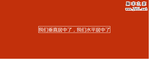
垂直居中代码:content居中
html部分
<div id="vc">
<div id="vci">
<div id="content">
我们垂直居中了,我们水平居中了
</div>
</div>
</div>
css部分
#vc { display:table; background-color:#C2300B; width:500px; height:200px; overflow:hidden; margin-left:50px; }
#vci { vertical-align:middle; display:table-cell; text-align:center; _position:absolute; _top:50%; _left:50%; }
#content { color:#fff; border:1px solid #fff; display:inline-block; _position:relative; _top:-50%; _left:-50%; }
代码要点:
父容器vc的css属性 display:table;overflow:hidden;
子容器vci的css属性 vertical-align:middle;display:table-cell;
针对ie6的hack,vci容器的 _position:absolute;_top:50%; 和content容器的 _position:relative; _top:-50%;
如果不需要水平居中的话,需要注释掉vci容器的text-align:center;_left:50%;以及content的display:inline-block;_left:-50%;
宽度高度固定的div垂直居中和水平居中

html部分
<div class="guding"><div class="gd">居中了</div></div>
css部分
.guding{width:500px;height:200px;background:#c2300b;margin-left:50px;position:relative;}
.gd{width:50px;height:20px;background:#fff;position:absolute;top:50%;left:50%;margin-top:-10px;margin-left:-25px;}
代码要点
父容器要用相对定位position:relative;否则的话子元素会相对于浏览器窗口进行绝对定位。
子容器绝对定位,top:50%;left:50%;margin-top,margin-left的值取该容器高度,宽度的一半的负值。
如果相对于浏览器窗口做水平垂直居中的话,比如需要大背景居中,代码如下
<style type="text/css">
body{background:#c12b02;}
.main{background:url(你的背景图片地址) no-repeat;width:1000px;height:800px;position:absolute;margin-top:-400px;margin-left:-500px;}//高度,宽度的一半的负值
</style>
<body>
<div class="main"></div>
</body>
水平居中代码:center居中
html部分
<div class="container">
<div class="center"><a href="#">1</a><a href="#">2</a><a href="#">3</a>
<div style="clear:both"></div>
</div>
css部分
.container{width:500px;height:80px;background:#C2300B;margin-left:50px;padding-top:10px;text-align:center;}
.center{display:inline-block;border:2px solid #fff;}
.center{_display:inline;} /*针对ie6 hack*/
.center a{float:left;border:1px solid #fff;padding:5px 10px;margin:10px;color:#fff;text-decoration:none;}
代码要点:
父容器container加css属性 text-align:center;
子容器center加css属性display:inline-block;
.center{_display:inline;} 为针对ie6的hack
宽度高度不固定的div垂直居中演示如下:
垂直居中代码:content居中
html部分
<div id="vc">
<div id="vci">
<div id="content">
我们垂直居中了,我们水平居中了
</div>
</div>
</div>
css部分
#vc { display:table; background-color:#C2300B; width:500px; height:200px; overflow:hidden; margin-left:50px; }
#vci { vertical-align:middle; display:table-cell; text-align:center; _position:absolute; _top:50%; _left:50%; }
#content { color:#fff; border:1px solid #fff; display:inline-block; _position:relative; _top:-50%; _left:-50%; }
代码要点:
父容器vc的css属性 display:table;overflow:hidden;
子容器vci的css属性 vertical-align:middle;display:table-cell;
针对ie6的hack,vci容器的 _position:absolute;_top:50%; 和content容器的 _position:relative; _top:-50%;
如果不需要水平居中的话,需要注释掉vci容器的text-align:center;_left:50%;以及content的display:inline-block;_left:-50%;
宽度高度固定的div垂直居中和水平居中
html部分
<div class="guding"><div class="gd">居中了</div></div>
css部分
.guding{width:500px;height:200px;background:#c2300b;margin-left:50px;position:relative;}
.gd{width:50px;height:20px;background:#fff;position:absolute;top:50%;left:50%;margin-top:-10px;margin-left:-25px;}
代码要点
父容器要用相对定位position:relative;否则的话子元素会相对于浏览器窗口进行绝对定位。
子容器绝对定位,top:50%;left:50%;margin-top,margin-left的值取该容器高度,宽度的一半的负值。
如果相对于浏览器窗口做水平垂直居中的话,比如需要大背景居中,代码如下
<style type="text/css">
body{background:#c12b02;}
.main{background:url(你的背景图片地址) no-repeat;width:1000px;height:800px;position:absolute;margin-top:-400px;margin-left:-500px;}//高度,宽度的一半的负值
</style>
<body>
<div class="main"></div>
</body>

相关文章推荐
- 宽度高度不固定的div 如何水平居中以及垂直居中
- 宽度高度不固定的div,如何水平居中以及垂直居中
- 宽度高度不固定的div如何水平居中与垂直居中(转)
- 父元素为一个div,宽度高度不固定,子元素是一个块状元素,宽高已知,如何实现子元素在父元素内水平、垂直居中?
- css实现高度不固定的div元素模块在页面中水平垂直居中
- 如何让div水平居中以及垂直居中,在宽高不定的情况下
- 固定宽度 高度的页面在不同分辨率的屏幕上垂直 水平居中
- 假如有一个固定高度的div,如何让里面的一个图片垂直居中?
- div宽高度不限自适应,如何垂直水平居中
- CSS中如何把Span标签等行内元素设置为固定宽度及div中内容垂直居中
- css样式实现左边的固定宽度和高度的图片或者div跟随右边高度不固定的文字或者div垂直居中(文字高度超过图片,图片跟随文字居中,反之文字跟随图片居中非table实现)
- 未知div宽度高度使div水平垂直居中(弹性盒子方法)
- css实现高度或者宽度不固定的div元素垂直左右居中
- 如何让div水平居中以及垂直居中,在宽高不定的情况下
- 如何让高度、宽度不定的容器保持水平、垂直居中
- DIV未知宽度高度垂直水平居中
- 高度和宽度不固定元素水平和垂直居中的实现(父元素高度和宽度固定)(完美解决兼容问题)
- 如何让DIV里面的DIV水平垂直居中
- div 垂直居中 解决方案(一行,多行,固定高度)
- 如何让一个不固定高宽的图片,垂直和水平居中在页面中间?