Android开发 常用控件罕见特殊属性集锦
2014-02-13 14:19
645 查看
1.TextView
TextView效果集锦:http://gundumw100.iteye.com/blog/974557
<1>自定义字体类型
布局文件中使用代码: 如
系统自带三种类型:normal(正常)、bold(粗体)、italic(斜体):
android:textStyle="normal"
Activity文件中使用代码: 如textView.setTypeface(Typeface.DEFAULT_BOLD,Typeface.BOLD_ITALIC
需要引用第三方.ttf格式字体文件时:
//字体库文件fontName.ttf放置于assets/fonts路径下
Typeface typeface = Typeface.createFromAsset(getAssets(), "fonts/shizhuangbianhuati.ttf");
textView.setTypeface(typeface);
字体浏览下载网站:http://font.chinaz.com/
GitHub自定义字体类库Calligraphy:
GitHub地址:https://github.com/chrisjenx/Calligraphy
相关博文:http://www.gimoo.net/t/1502/54ec4bab63655.html
附件:25款好看的液晶数字字体
http://www.cnblogs.com/lhb25/archive/2013/02/18/free-digitallcd-fonts-for-designers.html
http://newhtml.net/50%E6%AC%BEled%E5%AD%97%E4%BD%93%E6%8E%A8%E8%8D%90/<2>文本旁边搁置图片资源

代码中设置drawable如下:
Drawable drawable = getResources().getDrawable(R.drawable.img);
drawable.setBounds(0, 0, drawable.getMinimumWidth(), drawable.getMinimumWidth());
textView.setCompoundDrawables(drawable, null, null, null);
从源码中可以看出:
public void setCompoundDrawables (Drawable left, Drawable top, Drawable right, Drawable bottom)
Since: API Level 1
Sets the Drawables (if any) to appear to the left of, above, to the right of, and below the text. Use null if you do not want a Drawable there. The Drawables must already have had setBounds(Rect) called.
这个Drawables必须已经调用过了setBounds。
<3>多行文本 末尾显示省略号
android:lines="2"android:ellipsize="end"
注意:1. 当字符串内容不包含中文汉字时,只有英文字母和数字的情况下,如日期“yyyy-MM-dd HH:mm:ss”的情况下,省略号(...)将变成一个点(.);
2. maxLength和ellipsize属性配合使用并不能达到依据字数判断,超出部分末尾显示省略号的效果,只能通过代码截取字符串并拼接省略号来达到:
/**
* 最大字数截取,末尾展示省略号
* @param mContext
* @param textView
* @param contentStr
*/
public static void dealStringWithMaxLength(Context mContext, TextView textView, String contentStr) {
int maxLength = mContext.getResources().getInteger(R.integer.length_max_review);
String tempStr = "";
if (contentStr.length() > maxLength) {
tempStr = contentStr.substring(0, maxLength) + "...";
}else {
tempStr = contentStr;
}
textView.setText(tempStr);
}
对于maxEms属性:em是一个印刷排版的单位,表示字宽的单位。 em字面意思为:equal M (和M字符一致的宽度为一个单位)简称em。ems表示其复数形式。使用情景较为复杂,不推荐使用,详情参考:Android 开发者,你真的会用textview(maxEms和maxLength)的属性吗?
<4>android:includeFontPadding="false"属性
设计安卓界面的时候我发现一个TextView在布局上占用的高度和属性textSize的大小不一样,要比textSize要来的大(比如textSize="12dp",实际的高度大概有14-16dp),仔细看的话会发现文字的上方和下发留有空白。android:includeFontPadding 为上标和下标留出足够的空间,以取代字体上下标.默认为true.
注意:如果使用如下代码:
<Button
android:id="@+id/combination_supervise_btn"
android:layout_width="wrap_content"
android:layout_height="wrap_content"
android:layout_above="@id/combination_bottom_percent_tv"
android:layout_centerHorizontal="true"
android:drawableLeft="@drawable/ic_supervise"
android:drawablePadding="@dimen/text_line_space"
android:padding="@dimen/text_line_space"
android:text="@string/fund_supervise"
style="@style/AppSmallTextStyle"
android:background="@null"
android:includeFontPadding="true"/>
图标

和 文字不会垂直居中,仔细看会发现图标的顶部比文字高出一部分,然而设置android:includeFontPadding="false"之后,就会实现真正意义上的center_vertical了!
<5>文字雕刻效果
添加属性:android:shadowColor="@color/red" android:shadowDx="0" android:shadowDy="-2" android:shadowRadius="0.1"
<6>跑马灯效果
android:singleLine="true"
android:ellipsize="marquee"
android:focusable="true"
android:focusableInTouchMode="true"
android:marqueeRepeatLimit="marquee_forever"
<7>inputType属性大全
文本类型,多为大写、小写和数字符号android:inputType="none"android:inputType="text"android:inputType="textCapCharacters" 字母大写android:inputType="textCapWords" 首字母大写android:inputType="textCapSentences" 仅第一个字母大写android:inputType="textAutoCorrect" 自动完成android:inputType="textAutoComplete" 自动完成android:inputType="textMultiLine" 多行输入android:inputType="textImeMultiLine" 输入法多行(如果支持)android:inputType="textNoSuggestions" 不提示android:inputType="textUri" 网址android:inputType="textEmailAddress" 电子邮件地址android:inputType="textEmailSubject" 邮件主题 android:inputType="textShortMessage" 短讯android:inputType="textLongMessage" 长信息android:inputType="textPersonName" 人名android:inputType="textPostalAddress" 地址android:inputType="textPassword" 密码android:inputType="textVisiblePassword" 可见密码android:inputType="textWebEditText" 作为网页表单的文本android:inputType="textFilter" 文本筛选过滤android:inputType="textPhonetic" 拼音输入数值类型android:inputType="number" 数字android:inputType="numberSigned" 带符号数字格式android:inputType="numberDecimal" 带小数点的浮点格式android:inputType="phone" 拨号键盘android:inputType="datetime" 时间日期android:inputType="date" 日期键盘android:inputType="time" 时间键盘2.Button
01. 默认高度问题Button是TextView的子类,但是Button默认设置了最小高度,所以,在使用自定义backgroud属性时,当paddingTop和paddingBottom设置的值小于这个默认最小高度时,paddingTop和paddingBottom的设置是无效的,此时,解决办法如下,设置minHeight为0:android:minHeight="0dp"02. 5.0系统自带阴影问题在5.0及更高版本系统中,Button等部分控件会自带边界阴影效果,可通过如下属性设置取消默认样式:
style="?android:attr/borderlessButtonStyle"参考地址:https://developer.android.com/guide/topics/ui/controls/button.html
2.Dialog窗口
<1>AlertDialog自定义布局文件使用setview方法可以设置布局文件和alertdialog四周边框的距离,可以消除黑边框:alertdialog.setView(view, 0, 0, 0, 0); <2>Dialog自定义布局文件使用样式文件,在values 目录下新建styles.xml文件,编写如下代码:<strong><style name="dialog" parent="@android:style/Theme.Dialog"> <item name="android:windowFrame">@null</item> <item name="android:windowIsFloating">true</item> <item name="android:windowIsTranslucent">false</item> <item name="android:windowNoTitle">true</item> <item name="android:background">@android:color/black</item> <item name="android:windowBackground">@null</item> <item name="android:backgroundDimEnabled">false</item> </style> </strong>然后在Activity中调用:
<strong>Dialog dialog =  new Dialog(SetActivity.this, R.style.dialog);
dialog.setContentView(R.layout.test);</strong>
注意:
一:Dialog的ContentView的根布局采用RelativeLayout和LinearLayout将会出现两个两种不同的Dialog展示效果,最好使用LinearLayout,配合设置layoutParam的宽高使用: android.view.WindowManager.LayoutParams lParams = dialog.getWindow().getAttributes();
lParams.width = Utils.getScreenWidth(context);
lParams.height = android.view.WindowManager.LayoutParams.WRAP_CONTENT;
lParams.gravity = Gravity.TOP;
二:Dialog中包含EditText控件时,如果需要展示软键盘,需要如下设置:dialog.getWindow().setSoftInputMode(WindowManager.LayoutParams.SOFT_INPUT_STATE_ALWAYS_VISIBLE);
三:当 Dialog 的Content View 中使用 ViewPager 时,高度自适应就成了问题。就算设置 lParams.height = android.view.WindowManager.LayoutParams.WRAP_CONTENT,也解决不了高度充满屏幕的问题。此时的做法就是,自定义一个 ViewPager,重新 onMeasure() 方法:
public class WrapHeightViewPager extends ViewPager {

public WrapHeightViewPager(Context context) {
super(context);
}

public WrapHeightViewPager(Context context, AttributeSet attrs) {
super(context, attrs);
}

@Override
protected void onMeasure(int widthMeasureSpec, int heightMeasureSpec) {

int height = 0;
for(int i = 0; i < getChildCount(); i++) {
View child = getChildAt(i);
child.measure(widthMeasureSpec, MeasureSpec.makeMeasureSpec(0, MeasureSpec.UNSPECIFIED));
int h = child.getMeasuredHeight();
if(h > height) height = h;
}

heightMeasureSpec = MeasureSpec.makeMeasureSpec(height, MeasureSpec.EXACTLY);

super.onMeasure(widthMeasureSpec, heightMeasureSpec);
}

}
可参考地址:StackOverFlow Android: I am unable to have ViewPager WRAP_CONTENT
3.EditText
<1>设置EditText默认无焦点方法一:在EditText之前创建一个不可见的(invisible)LinearLayout,LinearLayout将会把焦点从EditText上移走。
<LinearLayout
android:focusable="true"
android:focusableInTouchMode="true"
android:layout_width="0px"
android:layout_height="0px" />
方法二:随便在你的xml里面找一个widget,比较好的选择是那种不用响应事件的控件,比如textview等。
然后就给这个textview加上如下两个属性(红色部分)就ok,这个textview只要是在同一个xml中就行,不用非得和edittext在同一个父控件内部。
android:focusable="true"
android:focusableInTouchMode="true"
<2>设置EditText的软键盘 回车键特殊功能
若是布局中包含多个EditText,可认为每个EditText控件设置android:singleLine=”true”,弹出的软盘输入法中回车键为next(下一步),直到最后一个获取核心后显示为Done(完成)。点击Done后,隐蔽软键输入盘。将EditText的imeOptions属性设置android:imeOptions=”actionDone”,则不管是不是最后一个EditText,点击回车键即隐蔽输入法。(故,当设置actionDone属性时,
EditText无法响应监听onKeyEvent和onActionEditorListener事件!)
把EditText的Ime Options属性设置成不同的值,Enter键上可以显示不同的文字或图案。
google 供给了 EditorInfo、KeyEvent 的一些办法,具体可研究:EditorInfo.class 和 KeyEvent.class.
actionNone : 回车键,按下后光标到下一行
actionGo : Go,
actionSearch : 一个放大镜
actionSend : Send
actionNext : Next
actionDone : Done,隐蔽软键盘,即使不是最后一个文本输入框
常用的常量值如下:actionUnspecified 未指定,对应常量EditorInfo.IME_ACTION_UNSPECIFIED.结果:

actionNone 没有动作,对应常量EditorInfo.IME_ACTION_NONE 结果:
actionGo 去往,对应常量EditorInfo.IME_ACTION_GO 结果:

actionSearch 搜刮,对应常量EditorInfo.IME_ACTION_SEARCH 结果:

actionSend 发送,对应常量EditorInfo.IME_ACTION_SEND 结果:

actionNext 下一个,对应常量EditorInfo.IME_ACTION_NEXT 结果:

actionDone 完成,对应常量EditorInfo.IME_ACTION_DONE 结果:

注意:必须配合android:inputType="text" 和 android:singleLine="true"至少其中的一个一起使用才能奏效
然后在代码中,设置监听事件:
mInputEdt.setOnKeyListener(new OnKeyListener() {
@Override
public boolean onKey(View v, int keyCode, KeyEvent event) {
//如果不添加"&& event.getAction() == KeyEvent.ACTION_UP",出现回车符点击事件执行两次的问题,action_down和action_up执行事件
if (keyCode == KeyEvent.KEYCODE_ENTER && event.getAction() == KeyEvent.ACTION_UP) {
mSendBtn.performClick();
}
return false;
}
});或者
mSearchEdt.setOnEditorActionListener(new OnEditorActionListener() {
@Override
public boolean onEditorAction(TextView v, int actionId, KeyEvent event) {
if (actionId == EditorInfo.IME_ACTION_SEARCH) {
mSearchBtn.performClick();
}
return false;
}
});
注意:
1. 返回值问题
onKeyListen()方法中return true,在软键盘处于隐藏状态 并且 EditText获得焦点的情况下,返回键将失效,即当前activity中onKeyDown事件不会执行(常见问题如:不能返回之前页面);
2.适配问题:
setOnEditorActionListener()方法不容易适配,
如当前输入法不是内置输入法,而是其他第三方输入法,那么可能会产生软件盘回车键无响应的问题。
针对于部分定制手机(如小米MI 2),return false将会导致onEditorAction内容执行两次,而
return true针对于Mi 3等手机会执行两次,所以,为适配起见,建议使用setOnKeyListen方法!
补充一点:android:imeOptions="flagNoExtractUi"
当我们手机横屏时,且用Android自带的软键盘为Edittext进行文本输入时,若不进行特殊的设置,该软盘会默认占用整个界面,当在EditText中设置上面这个属性时,可以避免这个问题!
<3>修改光标颜色
android:textCursorDrawable这个属性是用来控制光标颜色的
当值使用@null时,表示让光标颜色和text color颜色保持一致!
<3>修改光标位置
Android 的 EditText 控件默认获取焦点的时候, 插入光标是在第一个位置的,如果EditText中设置了文本,
这个时候光标是在文本的最前面, 而不是文本的最后.
为了方便用户使用, 需要把光标移动到文本最后, 但是EditText 没有提供 setCursor 函数.
经查看其文档 发现 setSelection 函数可以完成该功能. 如下:
mEditText.setSelection(mEditText.getText().toString().length());
<4>编辑框输入监听事件,举例银行卡账号输入框:每隔4位一个空格符
1.设置键盘输入属性 android:inputType="number|text"
2.添加监听事件:
private final int CARD_NUM_DIVIDER_LENGTH = 4;
private final String CARD_NUM_DIVIDER_STRING = " ";
mCardNumEdt.addTextChangedListener(new TextWatcher() {
@Override
public void onTextChanged(CharSequence s, int start, int before, int count) {
<strong>if (s.length() < CARD_NUM_DIVIDER_LENGTH) {
return;
}
if (count>1) {
return;
}</strong>
char[] charArray = s.toString().replace(CARD_NUM_DIVIDER_STRING, "").toCharArray();
StringBuffer sBuffer = new StringBuffer();
for (int i = 0; i < charArray.length; i++) {
if (i!=0 && i%CARD_NUM_DIVIDER_LENGTH == 0) {
sBuffer.append(CARD_NUM_DIVIDER_STRING);
sBuffer.append(charArray[i]);
}else {
sBuffer.append(charArray[i]);
}
}
mCardNumEdt.setText(sBuffer);
mCardNumEdt.setSelection(sBuffer.length());
}
@Override
public void beforeTextChanged(CharSequence s, int start, int count,
int after) {
}
@Override
public void afterTextChanged(Editable s) {
}
});注意事项:
如果去掉上述代码中的return判断,会出现java.lang.StackOverflowError(调用函数堆栈溢出)错误,由于setText()函数的调用本身就会回调监听器,递归函数没有出口,结果导致堆栈溢出!
<5> EditText底部与键盘顶部间距问题
在设置windowSoftInputType为adjustXXX等之后,通常,界面弹出软键盘,需要系统调整布局位置大小时,
都会调整至EditText底部与软键盘顶部相邻,便于用户输入。
但是如果EditText不适用paddingBottom属性,效果如左图:

左图:使用marginBottom控制EditText文本与底边分隔线
右图:使用paddingBottom控制EditText文本与底部分隔线
但是,左图弹出软键盘时,输入文本举例软键盘padding为0,而右图显然不是,用户体验不如右图好!
并且,用户点击EditText的响应区域高度也没有右图高,所以,
开发中,尽量使用Padding控制EditText的文本content举例EditText的background底部举例!
注意:一般用户都没有使用google原生输入法,较多使用第三方输入法键盘,如搜狗输入法,
导致普通设置无法自动弹出软键盘,故对于如下布局(左)想达到右图效果:

必须在布局文件中嵌入可伸缩性容器,如:
<ScrollView
android:layout_width="match_parent"
android:layout_height="wrap_content"></ScrollView>
同时可以在manifest.xml文件中配置android:windowSoftInputMode="stateAlwaysVisible"属性!
<6>通过代码控制EditText的最大字符长度
mEditText.setFilters(new InputFilter[]{ new InputFilter.LengthFilter(10)});
<7>EditText限制输入内容
开发中,对于用户名、昵称、个性签名等短字符串,经常需要对EditText的长度进行控制。
但是Java中的String.length不区分汉字和符号、数字、英文字母,比如一个汉字和一个字母对于String的length都是1,
但是显示在设备中,汉字所占的屏幕宽度比字母要宽,为了达到界面美观的目的,可以通过字符所占字节数限制汉字
和字母的各自能够输入的最大个数。
如微信个性签名(只允许输入30个字符,两个字母代表一个字符,
但是如果单数(如一个)字母或符号后面紧跟着汉字,采取四舍五入方法,算作2个字符)!

参考代码(四舍五入有待完善,应使用0.5和1,而不是1和2):
/**
* 正则表达式:字符串内容限制为 汉字、英文字符和数字
* @param testChar
* @return
*/
public static boolean checkIsLetterOrChineseOrNumber(char testChar) {
Pattern p = Pattern.compile("^[a-zA-Z0-9\u4e00-\u9fa5]+$");
Matcher matcher = p.matcher(String.valueOf(testChar));
return matcher.matches();
}
/**
* 计算字符串所占字节长度
* 一个汉字占两个字节,英文字符和数字占一个字节,使用ASSIC编码(ASSIC编码不包含汉字)
* @return
*/
public static double calculateLength(CharSequence c) {
double len = 0;
for (int i = 0; i < c.length(); i++) {
int tmp = Integer.valueOf(c.charAt(i));
if (tmp > 0 && tmp < 127) {
len += 1;
} else {
len += 2;
}
}
return len;
}
mNameEdt.addTextChangedListener(new TextWatcher() {

@Override
public void onTextChanged(CharSequence s, int start, int before, int count) {

}

@Override
public void beforeTextChanged(CharSequence s, int start, int count,
int after) {

}

@Override
public void afterTextChanged(Editable s) {
mNameEdt.removeTextChangedListener(this);
for (int i = 0; i < s.length(); i++) {
if (!StringUtils.checkIsLetterOrChineseOrNumber(s.charAt(i)) ||
StringUtils.calculateLength(s.toString().substring(0, i+1))>12) {
mNameEdt.setText(s.toString().substring(0, i));
mNameEdt.setSelection(i);
break;
}
}
mNameEdt.addTextChangedListener(this);
}
});
}
注意:在TextWatcher中涉及当前EditText的setText操作时,一定要进行TextWatcher事件的remove和add操作,否则堆栈溢出!
<7>点击EditText和软键盘之外的区域,隐藏软键盘
在Activity中添加重写dispatchTouchEvent方法:
@Override
public boolean dispatchTouchEvent(MotionEvent ev) {
//TODO hideSoftKeyboard
return super.dispatchTouchEvent(ev);
}
拓展:Android事件分发机制完全解析
4.ImageView
<1>缩放类型scaleType的属性值有:matrix fitXY fitStart fitCenter fitEnd center centerCrop centerInside
它们之间的区别如下:matrix 用矩阵来绘制(从左上角起始的矩阵区域)
fitXY 把图片不按比例扩大/缩小到View的大小显示(确保图片会完整显示,并充满View)
fitStart 把图片按比例扩大/缩小到View的宽度&高度,显示在View的上部分位置(图片会完整显示)
fitCenter 把图片按比例扩大/缩小到View的宽度,居中显示(图片会完整显示)
fitEnd 把图片按比例扩大/缩小到View的宽度,显示在View的下部分位置(图片会完整显示)
center 按图片的原来size居中显示,当图片宽超过View的宽,则截取图片的居中部分显示,当图片宽小于View的宽,则图片居中显示
centerCrop 按比例扩大/缩小图片的size居中显示,使得图片的高等于View的高,使得图片宽等于或大于View的宽
centerInside 将图片的内容完整居中显示,使得图片按比例缩小或原来的大小(图片比View小时)使得图片宽等于或小于View的宽 (图片会完整显示)
附上两张实验的截图:
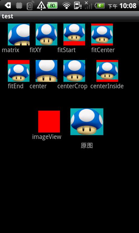
图1: 图片比ImageView大的截图
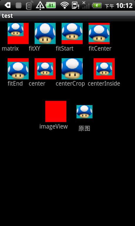
图2: 图比ImageView小 实验截图
补充:android:adjustViewBounds="true"属性:是否保持高宽比。ImageView限定宽度或者高度中的一个属性后,另一个属性是否自动调整以保持图片的高宽比例!常用于显示广告Banner图:宽度设为match_parent,高度设为wrap_content,广告图使用最大尺寸如1080*1920,这样不会出现各种适配问题!
<2>图片触摸变暗效果
有时需要ImageView实现点击按下图片变暗效果时(如GridView的item中含有ImageView,由于此处imageview图片不是固定的,不可能像Button那样在background中使用selector),可以使用类似PS滤镜效果,改变imageivew的src图片(不是backgroud)颜色值:
private void changeLight(ImageView imageview, int brightness) {
ColorMatrix matrix = new ColorMatrix();
matrix.set(new float[] { 1, 0, 0, 0, brightness, 0, 1, 0, 0,
brightness, 0, 0, 1, 0, brightness, 0, 0, 0, 1, 0 });
imageview.setColorFilter(new ColorMatrixColorFilter(matrix));

}

public OnTouchListener onTouchListener = new View.OnTouchListener() {
@Override
public boolean onTouch(View view, MotionEvent event) {
switch (event.getAction()) {
case MotionEvent.ACTION_UP:
changeLight((ImageView) view, 0);
// 可以在此处实现onclick事件
break;
case MotionEvent.ACTION_DOWN:
changeLight((ImageView) view, -80);
break;
case MotionEvent.ACTION_MOVE:
// changeLight(view, 0);
break;
case MotionEvent.ACTION_CANCEL:
changeLight((ImageView) view, 0);
break;
}
return false;
}
};
注意:经过测试,GridView中的item项中,ImageView使用ontouch事件后,如果返回false,会导致GirdView的onItemClick事件失效,因为
onTouch中的action_up事件并没有执行,解决办法:onTouch事件中return true,然后在Action_up中添加点击事件。
其实,上述实现了属性android:tint的功能,如果针对android:tint属性直接使用selector功能,则无法实现按下等状态变化时图片着色功能!
错误如下:If we set a ColorStateList in the attribute tint of an ImageView, the application crash we a NumberFormatException.
解决方案,自定义ImageView如下:
Extend ImageView and wrap drawableStateChanged() with code that sets the tint based on the new state:TintableImageView.java
package com.example.widgets;

import android.content.Context;
import android.content.res.ColorStateList;
import android.content.res.TypedArray;
import android.util.AttributeSet;
import android.widget.ImageView;

import com.example.R;

public class TintableImageView extends ImageView {

private ColorStateList tint;

public TintableImageView(Context context) {
super(context);
}

public TintableImageView(Context context, AttributeSet attrs) {
super(context, attrs);
init(context, attrs, 0);
}

public TintableImageView(Context context, AttributeSet attrs, int defStyle) {
super(context, attrs, defStyle);
init(context, attrs, defStyle);
}

private void init(Context context, AttributeSet attrs, int defStyle) {
TypedArray a = context.obtainStyledAttributes(attrs, R.styleable.TintableImageView, defStyle, 0);
tint = a.getColorStateList(R.styleable.TintableImageView_tint);
a.recycle();
}

@Override
protected void drawableStateChanged() {
super.drawableStateChanged();
if (tint != null && tint.isStateful())
updateTintColor();
}

public void setColorFilter(ColorStateList tint) {
this.tint = tint;
super.setColorFilter(tint.getColorForState(getDrawableState(), 0));
}

private void updateTintColor() {
int color = tint.getColorForState(getDrawableState(), 0);
setColorFilter(color);
}

}
Define a custom attribute:attrs.xml<?xml version="1.0" encoding="UTF-8"?> <resources> <declare-styleable name="TintableImageView"> <attr name="tint" format="reference|color" /> </declare-styleable> </resources>Use the widget and custom attribute with your local namespace instead of Android's:example_layout.xml
<?xml version="1.0" encoding="UTF-8"?>
<LinearLayout xmlns:android="http://schemas.android.com/apk/res/android"
xmlns:app="http://schemas.android.com/apk/res-auto"
android:layout_width="match_parent"
android:layout_height="match_parent"
android:orientation="horizontal">

<com.example.widgets.TintableImageView
android:layout_width="wrap_content"
android:layout_height="wrap_content"
android:src="@drawable/example"
app:tint="@color/color_selector"/>

</LinearLayout>
You can then use a colour selector like happydude suggested:color_selector.xml
<?xml version="1.0" encoding="utf-8"?> <selector xmlns:android="http://schemas.android.com/apk/res/android"> <item android:state_pressed="true" android:color="@color/pressed_color"/> <item android:color="#00000000"/> </selector>参考链接:http://stackoverflow.com/questions/11095222/android-imageview-change-tint-to-simulate-button-click
至于Android中的事件传递机制参考:
http://blog.csdn.net/jiangwei0910410003/article/details/17504315
http://blog.csdn.net/tanqiantot/article/details/21104645
http://blog.sina.com.cn/s/blog_61f4999d0100kygr.html
<2>为ImageView添加手势问题
类似于ImageView、TextView等控件,不同于Button、ImageButton等本身即可点击的控件,在给ImageView添加手势等点击之类的事件时,有时会失去效果,可以在布局相应文件中添加属性:android:clickable="true"
5.ListView
[b]一:Adapter的刷新机制:invalidate()与postInvalidate()[/b]1.invalidate()方法必须在UI线程中调用,通常使用方法如下:实例化一个Handler对象,并重写handleMessage方法调用invalidate()实现界面刷新;而在非UI线程中通过sendMessage发送界面更新消息。2.使用postInvalidate则比较简单,不需要handler,直接在异步线程中调用postInvalidate即可。注意:adapter的刷新,不能直接重新new一个新的adapter对象,应该改变与adapter对象绑定的数据源;否则调用以上方法无效!与adapter绑定的数据源如Arraylist如果使用了clear清楚数据的方法,之后重新使用赋值符号"="赋值,将会导致Adapter.notifyDataSet
Changed()方法无效,因为arraylist的引用发生变化啦!此时应该使用list.addAll(collection)方法改变list数据!
二:listview Item包含特殊控件 焦点问题
当ListView的Item包含EditText、Button等特殊控件时,在Item布局的相应子控件中添加android:focusable="false"属性即可;当ListView嵌套GridView时,需要在ListView的Item根布局控件中添加android:descendantFocusability="blocksFocusability"。否则,ListView的onItemClick事件将失效。
beforeFocusability viewgroup在子项处理之前获得焦点afterFocusability viewGroup在子项处理之后获得焦点blocksFocusability viewGroup阻止子项获得焦点
(注意:千万别在item布局中的根布局属性中添加android:clickable="true"属性,否则item将永远失去焦点,导致listview的onItemClick事件失去作用!)
android:descendantFocusability
Defines the relationship between the ViewGroup and its descendants when looking for a View to take focus.Must be one of the following constant values.
三:ListView几个特殊属性介绍
1.android:cacheColorHint="#00000000"当使用android:background="@drawable/bg"属性改变ListView背景颜色后,拖动,或者点击list空白位置的时候发现ListItem都变成黑色的了,破坏了整体效果,如下图所示:

这是为什么呢?
这个要从Listview的效果说起,默认的ListItem背景是透明的,而ListView的背景是固定不变的,所以在滚动条滚动的过程中如果实时地去将当前每个Item的显示内容跟背景进行混合运算,所以android系统为了优化这个过程用,就使用了一个叫做android:cacheColorHint 的属性,在黑色主题下默认的颜色值是#191919,所以就出现了刚才的画面,有一半是黑色的
那怎么办呢?
如果你只是换背景的颜色的话,可以直接指定android:cacheColorHint 为你所要的颜色,如果你是用图片做背景的话,那也只要将android:cacheColorHint 指定为透明(#00000000)就可以了。
2.android:listSelector="@null" 有时@null并不能起作用,可使用:android:listSelector="@android:color/transparent",即android:listSelector="#00000000"当你不使用android:listSelector属性,默认会显示选中的item为橙黄底色,有时候我们需要去掉这种效果:

常犯细节错误:1.有时设置listSelector为特定颜色之后,发现点击或者选中效果无效,检查是不是在item的根布局或者子元素设置了背景色呢(列表的Item布局match_parent,listSelector的效果被item内容挡住)!android:drawSelectorOnTop="false"属性:
When set to true, the selector will be drawn over the selecteditem. Otherwise the selector is drawn behind the selected item. Thedefault value is false.当设置为true,selector 将绘制在被点击item的上面,反之绘制在被点击item的下面,默认为false。android:drawSelectorOnTop="true" 点击某一条记录,颜色会显示在最上面,记录上的文字被遮住,所以点击文字不放,文字就看不到android:drawSelectorOnTop="false"点击某条记录不放,颜色会在记录的后面,成为背景色,但是记录内容的文字是可见的
2.有时ListView需要在初始化好数据后,其中一项需要呈选中状态。所谓"选中状态"就是该项底色与其它项不同,setSelection(position)只能定位到某个item,但是无法改变底色呈高亮。setSelection(position)只能让某个item显示在可见Item的最上面(如果Item超过一屏的话)! 就是所谓的firstVisibleItem啦!此时,可以通过在Adapter中设置一个selectedPosition变量,提供对外调用接口,在getView()方法这进行position的if-else判断,以此来更改选中状态切换时item的改变!注意:setOnItemClickListener有时并不且作用,需要使用onItemClickListener方法!
3.当没有设置android:listSelector属性时,ListView、GridView等列表控件会绘制内边距,导致Item布局不能与该控件四个顶部对齐,此时,只需要设置android:listSelector属性即可,因为这些控件默认设置了listSelector属性!
3.android:fadingEdge="none"
android:fadingEdgeLength="0dp"
去掉ListView边缘模糊效果;
4.android:overScrollMode="never"
当滑动到上下边界的时候,如果再滑动,就会触发这个效果,产生渐变效果,如下图:

在资源文件里,是overscroll_edge跟overscroll_glow。
关闭方法一,在xml中设置属性
android:overScrollMode=”never”
关闭方法二,使用代码
setOverScrollMode(OVER_SCROLL_NEVER)当然..API要求大于: API Level 9..说明这一切都是2.3以后的东西..
所以果断要做一个版本判断public static int getAndroidSDKVersion() {
int version;
try {
version = Integer.valueOf(android.os.Build.VERSION.SDK);
} catch (NumberFormatException e) {
Log.e(e.toString());
}
return version;
}
5.android:stackFromBottom="true"
android:transcriptMode="alwaysScroll" 经常需要用ListView或者其它显示大量Items的控件实时跟踪或者查看信息,并且希望最新的条目可以自动滚动到可视范围内。通过设置控件transcriptMode属性可以将Android平台的控件(支持ScrollBar)自动滑动到最底部。
setTranscriptMode(ListView.TRANSCRIPT_MODE_...):
Puts the list or grid into transcript mode. In this mode the list or grid will always scroll to the bottom to show new items.
setStackFromBottom(boolean stackFromBottom):
When stack from bottom is set to true, the list fills its content starting from the bottom of the view.
6.android:divider="@color/gray" 设置分隔符的颜色或者背景图片
android:dividerHeight="1dp" [b]设置分隔符的高度[/b]
android:footerDividersEnabled="true" 多个HeaderView中绘制分隔符,缺省值为true
android:headerDividersEnabled="true" [b]多个FooterView中绘制分隔符,缺省值为true 注意:使用问题如下[/b]
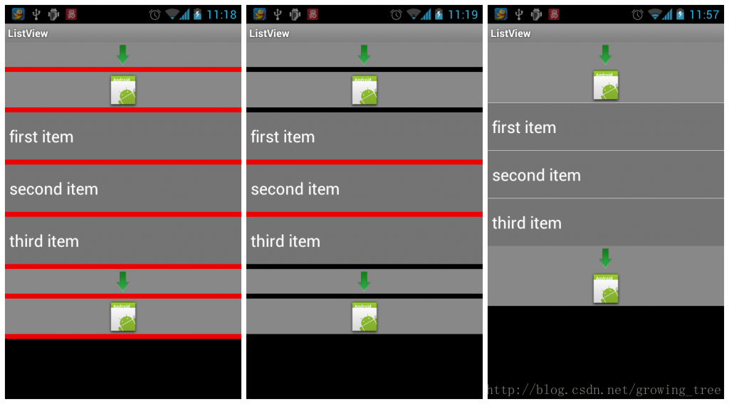
设置footerDividersEnabled和[b]headerDividersEnabled属性为true时,效果图如上图第一张;[/b][b] [b]设置footerDividersEnabled和headerDividersEnabled属性为false时,效果图如上图第二张(分割线没啦,但是位置留着);[/b][/b] 在上述基础上,设置[b]android:divider="[b]@null"后,效果图如上图第三张(header和footer的view中没有分割线)[/b][/b][b][b] 所以如果需要实现list item中有第一张图的分割线,header和footer中view中实现第三张图那样,没有分割线,怎么实现呢???[/b][/b]
四:ListView几个特殊方法介绍
ListView.getChidCount()返回的是当前显示的Item个数ListView.getCount()在没有headerView和footerView时等同于adapter.getCount();注意:ListView在setAdapter后,如果立马获取count,返回结果会为0!因为listview是异步加载的,立马获取数量是不能够获取到的,可以用post方法来处理mListView.post(new Runnable() {
@Override
public void run() {
if (mListView.getCount() == adapter.getCount() + 1) {
//如果ListView存在HeaderView,则打印的是HeaderView全部高度(getHeight()是可视高度)
Log.i("TAG", mListView.getChildAt(0).getMeasuredHeight() + "");
}
}
});
五:ListView自定义快速滑块图片在布局文件中设置属性即可:android:fastScrollEnabled="true"
但是有时候会发现设置属性无效,滚动ListView并未出现滑块。原因是该属性生效有最小记录限制。当ListView记录能够在4屏以内显示(也就是说滚动4页)就不会出现滑块。
用户自定义图片:
ListView及其父类AbsListView,都未提供自定义图片的设置接口。经过分析发现,该图片是ListView超类AbsListView的一个成员mFastScroller对象的成员mThumbDrawable。这里mThumbDrawable是Drawable类型的。mFastScroller是FastScroller类型,这个类型比较麻烦,类的声明没有modifier,也就是default(package),只能供包内的类调用。因此反射代码写的稍微麻烦一些:
//自定义ListView的快速滑动指示图片
try {
Field f = AbsListView.class.getDeclaredField("mFastScroller");
f.setAccessible(true);
Object o=f.get(mListView);
f=f.getType().getDeclaredField("mThumbDrawable");
f.setAccessible(true);
Drawable drawable=(Drawable) f.get(o);
drawable=getResources().getDrawable(R.drawable.ic_fast_scroll);
f.set(o, drawable);
} catch (Exception e) {
throw new RuntimeException(e);
}
六:ListView之EmptyView设置
做项目的时候,如果ListView或者gridView为空,进入界面一大片的空白,不是很好看,这个时候我们希望正在获取数据或者没有数据的时候给出友好性
提示信息,如加载中的进度条或者一个表示Empty的图片或文字,完全可以通过手动判断,当ListView中的size为0,显示或者隐藏某个TextView,但是
略显麻烦。下面说两种自动显示的情况。
第一种:
class extends ListActivity,布局中使用特殊系统ID,即可自动化显示
<ListView android:id="@id/android:list".../>
<TextView android:id="@id/android:empty.../>
第二种:(1)在Layout布局中构建显示的empty view,然后listview.setEmptyView(View emptyView)即可;
(2)在代码中创建显示的empty view,然后通过addView添加的listview的parent view中,再setEmptyView(View emptyView)即可。
((ViewGroup)listView.getParent()).addView(emptyView);
listView.setEmptyView(emptyView);
注意事项:
ListView的layout_width和layout_height设置成match_parent时,ListView所在的父容器布局以及Empty Layout的根容器布局最好都使用RelativeLayout,而不是LinearLayout,这样,emptyView便可以居中显示在ListView所占据的布局空间中!
ListView学习总结网址:http://www.eoeandroid.com/thread-167878-1-1.html
七:适配器子布局的根容器问题总结:问题一:BaseAdapter的getView方法中inflate的list_item.xml布局文件,使用中常出现问题。1. Item根布局使用LinearLayout时,出现问题较少,但是注意一点,当Item设置了固定高度时,item的根布局的android:minHeight属性需要设置一个固定值,也可以引用系统值android:minHeight="?android:attr/listPreferredItemHeight"。
2.Item根布局使用RelativeLayout时,出现问题较多,有时item的高度设置和相对位置设置都是无效的,解决办法如下:首先,item的layout_height必须是一个固定值,其次,在加载layout文件,创建LayoutInflater对象时,必须要依附到父容器中: convertView = mInflater.inflate(R.layout.list_item_kind, parent, false);
而不能使用
convertView = mInflater.inflate(R.layout.list_item_kind, null); //error
问题二:
当GridView、ListView等相似控件用于LinearLayout等容器布局下面,并设置了容器布局的点击事件,现在想屏蔽GridView或者ListView的点击事件,使得点击GridView区域也相应父容器的点击事件,如果不进行特殊设置,点击GridView等控件区域,会导致容器布局的点击事件不响应,解决办法如下:
对GridView同时设置clickable和enable属性为false,只设置clickable或者enable属性为false无法达到效果!
6.PopupWindow
PopupWindow:非模态对话框效果,不干扰用户对背后窗口的操作!AlertDialog:模态对话框效果,阻止用户操作界面其他元素!PopupWindow ppWindow = new PopupWindow(contentView,android.view.ViewGroup.LayoutParams.MATCH_PARENT, android.view.ViewGroup.LayoutParams.WRAP_CONTENT,true); ppWindow.setOutsideTouchable(true); ppWindow.setAnimationStyle(R.style.AnimationPreview); //BackgroundDrawable也可以使用 context.getResources().getDrawable(android.R.color.transparent) popupWindow.setBackgroundDrawable(new ColorDrawable());
注意:
1. PopupWindow必须设置高宽,才能显示在界面上!
2. 必须设置BackgroundDrawable属性,setOutsideTouchable(true)才能起作用!
3. 如下图界面:

需求功能:当PopupWindow显示时,按返回键,可以使PopupWindow消失;点击PopupWindow中的回复按钮时,PopupWindow消失并且背景Activity中的底部EditText获取焦点然后弹出软键盘! 困难如下:当点击PopupWindow中的回复按钮时,需要调用PopupWindow的dismiss方法,如果添加了PopupWindow.setFocusable(true);将导致无法弹起软键盘,所以需要PopupWindow.setFocusable(false);但是这样一来,当按下返回键时,PopupWindow就无法消失啦! 综合解决办法如下:1. 添加PopupWindow.setFocusable(false),以满足PopupWindow dismiss时能够弹起软键盘;
2. 在Activity中监听返回键,手动调用PopupWindow的dismiss方法:
@Override
public boolean onKeyDown(int keyCode, KeyEvent event) {
if (keyCode == KeyEvent.KEYCODE_BACK) {
if (mOperatePpw != null && mOperatePpw.isShowing()) {
mOperatePpw.dismiss();
return true;
}
}
return super.onKeyDown(keyCode, event);
}4.当ListView的item布局中响应出PopupWindow时,必须添加设置: popupWindow.setFocusable(true); 否则,ListView无法响应onItemClick()事件! 注意: 当使用ListView作为PopupWindow的ContentView时,必须指定具体宽度值,否则PopupWindow无法自适应内容 宽度,并且使用showAsDropDown(View anchor, int xoff, int yoff, int gravity)属性,传入具体Gravity值,如Gravity.rightpublic void showAsDropDown(View anchor, int xoff, int yoff, int gravity)方法是在API 19引入的,故不推荐使用,存在兼容性!
mPpWindow.setWidth(400);
mPpWindow.setHeight(android.view.WindowManager.LayoutParams.WRAP_CONTENT);
mPpWindow.setBackgroundDrawable(activity.getResources().getDrawable(R.color.transparent));
mPpWindow.setFocusable(true);
mPpWindow.showAsDropDown(dropView, -20, 0, Gravity.RIGHT);

5. 三种显示方式:a. 在anchor的左下角显示PopupWindow,偏移位置为xoff和yoff,即相当于以anchor的左下角定点为二维坐标系的原点,向右为正x,向下为正yvoid showAsDropDown(View anchor, int xoff, int yoff)注意:依据官方源码提示,当anchor锚视图的左下角控件无法不够显示全PopupWindow时,会自动计算位置,导致X或者Y轴偏移无效, 这时,为了满足设计需求,可使用第三种展示方式,showAtLocation方法! b. 在anchor的左下角显示PopupWindow,偏移位置为0void showAsDropDown(View anchor) c. 在固定位置显示,parent为父view,gravity为显示的格式(如居中:Gravity.CENTE),x和y为坐标点 注意:当gravity设置为Gravity.NO_GRAVITY时,parent将失去作用,仅依据x,y判断popupWindow位置!void showAtLocation(View parent, int gravity, int x, int y)例子:显示在给定View v的正上方边(popupView表示contentView,v表示anchorView): popupView.measure(MeasureSpec.UNSPECIFIED, MeasureSpec.UNSPECIFIED);
int popupWidth = popupView.getMeasuredWidth();
int popupHeight = popupView.getMeasuredHeight();
int[] location = new int[2];
v.getLocationOnScreen(location);
popupWindow.showAtLocation(v, Gravity.NO_GRAVITY, (location[0]+v.getWidth()/2)-popupWidth/2,
location[1]-popupHeight);显示在给定View v的正左方(类似微信朋友圈):
popupView.measure(MeasureSpec.UNSPECIFIED, MeasureSpec.UNSPECIFIED);
int popupWidth = popupView.getMeasuredWidth();
int popupHeight =  popupView.getMeasuredHeight();
int[] location = new int[2];
v.getLocationOnScreen(location);
popupWindow.showAtLocation(showBtn1, Gravity.NO_GRAVITY, location[0]-popupWidth,
location[1]-(popupHeight/2-v.getHeight()/2));
d:动画效果
<style name="popwin_anim_style">
<item name="android:windowEnterAnimation">@anim/ppw_enter</item>
<item name="android:windowExitAnimation">@anim/ppw_exit</item>
</style>
仿微信朋友圈“点赞”和“评论”视图动画效果:从右到左缩放展示
<?xml version="1.0" encoding="utf-8"?>
<set xmlns:android="http://schemas.android.com/apk/res/android"
android:fillAfter="true"
android:duration="1000">

<scale android:fromXScale="0"
android:toXScale="1"
android:fromYScale="1"
android:toYScale="1"
android:pivotX="100%"
android:pivotY="100%"/>

</set>

6. 背景变暗:
在show之前和close之后分别改变Activity窗口的透明度即可,具体代码如:
WindowManager.LayoutParams params = context.getWindow().getAttributes();
params.alpha=0.7f;
context.getWindow().setAttributes(params);
popupWindow.setOnDismissListener(new PopupWindow.OnDismissListener() {
@Override
public void onDismiss() {
WindowManager.LayoutParams params = activity.getWindow().getAttributes();
params.alpha=1f;
activity.getWindow().setAttributes(params);
}
});
6.layout_gravity与gravity属性
android :layout_gravity 是表示该组件在父控件中的位置android:gravity 是表示该组件的子组件在自身中的位置注意:当作为父layout的LinearLayout的属性为androidrientation="vertical" 的时候,android:layout_gravity="?"这里设为横向的时候才能生效。比如:left,right,center_horizontal等当作为父layout的LinearLayout的属性为androidrientation="horizental" 的时候,android:layout_gravity="?"这里设为纵向的时候才能生效。比如:top,bottom,center_vertical等;
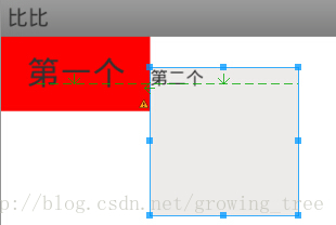
补充两点:RelativeLayout容器中的alignBaseLine属性:baseLine中文翻译基准线的意思,相当于作业本上写文字时下面那行线一样,表示当前空间内的文本内容的底部与制定含有文本内容的控件的文本内容的底部保持在同一水平线上,如图:
RelativeLayout中的android:marginBottom与layout_alignParentBottom同时使用时,marginBottom将会失效,解决办法如下:在RelativeLayout的合适位置添加一个看不见的View:<RelativeLayout xmlns:android="http://schemas.android.com/apk/res/android"
android:layout_width="fill_parent"
android:layout_height="fill_parent" >
<ImageView
android:id="@+id/avatar"
android:layout_width="wrap_content"
android:layout_height="wrap_content"
android:layout_marginBottom="8dp"
android:layout_alignParentBottom="true"/>
<View
android:layout_width="0px"
android:layout_height="0px"
android:layout_below="@id/avatar" />
</RelativeLayout>
8.xml文件中Selector标签使用注意事项
<?xml version="1.0" encoding="utf-8"?>
<selector xmlns:android="http://schemas.android.com/apk/res/android" >
<item android:state_pressed="true" >
<shape >
<corners android:radius="5dp"/>
<stroke  android:width="1px"
android:color="@color/title_bar_bg"/>
<solid android:color="@color/app_bg"/>
</shape>
</item>
<item >
<shape >
<corners android:radius="5dp"/>
<stroke  android:width="1px"
android:color="@color/title_bar_bg"/>
<solid android:color="@color/white"/>
</shape>
</item>
</selector>
注意:当使用在layout布局的background时,需要添加 android:clickable="true"属性,selector才能奏效!(但是这个属性千万别用在adapter的item根布局中,否则listview等列表控件的onItemClick事件将会失去作用!)
一:
shape可以绘制rectangle(矩形,缺省值)、oval(椭圆)、line、ring(环),当使用size标签时,大小就固定了!
<?xml version="1.0" encoding="UTF-8"?>
<shape xmlns:android="http://schemas.android.com/apk/res/android"
android:shape="oval"
android:useLevel="false" >
<solid android:color="@color/red" />
<padding
android:bottom="1dp"
android:left="2dp"
android:right="2dp"
android:top="1dp" />
<stroke
android:width="1dp"
android:color="@android:color/white" />
<size
android:height="15dp"
android:width="15dp" />
</shape>二:
水平虚线:
<?xml version="1.0" encoding="utf-8"?>
<shape xmlns:android="http://schemas.android.com/apk/res/android"
android:shape="line" >
<stroke
android:dashGap="12dp"
android:dashWidth="12dp"
android:width="1dp"
android:color="@color/black" />
<!-- 破折线的宽度为dashWith,破折线之间的空隙的宽度为dashGap,当dashGap=0dp时,为实线 -->
</shape>
注意事项:水平虚线的高度需要通过android:width属性来控制,另外,实际使用过程中经常会出现水平虚线不显示的问题,总结两点原因如下:
1. 在布局中引用水平虚线的drawable时,view高度必须大于drawable中设置的虚线高度,至于大多少,可实际测试。
2. 关闭硬件加速:可以在AndroidManifest.xml的application标签中设置:
android:hardwareAccelerated="false"
但是,这样就关闭了整个应用的硬件加速功能,可能会导致应用比较卡顿,解决办法就是单独给虚线View设置关闭硬件加速:
view.setLayerType(View.LAYER_TYPE_SOFTWARE, null);
垂直虚线:
<?xml version="1.0" encoding="utf-8"?>
<rotate xmlns:android="http://schemas.android.com/apk/res/android"
android:fromDegrees="90"
android:toDegrees="90" >
<shape android:shape="line" >
<stroke
android:dashGap="12dp"
android:dashWidth="12dp"
android:width="1dp"
android:color="@color/black" />
<!-- 虚线的高度 -->
<size android:height="1.5dp" />
<!-- 破折线的宽度为dashWith,破折线之间的空隙的宽度为dashGap,当dashGap=0dp时,为实线 -->
</shape>
</rotate>
三:
如果需要实现如下花纹效果,可以通过bitmap标签自定义drawable:

左边使用topLeftRadius和bottomLeftRadius构建背景drawable,花纹使用bitmap标签对单一花纹实现repeat重复效果,bitmap标签使用代码如下:
<?xml version="1.0" encoding="utf-8"?>
<bitmap xmlns:android="http://schemas.android.com/apk/res/android"
android:src="@drawable/ic_wave"
android:tileMode="repeat">
</bitmap>
9.GestureDetector使用注意事项
如:mGestureDetector = new GestureDetector(mContext, new GestureDetector.SimpleOnGestureListener(){
@Override
public boolean onFling(MotionEvent e1, MotionEvent e2,
float velocityX, float velocityY) {
float Xspacing = e2.getX() - e1.getX();
if (velocityX > 20) {
if (Xspacing > 120 ) {
mViewFlipper.setInAnimation(AnimationUtils.loadAnimation(mContext, R.anim.push_right_in));
mViewFlipper.setOutAnimation(AnimationUtils.loadAnimation(mContext, R.anim.push_right_out));
mViewFlipper.showPrevious();
} else if (Xspacing < -120 ) {
mViewFlipper.setInAnimation(AnimationUtils.loadAnimation(mContext, R.anim.push_left_in));
mViewFlipper.setOutAnimation(AnimationUtils.loadAnimation(mContext, R.anim.push_left_out));
mViewFlipper.showNext();
}
}
return true;
}
});
mViewFlipper.setLongClickable(true);
mViewFlipper.setOnTouchListener(this);同时,类实现了onTouchListener:
@Override
public boolean onTouch(View arg0, MotionEvent arg1) {
return mGestureDetector.onTouchEvent(arg1);
}
注意:1.ViewFlipper需要设置:mViewFlipper.setLongClickable(true);mViewFlipper.setOnTouchListener(this);
2.ontouch方法返回GestureDetector的onTouchEvent事件!
9.布局中Include标签使用注意事项
问题描述:布局文件使用include标签加载其他通用布局文件,却发现android:layout_alignParentBottom等属性不起作用!问题解决:在include标签下重载android:layout_width和android:layout_height属性,之后再添加其他属性,即可!补充一点知识:ViewStub区别:http://blog.csdn.net/mayingcai1987/article/details/6238609http://blog.csdn.net/hitlion2008/article/details/673753710.ScrollView嵌套ListView问题
问题描述:ScrollView嵌套ListView时,会出现ListView只显示一行或者不显示的情况,此时需要手动设置ListView的高度:private void setListViewHeight() {
if (mProductAdapter.getCount() != 0) {
int totalHetight = 0;
for (int i = 0; i < mProductAdapter.getCount(); i++) {
View itemView = mProductAdapter.getView(i, null, mProductLv);
itemView.measure(0, 0);
totalHetight += itemView.getMeasuredHeight();
}
totalHetight = totalHetight + mProductLv.getDividerHeight()*(mProductAdapter.getCount()-1);
android.widget.LinearLayout.LayoutParams lParams = new LayoutParams(LayoutParams.MATCH_PARENT, totalHetight);
mProductLv.setLayoutParams(lParams);
mProAmountTv.setFocusable(true);
mProAmountTv.setFocusableInTouchMode(true);
mProAmountTv.requestFocus();
}
}注意问题:0. Adapter中的itemView的根布局必须是LinearLayout布局, 只有LinearLayout才有measure()方法 !1. LayoutParams必须使用ListView的父容器对应的class,而不能使用android.widget.AbsListView.LayoutParams !2. 在获取itemView的measureHeight高度之前,一定要调用itemView.measure(0, 0)方法 !3. 如果按照以上代码设置的话,ListView默认会置顶,所以需要手动置顶ScrollView,但是不能使用scrollTo(0, 0)方法,一个灵活的 解决办法是 找到ScrollView的第一个子控件,使其获取焦点即可!mTopView.setFocusable(true); mTopView.setFocusableInTouchMode(true); mTopView.requestFocus();
补充:fillviewport属性Romain Guy write a little info about a ScrollView attribute that is missing from documentation :android:fillViewport=”true” .It must be set to ScrollView and has the following efect : when set to true, this attribute causes the scroll view’s child to expand to the height of the
ScrollViewif needed. When the child is taller than the
ScrollView, the attribute has no effect.当你想让一个高度值不足scrollview的子控件fillparent的时候,单独的定义android:layout_height="fill_parent"是不起作用的,必须加上fillviewport属性,当子控件的高度值大于scrollview的高度时,这个标签就没有任何意义了。拓展:ScrollView超出屏幕预览问题
使用ScrollView布局时,如果ScrollView作为根布局容器,则超出屏幕部分可以预览,否则无法预览。开发中,需要预览超出屏幕部分的试图时,可以先将ScrollView作为根布局,预览完后再修改回来。当然,也可以改变屏幕尺寸,达到预览的效果!
11.RadioButton使用技巧
通常,可以在drawable文件夹下自定义一个selector资源图片文件,改变RadioButton、CheckBox等控件的样式:在XML中使用:(注意自定义的selector用在background属性上,如果用在button属性上,会导致在部分系统中RadioButton内容不居中!)android:button="@null" android:background="@drawable/radioButton_selector"在Java代码中使用:
rButton.setButtonDrawable(android.R.color.transparent);
rButton.setBackgroundResource(R.drawable.radioButton_selector);
注意: 一: 在API 16及其以下版本中,如果不添加backgroud属性,将导致RadioButton左边留白,对比效果如下:


一个使用小技巧:在ViewPager等滑动控件配合RadioGroup使用,开发引导页、轮播广告图等效果时,ViewPager监听滑动事件的方法如public void onPageSelected(int position)等返回的是ViewPager的当前位置,而RadioGroup.check(int id)设置选中只能依据控件的Id判断,为了避免使用switch语句(依据position判断RadioButton的ID),可以在Java代码中通过radioButton.setId(int id)手动设置Id,使id值与position一致:
private void initIndicatorView() {
for (int i = 0; i < itemDescRes.length; i++) {
RadioButton rButton = new RadioButton(mContext);
rButton.setButtonDrawable(R.drawable.guide_indicator_selector);
LayoutParams lParams = new LayoutParams(LayoutParams.WRAP_CONTENT, LayoutParams.WRAP_CONTENT);
lParams.setMargins((int)getResources().getDimension(R.dimen.page_left_space), 0,
(int)getResources().getDimension(R.dimen.page_left_space), 0);
rButton.setLayoutParams(lParams);
rButton.setEnabled(false);
rButton.setId(i);
rButton.setChecked(i==0 ? true : false);
mGuideRgp.addView(rButton);
}
}
然后在ViewPager的滑动监听函数中实现:
@Override
public void onPageSelected(int arg0) {
mRadioGroup.check(arg0);
};即可。二:RadioGroup调用check(id)方法时,onCheckedChanged方法多次执行的问题
查看RadioGroup的check方法,源码如下:
public void check(int id) {
// don't even bother
if (id != -1 && (id == mCheckedId)) {
return;
}

if (mCheckedId != -1) {
setCheckedStateForView(mCheckedId, false);
}

if (id != -1) {
setCheckedStateForView(id, true);
}

setCheckedId(id);
}

private void setCheckedId(int id) {
mCheckedId = id;
if (mOnCheckedChangeListener != null) {
mOnCheckedChangeListener.onCheckedChanged(this, mCheckedId);
}
}

private void setCheckedStateForView(int viewId, boolean checked) {
View checkedView = findViewById(viewId);
if (checkedView != null && checkedView instanceof RadioButton) {
((RadioButton) checkedView).setChecked(checked);
}
}可以看出,在进行if (id != -1)判断时,执行了一次setCheckedStateForView(id, true); 最后,又调用了一次setCheckedId(id);所以,onCheckedChanged方法出现了多次执行的问题!解决办法如下:使用对应RadioButton的setCheck(true)方法代替RadioGroup的check(id)方法,其源码如下:
public void setChecked(boolean checked) {
if (mChecked != checked) {
mChecked = checked;
refreshDrawableState();
notifyViewAccessibilityStateChangedIfNeeded(
AccessibilityEvent.CONTENT_CHANGE_TYPE_UNDEFINED);

// Avoid infinite recursions if setChecked() is called from a listener
if (mBroadcasting) {
return;
}

mBroadcasting = true;
if (mOnCheckedChangeListener != null) {
mOnCheckedChangeListener.onCheckedChanged(this, mChecked);
}
if (mOnCheckedChangeWidgetListener != null) {
mOnCheckedChangeWidgetListener.onCheckedChanged(this, mChecked);
}

mBroadcasting = false;
}
}
12.arrays.xml资源数组
数组资源常见可以放置integer-array、string-array等,但是放置drawable图片资源,需要如下使用:arrays.xml文件中配置(注意tag标签为array):<array name="guide_pager_res_array"> <item >@drawable/ic_guide_desc_01</item> <item >@drawable/ic_guide_desc_02</item> <item >@drawable/ic_guide_desc_03</item> </array>Java代码中获取:
private void initPagerViews() {
TypedArray typedArray = getResources().obtainTypedArray(R.array.guide_pager_res_array);
pagerViews = new ArrayList<View>();
for (int i = 0; i < typedArray.length(); i++) {
View itemView = LayoutInflater.from(mContext).inflate(R.layout.guide_item_page, null);
((ImageView)itemView.findViewById(R.id.guide_item_iv)).setImageBitmap(ImageUtils.getBitmapFromRes(mContext, typedArray.getResourceId(i, 0)));
pagerViews.add(itemView);
}
}
13.应用启动 闪黑屏问题
之前在做 APP 的时候不太关注这个问题,因为自己在使用其他 APP 的时候也会在应用启动的初始有一个黑屏闪过后才会出现应用的欢迎页。直到最近开发过程中发现自己在欢迎页启动的线程由于请求和处理的数据量过大而,导致欢迎页在出现之前界面上会有一个短暂的白色闪屏停留,当然白色闪屏的停留是因为 application 的主题样式 android:theme="@style/AppTheme" 使用了 Theme.Light 题导致的,Light 样式的 windowBackground、colorBackground、colorForeground 等属性的值均为 light 也就是白色偏亮,所以才会出现白色闪屏。下面是我的 APP 出现白色闪屏时样式引用的代码:
   <style name="AppTheme" parent="android:Theme.Light">

   </style>
简单的修改后,闪屏颜色为黑色,代码如下:
   <style name="AppTheme" parent="android:style/Theme.Black.NoTitleBar.Fullscreen">

   </style>
代码修改后引用的样式为黑色主题,但欢迎页仍然会有黑色闪屏短暂的停留。继续进行修改,设置透明属性为 true,代码如下:
<style name="AppStartTheme" parent="android:style/Theme.Black.NoTitleBar.Fullscreen">
<item name="android:windowIsTranslucent">true</item>
</style>
经过这次的修改之后黑色闪屏现象消失了,最终达到了自己理想的效果。最后,经过查阅资料发现已经有人总结和处理过这类问题了,并且给出了优缺点的分析,我在这里以我的理解对其进行引用。
原来避免黑色闪屏有2种方法,分别为:1.为 Theme 设置背景图;2.为 Theme 设置透明属性。显然我采用的是第二种方式,先分别看看这2种方式所引用的代码:
<!-- 为 Theme 设置背景图 -->
<style name="AppStartTheme" parent="android:Theme">
<item name="android:windowBackground">@drawable/splash_bg</item>
<item name="android:windowNoTitle">true</item>
</style>
<!-- 为 Theme 设置透明属性 -->
<style name="AppStartTheme" parent="android:Theme">
<item name="android:windowIsTranslucent">true</item>
<item name="android:windowNoTitle">true</item>
</style>
<!-- 为 Activity 设置 Theme -->
<activity
android:name="com.sunzn.act.SplashActivity"
android:label="@string/app_name"
android:theme="@style/AppStartLoadTranslucent"
android:screenOrientation="portrait"
android:windowSoftInputMode="adjustPan" >
<intent-filter>
<action android:name="android.intent.action.MAIN" />
<category android:name="android.intent.category.LAUNCHER" />
</intent-filter>
</activity>
上面的2种 Theme 中,为 Theme 设置背景图后程序在启动的时候,会首先显示这张图,避免发生黑屏;为 Theme 设置透明属性,程序启动后不会黑屏而是透明,等到界面初始化完成后才一次性显示出来。下面是两种方式的优缺点:
为 Theme 设置背景图 给人程序启动快的感觉,界面先显示背景图,然后再刷新其他界面控件,刷新不同步。
为 Theme 设置透明属性 给人程序启动慢的感觉,界面会一次性刷出来,刷新同步。
14.LinearLayout中使用android:divider属性

除了ListView等列表控件,定义LinearLayout等其他ViewGroup的子控件间的分割线通常有两种方法:第一种是比较常见的,直接定义特定宽度或高度的View控件:
<View
android:layout_width="match_parent"
android:layout_height="1px"
android:background="@color/gray" />
第二种,使用android:divider属性,这个是在API 11+以后出现的,首先自定义一个separator.xml的drawable文件
<?xml version="1.0" encoding="utf-8"?>
<shape xmlns:android="http://schemas.android.com/apk/res/android" >

<size android:width="1px" />

<solid android:color="#cccccc" />

</shape>
然后在LinearLayout中使用分割线:android:divider代表分割线样式,android:dividerPadding表示分割线与LinearLayout间距,android:showDividers表示分割线位置,有"end"、"begin"、"middle"、"none"四个可选值!
<?xml version="1.0" encoding="utf-8"?>
<LinearLayout xmlns:android="http://schemas.android.com/apk/res/android"
android:layout_width="wrap_content"
android:layout_height="wrap_content"
android:background="@drawable/shape_round_corner_black"
android:orientation="horizontal"
android:divider="@drawable/separator"
android:dividerPadding="@dimen/page_left_space"
android:showDividers="middle">

<Button
android:id="@+id/topic_report_btn"
android:layout_width="wrap_content"
android:layout_height="wrap_content"
android:background="@color/transparent"
android:drawableLeft="@drawable/ic_topic_report"
android:drawablePadding="@dimen/text_line_space"
android:gravity="center"
android:paddingBottom="@dimen/text_line_space"
android:paddingLeft="@dimen/page_left_space"
android:paddingRight="@dimen/page_left_space"
android:paddingTop="@dimen/text_line_space"
android:text="@string/report"
android:textColor="@color/white"
android:textSize="@dimen/app_text_low_size" />

<Button
android:id="@+id/topic_review_btn"
android:layout_width="wrap_content"
android:layout_height="wrap_content"
android:background="@color/transparent"
android:drawableLeft="@drawable/ic_topic_review"
android:drawablePadding="@dimen/text_line_space"
android:gravity="center"
android:paddingBottom="@dimen/text_line_space"
android:paddingLeft="@dimen/page_left_space"
android:paddingRight="@dimen/page_left_space"
android:paddingTop="@dimen/text_line_space"
android:text="@string/review"
android:textColor="@color/white"
android:textSize="@dimen/app_text_low_size" />

<Button
android:id="@+id/topic_praise_btn"
android:layout_width="wrap_content"
android:layout_height="wrap_content"
android:background="@color/transparent"
android:drawableLeft="@drawable/ic_topic_praise"
android:drawablePadding="@dimen/text_line_space"
android:gravity="center"
android:paddingBottom="@dimen/text_line_space"
android:paddingLeft="@dimen/page_left_space"
android:paddingRight="@dimen/page_left_space"
android:paddingTop="@dimen/text_line_space"
android:text="@string/praise"
android:textColor="@color/white"
android:textSize="@dimen/app_text_low_size" />

</LinearLayout>
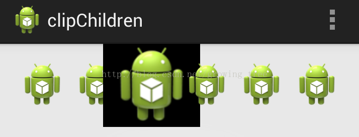
15.android:clipChildren属性
1.clipChild用来定义他的子控件是否要在他应有的边界内进行绘制。 默认情况下,clipChild被设置为true。 也就是不允许进行扩展绘制。2. clipToPadding用来定义ViewGroup是否允许在padding中绘制。默认情况下,cliptopadding被设置为ture, 也就是把padding中的值都进行裁切了。常见应用场景:一: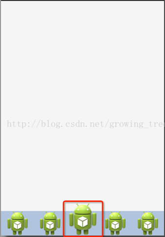
看到这个图时你可以先想想如果是你,你怎么实现这个效果。马上想到用RelativeLayout?NO,NO,NO,,,
实现代码:<?xml version="1.0" encoding="utf-8"?>
<LinearLayout xmlns:android="http://schemas.android.com/apk/res/android"
android:layout_width="match_parent"
android:layout_height="match_parent"
android:clipChildren="false"
android:orientation="vertical" >
<android.support.v4.view.ViewPager
android:id="@+id/view_pager"
android:layout_width="match_parent"
android:layout_height="0dip"
android:layout_weight="1.0" />
<LinearLayout
android:layout_width="match_parent"
android:layout_height="48dip"
android:background="#B0C4DE"
android:orientation="horizontal" >
<ImageView
android:layout_width="0dip"
android:layout_height="fill_parent"
android:layout_weight="1.0"
android:scaleType="fitCenter"
android:src="@drawable/ic_launcher" />
<ImageView
android:layout_width="0dip"
android:layout_height="fill_parent"
android:layout_weight="1.0"
android:scaleType="fitCenter"
android:src="@drawable/ic_launcher" />
<ImageView
android:layout_width="0dip"
android:layout_height="64dip"
android:layout_gravity="bottom"
android:layout_weight="1.0"
android:scaleType="fitCenter"
android:src="@drawable/ic_launcher" />
<ImageView
android:layout_width="0dip"
android:layout_height="fill_parent"
android:layout_weight="1.0"
android:scaleType="fitCenter"
android:src="@drawable/ic_launcher" />
<ImageView
android:layout_width="0dip"
android:layout_height="fill_parent"
android:layout_weight="1.0"
android:scaleType="fitCenter"
android:src="@drawable/ic_launcher" />
</LinearLayout>
</LinearLayout>二:当使用缩放动画,放大到一定范围,超出父容器布局时, 可以使用该属性,允许在父容器范围外绘制视图:
三:对于ListView,如果仅仅使用了paddingTop属性,效果如下:
可以看到滚动时,listview并没有到达最顶部,此时,可以添加clipToPadding为false属性,效果如下:
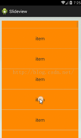
15.Gallery
Gallery是一个已经废弃的API,使用过程中存在的问题和注意事项如下:一:android:spacing属性问题Gallery在xml中定义时,如果不设置spacing属性,将导致Item布局在显示的时候挤在一起;二:左右留白问题Gallery默认会在左右两边留下一个item所占宽度的空白区域,非常难看;三:选中项位置问题setSelection(int position)选中的item将会位于Gallery中间位置,无法像ListView显示于顶部和底部那样,显示于左右两边。16.getResource
getDimension,getDimensionPixelOffset和getDimensionPixelSize的区别和联系:1. getDimension和getDimensionPixelOffset功能类似,唯一区别就是返回类型不一样;2. 如果resources中dimen属性值的单位是dp或者sp,三者都需要将其乘以density,然后返回对应px值;3. 如果单位是px,getDimension和getDimensionPixelOffset返回原值,而getDimensionPixelSize仍需乘以density;
<resources>
<dimen name="dp_01">16dp</dimen>
<dimen name="px_01">16px</dimen>
<dimen name="sp_01">16sp</dimen>
</resources>
float a1=getResources().getDimension(R.dimen.dp_01);
int a2=getResources().getDimensionPixelOffset(R.dimen.dp_01);
int a3=getResources().getDimensionPixelSize(R.dimen.dp_01);

float b1=getResources().getDimension(R.dimen.px_01);
int b2=getResources().getDimensionPixelOffset(R.dimen.px_01);
int b3=getResources().getDimensionPixelSize(R.dimen.px_01);

float c1=getResources().getDimension(R.dimen.sp_01);
int c2=getResources().getDimensionPixelOffset(R.dimen.sp_01);
int c3=getResources().getDimensionPixelSize(R.dimen.sp_01);

Log.d("test", "getDimension= "+a1+", getDimensionPixelOffset="+a2+",getDimensionPixelSize="+a3);
Log.d("test", "getDimension= "+b1+", getDimensionPixelOffset="+b2+",getDimensionPixelSize="+b3);
Log.d("test", "getDimension= "+c1+", getDimensionPixelOffset="+c2+",getDimensionPixelSize="+c3);
输出打印结果:
//Device (480*800,240dpi,density=1.5):
getDimension= 24.0, getDimensionPixelOffset=24,getDimensionPixelSize=24
getDimension= 16.0, getDimensionPixelOffset=16,getDimensionPixelSize=24
getDimension= 24.0, getDimensionPixelOffset=24,getDimensionPixelSize=24
补充:在代码中通过setTextSize方法设置文字大小时,可以考虑使用带单位参数的方法:
setTextSize(int unit, int size)
因为setTextSize(int size)方法默认的字号单位是sp,会导致在代码中设置字号和在xml布局文件中设置的字号大小不一致的情况。字号单位可选值有:
TypedValue.COMPLEX_UNIT_PX : Pixels
TypedValue.COMPLEX_UNIT_SP : Scaled Pixels
TypedValue.COMPLEX_UNIT_DIP : Device Independent Pixels
比如,在dimens.xml资源文件中定义了名为app_text_small_size的尺寸,在代码中使用为:
labelTv.setTextSize(TypedValue.COMPLEX_UNIT_PX, mContext.getResources().getDimension(R.dimen.app_text_small_size));

相关文章推荐
- Android开发——控件TextView的用法(常用属性)
- 【Android常用控件】EditText常用属性【一】:空白提示/文本域/特殊字符/数字类型/等属性设置
- ANDROID 控件常用属性
- Android:常用控件属性
- Android开发之四(二):常用控件之列表(ListView)
- 【Android 界面效果18】Android软件开发之常用系统控件界面整理
- android常用控件属性(中文)
- 在Android开发中显示和隐藏,大部分控件都有visibility这个属性,其属性有3个分别为“visible ”、“invisible”、“gone”
- Android开发UI之常用控件的使用
- 学习 Mars 老师 Android 开发视频教程笔记之01_06 Android 常用控件
- 【读书笔记《Android游戏编程之从零开始》】7.Android 游戏开发常用的系统控件(Dialog)
- Android开发笔记——TableLayout常用的属性
- C# 控件开发中常用属性整理
- Android 控件布局常用属性
- 【Android常用控件】EditText常用属性【二】:为文本输入框指定软键盘类型和软键盘回车键图标设置
- Android 控件布局常用属性
- Android:开发常用的名令集锦
- 【读书笔记-《Android游戏编程之从零开始》】3.Android 游戏开发常用的系统控件(Button、Layout、ImageButton)
- Android 开发之 布局控件的各个属性
- Android软件开发之常用系统控件界面大合集