强大的 类css 工具:nui - 换肤可以考虑用这个实现的
2013-03-11 00:56
639 查看
https://github.com/tombenner/nui
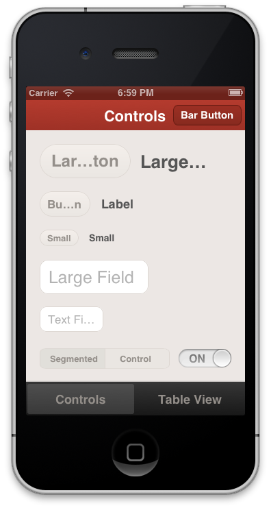
Out of the box, the styling looks like this:

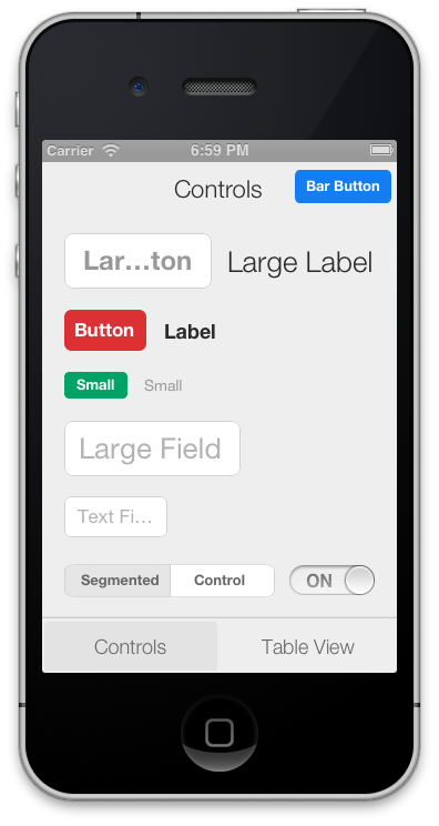
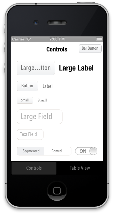
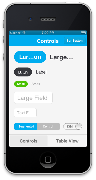
It's easily modified, though. The styling above, for example, is declared like this. Here
are examples of other themes that are definedhere:
The styling is declared using a CSS-like syntax that supports variables:
NUI lets you:
Update the visual appearance of an entire application in minutes
Save themes for use in multiple applications
Set the styles of UI elements using simple rules, like setting
Define variables like
la Sass/LESS)
Avoid digging through documentation to find how to change specific UI elements' styling
Quickly create custom style classes
Modify an application's styling while it is running
Some exciting features are on the horizon, and contributions are very encouraged. Please see the FAQ.
Add the CoreImage and QuartzCore frameworks to your application if you haven't already (like this)
Add
AppDelegate.m (like this)
Add
NUI can also be installed using CocoaPods (its pod name is "NUI"). Steps 3. and 4. above are still required.
4 in Installation).
Due to the nature of UIKit's usage of simple UI components within more complex UI components, NUI doesn't style some UIKit components in some very rare cases. If you ever need to apply styling for these cases, you can simply use NUIRenderer:
You can specify a custom style class, too:
N.B. NUI used to require that you make your elements inherit from a NUI class, but this is no longer the case. See "Migrating From Subclasses To Categories" below for details.
Editing
NUIStyle.nss contains all of the style rules. A rule like
The format should be self-explanatory, but here are some notes:
Styling variables are defined at the top, but they can be added/modified/removed as you see fit.
You can make an element inherit from multiple style classes (see Creating Custom Style Classes below).
To see all of the available properties and values, see the Style Classes and Style Value Types lists below.
Creating
You can give elements custom style classes (e.g.
and make those classes inherit from one or more other style classes by using the form
To bypass NUI's styling for a particular element, set the class to
You can set an element's style class either in Interface Builder or programmatically:
Setting
To do this, you'll set a runtime attribute for the element (in Identity Inspector > User Defined Runtime Attributes, click
Set the Key Path to
and Value to
Setting
To do this, you'll want to import the NUI category for the element. If you're styling a UIButton, you'd import:
You can then set
N.B. A style class can inherit from an indefinite number of style rules, so if you want to create groups of style rules, you can set
something like
Modifying
To do this, add the following line after
the absolute file path of your .nss file (e.g.
Now, whenever you modify and save your .nss file while the app is running, the new changes will be applied instantaneously, without any need to rebuild the app. This can drastically speed up the process of styling. You'll want to remove this line when you create
a release build.
Creating
Because all of the style rules are contained in NUIStyle.nss, it's easy to create an NUI theme that can be reused in other projects. If you make one you like, let me know, and I'll likely be very happy to include it in this repo.
Migrating
Version 0.1 of NUI required that you manually make your app's UI components inherit from NUI classes (e.g.
NUI no longer requires this, as it uses UIKit categories instead subclasses. If you were previously using NUI 0.1, and update to a newer version of NUI, you'll want to simply unset those custom classes, so that, for example, a UIButton is simply a UIButton,
instead of being a NUIButton (this would be done either in Identity Inspector > Custom Class or in the application code).
Style
Below are all of the currently available style classes, their corresponding UI component classes, and the properties they support. Value types (e.g. Color, Gradient)
are described below in Style Value Types.
background-color (Color)
background-color-top/background-color-bottom (Gradient)
background-image (Image)
background-image-insets (Box)
background-tint-color (Color)
border-color (Color)
border-width (Number)
corner-radius (Number)
font-color (Color)
font-name (FontName)
font-size (Number)
text-shadow-color (Color)
text-shadow-offset (Offset)
background-color (Color)
background-image (Image)
background-image-insets (Box)
background-tint-color (Color)
border-color (Color)
border-width (Number)
corner-radius (Number)
font-color (Color)
font-name (FontName)
font-size (Number)
text-shadow-color (Color)
text-shadow-offset (Offset)
background-color (Color)
background-color-top/background-color-bottom (Gradient)
background-color-disabled (Color)
background-color-highlighted (Color)
background-color-selected (Color)
background-image (Image)
background-image-insets (Box)
background-image-disabled (Image)
background-image-disabled-insets (Box)
background-image-highlighted (Image)
background-image-highlighted-insets (Box)
background-image-selected (Image)
background-image-selected-insets (Box)
border-color (Color)
border-width (Number)
content-insets (Box)
corner-radius (Number)
font-color (Color)
font-color-disabled (Color)
font-color-highlighted (Color)
font-color-selected (Color)
font-name (FontName)
font-size (Number)
height (Number)
padding (Box)
shadow-color (Color)
shadow-offset (Offset)
shadow-opacity (Number)
shadow-radius (Number)
text-align (TextAlign)
text-alpha (Number)
text-auto-fit (Boolean)
text-shadow-color (Color)
text-shadow-color-highlighted (Color)
text-shadow-color-selected (Color)
text-shadow-offset (Offset)
title-insets (Box)
width (Number)
background-color (Color)
background-image (Image)
border-color (Color)
border-width (Number)
corner-radius (Number)
shadow-color (Color)
shadow-offset (Offset)
shadow-opacity (Number)
shadow-radius (Number)
background-color (Color)
border-color (Color)
border-width (Number)
corner-radius (Number)
font-color (Color)
font-color-highlighted (Color)
font-name (FontName)
font-size (Number)
height (Number)
shadow-color (Color)
shadow-offset (Offset)
shadow-opacity (Number)
shadow-radius (Number)
text-align (TextAlign)
text-alpha (Number)
text-auto-fit (Boolean)
text-shadow-color (Color)
text-shadow-offset (Offset)
width (Number)
background-color (Color)
background-color-top/background-color-bottom (Gradient)
background-image (Image)
background-image-insets (Box)
background-tint-color (Color)
font-color (Color)
font-name (FontName)
font-size (Number)
shadow-image (Image)
text-shadow-color (Color)
text-shadow-offset (Offset)
background-color (Color)
background-color-top/background-color-bottom (Gradient)
background-image (Image)
scope-background-color (Color)
scope-background-image (Image)
See Button
See SegmentedControl
background-color (Color)
background-color-selected (Color)
background-tint-color (Color)
border-color (Color)
border-width (Number)
corner-radius (Number)
font-color (Color)
font-color-selected (Color)
font-name (FontName)
font-size (Number)
text-shadow-color (Color)
text-shadow-color-selected (Color)
text-shadow-offset (Offset)
text-shadow-offset-selected (Offset)
minimum-track-tint-color (Color)
maximum-track-tint-color (Color)
minimum-value-image (Image)
maximum-value-image (Image)
thumb-image (Image)
thumb-tint-color (Color)
background-color (Color)
off-image (Image)
off-image-insets (Box)
on-image (Image)
on-image-insets (Box)
on-tint-color (Color)
thumb-tint-color (Color)
tint-color (Color)
background-color (Color)
background-color-top/background-color-bottom (Gradient)
background-image (Image)
background-image-insets (Box)
background-tint-color (Color)
selected-image-tint-color (Color)
background-image-selected (Image)
background-image-selected-insets (Box)
font-color (Color)
font-name (FontName)
font-size (Number)
text-offset (Offset)
text-shadow-color (Color)
text-shadow-offset (Offset)
background-color (Color)
background-color-top/background-color-bottom (Gradient)
background-color-selected (Color)
background-color-top-selected/background-color-bottom-selected (Gradient)
font-color (Color)
font-color-highlighted (Color)
font-name (FontName)
font-size (Number)
text-align (TextAlign)
text-alpha (Number)
text-auto-fit (Boolean)
text-shadow-color (Color)
text-shadow-offset (Offset)
font-color (Color)
font-color-highlighted (Color)
font-name (FontName)
font-size (Number)
text-align (TextAlign)
text-alpha (Number)
text-auto-fit (Boolean)
text-shadow-color (Color)
text-shadow-offset (Offset)
background-color (Color)
background-image-top (Image)
background-image-bottom (Image)
background-image-top-landscape (Image)
background-image-bottom-landscape (Image)
background-tint-color (Color)
shadow-image (Image)
shadow-image-top (Image)
shadow-image-bottom (Image)
background-color (Color)
background-image (Image)
background-image-insets (Box)
border-color (Color)
border-style (BorderStyle)
border-width (Number)
corner-radius (Number)
font-color (Color)
font-name (FontName)
font-size (Number)
height (Number)
padding (Box)
shadow-color (Color)
shadow-offset (Offset)
shadow-opacity (Number)
shadow-radius (Number)
vertical-align (VerticalAlign)
width (Number)
background-color (Color)
background-image (Image)
border-color (Color)
border-width (Number)
corner-radius (Number)
height (Number)
shadow-color (Color)
shadow-offset (Offset)
shadow-opacity (Number)
shadow-radius (Number)
width (Number)
background-color (Color)
Style
Boolean - A boolean (
BorderStyle - A border style, as rendered by a UITextBorderStyle. Accepted values are
and
Box - A series of 1 to 4 integers that specify the widths of a box's edges. Interpreted like CSS's
(top, right, bottom, left). Examples:
box with a width of 15 for each edge),
box with a width of 10 for the top and bottom edges and 15 for the right and left edges)
Color - A hex color (e.g.
a rgb, rgba, hsl, or hsla expression (e.g.
If
supported.
FontName - A font name (see available values here)
Gradient - Two Colors that will create a vertical gradient. background-color-top and background-color-bottom need to be defined in separate .nss properties.
Image - A name of an image, as used in
Number - A number (e.g.
Offset - Two numbers comprising the horizontal and vertical values of an offset (e.g.
TextAlign - A text alignment (e.g.
VerticalAlign - A vertical alignment (e.g.
How
Contributers are extremely appreciated! NUI covers a lot of ground, but there are still a number of elements and properties that are unsupported. Adding support for new properties is easy (take a look at NUIButtonRenderer for
examples). There are also a number of exciting big features that on the Roadmap that are up for grabs. We're
also always looking for new themes, so feel free to add those, too!
What
UIAppearance is alright, but it's unintuitive, time-consuming, and it doesn't support either the granularity or number of style modifications that NUI does. Styling should be abstracted in a simple style sheet with simple property definitions; you shouldn't
have to stare at long, nested method calls and have to dig through Apple's documentation every time you want to make a small styling modification.
I
Sure! Feel free to add it to Apps Using NUI.
Do
Yep! It's unclear when it will be launched, it won't be free (in either meaning of the word, likely), and the jury is still out on how good of a product it'll be. I prefer free, lightweight solutions.
How
"New-ee". (It rhymes with "GUI", of course.)
NUI
Style iOS apps with a style sheet, similar to CSSDescription
NUI is a drop-in UI kit for iOS that lets you style UI elements using a style sheet, similar to CSS. It lets you style an entire app in minutes.Out of the box, the styling looks like this:
It's easily modified, though. The styling above, for example, is declared like this. Here
are examples of other themes that are definedhere:
The styling is declared using a CSS-like syntax that supports variables:
[code]@primaryFontName: HelveticaNeue;
@secondaryFontName: HelveticaNeue-Light;
@primaryFontColor: #333333;
@primaryBackgroundColor: #E6E6E6;

Button {
    background-color: @primaryBackgroundColor;
    border-color: #A2A2A2;
    border-width: @primaryBorderWidth;
    font-color: @primaryFontColor;
    font-color-highlighted: #999999;
    font-name: @primaryFontName;
    font-size: 18;
    corner-radius: 7;
}
NavigationBar {
    background-tint-color: @primaryBackgroundColor;
    font-name: @secondaryFontName;
    font-size: 20;
    font-color: @primaryFontColor;
    text-shadow-color: #666666;
    text-shadow-offset: 1,1;
}
NUI lets you:
Update the visual appearance of an entire application in minutes
Save themes for use in multiple applications
Set the styles of UI elements using simple rules, like setting
Button
 { border-color: #CCCCCC; }
Define variables like
@primaryFontNameor
@myBackgroundColor(a
la Sass/LESS)
Avoid digging through documentation to find how to change specific UI elements' styling
Quickly create custom style classes
Modify an application's styling while it is running
Some exciting features are on the horizon, and contributions are very encouraged. Please see the FAQ.
Installation
Copy the NUI directory into your applicationAdd the CoreImage and QuartzCore frameworks to your application if you haven't already (like this)
Add
[NUIAppearance
 init];
to
application:didFinishLaunchingWithOptionsin
AppDelegate.m (like this)
Add
[NUISettings
 init];
to
@autoreleasepoolin
main()in
main.m(like this)
NUI can also be installed using CocoaPods (its pod name is "NUI"). Steps 3. and 4. above are still required.
Usage
After dropping in NUI, you can modify your app's styling by simply editing NUIStyle.nss. If you want to avoid modifying NUI's files, you can copy NUIStyle.nss into your app, rename it (e.g. MyTheme.nss), then replace[NUISettings init]with
[NUISettings initWithStylesheet:@"MyTheme"];(step
4 in Installation).
Due to the nature of UIKit's usage of simple UI components within more complex UI components, NUI doesn't style some UIKit components in some very rare cases. If you ever need to apply styling for these cases, you can simply use NUIRenderer:
[code][NUIRenderer renderButton:myButton];
You can specify a custom style class, too:
[code][NUIRenderer renderButton:myButton withClass:@"LargeButton"]
N.B. NUI used to require that you make your elements inherit from a NUI class, but this is no longer the case. See "Migrating From Subclasses To Categories" below for details.
Editing
The Style Rules
NUIStyle.nss contains all of the style rules. A rule like Button
{ font-name: Helvetica; } modifies the font name of every UIButton, for example.The format should be self-explanatory, but here are some notes:
Styling variables are defined at the top, but they can be added/modified/removed as you see fit.
You can make an element inherit from multiple style classes (see Creating Custom Style Classes below).
To see all of the available properties and values, see the Style Classes and Style Value Types lists below.
Creating
Custom Style Classes
You can give elements custom style classes (e.g. LargeButton),
and make those classes inherit from one or more other style classes by using the form
Button:LargeButton.
To bypass NUI's styling for a particular element, set the class to
none.
You can set an element's style class either in Interface Builder or programmatically:
Setting
an Element's Style Class in Interface Builder
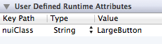
To do this, you'll set a runtime attribute for the element (in Identity Inspector > User Defined Runtime Attributes, click +).
Set the Key Path to
nuiClass, Type to
String,
and Value to
LargeButton(or
Button:MyButton:
Setting
an Element's Style Class Programmatically
To do this, you'll want to import the NUI category for the element. If you're styling a UIButton, you'd import:[code]#import "UIButton+NUI.h"
You can then set
nuiClasson your element:
[code]myButton.nuiClass = @"LargeButton";
N.B. A style class can inherit from an indefinite number of style rules, so if you want to create groups of style rules, you can set
nuiClassto
something like
@"MyStyleGroup1:MyStyleGroup2:MyButton".
Modifying
Styling While The Application Is Running
To do this, add the following line after [NUISettings init];in main.m, replacing
@"/path/to/Style.nss"with
the absolute file path of your .nss file (e.g.
/Users/myusername/projects/ios/MyApp/Style.nss):
[code][NUISettings setAutoUpdatePath:@"/path/to/Style.nss"];
Now, whenever you modify and save your .nss file while the app is running, the new changes will be applied instantaneously, without any need to rebuild the app. This can drastically speed up the process of styling. You'll want to remove this line when you create
a release build.
Creating
Custom Themes
Because all of the style rules are contained in NUIStyle.nss, it's easy to create an NUI theme that can be reused in other projects. If you make one you like, let me know, and I'll likely be very happy to include it in this repo.Migrating
From Subclasses To Categories
Version 0.1 of NUI required that you manually make your app's UI components inherit from NUI classes (e.g. NUIButton).
NUI no longer requires this, as it uses UIKit categories instead subclasses. If you were previously using NUI 0.1, and update to a newer version of NUI, you'll want to simply unset those custom classes, so that, for example, a UIButton is simply a UIButton,
instead of being a NUIButton (this would be done either in Identity Inspector > Custom Class or in the application code).
Style
Classes
Below are all of the currently available style classes, their corresponding UI component classes, and the properties they support. Value types (e.g. Color, Gradient)are described below in Style Value Types.
BarButton
UIBarButtonItembackground-color (Color)
background-color-top/background-color-bottom (Gradient)
background-image (Image)
background-image-insets (Box)
background-tint-color (Color)
border-color (Color)
border-width (Number)
corner-radius (Number)
font-color (Color)
font-name (FontName)
font-size (Number)
text-shadow-color (Color)
text-shadow-offset (Offset)
BarButtonBack
UIBarButtonItem back button, inherits from BarButtonbackground-color (Color)
background-image (Image)
background-image-insets (Box)
background-tint-color (Color)
border-color (Color)
border-width (Number)
corner-radius (Number)
font-color (Color)
font-name (FontName)
font-size (Number)
text-shadow-color (Color)
text-shadow-offset (Offset)
Button
UIButtonbackground-color (Color)
background-color-top/background-color-bottom (Gradient)
background-color-disabled (Color)
background-color-highlighted (Color)
background-color-selected (Color)
background-image (Image)
background-image-insets (Box)
background-image-disabled (Image)
background-image-disabled-insets (Box)
background-image-highlighted (Image)
background-image-highlighted-insets (Box)
background-image-selected (Image)
background-image-selected-insets (Box)
border-color (Color)
border-width (Number)
content-insets (Box)
corner-radius (Number)
font-color (Color)
font-color-disabled (Color)
font-color-highlighted (Color)
font-color-selected (Color)
font-name (FontName)
font-size (Number)
height (Number)
padding (Box)
shadow-color (Color)
shadow-offset (Offset)
shadow-opacity (Number)
shadow-radius (Number)
text-align (TextAlign)
text-alpha (Number)
text-auto-fit (Boolean)
text-shadow-color (Color)
text-shadow-color-highlighted (Color)
text-shadow-color-selected (Color)
text-shadow-offset (Offset)
title-insets (Box)
width (Number)
Control
UIControlbackground-color (Color)
background-image (Image)
border-color (Color)
border-width (Number)
corner-radius (Number)
shadow-color (Color)
shadow-offset (Offset)
shadow-opacity (Number)
shadow-radius (Number)
Label
UILabelbackground-color (Color)
border-color (Color)
border-width (Number)
corner-radius (Number)
font-color (Color)
font-color-highlighted (Color)
font-name (FontName)
font-size (Number)
height (Number)
shadow-color (Color)
shadow-offset (Offset)
shadow-opacity (Number)
shadow-radius (Number)
text-align (TextAlign)
text-alpha (Number)
text-auto-fit (Boolean)
text-shadow-color (Color)
text-shadow-offset (Offset)
width (Number)
NavigationBar
UINavigationBarbackground-color (Color)
background-color-top/background-color-bottom (Gradient)
background-image (Image)
background-image-insets (Box)
background-tint-color (Color)
font-color (Color)
font-name (FontName)
font-size (Number)
shadow-image (Image)
text-shadow-color (Color)
text-shadow-offset (Offset)
SearchBar
UISearchBarbackground-color (Color)
background-color-top/background-color-bottom (Gradient)
background-image (Image)
scope-background-color (Color)
scope-background-image (Image)
SearchBarButton
UISearchBar button, inherits from BarButtonSee Button
SearchBarScopeBar
UISearchBar scope bar, inherits from SegmentedControlSee SegmentedControl
SegmentedControl
UISegmentedControlbackground-color (Color)
background-color-selected (Color)
background-tint-color (Color)
border-color (Color)
border-width (Number)
corner-radius (Number)
font-color (Color)
font-color-selected (Color)
font-name (FontName)
font-size (Number)
text-shadow-color (Color)
text-shadow-color-selected (Color)
text-shadow-offset (Offset)
text-shadow-offset-selected (Offset)
Slider
UISliderminimum-track-tint-color (Color)
maximum-track-tint-color (Color)
minimum-value-image (Image)
maximum-value-image (Image)
thumb-image (Image)
thumb-tint-color (Color)
Switch
UISwitchbackground-color (Color)
off-image (Image)
off-image-insets (Box)
on-image (Image)
on-image-insets (Box)
on-tint-color (Color)
thumb-tint-color (Color)
tint-color (Color)
TabBar
UITabBarbackground-color (Color)
background-color-top/background-color-bottom (Gradient)
background-image (Image)
background-image-insets (Box)
background-tint-color (Color)
selected-image-tint-color (Color)
TabBarItem
UITabBarItembackground-image-selected (Image)
background-image-selected-insets (Box)
font-color (Color)
font-name (FontName)
font-size (Number)
text-offset (Offset)
text-shadow-color (Color)
text-shadow-offset (Offset)
TableCell
UITableViewCellbackground-color (Color)
background-color-top/background-color-bottom (Gradient)
background-color-selected (Color)
background-color-top-selected/background-color-bottom-selected (Gradient)
font-color (Color)
font-color-highlighted (Color)
font-name (FontName)
font-size (Number)
text-align (TextAlign)
text-alpha (Number)
text-auto-fit (Boolean)
text-shadow-color (Color)
text-shadow-offset (Offset)
TableCellDetail
The detail label of a UITableViewCellfont-color (Color)
font-color-highlighted (Color)
font-name (FontName)
font-size (Number)
text-align (TextAlign)
text-alpha (Number)
text-auto-fit (Boolean)
text-shadow-color (Color)
text-shadow-offset (Offset)
Toolbar
UIToolbarbackground-color (Color)
background-image-top (Image)
background-image-bottom (Image)
background-image-top-landscape (Image)
background-image-bottom-landscape (Image)
background-tint-color (Color)
shadow-image (Image)
shadow-image-top (Image)
shadow-image-bottom (Image)
TextField
UITextFieldbackground-color (Color)
background-image (Image)
background-image-insets (Box)
border-color (Color)
border-style (BorderStyle)
border-width (Number)
corner-radius (Number)
font-color (Color)
font-name (FontName)
font-size (Number)
height (Number)
padding (Box)
shadow-color (Color)
shadow-offset (Offset)
shadow-opacity (Number)
shadow-radius (Number)
vertical-align (VerticalAlign)
width (Number)
View
UIViewbackground-color (Color)
background-image (Image)
border-color (Color)
border-width (Number)
corner-radius (Number)
height (Number)
shadow-color (Color)
shadow-offset (Offset)
shadow-opacity (Number)
shadow-radius (Number)
width (Number)
Window
UIWindowbackground-color (Color)
Style
Value Types
Boolean - A boolean (trueor
false)
BorderStyle - A border style, as rendered by a UITextBorderStyle. Accepted values are
none,
line,
bezel,
and
rounded.
Box - A series of 1 to 4 integers that specify the widths of a box's edges. Interpreted like CSS's
paddingand
marginproperties
(top, right, bottom, left). Examples:
15(a
box with a width of 15 for each edge),
10 15(a
box with a width of 10 for the top and bottom edges and 15 for the right and left edges)
Color - A hex color (e.g.
#FF0000);
a rgb, rgba, hsl, or hsla expression (e.g.
rgb(255,0,0)or
hsla(0.5,
 0, 1.0, 0.5)
); or a color name that UIColor has a related method name for (e.g.
red,
yellow,
clear).
If
[UIColor redColor]is supported, then
redis
supported.
FontName - A font name (see available values here)
Gradient - Two Colors that will create a vertical gradient. background-color-top and background-color-bottom need to be defined in separate .nss properties.
Image - A name of an image, as used in
[UIImage
 imageNamed:name]
(e.g.
MyImage.png).
Number - A number (e.g.
-1,
4.5)
Offset - Two numbers comprising the horizontal and vertical values of an offset (e.g.
-1,1)
TextAlign - A text alignment (e.g.
left,
right,
center)
VerticalAlign - A vertical alignment (e.g.
top,
center,
bottom,
fill)
FAQ
How
can I contribute?
Contributers are extremely appreciated! NUI covers a lot of ground, but there are still a number of elements and properties that are unsupported. Adding support for new properties is easy (take a look at NUIButtonRenderer forexamples). There are also a number of exciting big features that on the Roadmap that are up for grabs. We're
also always looking for new themes, so feel free to add those, too!
What
advantages does this have over UIAppearance?
UIAppearance is alright, but it's unintuitive, time-consuming, and it doesn't support either the granularity or number of style modifications that NUI does. Styling should be abstracted in a simple style sheet with simple property definitions; you shouldn'thave to stare at long, nested method calls and have to dig through Apple's documentation every time you want to make a small styling modification.
I
have an app that uses NUI; can I add a link to it here?
Sure! Feel free to add it to Apps Using NUI.Do
you know about Pixate?
Yep! It's unclear when it will be launched, it won't be free (in either meaning of the word, likely), and the jury is still out on how good of a product it'll be. I prefer free, lightweight solutions.How
is "NUI" pronounced?
"New-ee". (It rhymes with "GUI", of course.)
相关文章推荐
- 最强大最好用的Web调试工具Fiddler,有了这个burp suit就可以del了
- 通过CSS切换图片效果,点击这个图片可以实现连接功能,这里的图片在一张大图片中,每个并要切换的图片没有切换,通过disposition定位的方式做
- 【C语言】没事可以试试这个小程序,使用文件操作,模拟实现一个简单的文件拷贝工具!
- 下面我这个方法可以实现限制某些QQ号登陆,而没有被限制的QQ号可以登陆,不需要借助任何工具。
- LANs.py:一款可以实现代码注入,无线渗透和WiFi用户监控的强大工具
- 50个极为有用和强大的CSS工具
- css实现下拉列表练习,原来javascipt的onmouseover和onmouseout可以用css轻松实现
- Javascript+css 实现网页换肤功能
- Android PowerImageView实现,可以播放动画的强大ImageView
- 分享一个CSS,可以实现很棒的提示效果
- JS+CSS实现可以凹陷显示选中单元格的方法
- 17个可以节省你时间的CSS工具
- Android PowerImageView实现,可以播放动画的强大ImageView
- Android PowerImageView实现,可以播放动画的强大ImageView
- LFTP 4.6.2 发布,命令行 FTP 工具。这个东东可以用来做插件
- Android PowerImageView实现,可以播放动画的强大ImageView
- (开源) Ring3下的DLL注入工具 x86&x64(NtCreateThreadEx + LdrLoadDll方式实现,可以注入系统进程)
- Adobe AIR技术,这个需求可以实现不?
- 这样可以实现随机的比率,很强大
- 利用QtQuick 2.0(qml)实现叶子节点可以拖动的强大的树形结构