百度贴吧布局框架的研究与实现(Android版本)
2012-08-02 20:03
387 查看
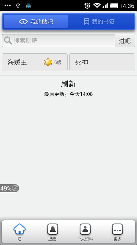
还记得几个月前刚接触“百度贴吧”这款应用时,瞬间就被它的悬浮式标题栏以及标签栏所吸引,虽然当时身边有个UI的MM说悬浮式一般都是具备隐藏的功能时才设计成这样的,一般情况下还是用直通式的好,在这里我也不讨论孰优孰劣,截取两个图,大家自己品味下。
悬浮式标题栏和标签栏:(百度贴吧);直通式标题栏和标签栏:(QQ空间)

本文的目的就是研究下百度贴吧的这个标题栏和标签栏的实现原理;
1、 悬浮式标题栏的实现
实现原理有两种:1)在布局文件中设置标题栏的layout_margin属性;2)给标题栏设置一个9-patch格式的background图片,在这种图片上设置上下左右的空白间隔,如下图所示,背景图片的top、left和right分别有一个像素的空白,bottom则是两个像素。

使用第二种方式实现的标题栏的布局文件如下:
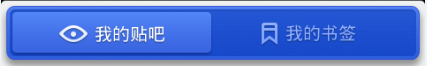
其中title_bg就是用来实现悬浮效果的9-patch背景图片,这里为了优化视觉上的效果,在背景图片上又加了一层图片,也就是home_topbar_bg,加与不加的对比效果如图:
我的贴吧和我的书签这两个按钮的按下与松开的是通过切换android:background和android:src的图片资源来实现的,而没有采用通常的selector方式,代码中设置按钮的单击响应函数,更换按钮图片资源的关键代码如下:
2、 悬浮式标签栏的实现
标签栏的实现有很多种组合,比较省事的是使用系统提供的TabHost+TabWidget,比较自由的是使用TabHost+RadioGroup,下面使用第二种方式。
标签栏悬浮效果同样是通过9-patch背景图片实现的,如下图:

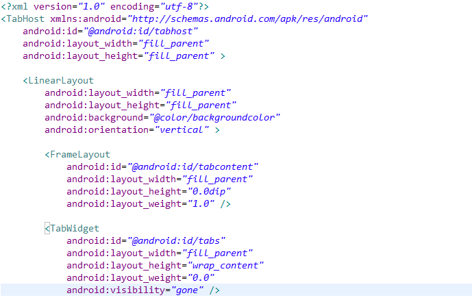
标签栏的实现必须具备三个基本元素,如下图所示,分别是1)id为@android:id/tabhost的<TabHost>标签;2)id为@android:id/tabcontent的<FrameLayout>标签;3)id为@android:id/tabs的<TabWidget>标签。如下图所示:
由于这里我们使用TabHost+RadioGroup的方式,也就是使用RadioGroup代替TabWidget,所以布局文件中TabWidget的可见性设置为gone,紧接上面布局的是RadioGroup的布局:
其中
1) maintab_toolbar_bg 是标签栏的背景图,实现悬浮效果;
2) RadioButton中的
android:drawableTop="@drawable/tabs_sort"
android:text="@string/remind"
组合可以轻松实现图片上文字下的效果;
3) FrameLayout中的android:layout_marginTop="-10.0dip"实现标签栏与上方id为tabcontent的FrameLayout部分重叠的效果(10.0dip);
4)两个TextView和FrameLayout配合实现下图中标签右上角的消息个数提示功能

接下来就是代码如何实现标签的添加,标签的点击响应等等,直接看代码了:
3、中间加载进度条的实现
既然介绍了上边的标题栏,下边的标签栏,那么中间部分也得说一说,就以加载进度条为例,效果如下图所示:
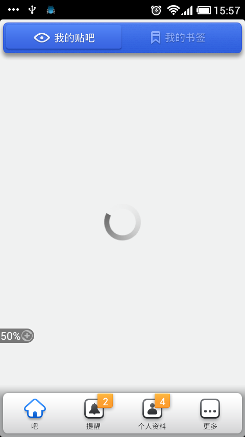
“我的贴吧”按钮对应的activity是LikeActivity,它的布局文件如下。在FrameLayout中布局了ListView和ProgressBar,且ProgressBar位于ListView的上层。
其中,android:indeterminateDrawable="@drawable/progressbar"用于指定进度条的显示的图片,progressbar.xml定义如下:
即实现图片loading围绕自身中心旋转的效果。loading图片如下图所示:

框架源码下载地址:http://download.csdn.net/detail/ace1985/4472460
悬浮式标题栏和标签栏:(百度贴吧);直通式标题栏和标签栏:(QQ空间)
本文的目的就是研究下百度贴吧的这个标题栏和标签栏的实现原理;
1、 悬浮式标题栏的实现
实现原理有两种:1)在布局文件中设置标题栏的layout_margin属性;2)给标题栏设置一个9-patch格式的background图片,在这种图片上设置上下左右的空白间隔,如下图所示,背景图片的top、left和right分别有一个像素的空白,bottom则是两个像素。
使用第二种方式实现的标题栏的布局文件如下:
<!-- 标题栏 -->
<LinearLayout
android:id="@+id/home_layout_bar"
android:layout_width="fill_parent"
android:layout_height="wrap_content"
android:layout_alignParentTop="true"
android:layout_gravity="top"
android:background="@drawable/title_bg"
android:gravity="center" >

<LinearLayout
android:layout_width="fill_parent"
android:layout_height="wrap_content"
android:background="@drawable/home_topbar_bg"
android:gravity="center"
android:orientation="horizontal" >

<!-- 我的贴吧 -->
<ImageButton
android:id="@+id/home_bt_like"
android:layout_width="fill_parent"
android:layout_height="fill_parent"
android:layout_gravity="center"
android:layout_margin="0.0dip"
android:layout_weight="1.0"
android:background="@null"
android:padding="0.0dip"
android:paddingBottom="2.0dip"
android:scaleType="center"
android:src="@drawable/home_bt_like_on" />

<!-- 我的标签 -->
<ImageButton
android:id="@+id/home_bt_mark"
android:layout_width="fill_parent"
android:layout_height="fill_parent"
android:layout_gravity="center"
android:layout_margin="0.0dip"
android:layout_weight="1.0"
android:background="@null"
android:padding="0.0dip"
android:paddingBottom="2.0dip"
android:scaleType="center"
android:src="@drawable/home_bt_mark" />
</LinearLayout>
</LinearLayout>
其中title_bg就是用来实现悬浮效果的9-patch背景图片,这里为了优化视觉上的效果,在背景图片上又加了一层图片,也就是home_topbar_bg,加与不加的对比效果如图:
我的贴吧和我的书签这两个按钮的按下与松开的是通过切换android:background和android:src的图片资源来实现的,而没有采用通常的selector方式,代码中设置按钮的单击响应函数,更换按钮图片资源的关键代码如下:
mButtonLike.setBackgroundResource(R.drawable.home_topbar_bt);
mButtonLike.setImageResource(R.drawable.home_bt_like_on);
mButtonMark.setBackgroundDrawable(null);
mButtonMark.setImageResource(R.drawable.home_bt_mark);
2、 悬浮式标签栏的实现
标签栏的实现有很多种组合,比较省事的是使用系统提供的TabHost+TabWidget,比较自由的是使用TabHost+RadioGroup,下面使用第二种方式。
标签栏悬浮效果同样是通过9-patch背景图片实现的,如下图:
标签栏的实现必须具备三个基本元素,如下图所示,分别是1)id为@android:id/tabhost的<TabHost>标签;2)id为@android:id/tabcontent的<FrameLayout>标签;3)id为@android:id/tabs的<TabWidget>标签。如下图所示:
由于这里我们使用TabHost+RadioGroup的方式,也就是使用RadioGroup代替TabWidget,所以布局文件中TabWidget的可见性设置为gone,紧接上面布局的是RadioGroup的布局:
<FrameLayout
android:layout_width="fill_parent"
android:layout_height="wrap_content"
android:layout_gravity="bottom"
android:layout_marginTop="-10.0dip"
android:background="@drawable/maintab_toolbar_bg"
android:paddingLeft="7.0dip"
android:paddingRight="7.0dip" >

<RadioGroup
android:id="@+id/main_radio"
android:layout_width="fill_parent"
android:layout_height="wrap_content"
android:gravity="center_vertical"
android:orientation="horizontal" >

<RadioButton
android:id="@+id/radio_home"
style="@style/main_tab_bottom"
android:drawableTop="@drawable/tabs_home"
android:text="@string/bar" />

<RadioButton
android:id="@+id/radio_mention"
style="@style/main_tab_bottom"
android:drawableTop="@drawable/tabs_sort"
android:text="@string/remind" />

<RadioButton
android:id="@+id/radio_person_info"
style="@style/main_tab_bottom"
android:drawableTop="@drawable/tabs_search"
android:text="@string/person_info" />

<RadioButton
android:id="@+id/radio_more"
style="@style/main_tab_bottom"
android:drawableTop="@drawable/tabs_more"
android:text="@string/more" />
</RadioGroup>

<TextView
android:id="@+id/message_mention"
android:layout_width="wrap_content"
android:layout_height="wrap_content"
android:layout_gravity="top|left|center"
android:layout_marginLeft="115.0dip"
android:layout_marginTop="-5.0dip"
android:background="@drawable/message_tips"
android:gravity="center"
android:text=""
android:textColor="#ffffffff"
android:textSize="13.0sp"
android:visibility="visible" />

<TextView
android:id="@+id/message_person"
android:layout_width="wrap_content"
android:layout_height="wrap_content"
android:layout_gravity="top|left|center"
android:layout_marginLeft="190.0dip"
android:layout_marginTop="-5.0dip"
android:background="@drawable/message_tips"
android:gravity="center"
android:text=""
android:textColor="#ffffffff"
android:textSize="13.0sp"
android:visibility="visible" />
</FrameLayout>
其中
1) maintab_toolbar_bg 是标签栏的背景图,实现悬浮效果;
2) RadioButton中的
android:drawableTop="@drawable/tabs_sort"
android:text="@string/remind"
组合可以轻松实现图片上文字下的效果;
3) FrameLayout中的android:layout_marginTop="-10.0dip"实现标签栏与上方id为tabcontent的FrameLayout部分重叠的效果(10.0dip);
4)两个TextView和FrameLayout配合实现下图中标签右上角的消息个数提示功能
接下来就是代码如何实现标签的添加,标签的点击响应等等,直接看代码了:
package com.hust.iprai.wen;

import android.app.AlertDialog;
import android.app.TabActivity;
import android.content.DialogInterface;
import android.content.Intent;
import android.os.Bundle;
import android.view.KeyEvent;
import android.widget.CompoundButton;
import android.widget.RadioButton;
import android.widget.TabHost;
import android.widget.TextView;

public class TiebaActivity extends TabActivity implements
CompoundButton.OnCheckedChangeListener {

private static final String HOME_TAB = "home_tab";
private static final String MENTION_TAB = "mention_tab";
private static final String PERSON_TAB = "person_tab";
private static final String MORE_TAB = "more_tab";

private Intent mHomeIntent = null;
private Intent mMentionIntent = null;
private Intent mPersonIntent = null;
private Intent mMoreIntent = null;

private TabHost mTabHost = null;

private TextView mMessageTipsMention = null;
private TextView mMessageTipsPerson = null;

@Override
public void onCreate(Bundle savedInstanceState) {
super.onCreate(savedInstanceState);
setContentView(R.layout.maintabs_activity);

mTabHost = getTabHost();
initIntents();
initTips();
initRadios();
setupIntents();
}

private void initIntents() {
mHomeIntent = new Intent(this, HomeActivity.class);
mMentionIntent = new Intent(this, MentionActivity.class);
mPersonIntent = new Intent(this, PersonInfoActivity.class);
mMoreIntent = new Intent(this, MoreActivity.class);
}

private void initTips() {
mMessageTipsMention = (TextView) findViewById(R.id.message_mention);
mMessageTipsPerson = (TextView) findViewById(R.id.message_person);
mMessageTipsMention.setText("2");
mMessageTipsPerson.setText("4");
}

private void initRadios() {
((RadioButton) findViewById(R.id.radio_home))
.setOnCheckedChangeListener(this);
((RadioButton) findViewById(R.id.radio_mention))
.setOnCheckedChangeListener(this);
((RadioButton) findViewById(R.id.radio_person_info))
.setOnCheckedChangeListener(this);
((RadioButton) findViewById(R.id.radio_more))
.setOnCheckedChangeListener(this);
}

private void setupIntents() {
((RadioButton) findViewById(R.id.radio_home)).setChecked(true);
mTabHost.addTab(buildTabSpec(HOME_TAB, mHomeIntent));
mTabHost.addTab(buildTabSpec(MENTION_TAB, mMentionIntent));
mTabHost.addTab(buildTabSpec(PERSON_TAB, mPersonIntent));
mTabHost.addTab(buildTabSpec(MORE_TAB, mMoreIntent));
mTabHost.setCurrentTabByTag(HOME_TAB);
}

private TabHost.TabSpec buildTabSpec(String tag, Intent intent) {
TabHost.TabSpec tabSpec = mTabHost.newTabSpec(tag);
tabSpec.setContent(intent).setIndicator("",
getResources().getDrawable(R.drawable.icon));
return tabSpec;
}

public void onCheckedChanged(CompoundButton buttonView, boolean isChecked) {
if (isChecked) {
switch (buttonView.getId()) {
case R.id.radio_home:
mTabHost.setCurrentTabByTag(HOME_TAB);
break;
case R.id.radio_mention:
mTabHost.setCurrentTabByTag(MENTION_TAB);
break;
case R.id.radio_person_info:
mTabHost.setCurrentTabByTag(PERSON_TAB);
break;
case R.id.radio_more:
mTabHost.setCurrentTabByTag(MORE_TAB);
break;
default:
break;
}
}
}

@Override
public boolean dispatchKeyEvent(KeyEvent event) {
if ((event.getAction() == KeyEvent.ACTION_DOWN)
&& (event.getKeyCode() == KeyEvent.KEYCODE_BACK)) {
quitDialog();
}
return super.dispatchKeyEvent(event);
}

private void quitDialog() {
new AlertDialog.Builder(this)
.setTitle(R.string.alerm_title)
.setIcon(null)
.setCancelable(false)
.setMessage(R.string.alert_quit_confirm)
.setPositiveButton(R.string.alert_yes_button,
new DialogInterface.OnClickListener() {

public void onClick(DialogInterface dialog,
int which) {
TiebaActivity.this.finish();
}
})
.setNegativeButton(R.string.alert_no_button,
new DialogInterface.OnClickListener() {

public void onClick(DialogInterface dialog,
int which) {
dialog.dismiss();
}
}).create().show();
}
}
3、中间加载进度条的实现
既然介绍了上边的标题栏,下边的标签栏,那么中间部分也得说一说,就以加载进度条为例,效果如下图所示:
“我的贴吧”按钮对应的activity是LikeActivity,它的布局文件如下。在FrameLayout中布局了ListView和ProgressBar,且ProgressBar位于ListView的上层。
<?xml version="1.0" encoding="utf-8"?>
<FrameLayout xmlns:android="http://schemas.android.com/apk/res/android"
android:layout_width="fill_parent"
android:layout_height="fill_parent" >

<ListView
android:id="@+id/home_lv_forum"
android:layout_width="fill_parent"
android:layout_height="wrap_content"
android:background="@color/backgroundcolor"
android:cacheColorHint="@color/backgroundcolor"
android:divider="@drawable/list_divider"
android:fadingEdge="none"
android:listSelector="@drawable/list_selector" />

<ProgressBar
android:id="@+id/home_progress_like"
style="?android:attr/progressBarStyleInverse"
android:layout_width="wrap_content"
android:layout_height="wrap_content"
android:layout_gravity="center"
android:indeterminateDrawable="@drawable/progressbar"
android:visibility="visible" />

</FrameLayout>
其中,android:indeterminateDrawable="@drawable/progressbar"用于指定进度条的显示的图片,progressbar.xml定义如下:
<?xml version="1.0" encoding="utf-8"?>
<animated-rotate xmlns:android="http://schemas.android.com/apk/res/android"
android:drawable="@drawable/loading"
android:pivotX="50.0%"
android:pivotY="50.0%" />
即实现图片loading围绕自身中心旋转的效果。loading图片如下图所示:
框架源码下载地址:http://download.csdn.net/detail/ace1985/4472460

相关文章推荐
- android 较高版本,页面分割线实现LinearLayoutCompat布局简单事例
- 在Android中afinal框架下实现sqlite数据库版本升级的办法
- android 较高版本,页面分割线实现LinearLayoutCompat布局简单事例
- Android批量图片加载经典系列——Volley框架实现多布局的新闻列表
- Android批量图片载入经典系列——Volley框架实现多布局的新闻列表
- 在Android中afinal框架下实现sqlite数据库版本升级的办法
- 在Android中afinal框架下实现sqlite数据库版本升级的办法
- Android用户界面设计“.NET研究”:框架布局
- PhoneGap或者Cordova框架下实现Html5中JS调用Android原生代码
- Android开发实现布局中为控件添加选择器的方法
- Android框架之路——Banner实现轮播图(RecyclerView添加Header)
- Android 实现高斯模糊效果及低版本兼容
- [置顶] Android 偷梁换柱!!!带你实现修改shareSDK九宫格布局,去除阴影的动画。
- android之自定义ViewGroup和自动换行的布局的实现
- Android中多层动态嵌套布局的实现
- Android自动化测试框架新书:<<MonnkeyRunner实现原理剖析>>交流
- Android服务器——使用TomCat实现软件的版本检测,升级,以及下载更新进度!
- android开发之&使用RecyclerView实现瀑布流布局(二)
- 解决Android软键盘弹出 布局内指定内容上移实现
- Android已有的原生Camera框架中添加自己的API的实现方案。