JavaScript版的简单动画
2012-03-15 20:23
134 查看
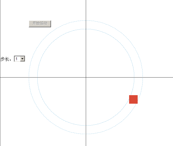
Google+中有一个特效:拖拽用户头像至分组内,用户头像会有一个特效(绕着圆圈转一圈)。写了个简单的示例,效果如下图所示:
核心部分就是:
for (var i = 0; i < 360; i+=1) {
var radius = Math.PI * i / 180;
//Math.cos(angle)、Math.sin(angle)
//todo….
}
1角度 = Math.PI / 180 => (π/180)
</body>
</html>
[/code]
本地运行示例:
~ ~
* {margin:0; padding:0;}
.m {position:absolute; width:1px; height:1px; z-index:1; background-color:#3399cc}
.move {width:30px; height:30px; position:absolute; background-color:#da4936; z-index:999; border-radius:25px;}
.h {width:800px; position:absolute; border-top:1px solid #323232; top:300px; left:0px; z-index:9;}
.v {height:800px; border-left:1px solid #323232; left:300px; top:0; z-index:10; position:absolute;}
#btn {margin:100px;}
开始运动
步长:
1
2
3
5
8
10
15
20
30
//1度=π/180 弧度 ( ≈0.017453弧度 )
!(function() {
for (var i = 0; i < 360; i+=1) {
var r = 200;
var x0 = 300;
var y0 = 300;
var angle = Math.PI * i / 180;
var x = Math.cos(angle) * r + x0;
var y = Math.sin(angle) * r + y0;
document.write('');
r = 170;
x = Math.cos(angle) * r + x0;
y = Math.sin(angle) * r + y0;
document.write('');
}
})();
function getEl(id) {
return typeof id === 'string' ? document.getElementById(id) : id;
}
getEl("btn").onclick = moveHandler;
function movePos(n) {
var el = getEl("modelEl");
var r = 185;
var x0 = 300;
var y0 = 300;
var angle = Math.PI * n / 180;
var x = Math.cos(angle) * r + x0 - el.offsetWidth/2;
var y = Math.sin(angle) * r + y0 - el.offsetHeight/2;
el.style.left = x + 'px';
el.style.top = y + 'px';
}
movePos(270);
function transform(A) {
return 1 - Math.pow(1 - A, 3);
}
function moveHandler() {
var base = 270;
var step = getEl('sel').value | 0;
var start = 360;
var end = 0;
getEl("btn").disabled = true;
var timer = setInterval(function() {
if (start >= end) {
movePos(base + start);
start -= step;
step += transform((start - end)/360) / 100;
} else {
movePos(base + end);
clearInterval(timer);
if (moveHandler.count < 10) {
moveHandler.count++;
setTimeout(function() {
getEl("sel").selectedIndex = Math.random() * getEl("sel").options.length | 0;
moveHandler();
}, 100);
} else {
moveHandler.count = 0;
getEl("btn").disabled = false;
}
}
}, 1);
}
moveHandler.count = 0;
预览代码
核心部分就是:
for (var i = 0; i < 360; i+=1) {
var radius = Math.PI * i / 180;
//Math.cos(angle)、Math.sin(angle)
//todo….
}
1角度 = Math.PI / 180 => (π/180)
[code]<!DOCTYPE HTML PUBLIC "-//W3C//DTD HTML 4.01//EN" "http://www.w3.org/TR/html4/strict.dtd">
<html>
<head>
<title>~ ~</title>
<meta name="generator" content="editplus" />
<meta name="author" content="" />
<meta name="keywords" content="" />
<meta name="description" content="" />
<meta http-equiv='content-type' content='text/html; charset=utf-8' />
<style type='text/css'>
* {margin:0; padding:0;}
.m {position:absolute; width:1px; height:1px; z-index:1; background-color:#3399cc}
.move {width:30px; height:30px; position:absolute; background-color:#da4936; z-index:999; border-radius:25px;}
.h {width:800px; position:absolute; border-top:1px solid #323232; top:300px; left:0px; z-index:9;}
.v {height:800px; border-left:1px solid #323232; left:300px; top:0; z-index:10; position:absolute;}

#btn {margin:100px;}
</style>
</head>

<body>

<button id="btn">开始运动</button>
<div class="move" id="modelEl"></div>

<div class="h"></div>
<div class="v"></div>

<div>
步长:<select id='sel'>
<option value="1">1</option>
<option value="2">2</option>
<option value="3">3</option>
<option value="5">5</option>
<option value="8">8</option>
<option value="10">10</option>
<option value="15">15</option>
<option value="20">20</option>
<option value="30">30</option>
</select>
</div>

<script type="text/javascript">
//1度=π/180 弧度 ( ≈0.017453弧度 )
!(function() {for (var i = 0; i < 360; i+=1) {var r = 200;
var x0 = 300;
var y0 = 300;
var angle = Math.PI * i / 180;
var x = Math.cos(angle) * r + x0;
var y = Math.sin(angle) * r + y0;
document.write('<div class="m" style="left:'+x+'px; top:'+y+'px;"></div>');r = 170;
x = Math.cos(angle) * r + x0;
y = Math.sin(angle) * r + y0;
document.write('<div class="m" style="left:'+x+'px; top:'+y+'px;"></div>');}
})();
function getEl(id) {return typeof id === 'string' ? document.getElementById(id) : id;
}
getEl("btn").onclick = moveHandler;function movePos(n) {var el = getEl("modelEl");var r = 185;
var x0 = 300;
var y0 = 300;
var angle = Math.PI * n / 180;
var x = Math.cos(angle) * r + x0 - el.offsetWidth/2;
var y = Math.sin(angle) * r + y0 - el.offsetHeight/2;
el.style.left = x + 'px';
el.style.top = y + 'px';
}
movePos(270);
function transform(A) {return 1 - Math.pow(1 - A, 3);
}
function moveHandler() {var base = 270;
var step = getEl('sel').value | 0;var start = 360;
var end = 0;
getEl("btn").disabled = true;var timer = setInterval(function() { if (start >= end) {movePos(base + start);
start -= step;
step += transform((start - end)/360) / 100;
} else {movePos(base + end);
clearInterval(timer);
if (moveHandler.count < 10) {moveHandler.count++;
setTimeout(function() { getEl("sel").selectedIndex = Math.random() * getEl("sel").options.length | 0;moveHandler();
}, 100);
} else {moveHandler.count = 0;
getEl("btn").disabled = false;}
}
}, 1);
}
moveHandler.count = 0;
</script>
</body>
</html>
[/code]
本地运行示例:
~ ~
* {margin:0; padding:0;}
.m {position:absolute; width:1px; height:1px; z-index:1; background-color:#3399cc}
.move {width:30px; height:30px; position:absolute; background-color:#da4936; z-index:999; border-radius:25px;}
.h {width:800px; position:absolute; border-top:1px solid #323232; top:300px; left:0px; z-index:9;}
.v {height:800px; border-left:1px solid #323232; left:300px; top:0; z-index:10; position:absolute;}
#btn {margin:100px;}
开始运动
步长:
1
2
3
5
8
10
15
20
30
//1度=π/180 弧度 ( ≈0.017453弧度 )
!(function() {
for (var i = 0; i < 360; i+=1) {
var r = 200;
var x0 = 300;
var y0 = 300;
var angle = Math.PI * i / 180;
var x = Math.cos(angle) * r + x0;
var y = Math.sin(angle) * r + y0;
document.write('');
r = 170;
x = Math.cos(angle) * r + x0;
y = Math.sin(angle) * r + y0;
document.write('');
}
})();
function getEl(id) {
return typeof id === 'string' ? document.getElementById(id) : id;
}
getEl("btn").onclick = moveHandler;
function movePos(n) {
var el = getEl("modelEl");
var r = 185;
var x0 = 300;
var y0 = 300;
var angle = Math.PI * n / 180;
var x = Math.cos(angle) * r + x0 - el.offsetWidth/2;
var y = Math.sin(angle) * r + y0 - el.offsetHeight/2;
el.style.left = x + 'px';
el.style.top = y + 'px';
}
movePos(270);
function transform(A) {
return 1 - Math.pow(1 - A, 3);
}
function moveHandler() {
var base = 270;
var step = getEl('sel').value | 0;
var start = 360;
var end = 0;
getEl("btn").disabled = true;
var timer = setInterval(function() {
if (start >= end) {
movePos(base + start);
start -= step;
step += transform((start - end)/360) / 100;
} else {
movePos(base + end);
clearInterval(timer);
if (moveHandler.count < 10) {
moveHandler.count++;
setTimeout(function() {
getEl("sel").selectedIndex = Math.random() * getEl("sel").options.length | 0;
moveHandler();
}, 100);
} else {
moveHandler.count = 0;
getEl("btn").disabled = false;
}
}
}, 1);
}
moveHandler.count = 0;
预览代码

相关文章推荐
- 巧用HTML5给按钮背景设计不同的动画简单实例
- iOS开发UI篇—iOS开发中三种简单的动画设置
- js 匀速/缓动动画 简单封装
- IOS视图切换实现简单动画
- UIView的简单动画
- JAVAScript简单动画~移动方块~setInterval()~碰到边缘弹回
- Android中PopupWindow的简单操作和动画的操作
- swift的代码教程-ios简单动画类(Animator)
- 收集汇总各种简单易用动画
- ios 交换两个uiview的简单动画
- 场景过渡动画(Scene Transition)-简单使用
- iOS 简单动画 序列帧动画
- 【Unity】动画系统简单介绍
- 用Quick3.3简单开发微信打飞机03 添加爆炸动画和子弹与敌机的碰撞
- 简单的弹跳动画
- 简单的动画移动效果 web
- 窗口的简单动画
- 基于HTML5的简单游戏动画Demo_update3
- Lottie- 让Android动画实现更简单
- 微信小程序 动画的简单实例