Matlab 二维绘图--图形与图轴控制
2011-08-27 15:22
591 查看
一、图形控制
plot(x, y, 'CLM')
C:曲线的颜色(Colors)
L:曲线的格式(Line Styles)
M:曲线的线标(Markers)
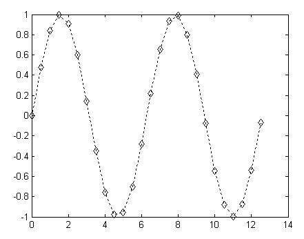
x = 0:0.5:4*pi; % x 向量的起始与结束元素为 0 及 4*pi, 0.5为各元素相差值
y = sin(x);
plot(x,y,'k:diamond') % 其中k代表黑色,:代表点线,而diamond则指定菱形为曲线的线标
plot 指令的曲线颜色
Plot指令的曲线颜色字串 曲线颜色
b 蓝色(Blue)
c 青蓝色(Cyan)
g 绿色(Green)
k 黑色(Black)
m 紫黑色(Magenta)
r 红色(Red)
w 白色
y 黃色(Yellow)
plot 指令的曲线样式
Plot指令的曲线样式字串 曲线样式
- 实线(默认值)
-- 虚线
: 点线
-. 点虚线
plot 指令的曲线线标
Plot指令的曲线线标字串 曲线线标
O 圆形
+ 加号
X 叉号
* 星号
. 点号
^ 朝上三角形
V 朝下三角形
> 朝右三角形
< 朝左三角形
square 方形
diamond 菱形
pentagram 五角星形
hexagram 六角星形
None 无符号(默认值)
二、图轴控制
plot 指令会根据坐标点自动决定坐标轴范围,也可以使用axis指令指定坐标轴范围
使用语法:
axis([xmin, xmax, ymin, ymax])
xmin, xmax:指定 x 轴的最小和最大值
ymin, ymax:指定 y 轴的最小和最大值
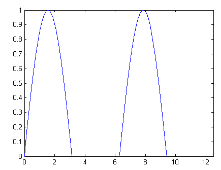
x = 0:0.1:4*pi;
y = sin(x);
plot(x, y);
axis([-inf, inf, 0, 1]); % 画出正弦波 y 轴介于 0 和 1 的部份
指定坐标轴上的网格点(Ticks)
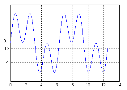
x = 0:0.1:4*pi;
plot(x, sin(x)+sin(3*x))
set(gca, 'ytick', [-1 -0.3 0.1 1]); % 在 y 轴加上网格点
grid on % 加上网格
gca:get current axis的简称,传回目前使用中的坐标轴
将网格点的数字改为文字
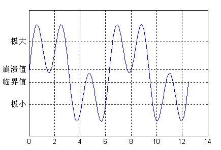
x = 0:0.1:4*pi;
plot(x, sin(x)+sin(3*x))
set(gca, 'ytick', [-1 -0.3 0.1 1]); % 改变网格点
set(gca, 'yticklabel', {'极小', '临界值', '崩溃值', '极大'}); % 改变网格点的文字
grid on
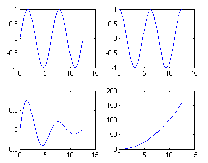
在一个视窗中同时画出四个图
x = 0:0.1:4*pi;
subplot(2, 2, 1); plot(x, sin(x)); % 左上角图形
subplot(2, 2, 2); plot(x, cos(x)); % 右上角图形
subplot(2, 2, 3); plot(x, sin(x).*exp(-x/5)); % 左下角图形
subplot(2, 2, 4); plot(x, x.^2); % 右下角图形

长宽比(Aspect Ratio)
一般图轴长宽比是视窗的长宽比, 可在axis指令后加不同的字串来修改
t = 0:0.1:2*pi;
x = 3*cos(t);
y = sin(t);
subplot(2, 2, 1); plot(x, y); axis normal %使用默认长宽比(等于图形长宽比)
subplot(2, 2, 2); plot(x, y); axis square %长宽比例为 1
subplot(2, 2, 3); plot(x, y); axis equal %长宽比例不变,但两轴刻度一致
subplot(2, 2, 4); plot(x, y); axis equal tight %两轴刻度比例一致,且图轴贴紧图形
三、grid 和 box 指令
grid on 画出网格
grid off 取消网格
box on 画出图轴的外围长方形
box off 取消图轴的外围长方形
给图形和图轴加说明文字
指令 说明
title 图形的标题
xlabel x 轴的说明
ylabel y 轴的说明
zlabel z 轴的说明
legend 多条曲线的说明
text 在图形中加入文字
gtext 使用滑鼠决定文字的位置

subplot(1,1,1);
x = 0:0.1:2*pi;
y1 = sin(x);
y2 = exp(-x);
plot(x, y1, '--*', x, y2, ':o');
xlabel('t = 0 to 2\pi');
ylabel('values of sin(t) and e^{-x}')
title('Function Plots of sin(t) and e^{-x}');
legend('sin(t)','e^{-x}');
「\」为特殊符号,产生上标、下标、希腊字母、数学符号等

text指令
text(x, y, string)
x、y :文字的起始座标位置
string :代表此文字
x = 0:0.1:2*pi;
plot(x, sin(x), x, cos(x));
text(pi/4, sin(pi/4),'\leftarrow sin(\pi/4) = 0.707');
text(5*pi/4, cos(5*pi/4),'cos(5\pi/4) = -0.707\rightarrow', 'HorizontalAlignment', 'right');
「HorizontalAlignment」及「right」将文字向右水平靠齐
四、各种二维绘图指令
指令 说明
errorbar 在曲线加上误差范围
fplot、ezplot 较精确的函数图形
polar、ezpolar 极座标图形
hist 直角座标直方图(累计图)
rose 极座标直方图(累计图)
compass 罗盘图
feather 羽毛图
area 面积图
stairs 阶梯图

已知资料的误差范围,用 errorbar 表示。以 y 坐标高度 20% 作为资料的误差范围
x = linspace(0,2*pi,30); % 在 0 到 2 之间,等分取 30 个点
y = sin(x);
e = y*0.2;
errorbar(x,y,e) % 图形上加上误差范围 e
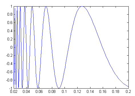
fplot 指令:对剧烈变化处进行较密集的取样
fplot('sin(1/x)', [0.02 0.2]); % [0.02 0.2]是绘图范围
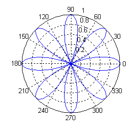
theta = linspace(0, 2*pi);
r = cos(4*theta);
polar(theta, r); % 进行极坐标绘图
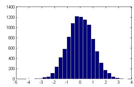
将 10000 个由 randn 产生的正规分布之随机数分成 25 堆
x = randn(10000, 1); % 产生 10000 个正规分布随机数
hist(x, 25); % 绘出直方图,显示 x 资料的分布情况和统计特性,数字 25 代表资料依大小分堆的堆数,即是指方图内长条的个数
set(findobj(gca, 'type', 'patch'), 'edgecolor', 'w');% 将长条图的边缘设定成白色
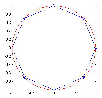
试写一函数 regpoly(n),其功能是画出一个圆心在 (0, 0)、半径为 1 的圆,并在圆内画出一个内接正 n 边形,其中一顶点位于 (0, 1)。
regpoly.m文件:
function regpoly(n)
vertices=[1];
for i=1:n
step=2*pi/n;
vertices=[vertices, exp(i*step*sqrt(-1))];
end
plot(vertices, '-o');
axis image
% 画外接圆
hold on
theta=linspace(0, 2*pi);
plot(cos(theta), sin(theta), '-r');
hold off
axis image
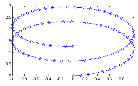
一条参数式的曲线可由下列方程式表示:
x = sin(t), y = 1 - cos(t) + t/10
当 t 由 0 变化到 4*pi 时,请写一个 MATLAB 的脚本 plotParam.m,画出此曲线在 XY 平面的轨迹。
t = linspace(0, 4*pi);
x = sin(t);
y = 1-cos(t)+t/10;
plot(x, y, '-o');
plot(x, y, 'CLM')
C:曲线的颜色(Colors)
L:曲线的格式(Line Styles)
M:曲线的线标(Markers)
x = 0:0.5:4*pi; % x 向量的起始与结束元素为 0 及 4*pi, 0.5为各元素相差值
y = sin(x);
plot(x,y,'k:diamond') % 其中k代表黑色,:代表点线,而diamond则指定菱形为曲线的线标
plot 指令的曲线颜色
Plot指令的曲线颜色字串 曲线颜色
b 蓝色(Blue)
c 青蓝色(Cyan)
g 绿色(Green)
k 黑色(Black)
m 紫黑色(Magenta)
r 红色(Red)
w 白色
y 黃色(Yellow)
plot 指令的曲线样式
Plot指令的曲线样式字串 曲线样式
- 实线(默认值)
-- 虚线
: 点线
-. 点虚线
plot 指令的曲线线标
Plot指令的曲线线标字串 曲线线标
O 圆形
+ 加号
X 叉号
* 星号
. 点号
^ 朝上三角形
V 朝下三角形
> 朝右三角形
< 朝左三角形
square 方形
diamond 菱形
pentagram 五角星形
hexagram 六角星形
None 无符号(默认值)
二、图轴控制
plot 指令会根据坐标点自动决定坐标轴范围,也可以使用axis指令指定坐标轴范围
使用语法:
axis([xmin, xmax, ymin, ymax])
xmin, xmax:指定 x 轴的最小和最大值
ymin, ymax:指定 y 轴的最小和最大值
x = 0:0.1:4*pi;
y = sin(x);
plot(x, y);
axis([-inf, inf, 0, 1]); % 画出正弦波 y 轴介于 0 和 1 的部份
指定坐标轴上的网格点(Ticks)
x = 0:0.1:4*pi;
plot(x, sin(x)+sin(3*x))
set(gca, 'ytick', [-1 -0.3 0.1 1]); % 在 y 轴加上网格点
grid on % 加上网格
gca:get current axis的简称,传回目前使用中的坐标轴
将网格点的数字改为文字
x = 0:0.1:4*pi;
plot(x, sin(x)+sin(3*x))
set(gca, 'ytick', [-1 -0.3 0.1 1]); % 改变网格点
set(gca, 'yticklabel', {'极小', '临界值', '崩溃值', '极大'}); % 改变网格点的文字
grid on
在一个视窗中同时画出四个图
x = 0:0.1:4*pi;
subplot(2, 2, 1); plot(x, sin(x)); % 左上角图形
subplot(2, 2, 2); plot(x, cos(x)); % 右上角图形
subplot(2, 2, 3); plot(x, sin(x).*exp(-x/5)); % 左下角图形
subplot(2, 2, 4); plot(x, x.^2); % 右下角图形
长宽比(Aspect Ratio)
一般图轴长宽比是视窗的长宽比, 可在axis指令后加不同的字串来修改
t = 0:0.1:2*pi;
x = 3*cos(t);
y = sin(t);
subplot(2, 2, 1); plot(x, y); axis normal %使用默认长宽比(等于图形长宽比)
subplot(2, 2, 2); plot(x, y); axis square %长宽比例为 1
subplot(2, 2, 3); plot(x, y); axis equal %长宽比例不变,但两轴刻度一致
subplot(2, 2, 4); plot(x, y); axis equal tight %两轴刻度比例一致,且图轴贴紧图形
三、grid 和 box 指令
grid on 画出网格
grid off 取消网格
box on 画出图轴的外围长方形
box off 取消图轴的外围长方形
给图形和图轴加说明文字
指令 说明
title 图形的标题
xlabel x 轴的说明
ylabel y 轴的说明
zlabel z 轴的说明
legend 多条曲线的说明
text 在图形中加入文字
gtext 使用滑鼠决定文字的位置
subplot(1,1,1);
x = 0:0.1:2*pi;
y1 = sin(x);
y2 = exp(-x);
plot(x, y1, '--*', x, y2, ':o');
xlabel('t = 0 to 2\pi');
ylabel('values of sin(t) and e^{-x}')
title('Function Plots of sin(t) and e^{-x}');
legend('sin(t)','e^{-x}');
「\」为特殊符号,产生上标、下标、希腊字母、数学符号等
text指令
text(x, y, string)
x、y :文字的起始座标位置
string :代表此文字
x = 0:0.1:2*pi;
plot(x, sin(x), x, cos(x));
text(pi/4, sin(pi/4),'\leftarrow sin(\pi/4) = 0.707');
text(5*pi/4, cos(5*pi/4),'cos(5\pi/4) = -0.707\rightarrow', 'HorizontalAlignment', 'right');
「HorizontalAlignment」及「right」将文字向右水平靠齐
四、各种二维绘图指令
指令 说明
errorbar 在曲线加上误差范围
fplot、ezplot 较精确的函数图形
polar、ezpolar 极座标图形
hist 直角座标直方图(累计图)
rose 极座标直方图(累计图)
compass 罗盘图
feather 羽毛图
area 面积图
stairs 阶梯图
已知资料的误差范围,用 errorbar 表示。以 y 坐标高度 20% 作为资料的误差范围
x = linspace(0,2*pi,30); % 在 0 到 2 之间,等分取 30 个点
y = sin(x);
e = y*0.2;
errorbar(x,y,e) % 图形上加上误差范围 e
fplot 指令:对剧烈变化处进行较密集的取样
fplot('sin(1/x)', [0.02 0.2]); % [0.02 0.2]是绘图范围
theta = linspace(0, 2*pi);
r = cos(4*theta);
polar(theta, r); % 进行极坐标绘图
将 10000 个由 randn 产生的正规分布之随机数分成 25 堆
x = randn(10000, 1); % 产生 10000 个正规分布随机数
hist(x, 25); % 绘出直方图,显示 x 资料的分布情况和统计特性,数字 25 代表资料依大小分堆的堆数,即是指方图内长条的个数
set(findobj(gca, 'type', 'patch'), 'edgecolor', 'w');% 将长条图的边缘设定成白色
试写一函数 regpoly(n),其功能是画出一个圆心在 (0, 0)、半径为 1 的圆,并在圆内画出一个内接正 n 边形,其中一顶点位于 (0, 1)。
regpoly.m文件:
function regpoly(n)
vertices=[1];
for i=1:n
step=2*pi/n;
vertices=[vertices, exp(i*step*sqrt(-1))];
end
plot(vertices, '-o');
axis image
% 画外接圆
hold on
theta=linspace(0, 2*pi);
plot(cos(theta), sin(theta), '-r');
hold off
axis image
一条参数式的曲线可由下列方程式表示:
x = sin(t), y = 1 - cos(t) + t/10
当 t 由 0 变化到 4*pi 时,请写一个 MATLAB 的脚本 plotParam.m,画出此曲线在 XY 平面的轨迹。
t = linspace(0, 4*pi);
x = sin(t);
y = 1-cos(t)+t/10;
plot(x, y, '-o');

相关文章推荐
- Matlab 常用绘图指令(二维图形)
- 介绍MATLAB 的基本绘图功能:二维平面图形
- 介绍MATLAB 的两种基本绘图功能:二维平面图形和三维立体图形
- Matlab中保存图像时 图形窗口大小的控制
- Matlabe二维绘图
- Matlab中使用Java api绘图图形并保存为jpeg格式
- Matlab绘图基本控制命令
- matlab 绘图字体大小控制
- Matlab编程之二维绘图
- matlab界面设计之一 二维绘图
- matlab图形控制
- Matlab绘图基本控制命令
- matlab绘图的坐标轴数字、范围、间隔控制 .
- Matlab 二维绘图函数
- matlab图形格式控制+程序结构
- Matlab图形窗口大小的控制 ,plot窗口大小,figure大小,axis设置,实用
- Matlab绘图颜色控制
- Matlab 二维曲线图形显示
- Matlab 二维绘图函数(plot类)
- matlab 生成二维或三维空间中满足正态分布的样本点,并绘图