CSS实现固定宽度且居中的页面排版
2011-08-01 16:18
369 查看
先看一下效果图:
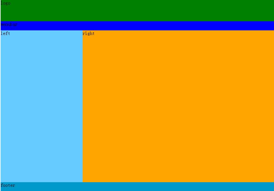
这样的排版即固定宽度且居中。它的实现代码如下:
<!DOCTYPE html PUBLIC "-//W3C//DTD XHTML 1.0 Transitional//EN" "http://www.w3.org/TR/xhtml1/DTD/xhtml1-transitional.dtd">
<html xmlns="http://www.w3.org/1999/xhtml">
<head>
<title>CSS实现固定宽度且居中页面版式</title>
<meta http-equiv="Content-Type" content="text/html; charset=gb2312" />
<style type="text/css">
body{margin:0;}
#container{width:900px;margin:0 auto;}
.clearfloat { clear:both; height:0; font-size: 1px; line-height: 0px;}
#header{height:100px;background-color:yellow;}
#logo{height:70px;background-color:green;}
#menubar{height:30px;background-color:blue;}
#mainbody{}
#left{width:30%;float:left;height:500px;background-color:#6cf}
#right{width:70%;float:right;height:500px;background-color:orange;}
#footer{height:30px;clear:both;background-color:#09c}
</style>
</head>
<body>
<div id="container">
<div id="header">
<div id="logo">logo</div>
<div id="menubar">menubar</div>
</div><!--head end-->
<div id="mainbody">
<div id="left">
left
</div>
<div id="right">
right
</div>
</div><!--mainbody end-->
<div id="footer">
footer
</div>
</div>
</body>
</html>

相关文章推荐
- DIV+CSS 页面布局--固定宽度且居中的版式
- css实现高度不固定的div元素模块在页面中水平垂直居中
- CSS实现不固定宽度和高度的自动居中
- css实现高度或者宽度不固定的div元素垂直左右居中
- CSS如何实现”右部宽度固定,左部自适应“的布局
- 网易的一道CSS笔试题--固定宽高的子元素如何在未知宽高的父元素中实现居中?
- 使用CSS实现三栏自适应布局(两边宽度固定,中间自适应)
- (中文排版CSS心得)----固定宽度汉字截断 —— 使用text-overflow!
- CSS实现左右栏宽度固定中间栏宽度变化且各栏高度自适应背景色不同的三栏布局
- css---pc、无线如果通过js获取屏幕宽度结合sass实现自适应页面
- 老生长谈:css实现右侧固定宽度,左侧宽度自适应
- 使用CSS实现三栏自适应布局(两边宽度固定,中间自适应)
- 基于flex弹性布局实现“头尾固定,中间滚动”的页面(纯CSS实现)
- css实现固定高度及未知高度文字垂直居中的完美解决方案
- CSS学习笔记----页面居中实现
- css自适应宽度 多种方法实现宽度自适应的水平居中
- css实现右侧固定宽度,左侧宽度自适应
- css实现页面元素居中
- CSS在页面布局中实现div垂直居中的方法总结(转)
- [Web]完全 Div 实现 页面居中、多行多列等 排版实例