使用Sencha Designer来快速开发web用户界面 -- 页面布局
2010-11-16 21:42
405 查看
使用Sencha Designer来快速开发web用户界面 -- 页面布局
1.what is layout?2.basic layout?
3.如何配置容器的layout?
4.some useful demo?
1.what is layout ?
In ExtJS, layouts control the size and position of the components within an application.其中需要注意的是一个子容器的layout是默认继承自它的父容器的layout的。有时候,一些container是存在default layout,例如像FormPanel默认使用的layout就是form layout。2.basic layout
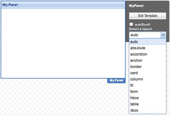
auto: 如果一个容器没有设置layout的话,那么默认的使用auto作为layout,但是对于特定的容器的话,默认的layout可能不是auto。For example, FormPanel defaults to the form layout and TabPanel defaults to the card layout.absolute: 使用xy坐标的形式来布局容器中的控件。当你使用absolute作为容器的布局时,Designer会显示grid,但是在最终的界面上是不显示的。
accordion: Arranges panel components in a vertical stack where only one panel is expanded at a time
anchor:Arranges components relative to the sides of the container.
card:Arranges multiple child components but only one component is visible at a time.
column: Arranges components in a multi-column layout.
fit: Expands a single child component to fill the available space.
form:Arranges a collection of labelled form fields. A FormPanel uses the form layout by default.
hbox:Arranges the child components horizontally.
table:Arranges components in an HTML table. You specify the number of columns in the table and can create complex layouts by specifying the rowspan and colspan attributes on the child components
vbox:Arranges the child components vertically. Setting the alignment of the container to stretch causes the
child components to fill the available horizontal space. Setting the flex attribute of the child components controls the proportion of the vertical space each component fills.
3.如何配置容器的layout?
4. some useful demo
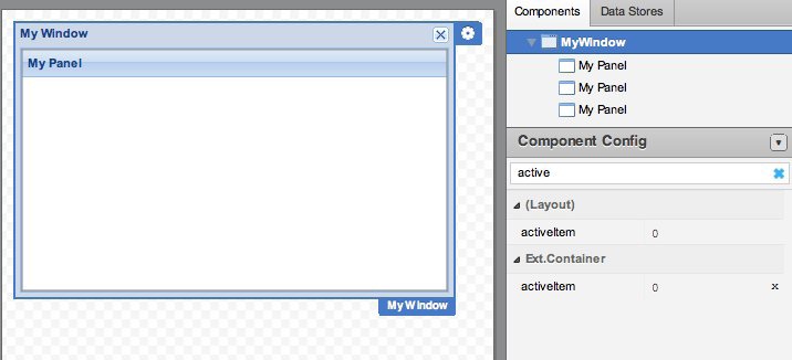
这里使用Designer设计一个使用Car layout的registration wizard。1. Drag a Window onto the Designer Canvas. A Window can only be added as a top-level component, it cannot be added as a child of an existing component.
2. Click the Window's flyout config button and select card from the layout menu.

3. Drag a Panel component onto the Window for the first step in the wizard. Panels in a CardLayout are numbered in the order they are added to the container, starting with item 0. By default, item 0 is set as the active item. To change the active item within Designer, select the Window and set the activeItem attribute to the panel you want to make active.
4. Add two more panels to the Window. You can drag them onto the title bar of the Window on the canvas, or onto the Window in the Components tab.
5. Edit the title of the Window to name the wizard. You can double-click the Window title on the Canvas to edit it, or select the Window and set the title attribute in the Component Config inspector.

6. Hide the title bars of each Panel in the Wizard by selecting the Panel in the Components tab and clicking the delete icon next to its title attribute in the Component Config inspector.

7. Add a Toolbar to the Window for the navigation buttons and dock it at the bottom of the Window (bbar).
8. Add four buttons to the Toolbar and set the buttons' text attributes to Cancel, Previous, Next, and Submit. You can double-click the button labels on the Canvas to edit them, and use tab to move to the next button in the Toolbar.
9. To align the buttons, you can add a Fill between the Cancel and Previous button, and a Spacer of width 20 between the Next and Submit buttons.
10. Set the autoRef attribute for each button so you can easily reference the buttons in your navigation handler. For example, autoRef: cancelBtn, autoRef: prevBtn, autoRef: nextBtn, and autoRef: submitBtn.
11.Now we're ready to add the content for each card in the Wizard. However, since we want to gather user input, we actually want each card to be a FormPanel rather than a Panel. Fortunately, in Designer it's easy to transform a component into another type. To change the Panels into FormPanels, right-click each one and choose Transform > FormPanel

相关文章推荐
- 使用Sencha Designer来快速开发web用户界面 -- 页面布局
- 使用Sencha Designer来快速开发web用户界面 -- 初识Designer
- 使用Sencha Designer来快速开发web用户界面 -- 初识Designer
- 使用 Grails 快速开发 Web 应用程序--定制页面
- [Phonegap+Sencha Touch] 移动开发59 移动web页面N宫格图标布局怎么实现?
- 自己开发的web快速开发平台教程(1),布局(Layout)的使用教程
- Java Web应用快速开发平台OpenJWeb(v1.6)增删改查页面生成器操作手册
- [Phonegap+Sencha Touch] 移动开发17 使用桌面版chrome调试安卓设备上的chrome和webview
- 移动端Web页面的CSS3 flex布局快速上手指南
- 使用 IDEA + Maven + Git 快速开发 Java Web 应用
- Java Web应用快速开发平台OpenJWeb(v1.6)增删改查页面生成器操作手册
- iOS开发之使用UIView-Positioning简化页面布局
- 使用OEPE快速开发WebLogic Web Service
- 使用 Grails 快速开发 Web 应用程序--Web 开发的关键要素
- Day 6:在 Java 虚拟机上使用 Grails 进行快速 Web 开发
- (转)基于MVC4+EasyUI的Web开发框架经验总结(11)--使用Bundles处理简化页面代码
- 使用 IDEA + Maven + Git 快速开发 JAVA或者Web 应用(转)
- 介绍内容有 Android 开发规范, 架构, 布局技巧, 以及使用一些有助于快速开发相关工具等等
- 从零开始,使用python快速开发web站点(1)
- Skyline软件二次开发初级——4如何在WEB页面中的三维地图上使用弹出框Popups