[转]Backwards compatible tab styles for Firefox 4.0
2010-08-11 15:09
246 查看
I know we have a few discussions going on talking about different aspects of theming for 4.0, but I wanted to tackle this one as it's own topic, because it's a pretty lengthy topic. The new tabs seems to be one of the few parts of the UI that will almost certainly break many themes and at this point they seem to be basically finished.
To start with, I have to say that Mozilla have greatly simplified the structure of the tabs and that should make it somewhat easier on new themers. However, that simplification might make it difficult to get your themes to be backwards compatible or just to look the same as they looked previously in 3.0 - 3.6.
First, lets look at the physical differences:
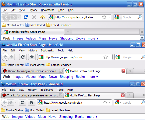
As you can see, they have removed the tiny strip below the tabs that the tabs were connected to. They have also removed the line at the bottom of that strip that physically separated the tabs from the content. In addition, they've moved the "fade" behind the tabs from the top to the bottom which makes more visual sense with tabs-on-top. Other than those things, the tabs basically *look* very similar, but under the surface they are very different. These illustrations are a visual translation of the DOM structure of 3.6 and 4.0b1:
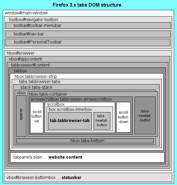
Here you can see that the strip below the tabs in 3.x is called .tabs-bottom.
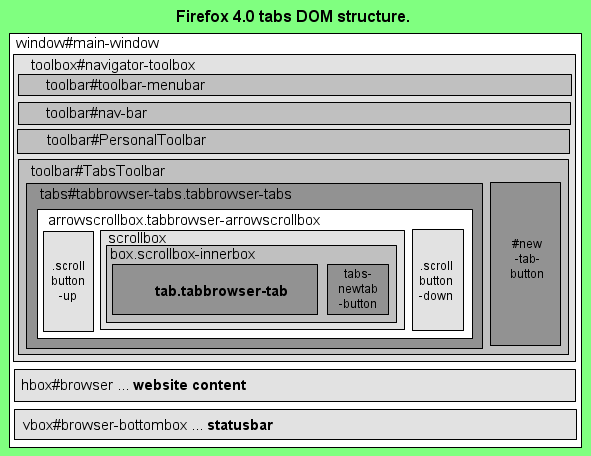
Here you can see just how much has been stripped out of the DOM structure. If you have any instructions in your theme that mention tabbox, .tabbrowser-strip, .tabs-stack, .tabs-bottom, or .tabs-container they will no longer work in 4.0.
Tabstrip background:
Another important difference is that .tabbrowser-tabs no longer spans the length of the tab strip. Instead, buttons can now be placed on either side of it. So you will no longer be able to put a background image in .tabbrowser-tabs as the 3.x default theme does:
CODE: SELECT ALL
Instead you should now place your tabstrip background image into #TabsToolbar for 4.0, and .tabbrowser-strip for 3.x. If you wanted, you could even use totally different images for 3.x and 4.0, so that your 3.x tabs have the "downward" fade background like the default theme, and the 4.0 tabs have the "upwards" fade background like the default theme.
CODE: SELECT ALL
Separate controls from content:
In Firefox 4.0, we want there to be a dark line at the bottom of the toolbox in tabs-on-top mode, but we want to do something different with tabs-on-bottom of Firefox 3.x. Remember, #navigator-toolbox is above the tabstrip in 3.x, so we don't want a hard line separating them. We can accomplish this with a little code based on the 4.0b1 default theme:
CODE: SELECT ALL
* A word of caution here. If you run 3.x and 4.0 under the same profile you may experience bugs dealing with the "tabsontop" selector. If you leave tabs set to the top in 4.0 and then close it and open 3.6, the theme will continue to obey "tabsontop" rules. It does not mean there is anything wrong with your theme, just remember to swap tabs back to the bottom before testing on 3.6.
Bring back the strip at the bottom of the tabs:
Even though .tabs-bottom doesn't exist any more doesn't mean we have to abandon a nice piece of design. I'll start with a few basic elements based on the 3.6 default theme and build on top of those:
CODE: SELECT ALL
This is basically the same as you will find in the default theme. Remember to use the same margins for .tabbrowser-arrowscrollbox > .scrollbutton-up, .tabbrowser-arrowscrollbox > .scrollbutton-down, .tabs-newtab-button, .tabs-alltabs-button as for the inactive tabs.
So how do we achieve the .tabs-bottom for 4.0? Try out this:
CODE: SELECT ALL
But I want tabs like in 4.0 in 3.x:
By modifying the margin
4000
s and the bottom border colors, we can take these same instructions and build tabs that look just like the ones in 4.0, with the active tab touching the content:
CODE: SELECT ALL
Dealing with a moveable new-tab-button:
(EDIT: changed this section 7/19)
In 3.6, the new-tab-button on the tabstrip is called .tabs-newtab-button. In Firefox 4.0 it is called #new-tab-button when tabs are in overflow mode or when a button is placed between the tab strip and the new tab button. Let's look at how the new tab button definitions worked in Firefox 3.x first:
CODE: SELECT ALL
As you can see, they used the same name .tabs-newtab-button for both positions and you had to identify them with different selectors for the two different states. This has also been simplified somewhat in Firefox 4.0 by only using .tabs-newtab-button for when the button is attached to the end of the tabs strip. As you probably know, #new-tab-button is already the name of the toolbar new tab button, so in order to style the new button differently for when it's in the tab strip, we can use the selector #TabsToolbar with it:
CODE: SELECT ALL
Disable 4.0 tab loading animations:
Firefox 4.0 will add a "wipe" effect that makes tabs appear to grow out of the new tab button. I'm personally not a fan of this kind of thing, so I disable it in my themes:
CODE: SELECT ALL
Phew! I think that's it!
To start with, I have to say that Mozilla have greatly simplified the structure of the tabs and that should make it somewhat easier on new themers. However, that simplification might make it difficult to get your themes to be backwards compatible or just to look the same as they looked previously in 3.0 - 3.6.
First, lets look at the physical differences:
As you can see, they have removed the tiny strip below the tabs that the tabs were connected to. They have also removed the line at the bottom of that strip that physically separated the tabs from the content. In addition, they've moved the "fade" behind the tabs from the top to the bottom which makes more visual sense with tabs-on-top. Other than those things, the tabs basically *look* very similar, but under the surface they are very different. These illustrations are a visual translation of the DOM structure of 3.6 and 4.0b1:
Here you can see that the strip below the tabs in 3.x is called .tabs-bottom.
Here you can see just how much has been stripped out of the DOM structure. If you have any instructions in your theme that mention tabbox, .tabbrowser-strip, .tabs-stack, .tabs-bottom, or .tabs-container they will no longer work in 4.0.
Tabstrip background:
Another important difference is that .tabbrowser-tabs no longer spans the length of the tab strip. Instead, buttons can now be placed on either side of it. So you will no longer be able to put a background image in .tabbrowser-tabs as the 3.x default theme does:
CODE: SELECT ALL
.tabbrowser-tabs {
  -moz-appearance: -moz-win-browsertabbar-toolbox;
  background: -moz-dialog url("chrome://browser/skin/tabbrowser/tabbrowser-tabs-bkgnd.png") repeat-x;
}
Instead you should now place your tabstrip background image into #TabsToolbar for 4.0, and .tabbrowser-strip for 3.x. If you wanted, you could even use totally different images for 3.x and 4.0, so that your 3.x tabs have the "downward" fade background like the default theme, and the 4.0 tabs have the "upwards" fade background like the default theme.
CODE: SELECT ALL
#TabsToolbar,
.tabbrowser-strip {
  background: -moz-dialog url("chrome://browser/skin/tabbrowser/tabbrowser-tabs-bkgnd.png") repeat-x;
}

/* OR */

.tabbrowser-strip {
  background: -moz-dialog url("chrome://browser/skin/tabbrowser/tabbrowser-tabs-bkgnd1.png") repeat-x;
}

/* you could also use a transition gradient here instead of an image */
#TabsToolbar {
  background: -moz-dialog url("chrome://browser/skin/tabbrowser/tabbrowser-tabs-bkgnd2.png") repeat-x;
}
Separate controls from content:
In Firefox 4.0, we want there to be a dark line at the bottom of the toolbox in tabs-on-top mode, but we want to do something different with tabs-on-bottom of Firefox 3.x. Remember, #navigator-toolbox is above the tabstrip in 3.x, so we don't want a hard line separating them. We can accomplish this with a little code based on the 4.0b1 default theme:
CODE: SELECT ALL
#navigator-toolbox {
  border: none;
}

/* reproduces dark line at bottom of .tabs-bottom in tabs-on-top */
#navigator-toolbox[tabsontop="true"] {
  border-bottom: 1px solid !important;
  -moz-border-bottom-colors: ThreeDDarkShadow!important;
}
* A word of caution here. If you run 3.x and 4.0 under the same profile you may experience bugs dealing with the "tabsontop" selector. If you leave tabs set to the top in 4.0 and then close it and open 3.6, the theme will continue to obey "tabsontop" rules. It does not mean there is anything wrong with your theme, just remember to swap tabs back to the bottom before testing on 3.6.
Bring back the strip at the bottom of the tabs:
Even though .tabs-bottom doesn't exist any more doesn't mean we have to abandon a nice piece of design. I'll start with a few basic elements based on the 3.6 default theme and build on top of those:
CODE: SELECT ALL
.tabbrowser-tab {
  margin: 3px 0px 4px 0px;
  padding: 0px 1px 1px 1px;
  background-color: transparent;
border-bottom: none;
}

/* when hovered, tab grows upwards */
.tabbrowser-tab:not([selected="true"]):hover {
  margin: 2px 0px 4px 0px;
  padding: 1px 1px 1px 1px;
}

/* when selected, tab grows downwards and becomes opaque
to obscure the line below and behind it */
.tabs-container > .tabs-closebutton,
.tabbrowser-tab[selected="true"] {
  margin: 1px 0px 3px 0px;
  padding: 2px 1px 2px 1px;
  background-color: -moz-dialog;
}

/* the top border separates background tabs from the active tab,
  the darker bottom border separates the tabs from the content */
.tabs-bottom {
  height: 4px;
  margin: 0px;
  background-color: -moz-dialog;
  border-top: 1px solid ThreeDShadow;
  border-bottom: 1px solid ThreeDDarkShadow;
}
This is basically the same as you will find in the default theme. Remember to use the same margins for .tabbrowser-arrowscrollbox > .scrollbutton-up, .tabbrowser-arrowscrollbox > .scrollbutton-down, .tabs-newtab-button, .tabs-alltabs-button as for the inactive tabs.
So how do we achieve the .tabs-bottom for 4.0? Try out this:
CODE: SELECT ALL
/*   reproduce line at the top of .tabs-bottom for tabs-on-top mode */
#navigator-toolbox[tabsontop="true"]  #TabsToolbar {
  border: none;
  border-bottom: 1px solid ThreeDShadow !important;
}

/* reproduces .tabs-bottom with a dark border
at the bottom of #TabsToolbar for tabs-on-bottom mode */
#navigator-toolbox[tabsontop="false"] #TabsToolbar {
  border: none;
  border-bottom: 4px solid !important;
  -moz-border-bottom-colors: ThreeDDarkShadow -moz-dialog -moz-dialog ThreeDShadow !important;
}

/* pulls tabs down to eliminate the effect of their bottom margins in 4.0 */
#TabsToolbar .tabbrowser-tabs {
  margin-bottom: -4px;
}
But I want tabs like in 4.0 in 3.x:
By modifying the margin
4000
s and the bottom border colors, we can take these same instructions and build tabs that look just like the ones in 4.0, with the active tab touching the content:
CODE: SELECT ALL
.tabbrowser-tab {
  margin: 3px 0px 1px 0px;
  padding: 0px 1px 1px 1px;
  background-color: transparent;
border-bottom: none;
}

.tabbrowser-tab:not([selected="true"]):hover {
  margin: 2px 0px 1px 0px;
  padding: 1px 1px 1px 1px;
}

.tabs-container > .tabs-closebutton,
.tabbrowser-tab[selected="true"] {
  margin: 1px 0px 0px 0px;
  padding: 2px 1px 2px 1px;
  background-color: -moz-dialog;
}

.tabs-bottom {
  height: 0px;
  margin: 0px;
  border-bottom: 1px solid ThreeDDarkShadow;
}

#navigator-toolbox[tabsontop="true"]  #TabsToolbar {
  border: none;
  border-bottom: 1px solid ThreeDShadow !important;
}

#navigator-toolbox[tabsontop="false"] #TabsToolbar {
  border: none;
  border-bottom: 1px solid !important;
  -moz-border-bottom-colors: ThreeDShadow !important;
}

#TabsToolbar .tabbrowser-tabs {
  margin-bottom: -1px;
}
Dealing with a moveable new-tab-button:
(EDIT: changed this section 7/19)
In 3.6, the new-tab-button on the tabstrip is called .tabs-newtab-button. In Firefox 4.0 it is called #new-tab-button when tabs are in overflow mode or when a button is placed between the tab strip and the new tab button. Let's look at how the new tab button definitions worked in Firefox 3.x first:
CODE: SELECT ALL
/* New tab button at then end of the tab strip */
.tabbrowser-arrowscrollbox > .tabs-newtab-button {
... styles for the button surround
}
.tabbrowser-arrowscrollbox > .tabs-newtab-button > .toolbarbutton-icon {
... define the image for the glyph
}

/* New tab button in between the overflow arrow and the all-tabs button */
.tabbrowser-tabs[overflow="true"] .tabs-newtab-button {
... styles for the button surround
}
.tabbrowser-tabs[overflow="true"] .tabs-newtab-button > .toolbarbutton-icon {
... define the image for the glyph
}
As you can see, they used the same name .tabs-newtab-button for both positions and you had to identify them with different selectors for the two different states. This has also been simplified somewhat in Firefox 4.0 by only using .tabs-newtab-button for when the button is attached to the end of the tabs strip. As you probably know, #new-tab-button is already the name of the toolbar new tab button, so in order to style the new button differently for when it's in the tab strip, we can use the selector #TabsToolbar with it:
CODE: SELECT ALL
/* New tab button at then end of the tab strip, same in 3.x and 4.0 */
.tabbrowser-arrowscrollbox > .tabs-newtab-button {
... styles for the button surround
}
.tabbrowser-arrowscrollbox > .tabs-newtab-button > .toolbarbutton-icon {
... define the image for the glyph
}

/* New tab button for 4.0, generic instructions,
  do NOT use this if you want the separated new tab button to use the toolbar new tab button style */
#TabsToolbar #new-tab-button  {
... styles for the button surround
}
#TabsToolbar #new-tab-button > .toolbarbutton-icon {
... define the image for the glyph
}

/* New tab button in overflow mode, directly beside overflow arrow */
#TabsToolbar .tabbrowser-tabs[overflow="true"] + #new-tab-button,
.tabbrowser-tabs[overflow="true"] .tabs-newtab-button {
... styles for the button surround
}
#TabsToolbar .tabbrowser-tabs[overflow="true"] + #new-tab-button > .toolbarbutton-icon,
.tabbrowser-tabs[overflow="true"] .tabs-newtab-button > .toolbarbutton-icon {
... define the image for the glyph
}

/* Or get really crazy and define a separate button for the new tab button separated,
  do NOT use this if you want the separated new tab button to use the toolbar new tab button style */
#TabsToolbar .tabbrowser-tabs + * ~ #new-tab-button {
... styles for the button surround
}
#TabsToolbar .tabbrowser-tabs + * ~ #new-tab-button > .toolbarbutton-icon {
... define the image for the glyph
}
Disable 4.0 tab loading animations:
Firefox 4.0 will add a "wipe" effect that makes tabs appear to grow out of the new tab button. I'm personally not a fan of this kind of thing, so I disable it in my themes:
CODE: SELECT ALL
/* optional, disable Firefox 4.0 tab loading animations */
.tabbrowser-tab[fadein],
.tabbrowser-tab[fadein] > .tab-text,
.tabbrowser-tab[fadein] > .tab-icon-image,
.tabbrowser-tab[fadein] > .tab-close-button {
-moz-transition: none!important;
}
Phew! I think that's it!

相关文章推荐
- Tab Mix Plus for Firefox
- Firefox 4.0 Beta 7 and 支付宝安全控件 For MeeGo(Linux)
- Gmarks for firefox 4.0
- firefox for android的典型配置
- Excel 操作工具 For .Net Framework 4.0
- 兼容多浏览器的iframe自适应高度(ie8 、谷歌浏览器4.0和 firefox3.5.3)
- The firefox installs flashplugin for Linux
- Rendering Problems Missing styles. Is the correct theme chosen for this layout?
- MOSS2007- closed problem of ["Cannot make a cache safe URL for "styles/portal.css", file not found.]
- IE and Firefox compatible javascript to reference innerText/text attribute
- Firefox 4.0不再支持PowerPC
- ArcIMS4.0 for windows IIS + ServletsExec安装全记录(1)
- Firefox 4 PPA for Ubuntu 10.04 and 10.10 users
- source insight 4.0设置tab宽度
- Veritas Storage Foundation for Oracle RAC(VCS4.0 + VxVM4.0 ..)安装过程
- [13年迁移]firefox and chrome css compatible
- Flex 3: Firefox Beta 3 returns 0 for HTTP status codes
- Ubuntu不错的下载工具Flashget for Linux 于firefox关联
- Firefox下如何将回车键转为Tab键
- Robotics Developer Studio 4.0 Beta + Kinect for Windows SDK 1.0 Beta 2