CSS3的过渡效果
2010-01-25 14:16
162 查看
在CSS2的世界中,过渡常常是非常单薄的,要么是从一种颜色变成另一种颜色、要么是从不透明变到透明,总而言之就是由一种状态变到另外一种状态。这就导致了很多页面给人的感觉很突兀,没有一个平滑的过渡。
虽然我们可以使用DHTML或者诸如jQuery等其他第三方的库文件来完成过渡效果,但是为了完成一个简单的效果我们就需要大量的编码。
我们所需要的就是用一种简单的方法来实现这些过渡,因为我相信在今后的WEB应用中,平滑的过渡越来越成为一种标准的展现形式。
CSS3现在已经添加到了Webkit中,现在 Apple Safari 和 Google Chrome 都已经开始支持。再往前推几个月,那个时候人们还在争论是否将这些过渡写在CSS3中,一些人坚持认为过渡并不是一种样式属性,应当用脚本来进行处理。经过众多人的努力,样式不仅限于静态的样式,动态的样式也是非常需要的。于是过渡的样式终于开始写入CSS3的官方文档中。
废话少说,进入正题。
本文的例子需要支持CSS3的浏览器,所以你最好使用 Safari 或者 Chrome 来测试。
过渡、状态和动作
我们知道,CSS中都是通过伪类来实现页面中的一个元素与用户互动的。例如,用户鼠标的悬停和移动。下面列出了几个伪类:
过渡包含哪些元素
一个从蓝色变成红色的动态过渡包含哪些元素呢,我们先看一个实例:
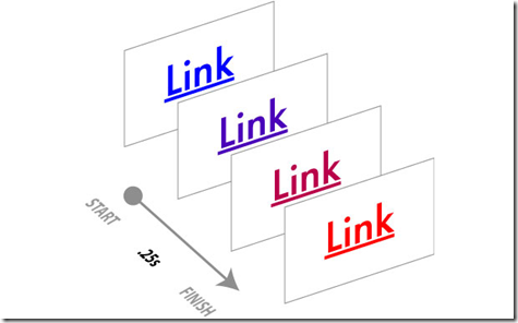
看到这个图,大家对于这几个参数的作用应该了解了吧。很简单的几个参数设置,实现了我们之前需要用大量js脚本实现的效果,那么有什么理由不期待CSS3的到来呢。
可以应用过渡的元素:
过渡的时间和延时:
现在,就期待CSS3早日全面普及吧。
Technorati 标签: css3,ui 参考资料
1、CSS Transitions 101
2、CSS Transitions Module Level 3
虽然我们可以使用DHTML或者诸如jQuery等其他第三方的库文件来完成过渡效果,但是为了完成一个简单的效果我们就需要大量的编码。
我们所需要的就是用一种简单的方法来实现这些过渡,因为我相信在今后的WEB应用中,平滑的过渡越来越成为一种标准的展现形式。
CSS3现在已经添加到了Webkit中,现在 Apple Safari 和 Google Chrome 都已经开始支持。再往前推几个月,那个时候人们还在争论是否将这些过渡写在CSS3中,一些人坚持认为过渡并不是一种样式属性,应当用脚本来进行处理。经过众多人的努力,样式不仅限于静态的样式,动态的样式也是非常需要的。于是过渡的样式终于开始写入CSS3的官方文档中。
废话少说,进入正题。
本文的例子需要支持CSS3的浏览器,所以你最好使用 Safari 或者 Chrome 来测试。
过渡、状态和动作
我们知道,CSS中都是通过伪类来实现页面中的一个元素与用户互动的。例如,用户鼠标的悬停和移动。下面列出了几个伪类:
| Dynamic Pseudo Class | Elements Affected | Description |
| :link | Links only | Unvisited links |
| :visited | Links only | Visited links |
| :hover | All elements | Mouse cursor over element |
| :active | All elements | Mouse clicks element |
| :focus | All elements that can be selected | Element is selected |
| None | All elements | Default state of all elements |
过渡包含哪些元素
一个从蓝色变成红色的动态过渡包含哪些元素呢,我们先看一个实例:
#css3tr a:link {
display:block;
height:30px;
line-height:30px;
width:100px;
border:5px solid #cccccc;
text-align:center;
-webkit-transition:width .25s ease-in-out, background-color .25s linear;
transitiona:width .25s ease-in-out, background-color .25s linear;
}
#css3tr a:hover {
color:red;
background-color:#e9e9e9;
width:200px;
-webkit-transition: width .25s ease-in-out, background-color .25s linear;
transition:width .25s ease-in-out, background-color .25s linear;
}
由此可见,transition 属性中包含了三个基本的属性:样式属性(CSS property)、持续时间(Duration)、计时函数(Timing Function)、延时(Delay)display:block;
height:30px;
line-height:30px;
width:100px;
border:5px solid #cccccc;
text-align:center;
-webkit-transition:width .25s ease-in-out, background-color .25s linear;
transitiona:width .25s ease-in-out, background-color .25s linear;
}
#css3tr a:hover {
color:red;
background-color:#e9e9e9;
width:200px;
-webkit-transition: width .25s ease-in-out, background-color .25s linear;
transition:width .25s ease-in-out, background-color .25s linear;
}

看到这个图,大家对于这几个参数的作用应该了解了吧。很简单的几个参数设置,实现了我们之前需要用大量js脚本实现的效果,那么有什么理由不期待CSS3的到来呢。
可以应用过渡的元素:
| CSS Property | What Changes |
| background-color | Color |
| background-image | Only gradients |
| background-position | Percentage, length |
| border-bottom-color | Color |
| border-bottom-width | Length |
| border-color | Color |
| border-left-color | Color |
| border-left-width | Length |
| border-right-color | Color |
| border-right-width | Length |
| border-spacing | Length |
| border-top-color | Color |
| border-top-width | Length |
| border-width | Length |
| bottom | Length, percentage |
| color | Color |
| crop | Rectangle |
| font-size | Length, percentage |
| font-weight | Number |
| grid-* | Various |
| height | Length, percentage |
| left | Length, percentage |
| letter-spacing | Length |
| line-height | Number, length, percentage |
| margin-bottom | Length |
| margin-left | Length |
| margin-right | Length |
| margin-top | Length |
| max-height | Length, percentage |
| max-width | Length, percentage |
| min-height | Length, percentage |
| min-width | Length, percentage |
| opacity | Number |
| outline-color | Color |
| outline-offset | Integer |
| outline-width | Length |
| padding-bottom | Length |
| padding-left | Length |
| padding-right | Length |
| padding-top | Length |
| right | Length, percentage |
| text-indent | Length, percentage |
| text-shadow | Shadow |
| top | Length, percentage |
| vertical-align | Keywords, length, percentage |
| visibility | Visibility |
| width | Length, percentage |
| word-spacing | Length, percentage |
| z-index | Integer |
| zoom | Number |
| Name | How It Works |
| cubic-bezier(x1, y1, x2, y2) | X and Y values are between 0 and 1 to define the shape of a bezier curve used for the timing function. |
| linear | Constant speed |
| ease | Gradual slowdown |
| ease-in | Speed up |
| ease-out | Slow down |
| ease-in-out | Speed up and then slow down |
现在,就期待CSS3早日全面普及吧。
Technorati 标签: css3,ui 参考资料
1、CSS Transitions 101
2、CSS Transitions Module Level 3

相关文章推荐
- Js点击触发Css3的动画Animations、过渡Transitions效果
- jQuery和CSS3全屏带过渡动画效果的模态窗口插件
- 操作CSS3过渡使用jQuery创建一个拖放文本效果
- 【HTML5学习笔记】33:CSS3过渡效果
- CSS3 transition 属性 过渡效果
- 学习css3过渡效果,可以实现很好玩的东西,无需js
- 超棒的CSS3动画页面过渡效果
- 超棒的CSS3动画页面过渡效果
- CSS3实践之路(六):CSS3的过渡效果(transition)与动画(animation)
- 【笔记】css3实现网页平滑过渡效果...
- css3过渡效果
- 使用IE过渡滤镜和CSS3中的RGBA属性完成背景色透明效果
- css3过渡属性之手风琴效果
- 制作动画平滑过渡效果:《CSS3 Transition》
- 15个CSS3和jQuery的超棒页面过渡效果教程
- CSS3的过渡效果(transition)与动画(animation)
- CSS3制作各种平滑过渡的动画效果
- CSS3变换、过渡、动画效果
- CSS3 如何让height:auto实现transition过渡效果
- [19]CSS3 过渡效果