css box model---------it's all about boxes
2007-03-05 09:46
316 查看
it's all about
b o x e s
jessey.net | Simon | articles | previous article | next articleIn Cascading Style Sheets, the box model is everything. The primary purpose of CSS is visual presentation (although styling for non-visual presentation is included) and the box model is the primary mechanism of layout. Also of great importance are the inline layout model and the special mechanisms that exist to handle positioning and floating of elements. The serious designer must have a firm grasp of how the box model works and familiarity with it will allow the author to understand all the various properties will interact with each other when applied.
The CSS Box Model
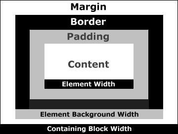
The diagram above demonstrates the CSS formatting model in general, but the box model in particular. Every CSS element forms a "box" composed of these components:
Content - The actual content of the element such as text or an image. When using the CSS
widthproperty, you are actually defining the width of this content.
Padding - This is set around the content when you define the
padding-top,
padding-right,
padding-bottom,
padding-leftand
paddingproperties, the latter of which is the shorthand property.
Border - This is set around the content and padding when you define the
border-top,
border-right,
border-bottom,
border-leftand
borderproperties, the latter of which is the shorthand property.
Margin - This is set around the combined content, padding and border when you define the
margin-top,
margin-right,
margin-bottom,
margin-leftand
marginproperties, the latter of which is the shorthand property.
widths
It is important to understand how box model widths are calculated. Use the following equation to determine the width of the containing block:width=
margin-left+
border-left-width+
padding-left+
width+
padding-right+
border-right-width+
margin-right
Microsoft get it wrong
Internet Explorer 5.x makes a complete pigs ear of this equation. It calculates the width of the content as the sum of the content and its padding and borders. If you want a box that is 100 pixels wide, with 10 pixels of padding and 10 pixels of border, you would normally set a style rule like this:width: 100px; padding: 10px; border: 10px
To achieve the same effect in Internet Explorer 5.x, you would alter the style rule like this, or you would end up with a box that is 40 pixels narrower than it should be:
width: 140px; padding: 10px; border: 10px
In Internet Explorer 6.0, Microsoft have corrected this problem, but only if you specify a correct
DOCTYPEdeclaration in your code, otherwise it reverts to the fucked-up version.
heights
It is equally important to understand the difference between how widths are calculated and how heights are calculated. Vertically-adjacent margins of elements in normal document flow are collapsed. That means that the distance between two vertical margins that are adjacent to each other is the highest of the two values. If a block with the style rulemargin-top: 1emis placed below another block with a style rule of
margin-bottom: 3emthan the distance between the two will be 3em, rather than 4em. There are two exceptions to this rule. Vertically-adjacent margins of positioned or floated elements are not collapsed.
the element background
If you apply a background (a color, an image or a combination of the two) to an element, that background extends all the way to the outer edge of the border around the element. The element and its padding are filled and the background will also be visible through the border if it has been given aborder-stylewith gaps in it, such as
dottedor
double.
Below is an example. The paragraph has 1em of padding and a white, dotted border that is 5 pixels in width.
this example is of some text
It should be noted that many browsers fail to display this example correctly. Internet Explorer makes a good stab at it, but Mozilla and Opera fail to extend the background image underneath the border.
background reading
More on the CSS box model can be found at the website of the World Wide Web Consortium, in particular, in the specification of The Box Model. Also at the W3C is the CSS2 revision that corrects and updates the CSS level 2 specification. Also of note is the latest version of the box model module that is intended for Cascading Style Sheets Level 3. The specification includes many new features to wet the appetite. Tantek Çelik of Microsoft has come up with a hack that takes advantage of yet another bug to fix the problem it has calculating widths. Thank you for reading.|

© Simon Jessey, 2002

相关文章推荐
- Android入门:It's All About UI(1)
- Review of Debugging the development process 7. It's All About Attitude
- Android入门:It's All About UI(2)
- It's all over
- 解决:ruby We're sorry, but something went wrong.We've been notified about this issue and we'll take a look at it shortly.
- It's about trust
- Announcing Microsoft All-In-One Script Framework - IT Pros' Time Saver
- Business: It's Not Really About the Money 事业:真的与金钱无关
- It's your pain killer,all of worldwide software engineer
- It is all about Using Text & Fonts in Flash
- 使用ffmpeg库编译错误undefined reference to `BZ2_bzDecompressInit'
- suspicious characters loitering about 'scp -t ~'
- Lanczos Algorithm and it's Parallelization Stragegy翻译
- [Visual Studio 2010]如何解决错误CoClass 'xx' can be used only as one of its applicable interfaces
- Could not load file or assembly ' .dll_newdevelop' or one of its dependencies 解决办法
- Physical and Logical Block Corruptions. All you wanted to know about it. (Doc ID 840978.1)
- poj 1094 && NYOJ 349 Sorting It All Out 拓扑排序 经典
- Miku's Boxes(简单题数学题)
- Could not install Gradle distribution from 'http://services.gradle.org/distributions/gradle-xx-all
- Eclipse CDT Ubuntu下重新导入工程后make: *** No rule to make target `all'. Stop.