CSS 单位 - 绝对长度、相对长度、响应式
2021-11-25 22:34
1496 查看
CSS 单位 (绝对长度和相对长度)
最近在开发响应式网页的时候,字体大小总是影响效果,原因就是使用了绝对长度单位导致的,因此让我们一起来了解一下CSS中有哪些单位是绝对长度、相对长度的,在开发中又如何使用呢!
绝对长度
下列这些是固定长度的单位,使用绝对单位表示的长度将显示为与该大小完全相同。不建议在屏幕上使用,因为屏幕的大小变化太大。因此,当输出介质已知时,应使用绝对单位,例如打印布局。
当项目中不考虑响应能力时,绝对单位很有用。它们对响应式网站不太有利,因为它们不会在屏幕更改时缩放。
通常,绝对长度始终被视为相同的大小。绝对长度单位的表格如下:
| cm | 厘米 |
|---|---|
| mm | 毫米 |
| in | 英寸 (1in = 96px = 2.54cm) |
| px * | 像素 (1px = 1/96th of 1in) |
| pt | 点 (1pt = 1/72 of 1in) |
| pc | 派卡 (1pc = 12 pt) |
***** 像素(px)是相对于观看设备的。对于低 dpi 的设备,1px 是显示器的一个设备像素(点)。对于打印机和高分辨率屏幕,1px 表示多个设备像素。
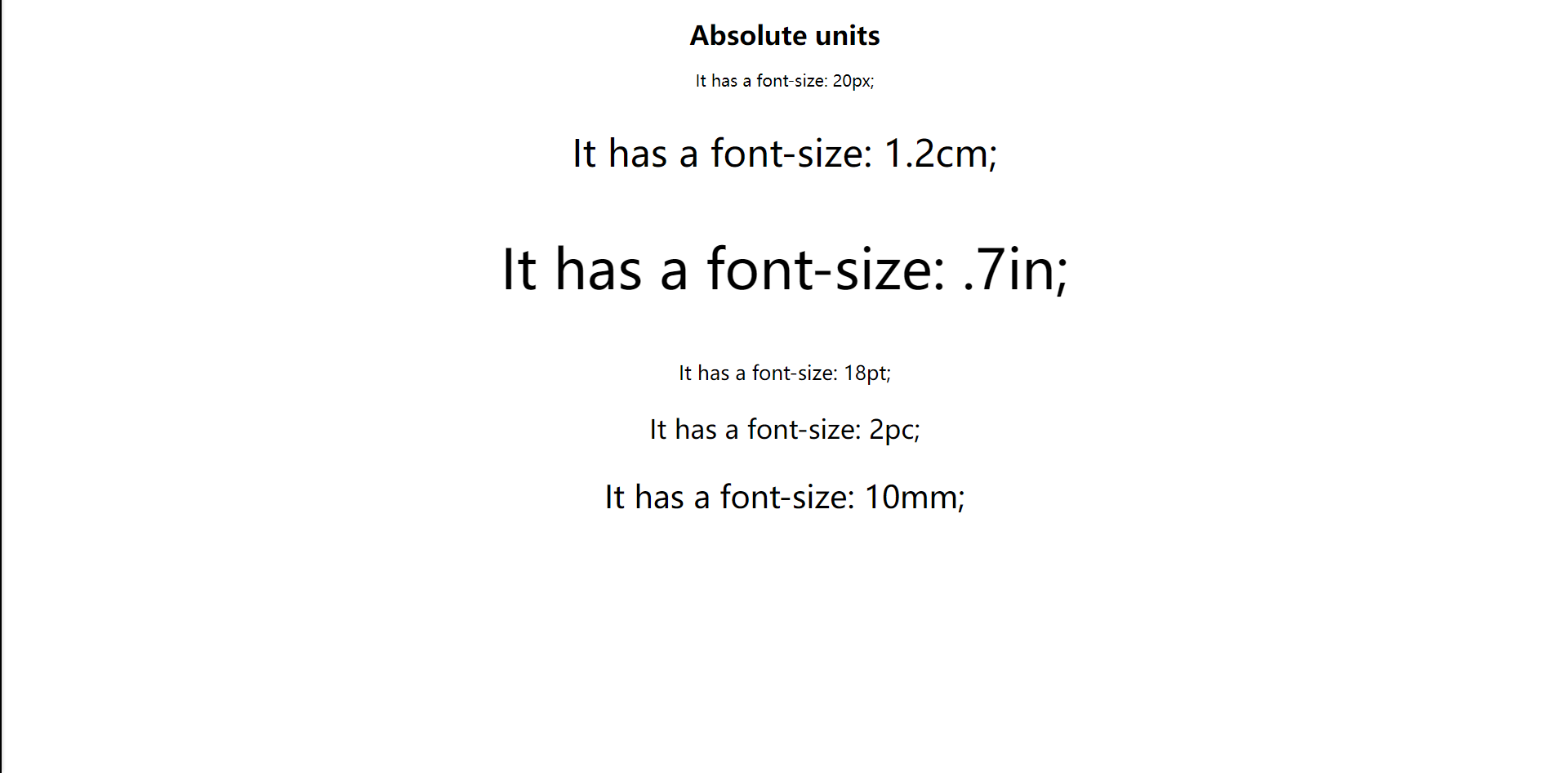
<!DOCTYPE html>
<html>

<head>
<style>
body {
text-align: center;
}
</style>
</head>

<body>
<h1> Absolute units </h1>
<p style="font-size: 20px;"> It has a font-size: 20px; </p>
<p style="font-size: 1.2cm;"> It has a font-size: 1.2cm; </p>
<p style="font-size: .7in;"> It has a font-size: .7in; </p>
<p style="font-size: 18pt;"> It has a font-size: 18pt; </p>
<p style="font-size: 2pc;"> It has a font-size: 2pc; </p>
<p style="font-size: 10mm;"> It has a font-size: 10mm; </p>
</body>

</html>
相对长度
相对单位非常适合设置响应式网站的样式,因为它们相对于窗口大小或父级进行缩放。它们指定长度,该长度相对于另一个 length 属性。
根据设备的不同,如果屏幕的大小变化太大,则相对长度单位是最好的,因为它们在不同的渲染媒体之间可以更好地缩放。我们可以使用相对单位作为响应单位的默认值。它有助于我们避免更新不同屏幕尺寸的样式。
相对长度单位的表格如下:
| 单位 | 描述 |
|---|---|
| em | 相对于元素的字体大小(font-size)(2em 表示当前字体大小的 2 倍) |
| ex | 相对于当前字体的 x-height(极少使用) |
| ch | 相对于 "0"(零)的宽度 |
| rem | 相对于根元素的字体大小(font-size) |
| vw | 相对于视口*宽度的 1% |
| vh | 相对于视口*高度的 1% |
| vmin | 相对于视口*较小尺寸的 1% |
| vmax | 相对于视口*较大尺寸的 1% |
| % | 用于设置元素的宽度时,它总是相对于其直接父元素的大小。如果没有定义的父级,则默认情况下 body 会被视为父级。 |
***** 视口(Viewport)= 浏览器窗口的尺寸。如果视口为 50 厘米宽,则 1vw = 0.5 厘米。
因此,我们要开发响应式网站,一般常用em、rem两个单位:
- em总是相对于它的直接父级的字体大小,如父元素字体为10px,则1em=10px,2em=20px;
- rem总是相对于根元素的字体大小,即html元素,而跟父元素的字体大小无关,如根元素字体10px,直接父元素为20px时,1rem=10px,而不是20px;
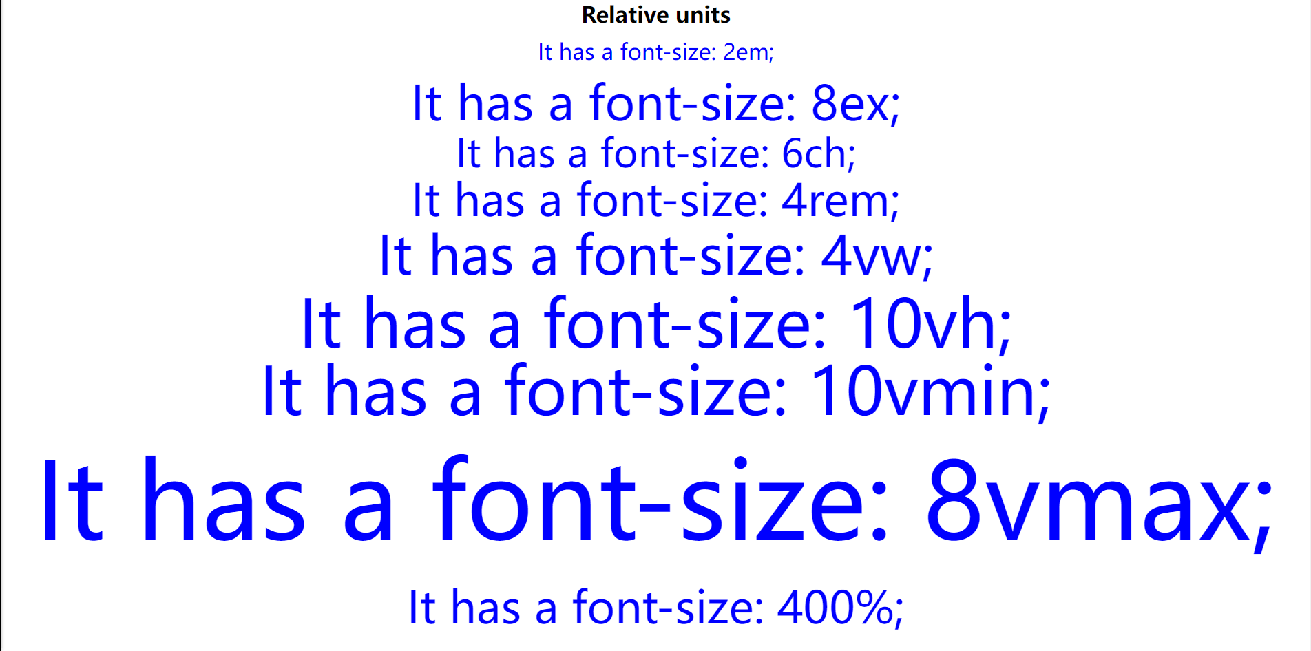
<!DOCTYPE html>
<html>

<head>
<style>
html {
/* 修改此属性查看rem的变化 */
font-size: 20px;
}

body {
text-align: center;
/* 修改此属性查看em的变化 */
font-size: 20px;
}

p {
line-height: 0.1cm;
color: blue;
}
</style>
</head>

<body>
<h1> Relative units </h1>
<p style="font-size: 2em;"> It has a font-size: 2em; </p>
<p style="font-size: 8ex;"> It has a font-size: 8ex; </p>
<p style="font-size: 6ch;"> It has a font-size: 6ch; </p>
<p style="font-size: 4rem;"> It has a font-size: 4rem; </p>
<p style="font-size: 4vw;"> It has a font-size: 4vw; </p>
<p style="font-size: 10vh;"> It has a font-size: 10vh; </p>
<p style="font-size: 10vmin;"> It has a font-size: 10vmin; </p>
<p style="font-size: 8vmax;"> It has a font-size: 8vmax; </p>
<p style="font-size: 400%;"> It has a font-size: 400%; </p>
</body>

</html>
文档下载
此文章系原创,转载请附上链接,抱拳...
此文档提供markdown源文件下载,请去我的码云仓库进行下载... 下载文档
若本文对你有用,请不要忘记给我的点个Star哦....

相关文章推荐
- CSS学习总结1:绝对大小与相对大小的单位
- css如何使用相对单位长度em和rem以及百分比
- CSS 单位 绝对单位 相对单位
- CSS中相对长度单位
- 【CSS】浅谈CSS中常用的相对长度单位
- css的长度单位
- css :相对定位,绝对定位,固定定位
- CSS系列:长度单位&字体大小的关系em rem px
- CSS的相对定位和绝对定位
- 分享:CSS长度单位:px和pt的区别
- CSS 中相对长度 rem 和 em 如何区别
- css中的长度单位
- 理解css中的长度单位
- CSS 相对|绝对(relative/absolute)定位系列(一)
- CSS中关于定位的问题, 相对,绝对定位
- android控件相对位置及长度单位
- CSS 长度单位
- css position相对定位绝对定位
- css 相对单位rem详解
- CSS 相对|绝对(relative/absolute)