前端 | Vue slot 插槽用法:自定义列表组件
Vue 框架的插槽(slot)功能相对于常用的
v-for, v-if等指令使用频率少得多,但在实现可复用的自定义组件时十分有用。例如,如果经常使用前端组件库的话,就会经常看到类似的用法:
<card>
<template slot="title">定制卡片组件的标题栏,例如插入icon、操作按钮等</template>
</card>
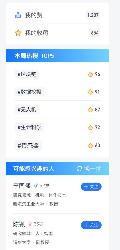
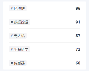
之前在写前端时,发现产品原型的多个页面中多次出现了基本一致的信息栏,如下图。如果只在一个页面中出现一两次,复制几遍列表代码,写一套样式也关系不大;但在多个页面中来回复制粘贴就很麻烦,增加无效代码量,以后也不好修改(众所周知,前端 UI 修改并不罕见)。因此将这个信息栏抽象成一个组件,可以多次复用,实现内容与样式分离。接下来借这个例子分享一下 Vue 插槽的几种主要用法。
基本用法
默认插槽
首先新建
InfoCard.vue组件,写好基本的模板结构和样式:上面一条标题栏,下面一个列表(项目中用的是 antd 组件库中的组件,只是样式,不影响理解)。CSS 不重要就不贴了。
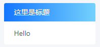
<!-- InfoCard.vue -->
<template>
<div class="side-card">
<div class="side-card-title">这里是标题</div>
<a-list>
<a-list-item>
<slot></slot>
</a-list-item>
</a-list>
</div>
</template>
在页面中引入组件后可以在模板中用标签使用:
<!-- index.vue -->
<info-card>Hello</info-card>
由于组件中只有一个
<slot>元素(也就是“插槽”),标签内的内容就会被“插入”插槽对应的位置:
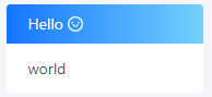
具名插槽
如果组件中有不止一个插槽,就需要通过名字来区分。
- 在组件中,使用
<slot name="xx">
属性指定插槽的名字 - 在页面中,使用
<template slot="xx">
属性将内容分发到对应的插槽
<!-- InfoCard.vue -->
<div class="side-card">
<div class="side-card-title" v-if="!hideTitle">
<slot name="title"></slot>
</div>
<a-list>
<a-list-item>
<slot name="content"></slot>
</a-list-item>
</a-list>
</div>

<!-- index.vue -->
<info-card>
<template slot="title">
<p>Hello <a-icon type="smile" /></p>
</template>
<template slot="content"> world </template>
</info-card>
缺省内容
有时候组件的可变部分有默认值,并不必须在使用时指定(例如默认提示语)。在组件的
<slot>标签内部的内容就是该插槽的缺省内容,如果在使用时没有传入相应内容,将使用缺省内容进行渲染。
在这个例子中,标题部分多数情况下是纯文本,少数情况下才需要使用 HTML 进行定制(例如包含操作按钮)。因此可以配合组件的传入参数,让标题定义变得更简洁,不需要为了一行文本去写整个标签。(顺便增加一个参数可以隐藏标题栏。)
提示:组件传参的时候注意区分
title="xxx"和:title="xxx",平时写多了冒号容易手滑。加冒号是简写的v-bind指令,这个“xxx”代表的是 data 中一个叫做 xxx 的变量;不加冒号的才是传入字符串“xxx”作为参数 title 的值。
<!-- InfoCard.vue -->
<div class="side-card">
<div class="side-card-title" v-if="!hideTitle">
<slot name="title">{{ title }}</slot>
</div>
<a-list>
<a-list-item>
<slot name="content"></slot>
</a-list-item>
</a-list>
</div>

<!-- index.vue -->
<info-card title="Hello">
<template slot="content">world</template>
</info-card>
作用域
列表组件应该接收一个数组作为参数,使用
v-for循环显示,并且每个列表项的具体内容由页面传入的插槽内容决定(因为不同列表里的对象不一致)。
<a-list>
<a-list-item v-for="item in items" :key="item.id">
<slot name="content"></slot>
</a-list-item>
</a-list>
但是如果在页面中这样使用,会产生报错
Cannot read property 'tag' of undefined。
<info-card title="Hello" :items="hotTags">
<template slot="content">
<a-tag># {{ item.tag }}</a-tag>
<span class="number">{{ item.count }}</span>
</template>
</info-card>
产生错误的原因在于,父页面插槽中的内容先在父页面中渲染,之后才整体插入子组件的插槽;而不是先插入 HTML 后再一起渲染。很显然,items、item 都是定义在子组件中的变量数据,在父组件中没有定义,自然也无法访问(父页面中的数据是 hotTags)。
插槽 prop
这里使用的是 Vue 2.6.0 起更新的语法,原来的作用域插槽
slot-scope属性已弃用
页面传递给子组件的参数作用域在子组件内部,而列表项的内容需要在父页面中定义;因此,需要一种在父组件访问子组件数据的机制。这就是插槽 prop 的作用。
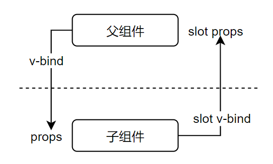
在子组件的
<slot>标签中使用
v-bind绑定的属性就是插槽 prop(这里为了清晰才区分命名了 itemprop 和 item,其实实际用的时候全命名成一样的即可,省的倒来倒去)。
页面使用组件时,通过命令
v-slot:name="slotProps"即可通过 slotProps 访问 name 插槽中绑定的插槽 prop。
<!-- InfoCard.vue -->
<a-list>
<a-list-item v-for="item in items" :key="item.id">
<slot name="content" :itemprop="item">
{{ item }}
</slot>
</a-list-item>
</a-list>

<!-- index.vue -->
<info-card hideTitle :items="hotTags">
<template v-slot:content="props">
<a-tag># {{ props.itemprop.tag }}</a-tag>
<span class="number">{{ props.itemprop.count }}</span>
</template>
</info-card>
注意:如前文所述,插槽内容是在父页面中渲染的。因此其中元素的样式(例如这里 a-tag 的样式)也应该定义在父页面中。
简写
v-slot:
指令可以简写为#
- 可以使用ES2015 解构解析插槽 prop 中的各个属性,更加清晰简洁
<template #content="{ itemprop }">
<a-tag># {{ itemprop.tag }}</a-tag>
<span class="number">{{ itemprop.count }}</span>
</template>
结语
以上是借助自定义表单组件案例对 Vue 插槽基本用法的介绍,希望对你有所帮助,如有疏漏欢迎留言指正讨论。
文末附上开头图片中信息栏案例的大部分实现代码,可以对照进行参考。
参考资料:Vue slot
附录
以下是
InfoCard.vue的全部代码:
<template>
<div class="side-card">
<div class="side-card-title" v-if="!hideTitle">
<slot name="title">{{ title }}</slot>
</div>
<a-list>
<a-list-item v-for="item in items" :key="item.id">
<slot name="content" :item="item">
{{ item }}
</slot>
</a-list-item>
</a-list>
</div>
</template>

<script>
export default {
props: {
title: {
type: String,
default: '',
},
hideTitle: {
type: Boolean,
default: false,
},
items: {
type: Array,
required: true,
},
},
}
</script>

<style lang="less" scoped>
.side-card {
border-radius: 4px;
background-color: @item-background;
.side-card-title {
height: 36px;
line-height: 36px;
padding: 0 20px;
color: #ffffff;
border-radius: 4px 4px 0 0;
background: linear-gradient(90deg, #1375ff 0%, #a4fffa 149.57%);
display: flex;
justify-content: space-between;
}
.ant-list {
padding: 0 20px;
.ant-list-item {
display: flex;
}
}
}
</style>
以下是实现开头三个信息栏的父页面代码(缺少一些 icon):
<list-card hideTitle :items="myData" class="side-card">
<template #content="{ item }">
<span>{{ item.title }}</span>
<a-tag class="number">{{ item.count }}</a-tag>
</template>
</list-card>

<list-card title="本周热搜 TOP5" :items="hotTags" class="side-card">
<template #content="{ item }">
<a-tag># {{ item.tag }}</a-tag>
<span class="number">{{ item.count }}</span>
</template>
</list-card>

<list-card :items="suggestScholars" class="side-card">
<template slot="title">
<span>可能感兴趣的人</span>
<span>换一批</span>
</template>
<template #content="{ item }">
<div class="scholar">
<div class="name">
<h2>{{ item.name }}</h2>
<a-button v-if="item.followed" shape="round" class="btn">
已关注
</a-button>
<a-button v-else type="primary" shape="round" class="btn">
关注
</a-button>
</div>
<div>研究领域:{{ item.field }}</div>
<div>{{ item.institution }} · {{ item.position }}</div>
</div>
</template>
</list-card>

- 30组常用前端开发组件库,前端组件收集整理列表
- vue-(插槽自定义段子列表.html)(1)
- vue 封装自定义组件--tabal列表编辑单元格组件
- 30组常用前端开发组件库,前端组件收集整理列表
- ExpandableListView(可展开的列表组件)的说明以及其用法
- 小程序 组件高级应用 slot 插槽的用法
- 30组常用前端开发组件库,前端组件收集整理列表
- 自定义组件用法指南
- 前端人员必知的Vue.js条件v-if与列表循环v-for相关用法
- 如何在EMP2.2版本的前端列表组件中处理单、复选框
- 微信小程序组件的自定义属性用法
- Web开发之自定义前端组件经验介绍
- vue自定义全局组件(自定义插件)的用法
- flex4 List等列表控件自定义项目呈示器组件研究_悄悄俏俏
- ExpandableListView(可展开的列表组件)的说明以及其用法
- 前端组件收集整理列表
- Vue 作用域插槽 列表组件 示例
- 前端框架Aurelia - 自定义组件
- 前端组件库(Element UI)的实现原理:教你如何实现自定义组件库,并打包发布至npm
- ExpandableListView(可展开的列表组件)的说明以及其用法