「HTML+CSS」--自定义加载动画【028】
2021-05-05 15:54
1316 查看
前言
Hello!小伙伴!
首先非常感谢您阅读海轰的文章,倘若文中有错误的地方,欢迎您指出~
哈哈 自我介绍一下
昵称:海轰
标签:程序猿一只|C++选手|学生
简介:因C语言结识编程,随后转入计算机专业,有幸拿过国奖、省奖等,已保研。目前正在学习C++/Linux(真的真的太难了~)
学习经验:扎实基础 + 多做笔记 + 多敲代码 + 多思考 + 学好英语!
日常分享:微信公众号【海轰Pro】记录生活、学习点滴,分享一些源代码或者学习资料,欢迎关注~

效果展示

Demo代码
HTML
<!DOCTYPE html>
<html lang="en">
<head>
<meta charset="UTF-8">
<meta http-equiv="X-UA-Compatible" content="IE=edge">
<meta name="viewport" content="width=device-width, initial-scale=1.0">
<link rel="stylesheet" href="style.css">
<title>Document</title>
</head>
<body>
<section><span></span></section>
</body>
</html>
CSS
html,body{
margin: 0;
height: 100%;
}
body{
display: flex;
justify-content: center;
align-items: center;
background: #263238;
}
section {
width: 650px;
height: 300px;
padding: 10px;
position: relative;
display: flex;
align-items: center;
justify-content: center;
border: 2px solid red;
}
span {
width : 96px;
height: 96px;
border-radius: 50%;display: inline-block;
position: relative;
border: 10px red;
border-style: dashed solid  solid dotted;
border-bottom-color: transparent;
animation: rotation 2s linear infinite ;
}
span::after{
content: '';
position: absolute;
left: 51px;
top: 79px;
border: 20px solid transparent;
border-right-color: red;
transform: rotate(-45deg);
}
@keyframes rotation {
0% { transform: rotate(0deg) }
100% { transform: rotate(360deg)
}
}
原理详解
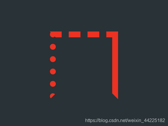
步骤1
使用span标签作为箭尾,设置为
- 宽度、高度均为96px
- 上边框:10px 红色 dashed(虚线)
- 下边框:10px 透明 solid(实线)
- 左边框:10px 红色 dotted(点状)
- 右边框:10px 红色 solid(实线)
width : 96px;
height: 96px;
border: 10px red;
border-style: dashed solid  solid dotted;
border-bottom-color: transparent;
效果图如下
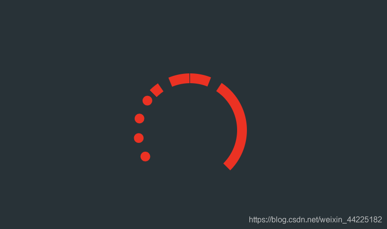
步骤2
span标签圆角化
border-radius: 50%;
效果图如下
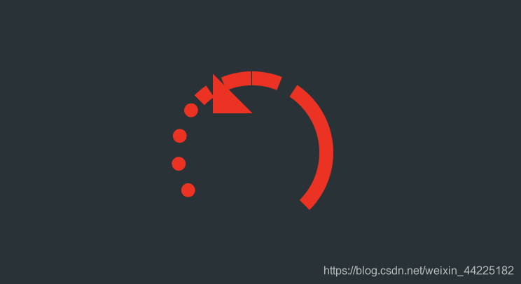
步骤3
使用span::after伪类元素 作为箭头
设置为
- 绝对定位
- 边 ad8 框:20px solid,右边框为红色,上/下/左边框为透明
- 旋转-45度
position: absolute;
border: 20px solid transparent;
border-right-color: red;
transform: rotate(-45deg);
效果图如下
步骤4
设置span::after的位置
注:
- 这里移动位置时候就需要一点点移动了
- 确保箭头和箭尾可以很好的重合
- 这里肯定是可以用数学公式计算出来的,这里稍微需要点时间,之后有空再更新更为一般情况时需要移动的距离公式吧
/*这里箭头需要移动的距离*/
left: 51px;
top: 79px;
效果图如下

步骤5
为span添加动画
- 顺时针旋转(0-360度) 2s 无限循环
animation: rotation 2s linear infinite ;
/*动画实现*/
@keyframes rotation {
0% { transform: rotate(0deg) }
100% { transform: rotate(360deg)
}
}
效果图如下
结语
学习来源:
文章仅作为学习笔记,记录从0到1的一个过程。希望对您有所帮助,如有错误欢迎小伙伴指正~
我是海轰ଘ(੭ˊᵕˋ)੭,如果您觉得写得可以的话,请点个赞吧
写作不易,「点赞」+「收藏」+「转发」
谢谢支持❤️

相关文章推荐
- 「HTML+CSS」--自定义加载动画【040】
- 「HTML+CSS」--自定义加载动画【026】
- 「HTML+CSS」--自定义加载动画【008】
- 安卓开发之自定义粒子旋转动画加载控件
- 使用Loader.css和css-spinners来制作加载动画的方法
- ZH奶酪:纯CSS自定义Html中Checkbox复选框样式
- HTML+CSS实现页面加载(变灰显示请稍等、页面控件不可用)
- animate() 方法执行 CSS 属性集的自定义动画。
- Flex :自定义Loading载入状态(含图标) 及解决Flex中GIF动画图片加载时显示动起来
- HTML CSS 兼容所有浏览器的自定义鼠标样式
- html+ css基础笔记_变形_动画_渐变色_字体图标_part2_2
- 通过JS和CSS,实现网页加载中的动画效果
- CSS 实现加载动画之二-圆环旋转
- CSS实现Loading加载动画
- HTML 加载CSS文件和javascript的思考
- wordpress 加载自定义的javascript和css
- html动画加载页面效果scrollReveal.js插件
- 自定义扇形进度条、异步加载网络图片、Activity疯狂旋转动画
- 自定义网络请求时加载动画dialog
- html,css,js加载顺序