单细胞分析实录(8): 展示marker基因的4种图形(一)
今天的内容讲讲单细胞文章中经常出现的展示细胞marker的图:tsne/umap图、热图、堆叠小提琴图、气泡图,每个图我都会用两种方法绘制。
使用的数据来自文献:Single-cell transcriptomics reveals regulators underlying immune cell diversity and immune subtypes associated with prognosis in nasopharyngeal carcinoma. 去年7月发表在Cell Research上的关于鼻咽癌的文章,数据下载:https://www.ncbi.nlm.nih.gov/geo/query/acc.cgi?acc=GSE150430
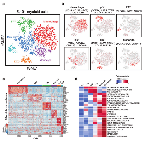
髓系细胞数量相对少一些,为了方便演示,选它作为例子。
library(Seurat)
library(tidyverse)
library(harmony)
Myeloid=read.table("Myeloid_mat.txt",header = T,row.names = 1,sep = "\t",stringsAsFactors = F)
Myeloid_anno=read.table("Myeloid_anno.txt",header = T,sep = "\t",stringsAsFactors = F)
导入数据的时候需要注意一个地方:从cell ranger得到的矩阵,每一列的列名会在CB后面加上"-1"这个字符串,在R里面导入数据时,会自动转化为".1",在做匹配的时候需要注意一下。我已经提前转换为"_1"
> summary(as.numeric(Myeloid["CD14",]))
Min. 1st Qu.  Median    Mean 3rd Qu.    Max.
0.000   0.000   0.689   1.080   2.111   4.500
> summary(as.numeric(Myeloid["PTPRC",]))
Min. 1st Qu.  Median    Mean 3rd Qu.    Max.
0.000   1.200   1.681   1.607   2.124   3.520
考虑到下载的表达矩阵,表达值都不是整数,且大于0,推测该矩阵已经经过了标准化,因此下面的流程会跳过这一步
0. Seurat流程
我们直接把注释结果赋值到mye.seu@meta.data矩阵中,后面省去聚类这一步
mye.seu=CreateSeuratObject(Myeloid)
mye.seu@meta.data$CB=rownames(mye.seu@meta.data)
mye.seu@meta.data=merge(mye.seu@meta.data,Myeloid_anno,by="CB")
rownames(mye.seu@meta.data)=mye.seu@meta.data$CB

#替代LogNormalize这一步
mye.seu[["RNA"]]@data=mye.seu[["RNA"]]@counts
mye.seu <- FindVariableFeatures(mye.seu, selection.method = "vst", nfeatures = 2000)
mye.seu <- ScaleData(mye.seu, features = rownames(mye.seu))

mye.seu <- RunPCA(mye.seu, npcs = 50, verbose = FALSE)
mye.seu=mye.seu %>% RunHarmony("sample", plot_convergence = TRUE)
mye.seu <- RunUMAP(mye.seu, reduction = "harmony", dims = 1:20)
mye.seu <- RunTSNE(mye.seu, reduction = "harmony", dims = 1:20)
#少了聚类

DimPlot(mye.seu, reduction = "tsne", group.by = "celltype", pt.size=1)+theme(
axis.line = element_blank(),
axis.ticks = element_blank(),axis.text = element_blank()
)
ggsave("tsne1.pdf",device = "pdf",width = 17,height = 14,units = "cm")
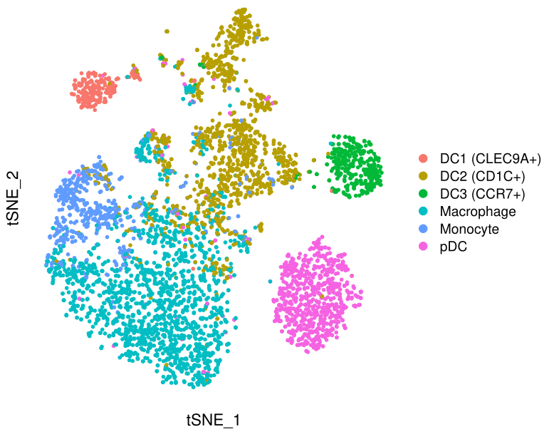
基本符合原图,三个亚群分得开,三个亚群分不开。
接下来,我用4种方式展示marker基因,这些基因可以在文献的补充材料里面找到。
1. tsne展示marker基因
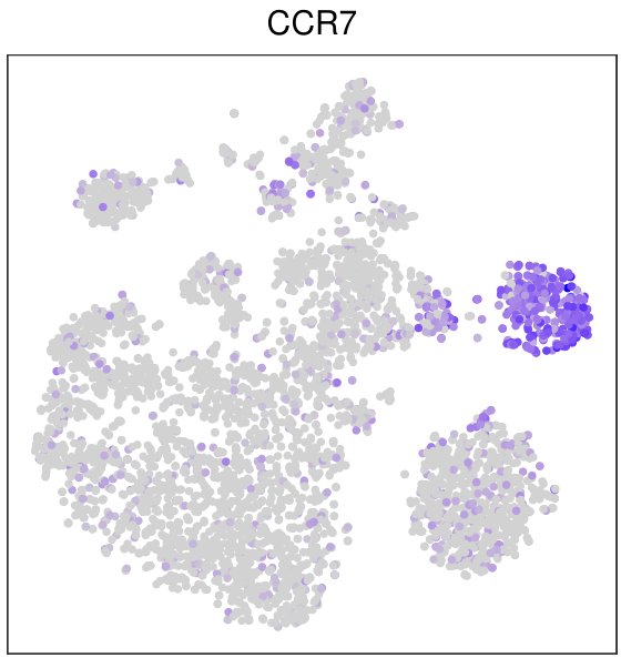
FeaturePlot(mye.seu,features = "CCR7",reduction = "tsne",pt.size = 1)+
scale_x_continuous("")+scale_y_continuous("")+
theme_bw()+ #改变ggplot2的主题
theme( #进一步修改主题
panel.grid.major = element_blank(),panel.grid.minor = element_blank(), #去掉背景线
axis.ticks = element_blank(),axis.text = element_blank(), #去掉坐标轴刻度和数字
legend.position = "none", #去掉图例
plot.title = element_text(hjust = 0.5,size=14) #改变标题位置和字体大小
)
ggsave("CCR7.pdf",device = "pdf",width = 10,height = 10.5,units = "cm")
另一种方法就是把tsne的坐标和基因的表达值提取出来,用ggplot2画,其实不是很必要,因为FeaturePlot也是基于ggplot2的,我还是演示一下
mat1=as.data.frame(mye.seu[["RNA"]]@data["CCR7",])
colnames(mat1)="exp"
mat2=Embeddings(mye.seu,"tsne")
mat3=merge(mat2,mat1,by="row.names")

#数据格式如下:
> head(mat3)
Row.names     tSNE_1     tSNE_2   exp
1 N01_AAACGGGCATTTCAGG_1   5.098727  32.748145 0.000
2 N01_AAAGATGCAATGTAAG_1 -24.394040  26.176422 0.000
3 N01_AACTCAGGTAATAGCA_1  11.856730   8.086553 0.000
4 N01_AACTCAGGTCTTCGTC_1  10.421878  12.660407 0.000
5 N01_AACTTTCAGGCCATAG_1  33.555756 -10.437406 1.606
6 N01_AAGACCTTCGAATGGG_1 -23.976967  11.897753 0.738

mat3%>%ggplot(aes(tSNE_1,tSNE_2))+geom_point(aes(color=exp))+
scale_color_gradient(low = "grey",high = "purple")+theme_bw()
ggsave("CCR7.2.pdf",device = "pdf",width = 13.5,height = 12,units = "cm")

用ggplot2的好处就是图形修改很方便,毕竟ggplot2大家都很熟悉
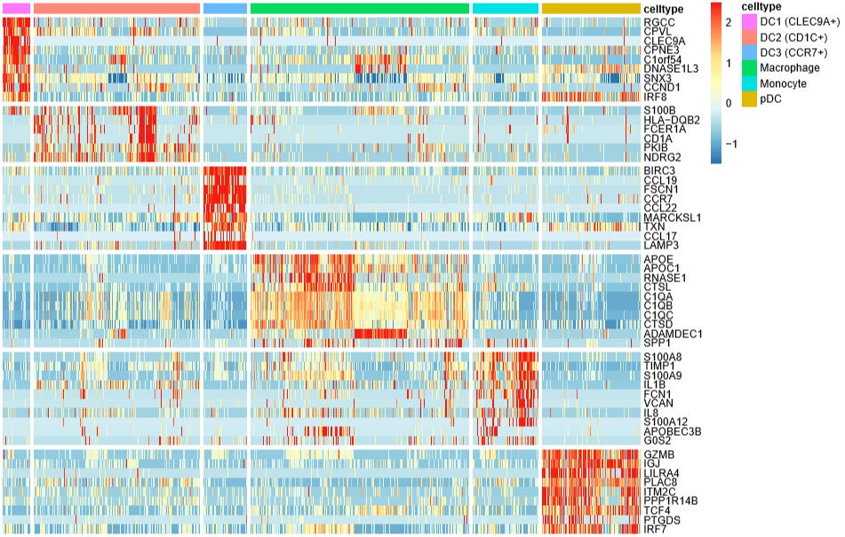
2. 热图展示marker基因
画图前,需要给每个细胞一个身份,因为我们跳过了聚类这一步,此处需要手动赋值
Idents(mye.seu)="celltype"

library(xlsx)
markerdf1=read.xlsx("ref_marker.xlsx",sheetIndex = 1)
markerdf1$gene=as.character(markerdf1$gene)
# 这个表格整理自原文的附表,选了53个基因

#数据格式
# > head(markerdf1)
# gene   celltype
# 1    S100B DC2(CD1C+)
# 2 HLA-DQB2 DC2(CD1C+)
# 3   FCER1A DC2(CD1C+)
# 4     CD1A DC2(CD1C+)
# 5     PKIB DC2(CD1C+)
# 6    NDRG2 DC2(CD1C+)

DoHeatmap(mye.seu,features = markerdf1$gene,label = F,slot = "scale.data")
ggsave("heatmap.pdf",device = "pdf",width = 23,height = 16,units = "cm")
label = F不在热图的上方标注细胞类型,
slot = "scale.data"使用scale之后的矩阵画图,默认就是这个

接下来用pheatmap画,在布局上可以自由发挥
library(pheatmap)
colanno=mye.seu@meta.data[,c("CB","celltype")]
colanno=colanno%>%arrange(celltype)
rownames(colanno)=colanno$CB
colanno$CB=NULL
colanno$celltype=factor(colanno$celltype,levels = unique(colanno$celltype))
先对细胞进行排序,按照celltype的顺序,然后对基因排序
rowanno=markerdf1
rowanno=rowanno%>%arrange(celltype)
提取scale矩阵的行列时,按照上面的顺序
mat4=mye.seu[["RNA"]]@scale.data[rowanno$gene,rownames(colanno)]
mat4[mat4>=2.5]=2.5
mat4[mat4 < (-1.5)]= -1.5 #小于负数时,加括号!
下面就是绘图代码了,我加了分界线,使其看上去更有区分度
pheatmap(mat4,cluster_rows = F,cluster_cols = F,
show_colnames = F,
annotation_col = colanno,
gaps_row=as.numeric(cumsum(table(rowanno$celltype))[-6]),
gaps_col=as.numeric(cumsum(table(colanno$celltype))[-6]),
filename="heatmap.2.pdf",width=11,height = 7
)
先写到这儿吧(原本以为能写完的),剩下的气泡图、堆叠小提琴图改天再补上。
因水平有限,有错误的地方,欢迎批评指正!

- C++实现线性表的分析与实现(图形展示)
- 信息管理系统开发架构 配置实现列表展示分析图形及编辑等 构建信息分析展示平台 C#快速开发架构
- 数据查询列表展示与分析图形展示的XML定制实现
- 单细胞分析实录(5): Seurat标准流程
- 用VML技术实现统计图形的绘制(考试系统中的试卷分析模块)
- ERP物料采购系统需求分析与效果展示 ERP实施以失败告终的四个原因分析
- TOP100summit:【分享实录-WalmartLabs】利用开源大数据技术构建WMX广告效益分析平台...
- TCP拥塞的4种算法,分析一个典型的拥塞检测过程
- FineReport图表展示之多维分析功能
- 用示波器对单片机I2C时序进行图形波形分析的试验小结
- 【转贴】公务员考试图形推理热点题型分析
- nGrinder源码分析:详细报告页数据展示
- 深度解读 - Windows 7核心图形架构细致分析(转贴)
- Android图形系统分析与移植 -- 五、Android FrameBuffer
- CAD和GIS绘制图形分析
- Android图形系统的分析与移植--七、双缓冲framebuffer的实现
- Hyper-v下安装网络流量监测图形分析工具 Cacti
- 京东7亿美元投资「兴盛优选」,「鹍远基因」B轮获投10亿元丨全球投融资周报丨睿兽分析
- 分析ASP.NET读取XML文件4种方法
- 深度解读 - Windows 7核心图形架构细致分析(来自微软)