使用Bootstrap 3网格系统的自适应设计
Bootstrap 3 tutorial. In this tutorial we will talk about the main building blocks that are common to most websites and about the creation of adaptive layout using a grid system of bootstrap3.
Bootstrap 3教程。 在本教程中,我们将讨论大多数网站所共有的主要构建块,以及使用bootstrap3的网格系统创建自适应布局的过程。
As for the main blocks (or areas) of the site, here are the following:
关于站点的主要块(或区域),以下是:
1. header – upper area with logo, main menu (sometimes), additional information (contacts, extra language switches), etc.
1.页眉 –带有徽标的上部区域,主菜单(有时),其他信息(联系人,其他语言切换)等
2. footer – the lowest part of a web page that can contain additional menu block with a subscription, contacts, social icons, copyright etc.
2.页脚 –网页的最低部分,可以包含带有订阅,联系人,社交图标,版权等的其他菜单块。
3. content – is usually just below the header. The main part of the content varies depending on the subject of the site, if this is a block, there will be some content (post, page, etc.), if this is an online store, there will be a product (product page, the category, etc).
3.内容 –通常在标题下方。 内容的主要部分因站点的主题而异,如果是块,则将包含某些内容(帖子,页面等),如果是在线商店,则将包含产品(产品页面) ,类别等)。
4. sidebar – it is not in all designs, however sometimes there can be even several sidebars. Sidebar is usually located on the left or right of the main content and contains a variety of widgets.
4.侧边栏 –并非所有设计都可以,但是有时甚至可以有几个侧边栏。 侧栏通常位于主要内容的左侧或右侧,并包含各种小部件。
Now I probably will stop describing, because there is no reason to expand the list of the above areas that are common to most sites.
现在,我可能会停止描述,因为没有理由扩大大多数站点共有的上述区域的列表。
现场演示
使用网格布局的特征 (Features using the grid layout)
Below is a layout code for the formation of four columns using the the grid:
以下是使用网格形成四列的布局代码:
<div class="container">
<div class="row">
<div class="col-md-3"><p>Column 1</p></div>
<div class="col-md-3"><p>Column 2</p></div>
<div class="col-md-3"><p>Column 3</p></div>
<div class="col-md-3"><p>Column 4</p></div>
</div>
</div>
<div class="container">
<div class="row">
<div class="col-md-3"><p>Column 1</p></div>
<div class="col-md-3"><p>Column 2</p></div>
<div class="col-md-3"><p>Column 3</p></div>
<div class="col-md-3"><p>Column 4</p></div>
</div>
</div>
[/code]
From the code above, we can see that for the formation of the structure of the site we can use three main classes: .container, .row, .col- *.
从上面的代码中,我们可以看到,对于网站结构的形成,我们可以使用三个主要类:.container,.row,.col- *。
.container– is wrapping the entire contents of the block, sets the width of the main website
.container–包装该块的全部内容,设置主网站的宽度
.row– block wrapper for columns. It has a negative padding
.row–列的块包装器。 它具有负填充
.col-*– block column
.col-*–阻止列
Now let’s talk more about the rules of construction layout using grid.
现在让我们更多地讨论使用网格的施工布局规则。
Rows (.rows) should be placed within .container (fixed-width) or .container-fluid (full width) for proper alignment and filling.
行(。行)应放置在.container(固定宽度)或.container-fluid(全宽)内,以正确对齐和填充。
- Use rows (.rows) to create a horizontal column group. 使用行(.rows)创建水平列组。
- The content should be placed in the columns and columns can only be direct descendants of rows. 内容应放在列中,而列只能是行的直接后代。
- Standard classes of the grid such as .row and .col-xs-4 are used to quickly create the grid layout. 网格的标准类(例如.row和.col-xs-4)用于快速创建网格布局。
- Columns have padding, which for the first and last column is offset negative margin indented in .row. 列具有填充,对于第一列和最后一列,该填充都是以.row缩进的负边距。
- Grid columns are based on the maximum number of columns – 12, ie, to create three blocks, then you need to use a class .col-md-4. 网格列基于最大列数– 12,即要创建三个块,则需要使用.col-md-4类。
- If a row contains more than 12 columns (the total width of all columns), then each subsequent colony will be moved to the new row. 如果一行包含多于12列(所有列的总宽度),则随后的每个菌落都将移至新行。
下表显示了网格项(列)的css类: (The table below shows css classes for grid items (columns):)
| Extra small devicesPhones (<768px) | Small devicesTablets (≥768px) | Medium devicesDesktops (≥992px) | Large devicesDesktops (≥1200px) | |
|---|---|---|---|---|
| Container width | None (auto) | 750px | 970px | 1170px |
| Class prefix | .col-xs- | .col-sm- | .col-md- | .col-lg- |
| Column width | Auto | ~62px | ~81px | ~97px |
| Gutter width | 30px (15px on each side of a column) |
| 超小型设备 手机(<768px) | 小型装置 平板电脑(≥768px) | 中型设备 台式机(≥992px) | 大型设备 台式机(≥1200px) | |
|---|---|---|---|---|
| 容器宽度 | 无(自动) | 750px | 970px | 1170px |
| 类前缀 | .col-xs- | .col-sm- | .col-md- | .col-lg- |
| 列宽 | 汽车 | 〜62px | 〜81px | 〜97px |
| 天沟宽度 | 30像素(每列15像素) |
将CSS Grid Bootstrap 3下载到您的计算机 (Download css grid bootstrap 3 to your computer)
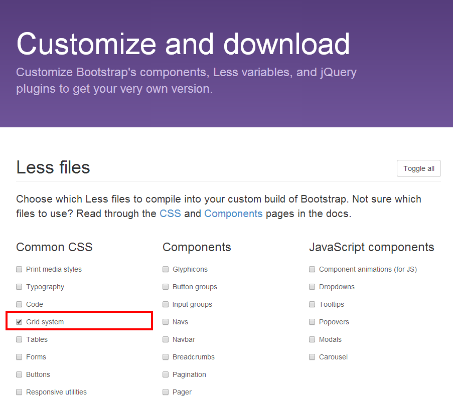
In order to download a minimized version (less files) of the bootstrap library, goto ‘Customize and download’ page and remove all ticks, except Grid System (this is if you want to download only the styles to form a layout using the grid)
为了下载引导程序库的最小版本(较少的文件),请转到“自定义和下载”页面并删除除网格系统以外的所有刻度(这是如果您仅要下载样式以使用网格形成布局)
And then we can connect the Bootstrap Grid System to your page:
然后,我们可以将Bootstrap Grid System连接到您的页面:
<link rel="stylesheet" type="text/css" href="css/bootstrap.css">
<link rel="stylesheet" type="text/css" href="css/bootstrap.css">[/code]
使用bootstrap3网格系统制作站点的骨架布局 (Making the skeleton layout of the site with the bootstrap3 grid system)
We will prepare the skeleton without real content, ie there will only conditional blocks. Initially, I thought about to make it for an online store, as in this case it will be more clearly displayed the behavior of blocks when you change the width of the browser.
我们将准备没有实际内容的骨架,即只有条件块。 最初,我打算将其用于在线商店,因为在这种情况下,当您更改浏览器的宽度时,它将更清楚地显示块的行为。
In the layout there will be the following areas:
在布局中将包含以下区域:
1. Site header with logo and some content
1.带有徽标和一些内容的网站标题
2. Sidebar
2.侧边栏
3. Footer, divided into an upper part with 4 blocks of the menu and the lower part with copyright and the area with social icons
3.页脚,分为菜单栏的上半部分和四个区域,下半部分为版权,而下半部分为社交图标
4. Content with 8 products
4.含8种产品的内容
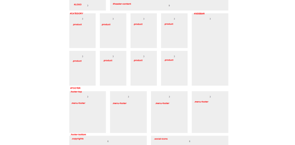
In addition to the main classes of the grid I added an additional block into each column with the class .well that is filled in gray (for clarity). All the .row sections have unique identifiers, in order to show that the use of the grid does not create a special depth of nesting in html coding. All blocks of columns also have their “semantic” classes.
除了网格的主要类别外,我还在每列中添加了一个附加块,类别为.well的类别以灰色填充(为清楚起见)。 所有.row节都有唯一的标识符,以表明使用网格不会在html编码中创建特殊的嵌套深度。 所有列块也都有其“语义”类。
Here is all the code of a layout using bootstrap 3 grid system:
这是使用bootstrap 3网格系统的布局的所有代码:
<div id="wrapper" class="container">
<div id="header" class="row">
<div id="logo" class="col-md-3"><div class="well">3<br>#logo</div></div>
<div id="header-content" class="col-md-9"><div class="well">9<br>header-content</div></div>
</div>
<div id="category" class="row">
<div id="featured" class="col-md-9">
<div class="row">
<div class="product col-sm-6 col-md-4 col-lg-3"><div class="well">3<br>product</div></div>
<div class="product col-sm-6 col-md-4 col-lg-3"><div class="well">3<br>product</div></div>
<div class="product col-sm-6 col-md-4 col-lg-3"><div class="well">3<br>product</div></div>
<div class="product col-sm-6 col-md-4 col-lg-3"><div class="well">3<br>product</div></div>
<div class="product col-sm-6 col-md-4 col-lg-3"><div class="well">3<br>product</div></div>
<div class="product col-sm-6 col-md-4 col-lg-3"><div class="well">3<br>product</div></div>
<div class="product col-sm-6 col-md-4 col-lg-3"><div class="well">3<br>product</div></div>
<div class="product col-sm-6 col-md-4 col-lg-3"><div class="well">3<br>product</div></div>
</div>
</div>
<div id="sidebar" class="col-md-3"><div class="well">3<br>#sidebar</div></div>
</div>
<div id="footer">
<div class="footer-top row">
<div class="menu-footer col-sm-6 col-md-3"><div class="well">3<br>.menu-footer</div></div>
<div class="menu-footer col-sm-6 col-md-3"><div class="well">3<br>.menu-footer</div></div>
<div class="menu-footer col-sm-6 col-md-3"><div class="well">3<br>.menu-footer</div></div>
<div class="menu-footer col-sm-6 col-md-3"><div class="well">3<br>.menu-footer</div></div>
</div>
<div class="footer-bottom row">
<div class="copyrights col-sm-6 col-md-6"><div class="well">6<br>.copyrights</div></div>
<div class="social-icons col-sm-6 col-md-6"><div class="well">6<br>.social-icons</div></div>
</div>
</div>
</div>
[/code]
As it is seen from the layout, three column classes are used for the ‘product’ block: col-sm-6 col-md-4 col-lg-3.
从布局中可以看出,“产品”块使用了三个列类:col-sm-6 col-md-4 col-lg-3。
col-lg-3 is to display our products at 4 in a row, for screens width more then 1200px
col-lg-3将连续显示4个产品,屏幕宽度大于1200px
col-md-4 is to display our products at 3 in a row, for screens width more then 992px
col-md-4将连续显示3个产品,屏幕宽度大于992px
col-sm-6 is to display our products at 2 in a row, for screens width more then 768px
col-sm-6将连续显示2个产品,屏幕宽度大于768px
Thus combining classes with the width of the block for a different screen resolution of the user device, we achieve adaptability of our design and quality and responsive display of the site.
因此,针对用户设备的不同屏幕分辨率,将类别与块的宽度相结合,我们实现了设计和质量的适应性以及站点的响应式显示。
The use of the grid during creating new websites allows automate routine approaches to similar projects and create ready-made models (solutions) for diverse tasks.
在创建新网站期间使用网格可以自动执行类似项目的常规方法,并为各种任务创建现成的模型(解决方案)。
Summing up: making the layout using the bootstrap grid is rather simple and easy. And I can not say that the html structure increases too much and grows nesting depth of webpage elements because of its use. If you clean up the library file (css) for bootstrap 3 grid, you can get a size even less than 10Kb. Try it, experiment and find convenient solution that would accelerate your work and quality.
总结:使用引导网格进行布局非常简单。 而且我不能说html结构由于其使用而增加太多并增加了网页元素的嵌套深度。 如果清理引导3网格的库文件(css),则大小甚至会小于10Kb。 尝试一下,进行实验并找到方便的解决方案,以加快您的工作和质量。
现场演示
[sociallocker]
[社交储物柜]
打包下载
[/sociallocker]
[/ sociallocker]
翻译自: https://www.script-tutorials.com/adaptive-design-using-bootstrap-3-grid-system/

- 经典网页设计:15个使用网格系统的精美网站作品
- bootstrap网格系统使用方法解析
- 使用960网格系统(960 Grid System)设计网页
- Bootstrap使用经验(一) 网格系统
- 如何使用设计模式来构造系统--(1)
- 如何使用设计模式来构造系统--(2)
- 转:Bootstrap研究 精巧的网格布局系统
- 从门禁系统的使用体验看良好的交互设计原则
- Bootstrap研究1-精巧的网格布局系统
- 翻译:使用 ASP.NET MVC 4, EF, Knockoutjs and Bootstrap 设计和开发站点 - 4 - 验证
- Bootstrap 网格系统
- 如何使用设计模式来构造系统--(4)
- 如何使用即时报表设计网格报表
- Bootstrap---Grid system 网格系统
- 如何使用设计模式来构造系统--(5)
- 使用 ASP.NET MVC 4, EF, Knockoutjs and Bootstrap 设计和开发站点 - 6 - 业务逻辑
- 线程中如何创建锁和使用锁 Lock,设计一个缓存系统
- 使用Java设计一个 高可用、高效率的缓存系统
- 使用jQuery和Bootstrap实现多层、自适应模态窗口
- 如何使用设计模式来构造系统--(5)