【记录】vue-cli+element-ui 制作一个侧边栏组件(抽屉Drawer)
2020-06-06 07:37
1306 查看
用到的组件
el-drawer抽屉、el-button按钮
测试还用到了输入框等组件
功能
1.自由添加按钮,并可使按钮居中
2.抽屉里的内容由
<slot>插入,用的具名插槽
3.鼠标悬停在按钮时出现文字
4.可指定侧边栏距离窗口最右侧的距离
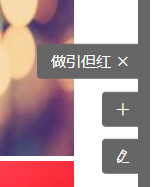
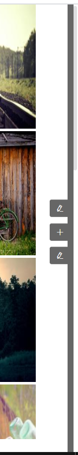
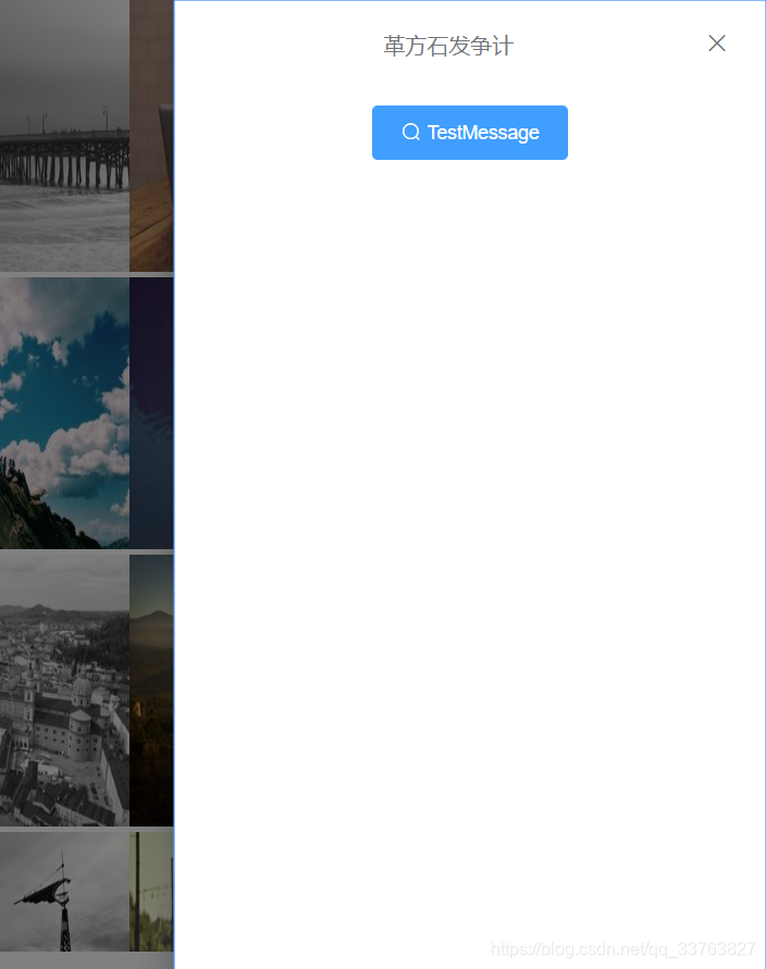
效果图
实现代码
//vue单组件文件
<template>
<div class="bar__index">
<div class="bar__side-bar-bg" :style="{ right: this.barRight }"></div>
<div :class="bar__btn-list" :style="{ right: this.barRight }"><div
:class="bar__btn"
@mouseover="item.btnText = item.title"
@mouseout="item.btnText = ''"
v-for="(item, index) in this.btnInfo"
:key="index"
prop="btnInfo"
>
<el-button
type="primary"
size="mini"
@click="isShow ? isShow(item, index) : ''"
>
{{ item.btnText }}
<i :class="item.iconClass"></i>
</el-button>
</div>
</div>
<el-drawer
:title="title"
:visible.sync="drawerShow"
:before-close="handleClose"
:size="drawerSize"
>
<slot :name="slotName"></slot>
</el-drawer>
</div>
</template>

<script>
import create from "../../core/create";

export default create({
name: "sidebar",
props: {
option: {
type: Object,
default: () => {
return {};
},
},
},
computed: {
btnInfo: function () {
return this.option.btnInfo || [];
},
},
data() {
return {
drawerShow: false,
title: "",
drawerSize: "",
slotName: "",
isShow: this.option.isShow,
barRight: this.option.barRight || "",
};
},
methods: {
handleClose(done) {
this.$confirm("确认离开提交页面?")
.then((_) => {
done();
})
.catch((_) => {});
},
},
});
</script>

<style scoped lang="scss">
$bg-color: #666666;
@mixin position{
position: fixed;
z-index: 999;
}.bar {
&__index {
>>> .el-drawer__header > :first-child {
text-align: center;
}
}
&__side-bar-bg {
@include position();
height: 100%;
width: 10px;
background-color: $bg-color;
}
&__btn-list {
@include position();
top: 50%;
transform: translate(0, -50%);
}
&__btn {
width: 100px;
display: flex;
justify-content: flex-end;margin-top: 10px;
>>> .el-button--primary {
background-color: $bg-color;
border-color: $bg-color;
padding-left: 10px;
padding-right: 15px;
}
}
}
</style>
生成测试的数据代码(用的mock.js)
<script>
//开始生成测试数据
const demoData = [];
const demoDataNum = Mock.mock("@integer(1, 8)");
const iconClass = [
"el-icon-plus",
"el-icon-edit",
"el-icon-close"
];
const slotName = ["btn1", "btn2", "btn3"];
for (let i = 0; i < demoDataNum; i++) {
demoData.push({
title: Mock.mock("@cword(4, 7)"),
btnText: "",
iconClass: iconClass[Mock.mock("@integer(0, 2)")],
drawerSize: Mock.mock("@integer(400, 500)").toString() + "px",
slotName: slotName[Mock.mock("@integer(0, 2)")],
});
}
new Vue({
el: "#app",
data() {
return {
datas: demoDataImage,
value: true,
textarea: "",
Msg: "TestMessage",
option: {
barRight: "7px",
btnInfo: demoData,
isShow: function (item, index) {
this.drawerShow = true;
this.title = item.title;
this.drawerSize = item.drawerSize;
this.slotName = item.slotName;
},
},
};
},
methods: {
},
});
</script>
插入drawer内容的代码例子,主要在
slot="name"上
```javascript
<sidebar :option="option">
<template slot="btn1">
<el-button type="primary" icon="el-icon-search">{{Msg}}</el-button>
</template>
<template slot="btn2">
<el-input
type="textarea"
:autosize="{ minRows: 2, maxRows: 4}"
:placeholder="Msg"
v-model="textarea"
>
</el-input>
</template>
<template slot="btn3">
<el-switch v-model="value" :active-text="Msg" :inactive-text="Msg">
</el-switch>
</template>
</sidebar>
实现功能的关键代码
1.用内联样式来指定侧边栏距离窗口最右侧的距离
<div class="bar__side-bar-bg" :style="{ right: this.barRight }"></div>
<div :class="bar__btn-list" :style="{ right: this.barRight }">
2.鼠标悬停出现文字提示
@mouseover="item.btnText = item.title"
@mouseout="item.btnText = ''"
这里会出现按钮浮动的情况所以还需要为按钮div添加样式,使按钮始终从右向左排列,默认的是靠左。关于flex可以去查阅CSS伸缩盒模型。
display: flex;
justify-content: flex-end;
3.使侧边栏始终保持在最上层(绝对定位+z-index)
@mixin position{
position: fixed;
z-index: 999;
}
4.无论多少个按钮都始终保持居中
绝对定位后,先使整个按钮div距离窗口顶部50%的距离,再通过一个translate减去自身元素高度的50%就可以实现
&__btn-list {
@include position();
top: 50%;
transform: translate(0, -50%);
}
5.点击按钮出现el-drawer组件即抽屉
@click="isShow ? isShow(item, index) : ''"

isShow: function (item, index) {
this.drawerShow = true;
this.title = item.title;
this.drawerSize = item.drawerSize;
this.slotName = item.slotName;
},
绑定按钮点击事件来改变el-drawer的
:visible.sync值并且给drawer里的标题,盒子大小还有slot进行赋值
:visible.sync="drawerShow"
.sync修饰符双向绑定
========================================================
大致就是这样,为了使弹出画面更流畅,推荐对窗口使用el-scrollbar组件,这样就不会出现页面内容过多出现浏览器自带的滚动条从而使体验度下降的问题,关于el-scorllbar,element-ui官方文档没有给出组件说明,但是在github可以看到源码,使用方法百度上也有特别多的教程,因为组件修改了很多遍,最终版本并没有用到el-drawer又怕忘了这个方法,特此记录。
========================================================
建议:看懂代码再自己编写,因为此组件是在组件开发的框架下面写的,所以如果是直接拿来应用会有很多东西需要修改

相关文章推荐
- vue-cli安装element-ui及分页组件使用
- vue+element-ui简单制作后台管理系统以及element table组件的应用
- 用vue-cli搭建一个项目配合element-ui做一个公司需要的后台管理系统
- vue2.0基于vue-cli,element-ui饿了么vue前端开源项目制作vue的树形table,treeTable
- vue-cli结合Element-ui基于cropper.js封装vue实现图片裁剪组件功能
- vue2.0基于vue-cli+element-ui制作树形treeTable
- vue新手实战项目 vue-cli/element-ui/ (自己已做,当作记录)
- Vue + Element-ui实现后台管理系统(4)---封装一个ECharts组件的一点思路
- vue-cli3.0+element-ui上传组件el-upload的使用
- 本篇文章使用vue结合element-ui开发tab切换vue的不同组件,每一个tab切换的都是一个新的组件。
- vue/element-ui/router---后台管理系统主页面---一个侧边栏与可配置的tab标签栏
- Vue-cli webpack,element-ui搭建一个完整的项目
- vue + element-ui 制作tab切换(切换vue组件,踩坑总结)
- 如何在vue项目中使用递归组件配合Element-ui布局侧边栏
- vue-cli + element-ui + webpack 新建项目
- vue+elementUi图片上传组件使用详解
- vue-cli以webpack-simple+elementui配置
- vue用mint-ui的picker组件封装一个省市区三级联动组件
- VUE 使用新版本 element-ui 组件库 Select 组件时, value 值为对象时的 BUG 处理
- vue elementUI 单选框默认值不选中,子组件传输数据 不展示