vue-cli+elment-ui 标签页动态加载组件(el-tabs)
2020-06-06 07:37
1276 查看
用到的组件
el-tabs标签页,
<component>标签,用
:is切换加载
功能
动态切换标签页并显示不同组件内容
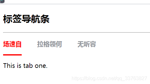
效果图
标题实现代码
//.vue单文件
<template>
<div :class="bemCss('tabs')">
<el-tabs v-model="activeName" @tab-click="handleClick">
<el-tab-pane
v-for="(item, index) in this.tabsData"
:key="index"
:label="item.labelName"
:name="item.tabName"v-if="item.show"
>
<keep-alive>
<component :is="currentTabComponent"></component>
</keep-alive></el-tab-pane>
</el-tabs>
</div>
</template>

<script>
import create from "../../core/create";

export default create({
name: "tabs",
props: {
option: {
type: Object,
default: () => {
return {};
},
},
},
computed: {
tabsData: function () {
return this.option.tabsData || [];
},
},
data() {
return {
currentTabComponent: this.option.currentTabComponent||"",
activeName: this.option.activeName || "",
};
},
methods: {
handleClick(tab) {
this.currentTabComponent=tab.paneName;
},},
});
</script>

<style scoped lang="scss">
$theme-color: #ff0000;
$height: 50px;

.hxvue-tabs {
&__tabs {
position: absolute;
>>> .el-tabs {
&__item {
font-size: 16px;
font-family: Segoe UI, Segoe UI-Bold;
font-weight: 800;
color: #909399;
&.is-active {
color: $theme-color;
}
&:hover {
color: $theme-color;
}
}
&__header {
height: $height;
}
&__active-bar {
background-color: $theme-color;
height: 3px;
}
&__nav {
height: $height;
&-wrap {
height: $height;
&::after {
height: 0;
}
}
&-scroll {
height: $height;
}
}
}
}
}
</style>
//使用代码
<script>
//开始生成测试数据
const demoData = [];
const demoDataNum = 5;
let active = "";
const tabName = ["tab-one", "tab-two", "tab-three", "tab-four", "tab-five"];
for (let i = 0; i < demoDataNum; i++) {
demoData.push({
labelName: Mock.mock("@ctitle(2, 5)"),
tabName: tabName[i],
show: Mock.mock({
"boolean|1": true,
}).boolean,
});
}
for (let i = 0; i < demoDataNum; i++) {
if (demoData[i].show === true) {
active = demoData[i].tabName;
break;
}
}
Vue.component("tab-one", {
template: "<div>This is tab one.</div>",
});
Vue.component("tab-two", {
template: "<div>This is tab two.</div>",
});
Vue.component("tab-three", {
template: "<div>This is tab three.</div>",
});
Vue.component("tab-four", {
template: "<div>This is tab four.</div>",
});
Vue.component("tab-five", {
template: "<div>This is tab five.</div>",
});
new Vue({
el: "#app",
data() {
return {
option: {
currentTabComponent:active,
activeName: active,
cardSpan: 4,
tabsData: demoData,
},
};
},
methods: {},
});
</script>
关键代码
@tab-click="handleClick"
这个是el-tabs官方给出的切换标签页使用的方法
:name="item.tabName"
绑定每个
el-tab-pane的name
<keep-alive>
<component :is="currentTabComponent"></component>
</keep-alive>
动态加载组件,这个在vue.js官方文档中可以找到
handleClick(tab) {
this.currentTabComponent=tab.paneName;
},
通过在控制台输出tab我们可以看到,tab中的paneName属性值就和我们绑定的tabName是同一个值,所以用这个来确定当前加载的组件是什么,让tabName和组件名称相同就可以实现组件的动态切换了,只需要在使用的时候import你要用的页面组件就好了
=========================================================
以上代码在组件开发框架下开发,所以直接拿来使用的话需要做修改,建议看懂了之后再参考编写

相关文章推荐
- 详解vue2.0 使用动态组件实现 Tab 标签页切换效果(vue-cli)
- 详解vue2.0 使用动态组件实现 Tab 标签页切换效果(vue-cli)
- vue-cli3.0+element-ui上传组件el-upload的使用
- 详解vue 动态加载并注册组件且通过 render动态创建该组件
- Vue + Element UI 实现权限管理系统 前端篇(十):动态加载菜单
- VUE 使用 element-ui 的 el-autocomplete 组件实现输入框自动提示查询功能 超简单!!!
- vue-cli4下按需加载element-ui遇到的问题
- vue 基于elment UI tree 组件实现带引导、提示线怎么写
- vue -- 动态加载组件
- 解决element-ui中el-menu组件作为vue-router模式在刷新页面后default-active属性与当前路由页面不一致问题的方法
- axios+vue+element-ui以服务端方式动态加载loading
- vue+element-ui el-tree 组件 的动态加载、新增、更新节点
- vue2.0使用动态组件实现tab切换效果(vue-cli)
- vue-cli结合Element-ui基于cropper.js封装vue实现图片裁剪组件功能
- Vue动态加载异步组件的方法
- 权限管理模块中动态加载Vue组件
- vue elementui el-upload组件 input type=file坑重新选择同一文件时不再显示
- 如何在 Vue-cli 创建的项目中引入 iView组件UI
- vue+element ui 使用$refs获取el-dialog 下的 el-table 组件 ,以及使用table多选,默认选中
- 仿ElementUI构建自己的Vue组件库用babel-plugin-component按需加载组件及自定义SASS主题