用flex实现css经典布局------圣杯布局
2020-02-03 02:05
603 查看
圣杯布局:
圣杯布局就是上下定高,中间自适应。中间左右的定宽但是高度自适应。
首先在讲圣杯布局之前,问你一个问题 flex:1 你是否真正的理解?
首先flex:1 时是 flex-basis:0 flex-grow:1 flex-shrink:1
好的我们一一来讲下 flex-basis:0 首先代替的是flex项目中的宽度,什么意思呢 就是给一个项目中同时设置 宽度和 flex-basis 那么这个项目的宽度肯定是按照flex-basis的。flex-grow:1 默认值是0 也就是说 他不平分容器中的剩余空间 而flex-shrink:1 则是缩放 默认值 容器的宽度 压缩 项目也会跟着压缩 就是这个意思。
看下面例子:中间那个div 已经实现了自适应了。
<!DOCTYPE html>
<html lang="en">
<head>
<meta charset="UTF-8">
<meta name="viewport" content="width=device-width, initial-scale=1.0">
<meta http-equiv="X-UA-Compatible" content="ie=edge">
<title>Document</title>
<style>
#father{

height: 100px;
background-color: #ff0;
display:flex;
}
div.child1{
width: 100px;
background-color: #369;
}
div.child2{
width: 100px;
background-color: #963;
flex:1
/*  这里的宽度是不起作用的 由于flex:1   */
}
div.child3{
width: 100px;
background-color: #339;
}
</style>
</head>
<body>
<div id="father">
<div class="child1"></div>
<div class="child2"></div>
<div class="child3"></div>
</div>
</body>
</html>
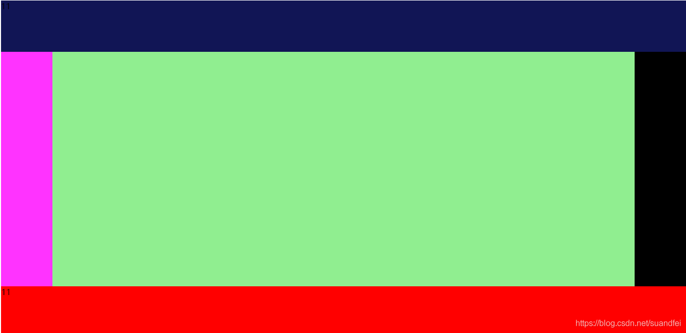
而圣杯布局就是再次基础上进行开发 ,只不过更换了主轴方向,所以中间div其实平分了剩余高度。 然后在把中间div设置为display:flex 然后做一个自适应。圣杯就完成了代码如下。 flex 容器中的项目如果不设置高度时,默认撑满父元素高度,一定要注意主轴方向。
<!DOCTYPE html>
<html lang="en">
<head>
<meta charset="UTF-8">
<meta name="viewport" content="width=device-width, initial-scale=1.0">
<meta http-equiv="X-UA-Compatible" content="ie=edge">
<title>Document</title>
<style>
body,html{
height: 100%;
}
#parent{
height:100%;
background-color:#36e;
display: flex;
justify-content: space-between;
flex-direction: column;
}
div.child1{
height: 100px;
background-color: #111555;
}
div.child2{
flex:1;
background-color: #0f0;
display: flex;
}
div.child3{
height: 100px;
background-color: red;
}
div.child4{
width: 100px;
background-color: #f3f;
}
div.child5{
flex:1;
background-color:lightgreen;
}
div.child6{
width: 100px;
background-color: black;
}
</style>
</head>
<body>
<div id="parent">
<div class="child1">11</div>
<div class="child2">
<div class="child4"></div>
<div class="child5"></div>
<div class="child6"></div>
</div>
<div class="child3">11</div>
</div>
</body>
</html>
实现的效果图如下:
你们可以自己去尝试,希望对你有所帮助。
- 点赞
- 收藏
- 分享
- 文章举报
 前端阿飞
发布了22 篇原创文章 · 获赞 3 · 访问量 1334
私信
关注
前端阿飞
发布了22 篇原创文章 · 获赞 3 · 访问量 1334
私信
关注

相关文章推荐
- 圣杯布局、双飞翼布局、Flex布局和绝对定位布局的几种经典布局的具体实现示例
- 圣杯布局、双飞翼布局、Flex布局和绝对定位布局的几种经典布局的具体实现示例
- 圣杯布局、双飞翼布局、Flex布局和绝对定位布局的几种经典布局的具体实现示例
- CSS布局(圣杯、双飞翼、flex)
- DIV + CSS 实现最经典的布局
- css布局:水平和垂直方向都居中,以及用flex实现
- 【聊一聊】css中的经典布局——圣杯布局
- css 圣杯布局、双飞翼布局、flex布局
- CSS实现经典三栏布局(两侧定宽,中间自适应)
- 利用div+css实现几种经典布局的详解,样式以及代码!
- 超经典面试题:用多种方法实现圣杯布局和双飞翼布局
- CSS经典布局~圣杯布局
- DIV + CSS 实现最经典的布局
- 经典用CSS实现form表单布局
- Flex布局实现圣杯布局,左右两列固定、中间列自适应的三列式布局
- 经典的流式布局实现方法总结(三)(圣杯布局&双飞翼布局)
- css 三栏布局 圣杯布局 双飞翼 flex
- CSS圣杯布局、双飞翼布局、flex布局的学习
- 16-14 小标题自适应经典flex布局实现
- CSS经典布局-圣杯布局和双飞翼布局对比