利用python实现周期财务统计可视化
2019-08-25 14:31
1231 查看
正文之前
上午给爸爸打了个电话庆祝他50岁生日,在此之前搞了个大扫除,看了会知乎,到实验室已经十一点多了。约喜欢的妹子吃饭失败,以至于工作积极性收到了打击,所以就写个程序来统计下开学十一天的财务消费情况,更清楚的认识自己。
正文
废话不多说,先放代码:
import matplotlib.pyplot as plt
import matplotlib
from pylab import mpl
plt.rcParams['font.sans-serif']=['SimHei']

def getAll(x):
s=0
for i in x:
s+=i
return s

sump = [374.9,70,85.5,72.9,33.7,14.8,35.4,30.1,66.52,114.3,-13]
fruit = [0,0,0,10,0,0,0,0,35,0,0]
other = [338.6,50,53.8,49.5,10,0,0,0,6.42,92,-34]
food = []
for i in range(len(sump)):
food.append(sump[i] - fruit[i] - other[i])

date = []

for i in range(11):
date.append("8."+str(i+14))

plt.xlabel(u"时间")
plt.ylabel(u"消费")
plt.plot(date,sump)
plt.plot(date,fruit)
plt.plot(date,other)
plt.plot(date,food)

plt.legend()
plt.show()

sump_all = getAll(sump)
fruit_all = getAll(fruit)
other_all = getAll(other)
food_all = getAll(food)

plt.figure(figsize=(6,9)) #调节图形大小
labels = [u'Food '+str(int(food_all)),u'Fruit '+str(fruit_all),u'Other '+str(other_all)] #定义标签
sizes = [food_all,fruit_all,other_all] #每块值
colors = ['red','yellowgreen','lightskyblue'] #每块颜色定义
explode = (0,0,0) #将某一块分割出来,值越大分割出的间隙越大
patches,text1,text2 = plt.pie(sizes,
explode=explode,
labels=labels,
colors=colors,
autopct = '%3.2f%%', #数值保留固定小数位
shadow = False, #无阴影设置
startangle =90, #逆时针起始角度设置
pctdistance = 0.6) #数值距圆心半径倍数距离
#patches饼图的返回值,texts1饼图外label的文本,texts2饼图内部的文本
# x,y轴刻度设置一致,保证饼图为圆形
plt.axis('equal')
plt.show()

print("十天合计消费:%d"%(fruit_all+other_all+food_all))
其实就画了俩图,一个是折线图,一个饼图
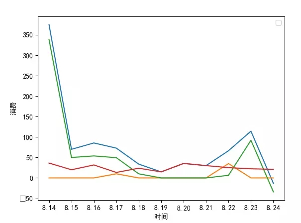

最后总结出来的就是这样了。。
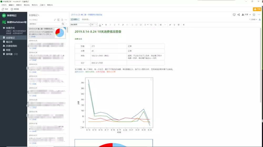
至于每天怎么做统计的,也放个样子出来。

每天花个几分钟统计下,然后隔段时间来做个统计,更清晰的知道自己最近花了多少钱,钱都去哪儿了。很有利于我脱离月光族的状态。。
总结
以上就是这篇文章的全部内容了,希望本文的内容对大家的学习或者工作具有一定的参考学习价值,谢谢大家对脚本之家的支持。
您可能感兴趣的文章:

相关文章推荐
- VIS-008 20 Python数据可视化:利用Pyecharts实现可视化(下)
- 利用Python代码实现数据可视化的5种方法详解
- python实现酷狗音乐下载,以及利用tk界面可视化
- Python数据可视化 pyecharts实现各种统计图表过程详解
- java利用map来实现可视化统计随机数分布
- 利用Python绘制MySQL数据图实现数据可视化
- 数据挖掘(二)用python实现数据探索:汇总统计和可视化
- 利用函数统计输入字符中字母、空格、数字和其他字符个数(Python实现)
- 【Python】利用setdefault函数实现dict的转置(key与value对互换),统计value出现的次数
- VIS-007 19 Python数据可视化:利用Pyecharts实现可视化(上)
- 利用Python实现卷积神经网络的可视化
- 利用结巴分词的Python版本实现分词并统计词频
- 可视化之一——利用R实现地图数据可视化
- 利用Python实现循环访问网站页面
- 利用python+selenium做框架实现自动化(1)
- 利用python+selenium做框架实现自动化(3)
- 利用SQL*PLUS导出成EXCEL和html的功能实现报表统计:
- Python利用heapq实现一个优先级队列的方法
- [Python3.4]通过Redis利用BloomFilter实现数据去重
- 利用servlet监听器实现jsp中在线人数统计的方法