html常见盒子居中小结
2017-12-04 09:39
232 查看
html常见盒子居中小结
在写界面时,经常被元素居中的问题困扰。经过一番查阅资料和摸索,鄙人实践出了一套常见元素居中的办法,现在记录下来,以便日后参考。元素在标准文档流和非标准流中的表现有所不同,所以居中方法也要分开来进行说明。
一、标准文档流
标准文档流里,元素被分为块级元素和行内元素。常用的块级元素有div、h1~h7、li等,它们能够设置宽和高;如果不显示设置,水平上将撑满父元素;高度为padding-top和padding-bottom以及子元素的高度决定;行内元素如p、span、a等,不能设置宽高(设置了也不起作用),其宽高由内容宽高决定。块级元素
块级元素居中前必须为其指定明确的宽高。以div为例:水平居中
| <style> .outer{ background-color: yellow; height:200px; width:200px; } .inner{ width: 50%;/*必须指定,否则将撑满外层div*/ height: 50%; margin: 30px auto; background-color: green; color: white; } </style> | <body> <div class="outer"> 外层 <div class="inner"> 内层 </div> </div> </body> | 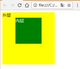 |
垂直居中
div的垂直居中没那么简单。
html代码如下:
| <body> <div class="outer"> <div class="inner"> </div> </div> </body> |
错误尝试一:
| <style> .outer{ background-color: yellow; height:200px; width:200px; padding-top: 50px; } .inner{ width: 50%; height: 50%; background-color: green; color: white; } </style> |  |
错误尝试二:
| <style> .outer{ background-color: yellow; height:200px; width:200px; } .inner{ width: 50%; height: 50%; margin: auto 10px; background-color: green; color: white; } </style> |  |
错误尝试三:
| <style> .outer{ background-color: yellow; height:200px; width:200px; } .inner{ width: 50%; height: 50%; margin-top: 50px; background-color: green; color: white; } </style> |  |
正确写法:
| <style> .outer{ border: 1px solid rgba(0,0,0,0); background-color: yellow; height:200px; width:200px; } .inner{ width: 50%; height: 50%; margin-top: 50px; background-color: green; color: white; } </style> | 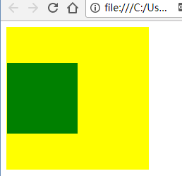 |
水平垂直居中
将水平居中和垂直居中综合一下,就能实现水平方向和垂直方向同时居中了:
| <style> .outer{ border: 1px solid rgba(0,0,0,0); background-color: yellow; height:200px; width:200px; } .inner{ width: 50%; height: 50%; margin:auto auto; margin-top: 50px; background-color: green; color: white; } </style> | <body> <div class="outer"> <div class="inner"> </div> </div> </body> |  |
行内元素
水平居中行内元素的居中比较简单,在其父元素上直接使用"text-align: center; "就能满足绝大多数需求了:
| <style> .outer{ padding:10px 10px; background-color: yellow; height:200px; width:200px; text-align: center; } .inner{ background-color: green; color: white; } </style> | <body> <div class="outer"> <span class="inner"> 项脊轩,旧南阁子也。室仅方丈,可容一人居。百年老屋,尘泥渗漉,雨泽下注;每移案,顾视,无可置者。 </span> </div> </body> | 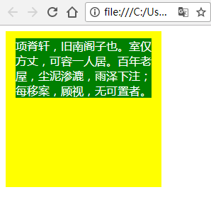 |
垂直居中
个人没找到好的办法,一般是将其转为块元素,然后再按照块级元素的居中方式来的:
| <style> .outer{ background-color: yellow; height:200px; width:200px; text-align: center; } .inner{ display: inline-block; height: 85px; margin: auto auto; margin-top:57.5px; background-color: green; color: white; } </style> | <body> <div class="outer"> <span class="inner"> 项脊轩,旧南阁子也。室仅方丈,可容一人居。百年老屋,尘泥渗漉,雨泽下注;每移案,顾视,无可置者。 </span> </div> </body> | 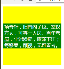 |
行内元素特殊元素的对齐
1)checkbox
chexbox与文字在垂直上一般不是对齐的,很不美观。这时可对checbox应用"vertical-align: text-bottom;"样式来调整:
默认表现:
| <style> .outer{ width: 200px; height: 100px; padding-top: 50px; background-color: yellow; padding-top: 50px; } </style> | <body> <div class="outer"> <form action="" method="post"> 爱好:<input type="checkbox" name="sex">男 <input type="checkbox" name="sex">女 </form> </div> </body> | 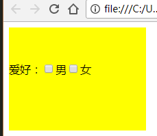 |
| <style> .outer{ width: 200px; height: 100px; padding-top: 50px; background-color: yellow; padding-top: 50px; } input[type="checkbox"]{ vertical-align: text-bottom; } </style> | <body> <div class="outer"> <form action="" method="post"> 爱好:<input type="checkbox" name="sex">男 <input type="checkbox" name="sex">女 </form> </div> </body> | 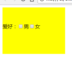 |
2)单行文本垂直居中
| <style> div{ width: 200px; height: 30px; line-height: 30px; border:1px solid grey; } </style> | <body> <div >我只有一行</div> </body> |  |
3)多行文本垂直居中
| <style> div{ width: 200px; text-align: center; padding-top: 40px; padding-bottom: 40px; line-height: 30px; border:1px solid grey; } </style> | <body> <div >项脊轩,旧南阁子也。室仅方丈,可容一人居。百年老屋,尘泥渗漉,雨泽下注;每移案,顾视,无可置者。</div> </body> |  |
padding-top=padding-bottom=(height – line_height * rows )/ 2
说明;height为容器实际占用高度;line_height为行高,rows为行数。
二、非标准文档流
元素通过浮动或定位脱离标准文档流后,就不再区分块元素和行内元素,可以直接设置宽高了。下面针对不同的脱标情况来分别说明元素居中处理。浮动
一般是一组元素一起浮动,针对这组元素,需要包在一个div里,然后对div进行居中即可:| <style> .outer{ height:200px; width:200px; border:1px solid grey; } .inner{ width: 120px; height:50px; margin: auto auto; margin-top: 75px; overflow: hidden;/*清除浮动*/ } .inner a{ width: 50px;/*直接设置宽和高*/ height: 30px; text-decoration: none; color: white; background-color: green; border-radius: 5px; text-align: center; line-height: 30px; } .inner a.float-left{ float:left; } .inner a.float-right{ float: right; } </style> | <body> <div class="outer"> <div class="inner"> <a href="#" class="float-left">确定</a> <a href="#" class="float-right">取消</a> </div> </div> </body> |  |
绝对定位
绝对定位的元素以父辈中定位过的、离得最近的元素为参考点,参考点可以是相对定位,或绝对定位或固定定位。元素居中:| <style> div{ border:1px solid grey; } .outer{ position: relative; /*父元素通过定位,成为后代元素的参考点*/ height:200px; width:200px; } .inner{ position: absolute; width: 120px; height:50px;/*必须指定宽高*/ left:50%; top:50%; margin-left: -60px; margin-top: -25px; } </style> | <body> <div class="outer"> outer <div class="inner"> inner </div> </div> </body> | 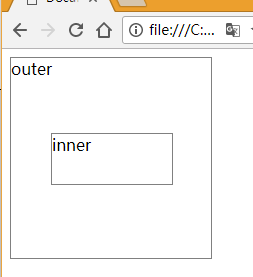 |
水平:left:50%;margin-left:-w/2
垂直:top:50%;margin-top:-h/2
说明:w为需要居中元素的宽度;h为需要居中元素的高度
固定定位
固定定位的元素没有父元素之说了,一切以浏览器窗口为参考点,无论页面如何滚动,元素显示的位置不会改变。居中公式和绝对定位一样:| <style> div{ position: fixed; width: 100px; height: 100px; top:50%; margin-top: -50px; left:50%; margin-left: -50px; border:1px solid grey; } </style> | <body> <div ></div> </body> | 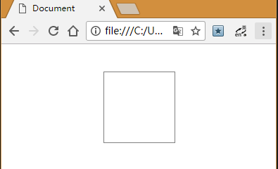 |
以上样式不保证兼容所有浏览器,本人是做后台的,对前端兼容性要求不高……(完)

相关文章推荐
- 面试小结:html/css实现元素居中
- HTML - 浅谈DIV盒子居中
- html中盒子上下左右居中方法汇总
- 关于html中 居中 问题小结
- 关于html水平垂直居中的问题小结
- Html中居中问题小结
- HTML中盒子模型上下左右(水平和垂直方向)都居中
- HTML基础知识一(HTML、常见方式、文档结构、<meta>、 网站文件命名、文本修饰、文本样式、段落标记、居中标记、水平线标记、特殊字符、列表、图像)
- 分针网—IT教育: Html / CSS常见问题的解决方案
- C++中常见const用法小结
- 黑马程序员_学习记录20:HTML,JavaScript,CSS小结
- 利用HTML+CSS实现常见的单列布局
- C++位操作的常见用法小结
- Android开发常见问题小结
- 利用 HTML 和 CSS 实现常见的布局
- <转载> GIT 操作小结 http://www.cnblogs.com/-ding/p/6008096.html
- Html的第一次小结
- iOS转前端之盒子模型以及居中问题
- HTML常见面试题
- 常见元素居中总结