iOS-Charts框架使用用法浅析
2017-04-13 13:58
886 查看
近期项目需要使用到K线图、折线图等图表功能,因此接触到了Charts这个框架,不得不说这个图表框架很强大,但是在使用过程中,发现网上很少有关于Charts的功能介绍,而且在GitHub上Charts的介绍也比较简单的介绍,就写写自己的一点心得供大家参考。
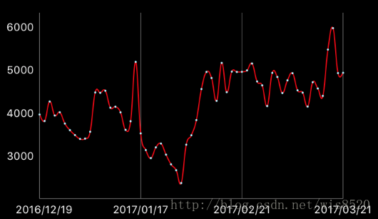
首先是最简单的折线图实现,效果如下:
直接上实现代码
下面是数据方法
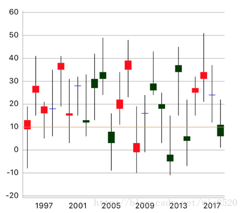
然后是K线图的实现 效果如下:
实现方式如下:
下面是数据方法
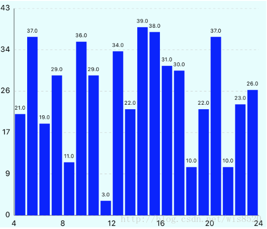
基础的柱形图做法也很简单 具体实现与折线图非常类似
首先还是图例:
直接上实现代码
数据源方法
柱形图的随机数据比较相对简单 设置好对应XY轴的数据即可
有的时候,我们绘图可能不仅仅是一种图表的呈现,而且多种图表属性混合呈现,比如说:
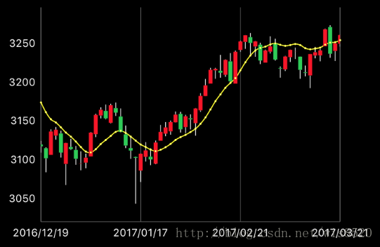
可以看得出来,这是一个LineChartView和一个CandleChartView拼合而成,但凡需要使用到混合数据图表时,我们就需要使用到Charts里的另一个类CombinedChartView,这个类可以实现所有类型图表混合呈现功能
只要我们想要实现混合图表,都需要使用该类
实现方式如下:
数据方法是重点,CombinedChartView可以赋值多种图表数据,注意不要赋值错误
首先是最简单的折线图实现,效果如下:
直接上实现代码
LineChartView *lineChartView = [[LineChartView alloc] init];
[self.view addSubview:lineChartView];
self.lineChartView = lineChartView;

lineChartView.doubleTapToZoomEnabled = NO;//禁止双击缩放 有需要可以设置为YES
lineChartView.gridBackgroundColor = [UIColor clearColor];//表框以及表内线条的颜色以及隐藏设置 根据自己需要调整
lineChartView.borderColor = [UIColor clearColor];
lineChartView.drawGridBackgroundEnabled = NO;
lineChartView.drawBordersEnabled = NO;
lineChartView.descriptionText = @"XXX";//该表格的描述名称
lineChartView.descriptionTextColor = [UIColor whiteColor];//描述字体颜色
lineChartView.legend.enabled = YES;//是否显示折线的名称以及对应颜色 多条折线时必须开启 否则无法分辨
lineChartView.legend.textColor = [UIColor whiteColor];//折线名称字体颜色

//设置动画时间
[lineChartView animateWithXAxisDuration:1];

//设置纵轴坐标显示在左边而非右边
rightAxis = lineChartView.rightAxis;
rightAxis.drawGridLinesEnabled = NO;

leftAxis = lineChartView.leftAxis;
leftAxis.drawGridLinesEnabled = NO;
leftAxis.labelTextColor = [UIColor whiteColor];

//设置横轴坐标显示在下方 默认显示是在顶部
xAxis = lineChartView.xAxis;
xAxis.labelPosition = XAxisLabelPositionBottom;
xAxis.labelTextColor = [UIColor whiteColor];
xAxis.labelCount = 3;
下面是数据方法
//用于存放多个折线数据的数组
NSMutableArray *sets = [NSMutableArray array];

//turnovers是用于存放模型的数组
self.turnovers = 模型数组 这里是使用的随机生成的模型数据

//横轴数据
NSMutableArray *xValues = [NSMutableArray array];
for (int i = 0; i < self.turnovers.count; i ++) {

//取出模型数据
ChartsModel *model = self.turnovers[i];

[xValues addObject:model.enterDate];
}

}
//设置横轴数据给chartview
self.lineChartView.xAxis.valueFormatter = [[ChartIndexAxisValueFormatter alloc] initWithValues:xValues];

//纵轴数据
NSMutableArray *yValues1 = [NSMutableArray array];
for (int i = 0; i < self.turnovers.count; i ++) {

ChartsModel *model = self.turnovers[i];

ChartDataEntry *entry = [[ChartDataEntry alloc] initWithX:i y:model.amount];
[yValues1 addObject:entry];
}

//创建LineChartDataSet对象
LineChartDataSet *set1 = [[LineChartDataSet alloc] initWithValues:yValues1 label:@"成交额"];
set1.circleRadius = 1.0;
set1.circleHoleRadius = 0.5;
[set1 setColor:[UIColor redColor]];
set1.mode = LineChartModeCubicBezier;
set1.drawValuesEnabled = NO;

//sets内存放所有折线的数据 多个折线创建多个LineChartDataSet对象即可
[sets addObject:set1];

LineChartData *data = [[LineChartData alloc] initWithDataSets:sets];

self.lineChartView.data = data;
然后是K线图的实现 效果如下:
实现方式如下:
CandleStickChartView *chartView = [[CandleStickChartView alloc] init];
[self.view addSubview:chartView];
self.chartView = chartView;

//如果需要显示选中图表位置进行数据展示 需要设置代理 可选项
chartView.delegate = self;
chartView.backgroundColor = [UIColor whiteColor];
chartView.descriptionTextColor = [UIColor blackColor];
//如果不想要描述文字就直接赋值为空字串
chartView.descriptionText = @"";

//取消双击缩放
chartView.doubleTapToZoomEnabled = NO;
// 画板以及边框颜色
chartView.gridBackgroundColor = [UIColor clearColor];
chartView.borderColor = [UIColor clearColor];

chartView.pinchZoomEnabled = NO;
//根据需要显示或隐藏边框以及画板
chartView.drawGridBackgroundEnabled = NO;
chartView.drawBordersEnabled = NO;

//设置X轴相关参数
ChartXAxis *xAxis = _chartView.xAxis;
xAxis.labelPosition = XAxisLabelPositionBottom;
xAxis.drawGridLinesEnabled = NO;
xAxis.drawAxisLineEnabled = YES;
e5bd
xAxis.forceLabelsEnabled = NO;
[chartView animateWithYAxisDuration:1.5];
[chartView animateWithXAxisDuration:1.5];

//设置y轴相关参数 将坐标轴显示在左边
ChartYAxis *leftAxis = _chartView.leftAxis;
leftAxis.labelCount = 7;
leftAxis.drawGridLinesEnabled = YES;
leftAxis.drawAxisLineEnabled = YES;
//label位置
leftAxis.labelPosition = YAxisLabelPositionOutsideChart;
//文字颜色
leftAxis.labelTextColor = [UIColor blackColor];
//文字字体
leftAxis.labelFont = [UIFont systemFontOfSize:10];

ChartYAxis *rightAxis = _chartView.rightAxis;
rightAxis.enabled = NO;
下面是数据方法
//这里的数据为随机数据
// 横轴数据
NSMutableArray *xValues = [NSMutableArray array];

for (int i = 0; i <= 100; i++) {

[xValues addObject:[NSString stringWithFormat:@"%d", i + 1993]];
}
chartView.maxVisibleCount = 10;
chartView.xAxis.valueFormatter = [[ChartIndexAxisValueFormatter alloc] initWithValues:xValues];

// 初始化CandleChartDataEntry数组
NSMutableArray *yValues = [NSMutableArray array];

// 产生20个随机立柱数据
for (int i = 0; i <= 100; i ++) {

CGFloat val = (arc4random_uniform(40));
CGFloat high = (arc4random_uniform(9)) + 8.0;
CGFloat low = (arc4random_uniform(9)) + 8.0;
CGFloat open = (arc4random_uniform(6)) + 1.0;
CGFloat close = (arc4random_uniform(6)) + 1.0;

CGFloat even = i % 2 == 0;

CandleChartDataEntry *y = [[CandleChartDataEntry alloc] initWithX:i shadowH:val + high shadowL:val - low open:even  ? val + open : val - open close:even ? val + close : val - close];

[yValues addObject:y];
}

CandleChartDataSet *set1 = [[CandleChartDataSet alloc] initWithValues:yValues label:@"data set"];
set1.axisDependency = AxisDependencyLeft;
[set1 setColor:[UIColor blueColor]];

//这是用于显示最高最低值区间的立线
set1.shadowColor = [UIColor blackColor];

//不在面板上直接显示数值
set1.drawValuesEnabled = NO;
// 立线的宽度
set1.shadowWidth = 0.7;
// close >= open
set1.increasingColor = [UIColor redColor];
// 内部是否充满颜色
set1.decreasingFilled = true;
// open > close
set1.decreasingColor = [UIColor colorWithRed:0.0006 green:0.2288 blue:0.001 alpha:1.0];

// 内部是否充满颜色
set1.increasingFilled = true;
// 赋值数据
CandleChartData *data = [[CandleChartData alloc] initWithDataSet:set1];

chartView.data = data;
基础的柱形图做法也很简单 具体实现与折线图非常类似
首先还是图例:
直接上实现代码
BarChartView *barChartView = [[BarChartView alloc] init];
[self.view addSubview:barChartView];
self.barChartView = barChartView;

self.barChartView.backgroundColor = [UIColor colorWithRed:230/255.0f green:253/255.0f blue:253/255.0f alpha:1];
self.barChartView.noDataText = @"暂无数据";//没有数据时的文字提示
self.barChartView.drawValueAboveBarEnabled = YES;//数值显示在柱形的上面还是下面
self.barChartView.drawBarShadowEnabled = NO;//是否绘制柱形的阴影背景

self.barChartView.scaleYEnabled = NO;//取消Y轴缩放
self.barChartView.doubleTapToZoomEnabled = NO;//取消双击缩放
self.barChartView.dragEnabled = YES;//启用拖拽图表
self.barChartView.dragDecelerationEnabled = YES;//拖拽后是否有惯性效果
self.barChartView.dragDecelerationFrictionCoef = 0.9;//拖拽后惯性效果的摩擦系数(0~1),数值越小,惯性越不明显

ChartXAxis *xAxis = barChartView.xAxis;
xAxis.axisLineWidth = 1;//设置X轴线宽
xAxis.labelPosition = XAxisLabelPositionBottom;//X轴的显示位置,默认是显示在上面的
xAxis.drawGridLinesEnabled = NO;//不绘制网格线
xAxis.forceLabelsEnabled = YES;
xAxis.labelTextColor = [UIColor blackColor];//label文字颜色

ChartYAxis *leftAxis = self.barChartView.leftAxis;//获取左边Y轴
leftAxis.forceLabelsEnabled = NO;//不强制绘制制定数量的label
leftAxis.inverted = NO;//是否将Y轴进行上下翻转
leftAxis.axisLineWidth = 0.5;//Y轴线宽
leftAxis.forceLabelsEnabled = YES;
leftAxis.axisLineColor = [UIColor blackColor];//Y轴颜色
leftAxis.axisMinValue = 0;

leftAxis.gridLineDashLengths = @[@3.0f, @3.0f];//设置虚线样式的网格线
leftAxis.gridColor = [UIColor colorWithRed:200/255.0f green:200/255.0f blue:200/255.0f alpha:1];//网格线颜色
leftAxis.gridAntialiasEnabled = YES;//开启抗锯齿

barChartView.rightAxis.enabled = NO;

ChartLimitLine *limitLine = [[ChartLimitLine alloc] initWithLimit:80 label:@"限制线"];
limitLine.lineWidth = 2;
limitLine.lineColor = [UIColor greenColor];
limitLine.lineDashLengths = @[@5.0f, @5.0f];//虚线样式
limitLine.labelPosition = ChartLimitLabelPositionRightTop;//位置
[leftAxis addLimitLine:limitLine];//添加到Y轴上
leftAxis.drawLimitLinesBehindDataEnabled = YES;//设置限制线绘制在柱形图的后面

self.barChartView.legend.enabled = NO;//不显示图例说明
self.barChartView.descriptionText = @"";//不显示,就设为空字符串即可
数据源方法
// 产生20个随机立柱数据
for (int i = 0; i < 20; i ++) {

double y = (arc4random_uniform(40));

BarChartDataEntry *yEntry = [[BarChartDataEntry alloc] initWithX:i + 5 y:y];

[yValues addObject:yEntry];
}

BarChartDataSet *set1 = [[BarChartDataSet alloc] initWithValues:yValues label:@"data set"];
set1.axisDependency = AxisDependencyLeft;
[set1 setColor:[UIColor blueColor]];

//不在面板上直接显示数值
set1.drawValuesEnabled = YES;

// 赋值数据
BarChartData *data = [[BarChartData alloc] initWithDataSet:set1];

barChartView.data = data;
柱形图的随机数据比较相对简单 设置好对应XY轴的数据即可
有的时候,我们绘图可能不仅仅是一种图表的呈现,而且多种图表属性混合呈现,比如说:
可以看得出来,这是一个LineChartView和一个CandleChartView拼合而成,但凡需要使用到混合数据图表时,我们就需要使用到Charts里的另一个类CombinedChartView,这个类可以实现所有类型图表混合呈现功能
只要我们想要实现混合图表,都需要使用该类
实现方式如下:
//很多相似的代码就不做注释了 可以参考上面的代码块
CombinedChartView *combinedChartView = [[CombinedChartView alloc] init];
[self.view addSubview:combinedChartView];
self.combinedChartView = combinedChartView;
combinedChartView.doubleTapToZoomEnabled = NO;
combinedChartView.gridBackgroundColor = [UIColor clearColor];
combinedChartView.borderColor = [UIColor clearColor];
combinedChartView.pinchZoomEnabled = NO;
combinedChartView.drawGridBackgroundEnabled = NO;
combinedChartView.drawBordersEnabled = NO;
combinedChartView.descriptionText = @"";
combinedChartView.legend.enabled = NO;//隐藏描述面板
//设置动画时间
[combinedChartView animateWithXAxisDuration:1];

ChartYAxis *rightAxis = combinedChartView.rightAxis;
rightAxis.drawGridLinesEnabled = NO;

ChartYAxis *leftAxis = combinedChartView.leftAxis;
leftAxis.drawGridLinesEnabled = NO;
leftAxis.labelTextColor = [UIColor whiteColor];

ChartXAxis *xAxis = combinedChartView.xAxis;
xAxis.labelPosition = XAxisLabelPositionBottom;
xAxis.labelTextColor = [UIColor whiteColor];
xAxis.labelCount = 3;
数据方法是重点,CombinedChartView可以赋值多种图表数据,注意不要赋值错误
//存放X轴数据的数组
NSMutableArray *xValues = [NSMutableArray array];
for (int i = 0; i <= 100; i++) {

[xValues addObject:[NSString stringWithFormat:@"%d", i + 1993]];
}
chartView.maxVisibleCount = 10;
chartView.xAxis.valueFormatter = [[ChartIndexAxisValueFormatter alloc] initWithValues:xValues];

//Y轴数据比较关键,不同图表的数据自然是需要分别赋值的
//这里数据是随便弄的 看个意思就行
CombinedChartData *data = [[CombinedChartData alloc] init];
//分别赋值lineData(折线) 以及 candle(k线)
//注意 如果需要使用不同的图表类型混合,那么只需要给data赋值对应图表的数据即可这里演示使用的是k线图以及折线图
data.lineData = [self generateLineData];
data.candleData = [self candleData];
_chartView.xAxis.axisMaximum = data.xMax + 0.25;
_chartView.data = data;

//generateLineData方法
LineChartData *d = [[LineChartData alloc] init];

NSMutableArray *entries = [[NSMutableArray alloc] init];

for (int index = 0; index <= 100; index++)
{
[entries addObject:[[ChartDataEntry alloc] initWithX:index y:(arc4random_uniform(15) + 5)]];
}

LineChartDataSet *set = [[LineChartDataSet alloc] initWithValues:entries label:@"Line DataSet"];
[set setColor:[UIColor colorWithRed:240/255.f green:238/255.f blue:70/255.f alpha:1.f]];
set.lineWidth = 2.5;
[set setCircleColor:[UIColor colorWithRed:240/255.f green:238/255.f blue:70/255.f alpha:1.f]];
set.circleRadius = 3.0;
set.circleHoleRadius = 2.5;
set.fillColor = [UIColor colorWithRed:240/255.f green:238/255.f blue:70/255.f alpha:1.f];
set.mode = LineChartModeCubicBezier;
set.drawValuesEnabled = YES;
set.valueFont = [UIFont systemFontOfSize:10.f];
set.valueTextColor = [UIColor colorWithRed:240/255.f green:238/255.f blue:70/255.f alpha:1.f];

set.axisDependency = AxisDependencyLeft;
[d addDataSet:set];

return d;

//candleData方法
NSMutableArray *yValues = [NSMutableArray array];
for (int i = 0; i <= 100; i ++) {

CGFloat val = (arc4random_uniform(40));
CGFloat high = (arc4random_uniform(9)) + 8.0;
CGFloat low = (arc4random_uniform(9)) + 8.0;
CGFloat open = (arc4random_uniform(6)) + 1.0;
CGFloat close = (arc4random_uniform(6)) + 1.0;

CGFloat even = i % 2 == 0;

CandleChartDataEntry *y = [[CandleChartDataEntry alloc] initWithX:i shadowH:val + high shadowL:val - low open:even  ? val + open : val - open close:even ? val + close : val - close];

[yValues addObject:y];
}

CandleChartDataSet *set1 = [[CandleChartDataSet alloc] initWithValues:yValues label:@"data set"];
set1.axisDependency = AxisDependencyLeft;
CandleChartData *data = [[CandleChartData alloc] init];;
[data addDataSet:set1];
return data;

相关文章推荐
- iOS 使用Charts框架 折线,柱状,K线,饼状,雷达全攻略
- iOS使用Charts框架绘制柱形图
- iOS使用Charts框架绘制—饼状图
- iOS使用Charts框架绘制—饼状图
- iOS使用Charts框架绘制饼状图
- iOS使用Charts框架绘制—饼状图
- iOS使用Charts框架绘制—柱形图
- iOS画折线图Charts框架的使用
- iOS使用Charts框架绘制—饼状图
- iOS使用Charts框架绘制—柱形图
- iOS 使用Charts框架 折线,柱状,K线,饼状,雷达全攻略
- iOS使用Charts框架绘制折线图
- iOS 开发中使用正则表达式-暨 RegexKitLite 库的用法
- ios数据存储中关于Sqlite3使用第三方框架FMDB
- 浅析ASP.net Web API的Model验证(使用MVC4框架的Web API须谨慎)
- 浅析iOS中Push通知的使用【图文+视频】
- 本附录介绍iOS系统包含的框架,它们为编写iOS平台的软件提供必要的接口。下面的表格尽可能地列出框架中的类、方法、函数、类型以及常量使用的关键前缀,请避免在您的符号名称中使用这些前缀。
- IOS开源框架自定义状态栏MTStatusBarOverlay使用实例
- Objective-C之foundation框架中的NSString的使用方法、指针基本用法、读取本地和远程文件
- 浅析iOS中Push通知的使用【图文+视频】