VR系列——Oculus最佳实践:四、渲染技术
2017-02-27 19:37
471 查看
注意Rift的屏幕分辨率,特别是微细节。在用户投放注意力的地方,确保文本足够大而且清晰可读,避免微小的对象和过于华丽的纹理。
DK1面板,采用网格像素结构,由于像素之间的空隙产生了一个“纱门效应”(以其类似于透过纱门命名)。DK2,另一方面,具有波形瓦结构(锯齿状、毛刺感),产生更多蜂窝效应。红颜色倾向于放大效应,由于显示屏子像素分离的独特几何形状。
结合透镜畸变效应,一些详细的图像(如文本或详细的纹理)在Rift内可能看起来不同于你的电脑显示器。在开发过程中一定要观察你在Rift内的作品和资产,并做出任何必要的调整以确保视觉质量。
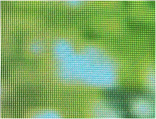
图1:“纱门”效应
显示闪烁一般被看作屏幕的全部或部分明暗度的快速“脉冲”。有些人对闪烁极为敏感,结果是遭受着视疲劳、疲倦、或头痛。其他人则永远不会注意到闪烁或有任何不良症状。然而,有一些确定的因素可以增加或减少指定人群感知显示闪烁的可能性。
用户感知闪烁的程度受到多个因素的影响,包括:显示在“开启”和“关闭”模式之间循环的速率,“开启”阶段发射的光的量,多少视网膜部分被刺激,甚至当天的时间和个人的疲劳程度。
有两条信息对开发者很重要。首先,人们在视觉外围比在视觉中心位置对闪烁更敏感。第二,更亮的屏幕图像产生更明显的闪烁。明亮的图像,特别是在外围(例如,站在一个明亮的白色房间里)可能产生更易被感知的显示闪烁。尽可能使用更深的颜色,尤其是在玩家视角中心以外的区域。
刷新率越高,感知的闪烁越少。这就是以75帧/秒 v-synced(垂直同步),无缓冲运行如此关键的原因之一。随着VR硬件的逐渐成熟,刷新率和帧速率将很有可能超过75帧/秒。
如此大的渲染目标可能导致一些显卡存在性能问题,丢帧从而
4000
产生糟糕的VR体验。丢失显示分辨率影响不大,可以产生视觉假象。然而,减少眼缓冲分辨率,却可以提高性能并保持视觉感知质量。
这个过程在SDK中有详细的介绍。
你可以利用远距离内深度感知的相对不敏感性,通过采用“欺骗”或“广告牌”纹理代替全3D场景,来释放一些深度计算。例如,与其用3D渲染一个远山,你或许可以简单地渲染一个山的平面图到一个单一的多边形上,呈现在左右眼图像中。这可以用传统3D游戏中同样的方式,在VR中欺骗眼睛。
注:这些欺骗的有效性依据所涉及的对象的大小、对象内部和周围的深度线索以及它们出现的上下文而变化。[1]你需要对你的资产进行单独测试以确保欺骗伪装看起来和感觉起来是对的。警惕这种欺骗处理离镜头够远,否则融入感不足,同时真实和欺骗场景元素之间的界面不会破坏沉浸感。
“视差映射”建立在法线映射的观点上,但考虑了法线映射没有考虑的深度线索。视差映射通过使用内容创建者提供的附加高度图来改变采样表面的纹理坐标。纹理坐标转换适用于着色层计算的每个像素或每个顶点视图方向。视差映射最好地用在表面及微细节上,不会影响碰撞表面,如砖墙或鹅卵石路面。
[1] Allison, R. S., Gillam, B. J., & Vecellio, E. (2009). Binocular depth discrimination and estimation beyond interaction space(超越交互空间的双目深度分辨与估计). Journal of Vision, 9, 1–14.
原文如下
Be mindful of the Rift screen’s resolution, particularly with fine detail. Make sure text is large and clear enough to read and avoid thin objects and ornate textures in places where users will focus their attention.
The DK1 panel, which uses a grid pixel structure, gives rise to a “screen door effect” (named for its resemblance to looking through a screen door) due to the space between pixels. The DK2, on the other hand, has a pentile structure that produces more of a honeycomb-shaped effect. Red colors tend to magnify the effect due to the unique geometry of the display’s sub-pixel separation.
Combined with the effects of lens distortion, some detailed images (such as text or detailed textures) may look different inside the Rift than on your computer monitor. Be sure to view your artwork and assets inside the Rift during the development process and make any adjustments necessary to ensure their visual quality.

Figure 1: “Screen Door” Effect
Display flicker is generally perceived as a rapid “pulsing” of lightness and darkness on all or parts of a screen. Some people are extremely sensitive to flicker and experience eyestrain, fatigue, or headaches as a result. Others will never even notice it or have any adverse symptoms. Still, there are certain factors that can increase or decrease the likelihood any given person will perceive display flicker.
The degree to which a user will perceive flicker is a function of several factors, including: the rate at which the display is cycling between “on” and “off” modes, the amount of light emitted during the “on” phase, how much of which parts of the retina are being stimulated, and even the time of day and fatigue level of the individual.
Two pieces of information are important to developers. First, people are more sensitive to flicker in the periphery than in the center of vision. Second, brighter screen images produce more flicker. Bright imagery, particularly in the periphery (e.g., standing in a bright, white room) can potentially create noticeable display flicker. Try to use darker colors whenever possible, particularly for areas outside the center of the player’s viewpoint.
The higher the refresh rate, the less perceptible flicker is. This is one of the reasons it is so critical to run at 75fps v-synced, unbuffered. As VR hardware matures over time, refresh rate and frame rate will very likely exceed 75fps.
Such large render targets can be a performance problem for some graphics cards, and dropping framerate produces a poor VR experience. Dropping display resolution has little effect, and can introduce visual artifacts. Dropping the resolution of the eye buffers, however, can improve performance while maintaining perceived visual quality.
This process is covered in more detail in the SDK.
You can exploit this relative insensitivity to depth perception in the distance for the sake of freeing up computational power by using “imposter” or “billboard” textures in place of fully 3D scenery. For instance, rather than rendering a distant hill in 3D, you might simply render a flat image of the hill onto a single polygon that appears in the left and right eye images. This can fool the eyes in VR the same way they do in traditional 3D games.
Note: The effectiveness of these imposters will vary depending on the size of the objects involved, the depth cues inside of and around those objects, and the context in which they appear.[1] You will need to engage in individual testing with your assets to ensure the imposters look and feel right. Be wary that the impostors are sufficiently distant from the camera to blend in inconspicuously, and that interfaces between real and impostor scene elements do not break immersion.
“Parallax mapping” builds on the idea of normal mapping, but accounts for depth cues normal mapping does not. Parallax mapping shifts the texture coordinates of the sampled surface texture by using an additional height map provided by the content creator. The texture coordinate shift is applied using the per-pixel or pervertex view direction calculated at the shader level. Parallax mapping is best utilized on surfaces with fine detail that would not affect the collision surface, such as brick walls or cobblestone pathways.
[1] Allison, R. S., Gillam, B. J., & Vecellio, E. (2009). Binocular depth discrimination and estimation beyond interaction space. Journal of Vision, 9, 1–14.
显示分辨率
DK2 Rift是具有1920 x 1080低持久性、75Hz刷新率的OLED显示屏。在许多方面这代表了DK1后多方位的一个飞跃,DK1特征为1280 x 720、全持久60赫兹的LCD显示屏。在DK1中发现,更高的分辨率意味着图像更清晰、更鲜明,而低持久性和高刷新率消除大部分的运动模糊(比如,移动头部时产生的模糊)。DK1面板,采用网格像素结构,由于像素之间的空隙产生了一个“纱门效应”(以其类似于透过纱门命名)。DK2,另一方面,具有波形瓦结构(锯齿状、毛刺感),产生更多蜂窝效应。红颜色倾向于放大效应,由于显示屏子像素分离的独特几何形状。
结合透镜畸变效应,一些详细的图像(如文本或详细的纹理)在Rift内可能看起来不同于你的电脑显示器。在开发过程中一定要观察你在Rift内的作品和资产,并做出任何必要的调整以确保视觉质量。
图1:“纱门”效应
理解并避免显示闪烁
DK2的低持久性OLED显示器有利有弊。导致运动模糊减少的相同的机制—屏幕上点亮和关闭照明的毫秒级周期—对于更敏感的用户,也与显示闪烁有关。经历过上世纪90年代CRT监视器的人(而且事实上,今天一些OLED显示器面板用户)已经熟悉显示闪烁和其潜在的视疲劳效应。显示闪烁一般被看作屏幕的全部或部分明暗度的快速“脉冲”。有些人对闪烁极为敏感,结果是遭受着视疲劳、疲倦、或头痛。其他人则永远不会注意到闪烁或有任何不良症状。然而,有一些确定的因素可以增加或减少指定人群感知显示闪烁的可能性。
用户感知闪烁的程度受到多个因素的影响,包括:显示在“开启”和“关闭”模式之间循环的速率,“开启”阶段发射的光的量,多少视网膜部分被刺激,甚至当天的时间和个人的疲劳程度。
有两条信息对开发者很重要。首先,人们在视觉外围比在视觉中心位置对闪烁更敏感。第二,更亮的屏幕图像产生更明显的闪烁。明亮的图像,特别是在外围(例如,站在一个明亮的白色房间里)可能产生更易被感知的显示闪烁。尽可能使用更深的颜色,尤其是在玩家视角中心以外的区域。
刷新率越高,感知的闪烁越少。这就是以75帧/秒 v-synced(垂直同步),无缓冲运行如此关键的原因之一。随着VR硬件的逐渐成熟,刷新率和帧速率将很有可能超过75帧/秒。
渲染分辨率
DK2 Rift具有1920x1080的显示分辨率,但透镜畸变意味着屏幕上被渲染的图像必须转换才能正常呈现给观众。为了给转换提供充足的像素密度,每一只眼睛都需要一个被渲染的图像,实际上大于显示分辨率的一半。如此大的渲染目标可能导致一些显卡存在性能问题,丢帧从而
4000
产生糟糕的VR体验。丢失显示分辨率影响不大,可以产生视觉假象。然而,减少眼缓冲分辨率,却可以提高性能并保持视觉感知质量。
这个过程在SDK中有详细的介绍。
动态渲染欺骗/广告牌
离眼睛距离更远时深度感知变得不那么敏感。靠近一点,立体影像也许能使你分辨出桌上的两个物体在毫米级范围内哪个更近。越远这么做就变得越困难;当你看着公园里相对的两棵树,可能在几米范围,你才能自信地说出哪个更近哪个更远。在更大的范围内,你可能会难以判断出一个山脉的两座山哪个离你更近,直到差距达到千米级。你可以利用远距离内深度感知的相对不敏感性,通过采用“欺骗”或“广告牌”纹理代替全3D场景,来释放一些深度计算。例如,与其用3D渲染一个远山,你或许可以简单地渲染一个山的平面图到一个单一的多边形上,呈现在左右眼图像中。这可以用传统3D游戏中同样的方式,在VR中欺骗眼睛。
注:这些欺骗的有效性依据所涉及的对象的大小、对象内部和周围的深度线索以及它们出现的上下文而变化。[1]你需要对你的资产进行单独测试以确保欺骗伪装看起来和感觉起来是对的。警惕这种欺骗处理离镜头够远,否则融入感不足,同时真实和欺骗场景元素之间的界面不会破坏沉浸感。
法线映射 vs. 视差映射
被称为“法线映射”的技术提供逼真的照明线索来表达深度和纹理,不需要增加到给定的3D模型的顶点细节。尽管广泛应用在现代游戏中,但在立体三维视图中它的吸引力小得多。因为法线映射不考虑双目视差或运动视差,它产生一个类似于平面纹理的图像涂到对象模型上。“视差映射”建立在法线映射的观点上,但考虑了法线映射没有考虑的深度线索。视差映射通过使用内容创建者提供的附加高度图来改变采样表面的纹理坐标。纹理坐标转换适用于着色层计算的每个像素或每个顶点视图方向。视差映射最好地用在表面及微细节上,不会影响碰撞表面,如砖墙或鹅卵石路面。
[1] Allison, R. S., Gillam, B. J., & Vecellio, E. (2009). Binocular depth discrimination and estimation beyond interaction space(超越交互空间的双目深度分辨与估计). Journal of Vision, 9, 1–14.
原文如下
Be mindful of the Rift screen’s resolution, particularly with fine detail. Make sure text is large and clear enough to read and avoid thin objects and ornate textures in places where users will focus their attention.
Display Resolution
The DK2 Rift has a 1920 x 1080 low-persistence OLED display with a 75-hz refresh rate. This represents a leap forward from DK1 in many respects, which featured a 1280 x 720, full-persistence 60-hz LCD display. The higher resolution means images are clearer and sharper, while the low persistence and high refresh rate eliminate much of the motion blur (i.e., blurring when moving your head) found in DK1.The DK1 panel, which uses a grid pixel structure, gives rise to a “screen door effect” (named for its resemblance to looking through a screen door) due to the space between pixels. The DK2, on the other hand, has a pentile structure that produces more of a honeycomb-shaped effect. Red colors tend to magnify the effect due to the unique geometry of the display’s sub-pixel separation.
Combined with the effects of lens distortion, some detailed images (such as text or detailed textures) may look different inside the Rift than on your computer monitor. Be sure to view your artwork and assets inside the Rift during the development process and make any adjustments necessary to ensure their visual quality.
Figure 1: “Screen Door” Effect
Understanding and Avoiding Display Flicker
The low-persistence OLED display of the DK2 has pros and cons. The same mechanisms that lead to reduced motion blur—millisecond-scale cycles of lighting up and turning off illumination across the screen—are also associated with display flicker for more sensitive users. People who endured CRT monitors in the ‘90s (and, in fact, some OLED display panel users today) are already familiar with display flicker and its potentially eyestraining effects.Display flicker is generally perceived as a rapid “pulsing” of lightness and darkness on all or parts of a screen. Some people are extremely sensitive to flicker and experience eyestrain, fatigue, or headaches as a result. Others will never even notice it or have any adverse symptoms. Still, there are certain factors that can increase or decrease the likelihood any given person will perceive display flicker.
The degree to which a user will perceive flicker is a function of several factors, including: the rate at which the display is cycling between “on” and “off” modes, the amount of light emitted during the “on” phase, how much of which parts of the retina are being stimulated, and even the time of day and fatigue level of the individual.
Two pieces of information are important to developers. First, people are more sensitive to flicker in the periphery than in the center of vision. Second, brighter screen images produce more flicker. Bright imagery, particularly in the periphery (e.g., standing in a bright, white room) can potentially create noticeable display flicker. Try to use darker colors whenever possible, particularly for areas outside the center of the player’s viewpoint.
The higher the refresh rate, the less perceptible flicker is. This is one of the reasons it is so critical to run at 75fps v-synced, unbuffered. As VR hardware matures over time, refresh rate and frame rate will very likely exceed 75fps.
Rendering resolution
The DK2 Rift has a display resolution of 1920 x 1080, but the distortion of the lenses means the rendered image on the screen must be transformed to appear normal to the viewer. In order to provide adequate pixel density for the transformation, each eye requires a rendered image that is actually larger than the resolution of its half of the display.Such large render targets can be a performance problem for some graphics cards, and dropping framerate produces a poor VR experience. Dropping display resolution has little effect, and can introduce visual artifacts. Dropping the resolution of the eye buffers, however, can improve performance while maintaining perceived visual quality.
This process is covered in more detail in the SDK.
Dynamically-rendered impostors/billboards
Depth perception becomes less sensitive at greater distances from the eyes. Up close, stereopsis might allow you to tell which of two objects on your desk is closer on the scale of millimeters. This becomes more difficult further out; if you look at two trees on the opposite side of a park, they might have to be meters apart before you can confidently tell which is closer or farther away. At even larger scales, you might have trouble telling which of two mountains in a mountain range is closer to you until the difference reaches kilometers.You can exploit this relative insensitivity to depth perception in the distance for the sake of freeing up computational power by using “imposter” or “billboard” textures in place of fully 3D scenery. For instance, rather than rendering a distant hill in 3D, you might simply render a flat image of the hill onto a single polygon that appears in the left and right eye images. This can fool the eyes in VR the same way they do in traditional 3D games.
Note: The effectiveness of these imposters will vary depending on the size of the objects involved, the depth cues inside of and around those objects, and the context in which they appear.[1] You will need to engage in individual testing with your assets to ensure the imposters look and feel right. Be wary that the impostors are sufficiently distant from the camera to blend in inconspicuously, and that interfaces between real and impostor scene elements do not break immersion.
Normal mapping vs. Parallax Mapping
The technique known as “normal mapping” provides realistic lighting cues to convey depth and texture without adding to the vertex detail of a given 3D model. Although widely used widely in modern games, it is much less compelling when viewed in stereoscopic 3D. Because normal mapping does not account for binocular disparity or motion parallax, it produces an image akin to a flat texture painted onto the object model.“Parallax mapping” builds on the idea of normal mapping, but accounts for depth cues normal mapping does not. Parallax mapping shifts the texture coordinates of the sampled surface texture by using an additional height map provided by the content creator. The texture coordinate shift is applied using the per-pixel or pervertex view direction calculated at the shader level. Parallax mapping is best utilized on surfaces with fine detail that would not affect the collision surface, such as brick walls or cobblestone pathways.
[1] Allison, R. S., Gillam, B. J., & Vecellio, E. (2009). Binocular depth discrimination and estimation beyond interaction space. Journal of Vision, 9, 1–14.

相关文章推荐
- VR系列——Oculus最佳实践:三、视野和比例
- VR系列——Oculus最佳实践:九、用户输入和导航
- VR系列——Oculus最佳实践:一、最佳实践简介
- VR系列——Oculus最佳实践:十、总结
- VR系列——Oculus最佳实践:六、追踪
- VR系列——Oculus Audio sdk文档:四、传统Oculus声场定位技术的统一集成指南(2)——降低Android延迟:OpenSL低延迟驱动
- VR系列——Oculus Rift 开发者指南:三、Oculus Rift的渲染(二)
- VR系列——Oculus Audio sdk文档:一、虚拟现实音频技术简介(1)——概述
- VR系列——Oculus Rift 开发者指南:三、Oculus Rift的渲染(一)
- VR系列——Oculus Audio sdk文档:三、Oculus对于Unity天然的声场定位技术(1)——概述及要求和安装
- VR系列——Oculus Audio sdk文档:三、Oculus对于Unity天然的声场定位技术(3)——空间定位的应用
- VR系列——Oculus Audio sdk文档:一、虚拟现实音频技术简介(5)——环境建模
- VR系列——Oculus Rift 开发者指南:三、Oculus Rift的渲染(五)
- VR系列——Oculus Rift 开发者指南:三、Oculus Rift的渲染(七)
- VR系列——Oculus Rift 开发者指南:三、Oculus Rift的渲染(八)
- VR系列——Oculus Audio sdk文档:四、传统Oculus声场定位技术的统一集成指南(1)——概述
- VR系列——Oculus Rift 开发者指南:三、Oculus Rift的渲染(三)
- VR系列——Oculus Audio sdk文档:一、虚拟现实音频技术简介(6)——空间化的音响设计
- VR系列——Oculus Audio sdk文档:四、传统Oculus声场定位技术的统一集成指南(3)——安装到Unity
- VR系列——Oculus Audio sdk文档:一、虚拟现实音频技术简介(3)——3D音频的空间化