html5移动端适配使用流体布局经常遇到的坑
2016-09-25 16:24
489 查看
以如下布局为例:

相应的布局如下:
可是运行结果如下:
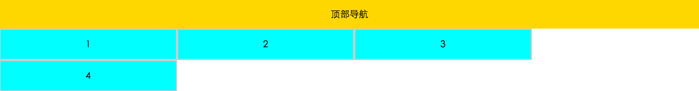
为什么呢,因为border占用的像素,也被算在整个宽度中,所以4被挤下来了。。。
运用流体布局的第一个方法:使用样式中的计算函数 calc() 来设置宽度。。。
结果如下:

这又是为什么呢?这里有好大的一个坑。。。
width: calc(25%-4px);----这个地方减号前后都要加空格,悲伤。。。修改以后,恢复正常。。。
当然,在使用流体布局时,不建议使用calc函数,建议使用流体布局的第二种方法: box-sizing
1、content-box 默认的盒子尺寸计算方式
2、border-box 置盒子的尺寸计算方式为从边框开始,盒子的尺寸,边框和内填充算在盒子尺寸内;
使用 box-sizing 达到上述布局代码如下:
当然在适配移动端时除了流体布局外,还有响应式布局和基于rem的布局,后续遇到坑再总结。。。
相应的布局如下:
<!DOCTYPE html>
<html lang="en">
<head>
<meta charset="UTF-8">
<title>流体布局</title>
<style type="text/css">
body,ul{
margin: 0;padding: 0;
}
ul{
list-style: none;
}
.top{
height: 50px;
text-align: center;
background-color: gold;
line-height: 50px;
}
ul li{
width: 25%;
height: 50px;
background-color: cyan;
float: left;
text-align: center;
line-height: 50px;
border: 2px solid #ccc;
}
</style>
</head>
<body>
<div class="top">顶部导航</div>
<ul>
<li>1</li>
<li>2</li>
<li>3</li>
<li>4</li>
</ul>

</body>
</html>
可是运行结果如下:
为什么呢,因为border占用的像素,也被算在整个宽度中,所以4被挤下来了。。。
运用流体布局的第一个方法:使用样式中的计算函数 calc() 来设置宽度。。。
<!DOCTYPE html>
<html lang="en">
<head>
<meta charset="UTF-8">
<title>流体布局</title>
<style type="text/css">
body,ul{
margin: 0;padding: 0;
}
ul{
list-style: none;
}
.top{
height: 50px;
text-align: center;
background-color: gold;
line-height: 50px;
}
ul li{
width: calc(25%-4px);
height: 50px;
background-color: cyan;
float: left;
text-align: center;
line-height: 50px;
border: 2px solid #ccc;
/*box-sizing: border-box;*/
}
</style>
</head>
<body>
<div class="top">顶部导航</div>
<ul>
<li>1</li>
<li>2</li>
<li>3</li>
<li>4</li>
</ul>

</body>
</html>
结果如下:
这又是为什么呢?这里有好大的一个坑。。。
width: calc(25%-4px);----这个地方减号前后都要加空格,悲伤。。。修改以后,恢复正常。。。
当然,在使用流体布局时,不建议使用calc函数,建议使用流体布局的第二种方法: box-sizing
1、content-box 默认的盒子尺寸计算方式
2、border-box 置盒子的尺寸计算方式为从边框开始,盒子的尺寸,边框和内填充算在盒子尺寸内;
使用 box-sizing 达到上述布局代码如下:
<!DOCTYPE html>
<html lang="en">
<head>
<meta charset="UTF-8">
<title>流体布局</title>
<style type="text/css">
body,ul{
margin: 0;padding: 0;
}
ul{
list-style: none;
}
.top{
height: 50px;
text-align: center;
background-color: gold;
line-height: 50px;
}
ul li{
width: 25%;
height: 50px;
background-color: cyan;
float: left;
text-align: center;
line-height: 50px;
border: 2px solid #ccc;
box-sizing: border-box;
}
</style>
</head>
<body>
<div class="top">顶部导航</div>
<ul>
<li>1</li>
<li>2</li>
<li>3</li>
<li>4</li>
</ul>

</body>
</html>
当然在适配移动端时除了流体布局外,还有响应式布局和基于rem的布局,后续遇到坑再总结。。。

相关文章推荐
- Android布局的小窍门?
- Web布局连载——两栏固定布局(五)
- 在 Linux 中如何移动文件
- HTML5中在客户端验证文件上传的大小
- html5 web数据存储
- 页面元素查找之Selectors API
- 使用ajax实现用户登录验证(升级版)
- 如何从命令行同时移动多种文件类型
- Canvas 在高清屏下绘制图片变模糊的解决方法
- 关于前端的思考与感悟
- 新时代编辑神器:Atom
- rem : web app适配的秘密武器
- jquery高级应用之Deferred对象
- 又被事件冒泡坑了一把,这次要彻底弄懂浏览器的事件流
- 移动端点击事件全攻略,这里的坑你知多少?
- $q 实例分析 Angular 中的 Promise
- 浏览器中唤起native app || 跳转到应用商城下载
- Angular directive 实例详解