Qt之QSS(QDarkStyleSheet)
2016-07-13 16:11
666 查看
简述
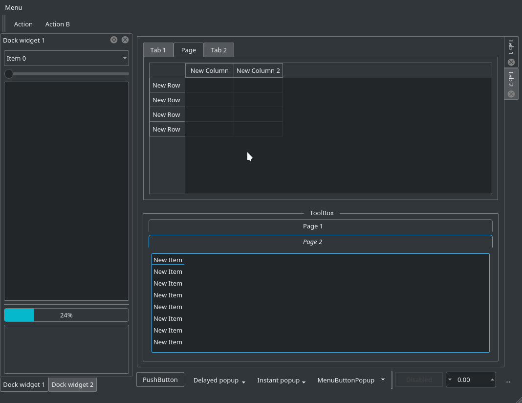
关于样式,前面介绍了很多内容,下面分享一个深色样式表,很值得借鉴!简述
效果
QSS
更多参考
效果
QSS
/*
* The MIT License (MIT)
*
* Copyright (c) <2013-2014> <Colin Duquesnoy>
*
* Permission is hereby granted, free of charge, to any person obtaining a copy
* of this software and associated documentation files (the "Software"), to deal
* in the Software without restriction, including without limitation the rights
* to use, copy, modify, merge, publish, distribute, sublicense, and/or sell
* copies of the Software, and to permit persons to whom the Software is
* furnished to do so, subject to the following conditions:

* The above copyright notice and this permission notice shall be included in
* all copies or substantial portions of the Software.

* THE SOFTWARE IS PROVIDED "AS IS", WITHOUT WARRANTY OF ANY KIND, EXPRESS OR
* IMPLIED, INCLUDING BUT NOT LIMITED TO THE WARRANTIES OF MERCHANTABILITY,
* FITNESS FOR A PARTICULAR PURPOSE AND NONINFRINGEMENT. IN NO EVENT SHALL THE
* AUTHORS OR COPYRIGHT HOLDERS BE LIABLE FOR ANY CLAIM, DAMAGES OR OTHER
* LIABILITY, WHETHER IN AN ACTION OF CONTRACT, TORT OR OTHERWISE, ARISING FROM,
* OUT OF OR IN CONNECTION WITH THE SOFTWARE OR THE USE OR OTHER DEALINGS IN
* THE SOFTWARE.
*/
QToolTip
{
border: 1px solid #76797C;
background-color: rgb(90, 102, 117);;
color: white;
padding: 5px;
opacity: 200;
}

QWidget
{
color: #eff0f1;
background-color: #31363b;
selection-background-color:#3daee9;
selection-color: #eff0f1;
background-clip: border;
border-image: none;
outline: 0;
}

QWidget:item:hover
{
background-color: #3daee9;
color: #eff0f1;
}

QWidget:item:selected
{
background-color: #3daee9;
}

QCheckBox
{
spacing: 5px;
outline: none;
color: #eff0f1;
margin-bottom: 2px;
}

QCheckBox:disabled
{
color: #76797C;
}

QCheckBox::indicator,
QGroupBox::indicator
{
width: 18px;
height: 18px;
}
QGroupBox::indicator
{
margin-left: 2px;
}

QCheckBox::indicator:unchecked
{
image: url(:/qss_icons/rc/checkbox_unchecked.png);
}

QCheckBox::indicator:unchecked:hover,
QCheckBox::indicator:unchecked:focus,
QCheckBox::indicator:unchecked:pressed,
QGroupBox::indicator:unchecked:hover,
QGroupBox::indicator:unchecked:focus,
QGroupBox::indicator:unchecked:pressed
{
border: none;
image: url(:/qss_icons/rc/checkbox_unchecked_focus.png);
}

QCheckBox::indicator:checked
{
image: url(:/qss_icons/rc/checkbox_checked.png);
}

QCheckBox::indicator:checked:hover,
QCheckBox::indicator:checked:focus,
QCheckBox::indicator:checked:pressed,
QGroupBox::indicator:checked:hover,
QGroupBox::indicator:checked:focus,
QGroupBox::indicator:checked:pressed
{
border: none;
image: url(:/qss_icons/rc/checkbox_checked_focus.png);
}

QCheckBox::indicator:indeterminate
{
image: url(:/qss_icons/rc/checkbox_indeterminate.png);
}

QCheckBox::indicator:indeterminate:focus,
QCheckBox::indicator:indeterminate:hover,
QCheckBox::indicator:indeterminate:pressed
{
image: url(:/qss_icons/rc/checkbox_indeterminate_focus.png);
}

QCheckBox::indicator:checked:disabled,
QGroupBox::indicator:checked:disabled
{
image: url(:/qss_icons/rc/checkbox_checked_disabled.png);
}

QCheckBox::indicator:unchecked:disabled,
QGroupBox::indicator:unchecked:disabled
{
image: url(:/qss_icons/rc/checkbox_unchecked_disabled.png);
}

QRadioButton
{
spacing: 5px;
outline: none;
color: #eff0f1;
margin-bottom: 2px;
}

QRadioButton:disabled
{
color: #76797C;
}
QRadioButton::indicator
{
width: 21px;
height: 21px;
}

QRadioButton::indicator:unchecked
{
image: url(:/qss_icons/rc/radio_unchecked.png);
}

QRadioButton::indicator:unchecked:hover,
QRadioButton::indicator:unchecked:focus,
QRadioButton::indicator:unchecked:pressed
{
border: none;
outline: none;
image: url(:/qss_icons/rc/radio_unchecked_focus.png);
}

QRadioButton::indicator:checked
{
border: none;
outline: none;
image: url(:/qss_icons/rc/radio_checked.png);
}

QRadioButton::indicator:checked:hover,
QRadioButton::indicator:checked:focus,
QRadioButton::indicator:checked:pressed
{
border: none;
outline: none;
image: url(:/qss_icons/rc/radio_checked_focus.png);
}

QRadioButton::indicator:checked:disabled
{
outline: none;
image: url(:/qss_icons/rc/radio_checked_disabled.png);
}

QRadioButton::indicator:unchecked:disabled
{
image: url(:/qss_icons/rc/radio_unchecked_disabled.png);
}

QMenuBar
{
background-color: #31363b;
color: #eff0f1;
}

QMenuBar::item
{
background: transparent;
}

QMenuBar::item:selected
{
background: transparent;
border: 1px solid #76797C;
}

QMenuBar::item:pressed
{
border: 1px solid #76797C;
background-color: #3daee9;
color: #eff0f1;
margin-bottom:-1px;
padding-bottom:1px;
}

QMenu
{
border: 1px solid #76797C;
color: #eff0f1;
margin: 2px;
}

QMenu::icon
{
margin: 5px;
}

QMenu::item
{
padding: 5px 30px 5px 30px;
margin-left: 5px;
border: 1px solid transparent; /* reserve space for selection border */
}

QMenu::item:selected
{
color: #eff0f1;
}

QMenu::separator {
height: 2px;
background: lightblue;
margin-left: 10px;
margin-right: 5px;
}

QMenu::indicator {
width: 18px;
height: 18px;
}

/* non-exclusive indicator = check box style indicator
(see QActionGroup::setExclusive) */
QMenu::indicator:non-exclusive:unchecked {
image: url(:/qss_icons/rc/checkbox_unchecked.png);
}

QMenu::indicator:non-exclusive:unchecked:selected {
image: url(:/qss_icons/rc/checkbox_unchecked_disabled.png);
}

QMenu::indicator:non-exclusive:checked {
image: url(:/qss_icons/rc/checkbox_checked.png);
}

QMenu::indicator:non-exclusive:checked:selected {
image: url(:/qss_icons/rc/checkbox_checked_disabled.png);
}

/* exclusive indicator = radio button style indicator (see QActionGroup::setExclusive) */
QMenu::indicator:exclusive:unchecked {
image: url(:/qss_icons/rc/radio_unchecked.png);
}

QMenu::indicator:exclusive:unchecked:selected {
image: url(:/qss_icons/rc/radio_unchecked_disabled.png);
}

QMenu::indicator:exclusive:checked {
image: url(:/qss_icons/rc/radio_checked.png);
}

QMenu::indicator:exclusive:checked:selected {
image: url(:/qss_icons/rc/radio_checked_disabled.png);
}

QMenu::right-arrow {
margin: 5px;
image: url(:/qss_icons/rc/right_arrow.png)
}

QWidget:disabled
{
color: #454545;
background-color: #31363b;
}

QAbstractItemView
{
alternate-background-color: #31363b;
color: #eff0f1;
border: 1px solid 3A3939;
border-radius: 2px;
}

QWidget:focus, QMenuBar:focus
{
border: 1px solid #3daee9;
}

QTabWidget:focus, QCheckBox:focus, QRadioButton:focus, QSlider:focus
{
border: none;
}

QLineEdit
{
background-color: #232629;
padding: 5px;
border-style: solid;
border: 1px solid #76797C;
border-radius: 2px;
color: #eff0f1;
}

QGroupBox {
border:1px solid #76797C;
border-radius: 2px;
margin-top: 20px;
}

QGroupBox::title {
subcontrol-origin: margin;
subcontrol-position: top center;
padding-left: 10px;
padding-right: 10px;
padding-top: 10px;
}

QAbstractScrollArea
{
border-radius: 2px;
border: 1px solid #76797C;
background-color: transparent;
}

QScrollBar:horizontal
{
height: 15px;
margin: 3px 15px 3px 15px;
border: 1px transparent #2A2929;
border-radius: 4px;
background-color: #2A2929;
}

QScrollBar::handle:horizontal
{
background-color: #605F5F;
min-width: 5px;
border-radius: 4px;
}

QScrollBar::add-line:horizontal
{
margin: 0px 3px 0px 3px;
border-image: url(:/qss_icons/rc/right_arrow_disabled.png);
width: 10px;
height: 10px;
subcontrol-position: right;
subcontrol-origin: margin;
}

QScrollBar::sub-line:horizontal
{
margin: 0px 3px 0px 3px;
border-image: url(:/qss_icons/rc/left_arrow_disabled.png);
height: 10px;
width: 10px;
subcontrol-position: left;
subcontrol-origin: margin;
}

QScrollBar::add-line:horizontal:hover,QScrollBar::add-line:horizontal:on
{
border-image: url(:/qss_icons/rc/right_arrow.png);
height: 10px;
width: 10px;
subcontrol-position: right;
subcontrol-origin: margin;
}

QScrollBar::sub-line:horizontal:hover, QScrollBar::sub-line:horizontal:on
{
border-image: url(:/qss_icons/rc/left_arrow.png);
height: 10px;
width: 10px;
subcontrol-position: left;
subcontrol-origin: margin;
}

QScrollBar::up-arrow:horizontal, QScrollBar::down-arrow:horizontal
{
background: none;
}

QScrollBar::add-page:horizontal, QScrollBar::sub-page:horizontal
{
background: none;
}

QScrollBar:vertical
{
background-color: #2A2929;
width: 15px;
margin: 15px 3px 15px 3px;
border: 1px transparent #2A2929;
border-radius: 4px;
}

QScrollBar::handle:vertical
{
background-color: #605F5F;
min-height: 5px;
border-radius: 4px;
}

QScrollBar::sub-line:vertical
{
margin: 3px 0px 3px 0px;
border-image: url(:/qss_icons/rc/up_arrow_disabled.png);
height: 10px;
width: 10px;
subcontrol-position: top;
subcontrol-origin: margin;
}

QScrollBar::add-line:vertical
{
margin: 3px 0px 3px 0px;
border-image: url(:/qss_icons/rc/down_arrow_disabled.png);
height: 10px;
width: 10px;
subcontrol-position: bottom;
subcontrol-origin: margin;
}

QScrollBar::sub-line:vertical:hover,QScrollBar::sub-line:vertical:on
{

border-image: url(:/qss_icons/rc/up_arrow.png);
height: 10px;
width: 10px;
subcontrol-position: top;
subcontrol-origin: margin;
}

QScrollBar::add-line:vertical:hover, QScrollBar::add-line:vertical:on
{
border-image: url(:/qss_icons/rc/down_arrow.png);
height: 10px;
width: 10px;
subcontrol-position: bottom;
subcontrol-origin: margin;
}

QScrollBar::up-arrow:vertical, QScrollBar::down-arrow:vertical
{
background: none;
}

QScrollBar::add-page:vertical, QScrollBar::sub-page:vertical
{
background: none;
}

QTextEdit
{
background-color: #232629;
color: #eff0f1;
border: 1px solid #76797C;
}

QPlainTextEdit
{
background-color: #232629;;
color: #eff0f1;
border-radius: 2px;
border: 1px solid #76797C;
}

QHeaderView::section
{
background-color: #76797C;
color: #eff0f1;
padding: 5px;
border: 1px solid #76797C;
}

QSizeGrip {
image: url(:/qss_icons/rc/sizegrip.png);
width: 12px;
height: 12px;
}

QMainWindow::separator
{
background-color: #31363b;
color: white;
padding-left: 4px;
spacing: 2px;
border: 1px dashed #76797C;
}

QMainWindow::separator:hover
{

background-color: #787876;
color: white;
padding-left: 4px;
border: 1px solid #76797C;
spacing: 2px;
}

QMenu::separator
{
height: 1px;
background-color: #76797C;
color: white;
padding-left: 4px;
margin-left: 10px;
margin-right: 5px;
}

QFrame
{
border-radius: 2px;
border: 1px solid #76797C;
}

QFrame[frameShape="0"]
{
border-radius: 2px;
border: 1px transparent #76797C;
}

QStackedWidget
{
border: 1px transparent black;
}

QToolBar {
border: 1px transparent #393838;
background: 1px solid #31363b;
font-weight: bold;
}

QToolBar::handle:horizontal {
image: url(:/qss_icons/rc/Hmovetoolbar.png);
}
QToolBar::handle:vertical {
image: url(:/qss_icons/rc/Vmovetoolbar.png);
}
QToolBar::separator:horizontal {
image: url(:/qss_icons/rc/Hsepartoolbar.png);
}
QToolBar::separator:vertical {
image: url(:/qss_icons/rc/Vsepartoolbars.png);
}

QPushButton
{
color: #eff0f1;
background-color: #31363b;
border-width: 1px;
border-color: #76797C;
border-style: solid;
padding: 5px;
border-radius: 2px;
outline: none;
}

QPushButton:disabled
{
background-color: #31363b;
border-width: 1px;
border-color: #454545;
border-style: solid;
padding-top: 5px;
padding-bottom: 5px;
padding-left: 10px;
padding-right: 10px;
border-radius: 2px;
color: #454545;
}

QPushButton:focus {
background-color: #3daee9;
color: white;
}

QPushButton:pressed
{
background-color: #3daee9;
padding-top: -15px;
padding-bottom: -17px;
}

QComboBox
{
selection-background-color: #3daee9;
border-style: solid;
border: 1px solid #76797C;
border-radius: 2px;
padding: 5px;
min-width: 75px;
}

QPushButton:checked{
background-color: #76797C;
border-color: #6A6969;
}

QComboBox:hover,QPushButton:hover,QAbstractSpinBox:hover,QLineEdit:hover,QTextEdit:hover,QPlainTextEdit:hover,QAbstractView:hover,QTreeView:hover
{
border: 1px solid #3daee9;
color: #eff0f1;
}

QComboBox:on
{
padding-top: 3px;
padding-left: 4px;
selection-background-color: #4a4a4a;
}

QComboBox QAbstractItemView
{
background-color: #232629;
border-radius: 2px;
border: 1px solid #76797C;
selection-background-color: #3daee9;
}

QComboBox::drop-down
{
subcontrol-origin: padding;
subcontrol-position: top right;
width: 15px;

border-left-width: 0px;
border-left-color: darkgray;
border-left-style: solid;
border-top-right-radius: 3px;
border-bottom-right-radius: 3px;
}

QComboBox::down-arrow
{
image: url(:/qss_icons/rc/down_arrow_disabled.png);
}

QComboBox::down-arrow:on, QComboBox::down-arrow:hover,
QComboBox::down-arrow:focus
{
image: url(:/qss_icons/rc/down_arrow.png);
}

QAbstractSpinBox {
padding: 5px;
border: 1px solid #76797C;
background-color: #232629;
color: #eff0f1;
border-radius: 2px;
min-width: 75px;
}

QAbstractSpinBox:up-button
{
background-color: transparent;
subcontrol-origin: border;
subcontrol-position: center right;
}

QAbstractSpinBox:down-button
{
background-color: transparent;
subcontrol-origin: border;
subcontrol-position: center left;
}

QAbstractSpinBox::up-arrow,QAbstractSpinBox::up-arrow:disabled,QAbstractSpinBox::up-arrow:off {
image: url(:/qss_icons/rc/up_arrow_disabled.png);
width: 10px;
height: 10px;
}
QAbstractSpinBox::up-arrow:hover
{
image: url(:/qss_icons/rc/up_arrow.png);
}

QAbstractSpinBox::down-arrow,QAbstractSpinBox::down-arrow:disabled,QAbstractSpinBox::down-arrow:off
{
image: url(:/qss_icons/rc/down_arrow_disabled.png);
width: 10px;
height: 10px;
}
QAbstractSpinBox::down-arrow:hover
{
image: url(:/qss_icons/rc/down_arrow.png);
}

QLabel
{
border: 0px solid black;
}

QTabWidget{
border: 0px transparent black;
}

QTabWidget::pane {
border: 1px solid #76797C;
padding: 5px;
margin: 1px;
}

QTabBar
{
qproperty-drawBase: 0;
left: 5px; /* move to the right by 5px */
border-radius: 3px;
}

QTabBar:focus
{
border: 0px transparent black;
}

QTabBar::close-button  {
image: url(:/qss_icons/rc/close.png);
background: transparent;
}

QTabBar::close-button:hover
{
image: url(:/qss_icons/rc/close-hover.png);
background: transparent;
}

QTabBar::close-button:pressed {
image: url(:/qss_icons/rc/close-pressed.png);
background: transparent;
}

/* TOP TABS */
QTabBar::tab:top {
color: #eff0f1;
border: 1px solid #76797C;
border-bottom: 1px transparent black;
background-color: #31363b;
padding: 5px;
min-width: 50px;
border-top-left-radius: 2px;
border-top-right-radius: 2px;
}

QTabBar::tab:top:!selected
{
color: #eff0f1;
background-color: #54575B;
border: 1px solid #76797C;
border-bottom: 1px transparent black;
}

QTabBar::tab:top:!selected:hover {
background-color: #3daee9;
}

/* BOTTOM TABS */
QTabBar::tab:bottom {
color: #eff0f1;
border: 1px solid #76797C;
border-top: 1px transparent black;
background-color: #31363b;
padding: 5px;
border-bottom-left-radius: 2px;
border-bottom-right-radius: 2px;
min-width: 50px;
}

QTabBar::tab:bottom:!selected
{
color: #eff0f1;
background-color: #54575B;
border: 1px solid #76797C;
border-top: 1px transparent black;
border-bottom-left-radius: 2px;
border-bottom-right-radius: 2px;
}

QTabBar::tab:bottom:!selected:hover {
background-color: #3daee9;
}

/* LEFT TABS */
QTabBar::tab:left {
color: #eff0f1;
border: 1px solid #76797C;
border-left: 1px transparent black;
background-color: #31363b;
padding: 5px;
border-top-right-radius: 2px;
border-bottom-right-radius: 2px;
min-height: 50px;
}

QTabBar::tab:left:!selected
{
color: #eff0f1;
background-color: #54575B;
border: 1px solid #76797C;
border-left: 1px transparent black;
border-top-right-radius: 2px;
border-bottom-right-radius: 2px;
}

QTabBar::tab:left:!selected:hover {
background-color: #3daee9;
}

/* RIGHT TABS */
QTabBar::tab:right {
color: #eff0f1;
border: 1px solid #76797C;
border-right: 1px transparent black;
background-color: #31363b;
padding: 5px;
border-top-left-radius: 2px;
border-bottom-left-radius: 2px;
min-height: 50px;
}

QTabBar::tab:right:!selected
{
color: #eff0f1;
background-color: #54575B;
border: 1px transparent #76797C;
border-right: 1px transparent black;
border-top-left-radius: 0px;
border-bottom-left-radius: 0px;
}

QTabBar::tab:right:!selected:hover {
background-color: #3daee9;
}

QTabBar QToolButton::right-arrow:enabled {
image: url(:/qss_icons/rc/right_arrow.png);
}

QTabBar QToolButton::left-arrow:enabled {
image: url(:/qss_icons/rc/left_arrow.png);
}

QTabBar QToolButton::right-arrow:disabled {
image: url(:/qss_icons/rc/right_arrow_disabled.png);
}

QTabBar QToolButton::left-arrow:disabled {
image: url(:/qss_icons/rc/left_arrow_disabled.png);
}

QDockWidget {
background: #31363b;
border: 1px solid #403F3F;
titlebar-close-icon: url(:/qss_icons/rc/close.png);
titlebar-normal-icon: url(:/qss_icons/rc/undock.png);
}

QDockWidget::close-button, QDockWidget::float-button {
border: 1px solid transparent;
border-radius: 2px;
background: transparent;
}

QDockWidget::close-button:hover, QDockWidget::float-button:hover {
background: rgba(255, 255, 255, 10);
}

QDockWidget::close-button:pressed, QDockWidget::float-button:pressed {
padding: 1px -1px -1px 1px;
background: rgba(255, 255, 255, 10);
}

QTreeView, QListView
{
border: 1px solid #76797C;
background-color: #232629;
}

QTreeView:branch:selected, QTreeView:branch:hover
{
background: url(:/qss_icons/rc/transparent.png);
}

QTreeView::branch:has-siblings:!adjoins-item {
border-image: url(:/qss_icons/rc/transparent.png);
}

QTreeView::branch:has-siblings:adjoins-item {
border-image: url(:/qss_icons/rc/transparent.png);
}

QTreeView::branch:!has-children:!has-siblings:adjoins-item {
border-image: url(:/qss_icons/rc/transparent.png);
}

QTreeView::branch:has-children:!has-siblings:closed,
QTreeView::branch:closed:has-children:has-siblings {
image: url(:/qss_icons/rc/branch_closed.png);
}

QTreeView::branch:open:has-children:!has-siblings,
QTreeView::branch:open:has-children:has-siblings  {
image: url(:/qss_icons/rc/branch_open.png);
}

QTreeView::branch:has-children:!has-siblings:closed:hover,
QTreeView::branch:closed:has-children:has-siblings:hover {
image: url(:/qss_icons/rc/branch_closed-on.png);
}

QTreeView::branch:open:has-children:!has-siblings:hover,
QTreeView::branch:open:has-children:has-siblings:hover  {
image: url(:/qss_icons/rc/branch_open-on.png);
}

QListView::item:!selected:hover, QListView::item:!selected:hover, QTreeView::item:!selected:hover  {
background: rgba(0, 0, 0, 0);
outline: 0;
color: #eff0f1
}

QListView::item:selected:hover, QListView::item:selected:hover, QTreeView::item:selected:hover  {
background: #3daee9;
color: #eff0f1;
}

QSlider::groove:horizontal {
border: 1px solid #565a5e;
height: 4px;
background: #565a5e;
margin: 0px;
border-radius: 2px;
}

QSlider::handle:horizontal {
background: #232629;
border: 1px solid #565a5e;
width: 16px;
height: 16px;
margin: -8px 0;
border-radius: 9px;
}

QSlider::groove:vertical {
border: 1px solid #565a5e;
width: 4px;
background: #565a5e;
margin: 0px;
border-radius: 3px;
}

QSlider::handle:vertical {
background: #232629;
border: 1px solid #565a5e;
width: 16px;
height: 16px;
margin: 0 -8px;
border-radius: 9px;
}

QToolButton {
background-color: transparent;
border: 1px transparent #76797C;
border-radius: 2px;
margin: 3px;
padding: 5px;
}

QToolButton[popupMode="1"] { /* only for MenuButtonPopup */
padding-right: 20px; /* make way for the popup button */
border: 1px #76797C;
border-radius: 5px;
}

QToolButton[popupMode="2"] { /* only for InstantPopup */
padding-right: 10px; /* make way for the popup button */
border: 1px #76797C;
}

QToolButton:hover, QToolButton::menu-button:hover {
background-color: transparent;
border: 1px solid #3daee9;
padding: 5px;
}

QToolButton:checked, QToolButton:pressed,
QToolButton::menu-button:pressed {
background-color: #3daee9;
border: 1px solid #3daee9;
padding: 5px;
}

/* the subcontrol below is used only in the InstantPopup or DelayedPopup mode */
QToolButton::menu-indicator {
image: url(:/qss_icons/rc/down_arrow.png);
top: -7px; left: -2px; /* shift it a bit */
}

/* the subcontrols below are used only in the MenuButtonPopup mode */
QToolButton::menu-button {
border: 1px transparent #76797C;
border-top-right-radius: 6px;
border-bottom-right-radius: 6px;
/* 16px width + 4px for border = 20px allocated above */
width: 16px;
outline: none;
}

QToolButton::menu-arrow {
image: url(:/qss_icons/rc/down_arrow.png);
}

QToolButton::menu-arrow:open {
border: 1px solid #76797C;
}

QPushButton::menu-indicator  {
subcontrol-origin: padding;
subcontrol-position: bottom right;
left: 8px;
}

QTableView
{
border: 1px solid #76797C;
gridline-color: #31363b;
background-color: #232629;
}

QTableView, QHeaderView
{
border-radius: 0px;
}

QTableView::item:pressed, QListView::item:pressed, QTreeView::item:pressed  {
background: #3daee9;
color: #eff0f1;
}

QTableView::item:selected:active, QTreeView::item:selected:active, QListView::item:selected:active  {
background: #3daee9;
color: #eff0f1;
}

QHeaderView
{
background-color: #31363b;
border: 1px transparent;
border-radius: 0px;
margin: 0px;
padding: 0px;

}

QHeaderView::section  {
background-color: #31363b;
color: #eff0f1;
padding: 5px;
border: 1px solid #76797C;
border-radius: 0px;
text-align: center;
}

QHeaderView::section::vertical::first, QHeaderView::section::vertical::only-one
{
border-top: 1px solid #76797C;
}

QHeaderView::section::vertical
{
border-top: transparent;
}

QHeaderView::section::horizontal::first, QHeaderView::section::horizontal::only-one
{
border-left: 1px solid #76797C;
}

QHeaderView::section::horizontal
{
border-left: transparent;
}

QHeaderView::section:checked
{
color: white;
background-color: #334e5e;
}

/* style the sort indicator */
QHeaderView::down-arrow {
image: url(:/qss_icons/rc/down_arrow.png);
}

QHeaderView::up-arrow {
image: url(:/qss_icons/rc/up_arrow.png);
}

QTableCornerButton::section {
background-color: #31363b;
border: 1px transparent #76797C;
border-radius: 0px;
}

QToolBox  {
padding: 5px;
border: 1px transparent black;
}

QToolBox::tab {
color: #eff0f1;
background-color: #31363b;
border: 1px solid #76797C;
border-bottom: 1px transparent #31363b;
border-top-left-radius: 5px;
border-top-right-radius: 5px;
}

QToolBox::tab:selected { /* italicize selected tabs */
font: italic;
background-color: #31363b;
border-color: #3daee9;
}

QStatusBar::item {
border: 1px solid #76797C;
border-radius: 2px;
}

QFrame[height="3"], QFrame[width="3"] {
background-color: #76797C;
}

QSplitter::handle {
border: 1px dashed #76797C;
}

QSplitter::handle:hover {
background-color: #787876;
border: 1px solid #76797C;
}

QSplitter::handle:horizontal {
width: 1px;
}

QSplitter::handle:vertical {
height: 1px;
}

QProgressBar {
border: 1px solid #76797C;
border-radius: 5px;
text-align: center;
}

QProgressBar::chunk {
background-color: #05B8CC;
}
更多参考
Qt之加载QSS文件Qt之QSS(语法高亮)
Qt之QSS(样式表语法)
Qt之QSS(动态属性)
Qt之QSS(Q_PROPERTY-原始属性)
Qt之QSS(Q_PROPERTY-自定义属性)
Qt之QSS(黑色炫酷)
Qt之QSS(白色靓丽)
Qt之界面换肤
QDarkStyleSheet

相关文章推荐
- QT学习 第一章:基本对话框
- 使用Shiboken为C++和Qt库创建Python绑定
- Qt 5.6更新至RC版,最终版本近在咫尺
- Qt定时器和随机数详解
- Qt实现图片移动实例(图文教程)
- Qt for Android开发实例教程
- QModelIndex/Role/Model介紹<二>
- Qt Model/View/Delegate浅谈 - QAbstractListModel
- Qt Model/View/Delegate浅谈 - roleNames()
- QT历程(一):与CryptoJs对应的AES加密
- 基于PyQt5的快速开发框架QFramer
- OSX下安装PyQt
- ok6410开发板移植DirectFB手记
- 【笔记】给Qt内嵌一个Chrome吧
- 【算法】最短路径之A*搜索
- qt入门必备
- 在 Qt4 中使用 C++11
- Hello Word ~ v0.2.2 背单词软件发布 -- By WHYPRO
- ubuntu下opencv和qt的安装配置
- linux下opengl的安装(with qt)