[翻译]mongodb日志分析工具mtools之mplotqueries
2014-11-28 09:40
302 查看
摘要: mtools是一组非常好用的mongodb日志分析工具,里面最复杂的命令是mplotqueries,上网查了一下,还没有人翻译过。英文不好,费了好大的劲翻完,翻的不好,但没有办法,我英文水平就这么多~
mtools是一组非常好用的mongodb日志分析工具,里面最复杂的命令是mplotqueries,上网查了一下,还没有人翻译过。英文不好,费了好大的劲翻完,翻的不好,但没有办法,我英文水平就这么多~
原文地址:https://github.com/rueckstiess/mtools/wiki/mplotqueries
-----------------------------------------------------------------------------------------------------------------------
mplotqueries is a tool to visualize operations in MongoDB logfiles. It has several different plot types and can group information in various ways.
把MongoDB操作形象化的工具。它有多种类型的图表支持多种方式对信息分组。
mplotqueries can also be used with shell pipe syntax, for example:
可以在命令行管道语法中使用,例如
-h, --help
shows the help text and exits.
显示帮助信息并退出
Version(版本)
--version
shows the version number and exits.
显示版本信息并退出
Logarithmic Scale (对数模式)
--logscale
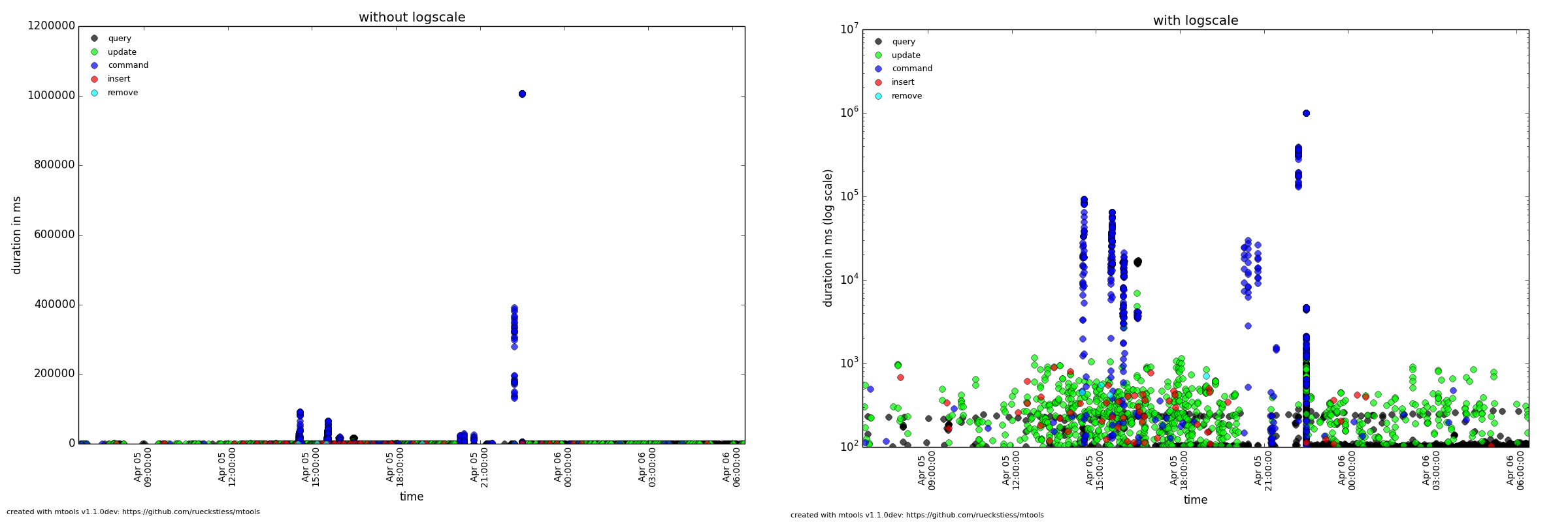
This option enables the logarithmic scale for plots where this makes sense. This is very useful if the plot contains outliers that squash all other data points to the bottom of the graph (see below comparison on the same data between log scale disabled and enabled). It can also be enabled with the l (lowercase L) shortcut once a plot is rendered. Switching scale on an already rendered plot may take a few seconds before the new scale is shown.
这个选项允许在图表中使用对数模式。如果图表中的数据分化严重,所有的点都被压到图的底部时,它非常有用(参见下面的比较,相同的数据在使用对数模式和不使用时的区别)。
它可以在渲染图表时用l (小l)来启用。在已经渲染好的图表中切换显示模式,需要花比较长的时间才能显示出来。
Custom Title(自定义标题)
--title
This option lets you overwrite the default title (the file name(s)) with a custom title. If the title contains spaces, the full title needs to be quoted in strings. The title of a plot is shown above the graph. A file read in from stdin does not use a title.
这个选项允许用户设置一个标题来替代默认标题(文件名)。如果标题中有空格,整个标题需要被放在引号里。标题在图上显示。从stdin中读入的文件没有标题。
Operation Start Time (操作开始时间)
--optime-start
Events are written to the log file when they finish, and by default, mplotqueries plots the operation on the x-axis at that point in time. Sometimes, it can be useful to see when operations started instead. For operations that have a duration (queries, updates, etc.) mplotqueries can subtract the duration and plot the operation when it started instead. Turn this feature on with the --optime-start flag.
事件是在完成后写入log的,默认情况下,mplotqueries 在x轴上对应的时间点上。有时想看进程的启动时间时,它比较有用。对于操作的持续时间,mplotqueries 可以减掉持续时间,在操作开始时绘制图像。使用 --optime-start 标记开启这个功能。
Output to File (输出文件)
--output-file
With this option, the plot can be written to a file rather than opening the interactive view window. The format is auto-recognized from the filename extension, with many supported formats, e.g. .png, .pdf, ...
使用这个选项,可以把图像绘制到文件里而不是使用交互式的窗口视图。文件格式可以根据扩展名来自动识别,支持的格式有.png, .pdf 等。
--group GROUP
The group parameter specifies what the data should be grouped on. Grouping can have different meaning for the various plots below, but generally, groups are represented by color. A scatter plot would choose one color for each group. A histogram plot would also choose a color per group, but additionally stack the histogrammed groups on top of each other. Some plots don't support grouping at all. See the plot types below for information about their grouping behavior.
分组参数指定用哪个数据来分组。分组在多种图表中可以有多种意义,但是通常,分组用不同颜色表示。一个散点图可以为每一个分组选择一个颜色。一个柱状图也可以为每个组分一个颜色,而不是把每个组堆起来。有些图完全不支持分组。参见下面的 plot types 中的关于分组行为的信息
The following values are possible for GROUP for most plots (some plots may not support all groups)
下面的值在大多数图中允许分组(有些图不支持任何分组)
namespace (default for single file) ( 单文件时的默认选项 )
filename (default for multiple files) ( 多文件时的默认选项 )
operation (queries, inserts, updates, ...) (操作)
thread ( 进程号 )
log2code (not supported by every plot type) (不支持图表)
pattern (query pattern, e.g. {foo: 1, bar: 1}, no sub-documents) (查询表达式,不包含子文档)
custom grouping with regular expressions (see Python's regex syntax) (正则表达式格式的自定义分组)
Example (示例)
This command creates a scatter plot on duration (by default) and colors the operations (queries, inserts, updates, deletes, commands, getmores) in individual colors.
这个命令使用持续时间数据创建一个散点图,并组每个操作定义一个单独的颜色。
Example (示例)
This command combination creates a histogram plot on duration of all the update operations on the test.users collection and groups the updates based on the _idObjectId (extracted by the regular expression). If parentheses are present in the regular expression, then only the first matched group is being used as the group string (in this case, the 24 hex characters in the ObjectId). If parentheses are not present, the full regex match is being used as group string. Parentheses (and other reserved symbols) that need to be matched literally (like the parentheses inObjectId('...') above) need to be escaped with a \.
这个命令联合创建一个图表,使用所有 test.users 集合更新操作的持续时间并用_idObjectId (正则过滤到的) 分组。如果正则使用了圆括号,只有第一个匹配到的分组会被当成分组字符串(本例中是ObjectId中的24位哈希串)来使用。如果提取不到括号中的内容,会使用整个正则匹配到的数据来作分组串。括号(和其他保留符号)需要被直接匹配(如括号中的 inObjectId('...') )的,需要用反斜线 (\)转义。
If the number of groups is large, like in this example, it can be reduced with the --group-limit option below.
如果分组数特别多,如下例,可以用 --group-limit 选项限制它的数量。
Group Limits (分组限制)
--group-limit N
This parameter will limit the number of groups to the top N, based on the number of matching lines per group (descending). The remaining groups are then grouped together in a single bucket called other. This option is useful if the number of groups is very large, as repetitions in color (there are only 14 distinct colors) could otherwise make it hard to distinguish all the groups for some plot types.
此参数限制只显示前N个分组,基于每一个分组的匹配行数。其余的分组会合并成一个块取名为other。当分组特别多的时候,这就特别有用了,如果重复的颜色(最多支持14种颜色)太多,在一些图表中区分分组会比较困难。
Example (例如)
This command creates a range plot, grouped on log2code, but only displays the 10 most frequently occurring log messages as separate groups. All others are plotted as one additional group others.
这个命令会创建一个图,用 log2code 分组,但是只有前10个最频繁的事件信息会被分开显示。其他的都合并在一个组里。
A scatter plot prints a marker on a two-dimensional axis, where the x-axis represents date and time, and the y-axis represents a certain numeric value. The numeric value for the y-axis can be chosen with an additional parameter (--yaxis, see below). By default, scatter plots show the duration of operations (queries, updates, inserts, deletes, ...) on the y-axis.
散点图会把点绘制在一个二维区域里。x轴代表日期和时间,y轴代表某一个值。y轴上的数值可以在附加参数(--yaxis,参见下方)中被添加。默认的,散点图在y轴上显示操作的持续时间。
Available Groupings (有效分组)
Scatter plots use colors and additionally different marker shapes (circles, squares, diamonds, ...) to display different groups. The supported groupings for scatter plots are:namespace, operation, thread, filename (for multiple files), and regular expressions.
散点图使用颜色和不同的标记形状(圆,正方,菱形)来显示不同的分组。散点图支持的分组有namespace, operation, thread, filename (for multiple files) 和正则表达式。
Additional Parameters (可选参数)
Y-Axis Value (y轴值)
--yaxis FIELD
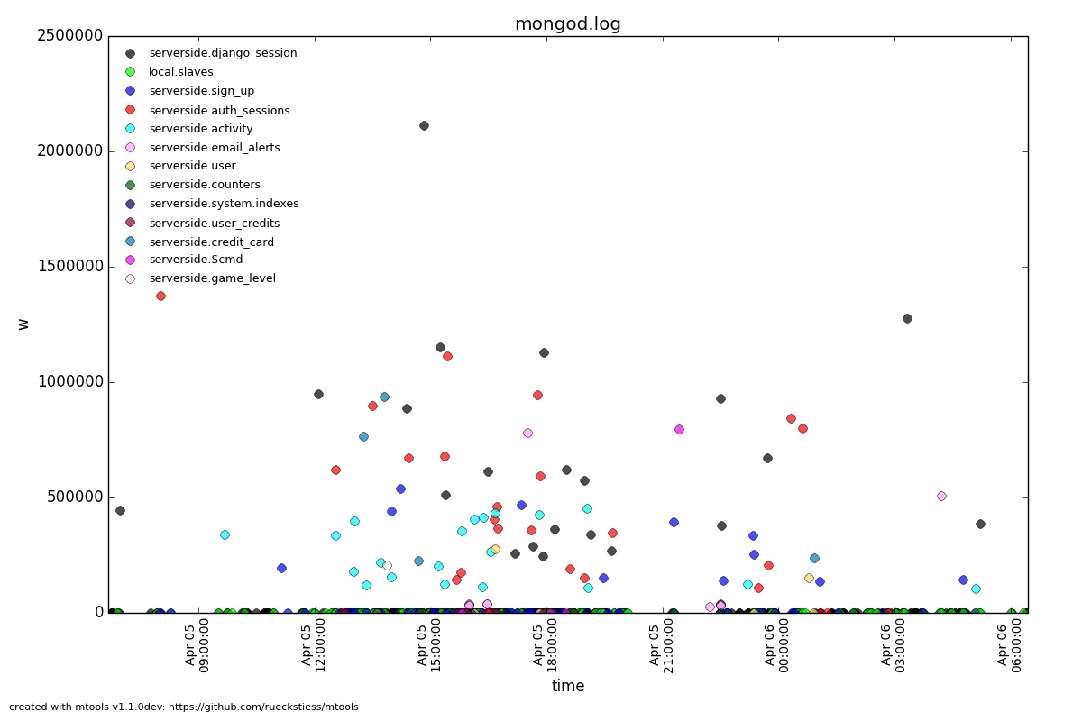
This parameter determines what value should be considered for the location on the y-axis. By default, the y-axis plots duration. Other possibilities are nscanned, nupdated,ninserted, ntoreturn, nreturned, numYields, r (read lock), w (write lock).
此参数确定y轴遵循的数据。默认情况,y轴绘制操作的持续时间。其他可用的有nscanned, nupdated,ninserted, ntoreturn, nreturned, numYields, r (读锁), w (写锁).
Example (例如)
This command plots the time (x-axis) vs. the write lock values of all operations (y-axis). Only lines that have a write lock value present are considered for the plot. Note that the unit for read/write lock is in microseconds.
此命令在x轴上绘制时间。在y轴上绘制所有操作的写入锁花费的时间。每一条横行表示一个抽取出来的特定的写入锁的值。注意读写锁的单位是微秒。
The scan ratio plot is a special type of scatter plot. Instead of plotting a single field as the standard scatter plot, it will calculate the ratio between the nscanned value and the nreturned value, and uses that result as the value for the y-axis. This plot is very useful to quickly find inefficient queries.
扫描比例图是一种特殊的散点图。替代只有一个列的散点图,它会计算nscanned 和nreturned 之间的比率,并把它作为y轴上参照的值。这个图非常有用,用它可以快速找出无效的查询。
Example (例如)
The Duration Line plot shows operations that have a duration (like queries, updates, inserts, commands, etc). It draws a diagnonal line from when the operation started (touching the x-axis) to when the operation stopped. This plot is especially useful to see when operations started and what impact they had on other queries during that time. It has the nice side-effect that all operations that started at the same time lie on the same diagonal line. Duration Line plots also make good plots to overlay with others.
持续时间图显示操作的持续时间。它会在操作的开始时间和结束时间中间画一条斜线。这个图在查看操开始后在执行期间受到其他哪些操作的影响时特别有用。它很好的显示了副作用,所有在同一个时间开始的操作都显示在同一条斜线上。
Example (例如)
This command plots long-running oplog.rs operations as duration lines, and overlays them with a scatter plot of all operations.
此命令把所有时间长的oplog.rs操作绘成斜线,并在上面覆盖所有操作的散点图。
Histogram plots don't consider a particular value in the log line (like for example scatter plots do), but rather bin the occurrence of log lines together in time buckets and present the result as a bar chart. The more occurrences of a certain log line (per group) in a given time frame, the higher the bar for that bucket. The size of a bucket is 60 seconds by default, but can be configured to another value (--bucketsize, see below). Unless one wants to know the total number of log lines per time bucket (which is not very useful information), this command should always be preceeded with a filter, for examplemlogfilter or grep.
柱状图不考虑日志中的特定值(像散点图那样),而是把日志中的时间加在一起,把结果显示成一个条块。发生的事件越多,显示的条块也越长。默认情况下一个条块表示60秒,但可以设置成其他值(--bucketsize,参见下方)。除非只想知道一个单位时间内的总数(不是非常有用的信息),否则这个命令总是和过滤器一起使用,如logfilter或grep。
Available Groupings (有效的分组)
Histogram plots use colors to display different groups. Each group gets its own bar, the bars are stacked on top of each other to also give an indication of the total number of matched lines per bucket. The supported groupings for histogram plots are: namespace,operation, thread, filename (for multiple files), log2code and regular expressions.
柱状图使用不同的颜色表示不同的分组。每一个分组一个条块,条块互相叠加,显示了每一个块匹配到的记录数。柱块图支持的分组有namespace,operation, thread, filename (for multiple files), log2code and 正则表达式.
Additional Parameters (附加参数)
Bucket Size
--bucketsize SIZE, -b SIZE (alias)
This parameter sets the bucket size for an individual bucket (bar). The unit is measured in seconds and the default value is 60 seconds. This needs to be adjusted if the total time span of a log file is rather large. More than 1000 buckets are slow to render, andmplotqueries will output a warning to consider increasing the bucket size.
此参数设置条块的尺寸。单位是秒默认是60秒。如果log日志文件非常大的话,有必要调整这个参数,如果条块大于1000个,渲染会非常慢,mplotqueries 会输出一个警告信息,提示条块尺寸需要调整。
Example (示例)
This command plots the inserts per hour (3600 seconds) as a histogram plot. By default, the grouping is on namespace.
此命令绘制每小时的插入量柱状图。默认情况下,按 namespace. 分组。
See this plot for another histogram plot example.
参见此图中的其他柱状图示例。
A connection churn plot is a special plot that only considers lines about opening and closing connections. It will then create an opened (green bars) vs. closed (red bars) plot over time, and additionally show the number of currently open connections (black line, only for MongoDB log files >= 2.2).
连接产生图是一个特殊的图表它只关心连接打开和关闭。它会创建一个图来显示随时间打开和关闭的连接数,并附加显示当前打开的连接数。
Available Groupings (有效分组)
No groupings are supported by this type of plot.
此类图不支持分组。
Additional Parameters (附加参数)
Bucket Size (块大小)
--bucketsize SIZE, -b SIZE (alias)
As with histogram plots, this parameter sets the bucket size for an individual bucket (bar). The unit is measured in seconds and the default value is 60 seconds. This needs to be adjusted if the total time span of a log file is rather large. More than 1000 buckets are slow to render, and mplotqueries will output a warning to consider increasing the bucket size.
就像柱状图,此参数设置条块的尺寸。单位是时间,默认值是60秒。当日志文件特别大的时候需要调整这个参数。超过1000个条块渲染会很慢,mplotqueries会输出建议增加条块尺寸的警告。
Example (示例)
This command plots connection churn per 10 minutes (600 seconds) as a bi-directional histogram plot, as well as the total number of open connections at each time (black line).
此命令用每10分钟内的连接数据生成双向柱状图,并显示每个时段内的连接数(黑线)。
Range plots are good in displaying when certain events occurred and how long they lasted. For example, you can grep for a certain error message and use the range plot to see when these errors mostly occurred. For each group, a range plot shows one or several (if the --gap option is used) horizontal bars, that go from beginning to end of a certain event. If no --gap value is provided, the default is to not have any gaps at all, and the bar goes from the time of the first to the time of the last line of that group. If --gap is used, then the bar is interrupted whenever two consecutive log lines are further apart than the gap threshold.
区间图擅长表现事件的发生和持续时间。例如,可以把异常事件信息过滤出来然后用区间图看它在何时发生的最多。每一个分组中,显示一条或多条横向条块,表示一个事件从开始到结束。如果没指定 --gap 值,默认情况下是没有空隙的,条块从分组中的第一个时间一直到最后一个时间。如果使用了 --gap ,在两个连续的日志间隔时间大于指定的时间时,条块中会显示空隙 。
Available Groupings (可用分组)
Range plots use colors to display different groups. Each group gets its own horizontal bar(s). The supported groupings for range plots are: namespace, operation, thread,filename (for multiple files), log2code and regular expressions.
区间图中有不同的颜色来区分分组。每个分组有自己的条块。区间图支持的分组有 namespace, operation, thread,filename (多文件中使用), log2code 和正则表达式。
Example (示例)
This plot shows for multiple files when they start and finish. By default, the grouping for multiple files is on filename, and as there is no gap threshold given, the bars range from the first two the last log line per file. This is useful to find out if and where several log files have an overlap.
此图用多文件中的开始和结束时间绘制。默认情况下多文件的分组是filename ,并且没使用间隔区间,条块中显示的是每个文件从开始真到结束的所有行。这在显示多个日志的重复区域时特别有有。
Additional Parameters (附加参数)
Gap Threshold (间隔空隙)
--gap LEN
If a gap threshold is provided, then the horizontal bars are interrupted when two consecutive events of the same group are further apart than LEN seconds.
如果指定了间隔空隙,在两个连续事件相隔超过 LEN 秒时,条块中会显示空隙。
Example (示例)
This plot shows ranges of contiguous blocks of updates where the gap threshold is 600 seconds (only gaps between two operations that are larger than 10 minutes are displayed as separate bars).
此图显示连续的更新块,间隔时间为600秒(只有两个连续的操作间隔时间大于10分钟时,才显示分隔块)。
Event plots show the occurrence of certain events in a log file. They make sense mostly in combination with a preceeding filter, either mlogfilter or a grep. For each matching event, a vertical line will be plotted at the time the event occurred. If the number of events is very large, you may want to consider using a range plot instead.
事件图显示日志中的事件发生。它通常和一个过滤器一起使用,可以是mlogfilter或grep。在每个匹配到的事件的发生时间上画一条竖线。如果事件的数量非常多,可以考虑用区间图来替代它。
Example(示例)
This plot shows the occurrences of all "getlasterror" events in the log file.
此图显示日志中的所有 getlasterror 事件。
Available Groupings (有效分组)
Event plots use colors and to display different groups. The supported groupings for event plots are: namespace, operation, thread, filename (for multiple files), and regular expressions.
事件图用不同的颜色来区分分组。事件图支持的分组有namespace, operation, thread, filename (多文件), 和正则表达式.
Additional Parameters (附加参数)
No additional parameters are supported by this type of plot.
此图不支持附加参数。
Replica set state plots are specialized event plots, that only consider lines about replica set state changes in a log file. They will display all changes of all replica set members (not just the node itself) with colored vertical lines, indicating different states. The most common states are PRIMARY, SECONDARY, ARBITER, STARTUP2, DOWN and RECOVERING, but other state changes are also displayed if found. This plot type helps to quickly determine any state changes at a given time. It is also useful to overlay this plot with a different plot, for example a scatter plot.
副本集状态图是种特殊的事件图,只给日志中的副本集状态改变画线。它会显示副本集中所有成员的所有状态改变,并用不同颜色的竖线显示不用的状态。最通用的状态有 are PRIMARY, SECONDARY, ARBITER, STARTUP2, DOWN 和 RECOVERING,但是如果找到其他的状态改变,也会显示出来。此图用于快速查看指定时间内的所有状态变化。它和其他图覆盖使用时也非常有用,例如和散点图覆盖使用。
Example (示例)
This plot shows the state changes of all replica set members found in the log file.
此图显示日志中能找到的成员的所有状态变化。

Available Groupings (有效分组)
No groupings are supported by this type of plot.
此图不支持分组。
Additional Parameters (附加参数)
No additional parameters are supported by this type of plot.
此图不支持附加参数。
组合机制允许把多个图合并成一个图。这在查看统计的时候很有用,从多个图中匹配信息并在多个角度显示信息。
Each of the plot types can in theory be used as an overlay, however some of them make more sense then others.
理论上每种图都可以用于组合,无论哪个图表显得更加突出。
Overlays are created just as normal plots, except they are stored on disk and do not render immediately. The first call to mplotqueries that does not add another overlay then will load all existing overlays added previously and render them on top of each other, matching the time axis.
组合只能创建标准图像,除非它们已经被储存并且非直接渲染。第一次调用mplotqueries不会添加其他图像的组合,还需要加载所有已经存在的图并一层层地渲染,用时间轴来匹配。
Overlays are stored globally and are persistent, independent of your current working directory. Therefore, if you no longer need to store added overlays, make sure that you remove them again or they will be added to your next call of mplotqueries.
组合对当前目录来说是全局存储的,并且稳定的,不依赖的。因此,因此如果不再需要存储组合图,请确认它们已经被删除了,否则它会在下次运行mplotqueries时被添加进去。
Plot types that are often used for overlays are: event, range, rsstate, and scatter.
常用于组合的图有:事件图,区域图,副本集状态图,散点图。
To create an overlay, run mplotqueries as you would normally, with all the command line arguments. In addition, specify the --overlay add argument. As add is the default for overlays, it can be omitted.
创建一个组合图,除正常使用 mplotqueries 命令和所有参数外,需要特别指定 --overlay add 参数。add 是组合的默认参数,可以省略。
Example (示例)
This will add an overlay plot. The plot is not shown but saved on disk instead, and rendered with the next call without --overlay.
此命令会添加一个组合图。这个图不会被显示出来而是被存储在磁盘上,并且在下次不带 --overlay 参数时被渲染。
To see if overlays are currently existing, you can use this command. A list of existing overlay identifiers will be returned. Currently, the indentifiers are not all that useful by themselves, but the command will show you how many different overlays exist.
查看组合是不是已经存在,可以使用这个命令。它会返回一个已经存在的组合的id列表。这时,这些标识并不是全部被使用,这个命令只是显示有多少不同的组合存在。
To remove all overlays, you can use this command. It will delete all existing overlays, and the next (or current, if a log file is specified as well) call to mplotqueries will not show additional overlays anymore.
使用这个命令删除所有的组合。它会删除所有已经存在的组合,然后(或现在,如果日志文件已经被指定好了)调用mplotqueries 命令就不会显示添加过的组合了。
mtools是一组非常好用的mongodb日志分析工具,里面最复杂的命令是mplotqueries,上网查了一下,还没有人翻译过。英文不好,费了好大的劲翻完,翻的不好,但没有办法,我英文水平就这么多~
原文地址:https://github.com/rueckstiess/mtools/wiki/mplotqueries
-----------------------------------------------------------------------------------------------------------------------
mplotqueries
Thomas Rueckstiess edited this page on 9 Oct · 31 revisionsmplotqueries is a tool to visualize operations in MongoDB logfiles. It has several different plot types and can group information in various ways.
把MongoDB操作形象化的工具。它有多种类型的图表支持多种方式对信息分组。
Usage(使用说明)
mplotqueries [-h] [--version] logfile [logfile ...] [--group GROUP] [--logscale] [--type {nscanned/n,rsstate,connchurn,histogram,range,scatter,event} ] [--overlay [ {add,list,reset} ]] [additional plot type parameters]mplotqueries can also be used with shell pipe syntax, for example:
可以在命令行管道语法中使用,例如
mlogfilter logfile [parameters] | mplotqueries --type histogram
General Parameters(全局参数)
Help(帮助)-h, --help
shows the help text and exits.
显示帮助信息并退出
Version(版本)
--version
shows the version number and exits.
显示版本信息并退出
Logarithmic Scale (对数模式)
--logscale
This option enables the logarithmic scale for plots where this makes sense. This is very useful if the plot contains outliers that squash all other data points to the bottom of the graph (see below comparison on the same data between log scale disabled and enabled). It can also be enabled with the l (lowercase L) shortcut once a plot is rendered. Switching scale on an already rendered plot may take a few seconds before the new scale is shown.
这个选项允许在图表中使用对数模式。如果图表中的数据分化严重,所有的点都被压到图的底部时,它非常有用(参见下面的比较,相同的数据在使用对数模式和不使用时的区别)。
它可以在渲染图表时用l (小l)来启用。在已经渲染好的图表中切换显示模式,需要花比较长的时间才能显示出来。
Custom Title(自定义标题)
--title
This option lets you overwrite the default title (the file name(s)) with a custom title. If the title contains spaces, the full title needs to be quoted in strings. The title of a plot is shown above the graph. A file read in from stdin does not use a title.
这个选项允许用户设置一个标题来替代默认标题(文件名)。如果标题中有空格,整个标题需要被放在引号里。标题在图上显示。从stdin中读入的文件没有标题。
Operation Start Time (操作开始时间)
--optime-start
Events are written to the log file when they finish, and by default, mplotqueries plots the operation on the x-axis at that point in time. Sometimes, it can be useful to see when operations started instead. For operations that have a duration (queries, updates, etc.) mplotqueries can subtract the duration and plot the operation when it started instead. Turn this feature on with the --optime-start flag.
事件是在完成后写入log的,默认情况下,mplotqueries 在x轴上对应的时间点上。有时想看进程的启动时间时,它比较有用。对于操作的持续时间,mplotqueries 可以减掉持续时间,在操作开始时绘制图像。使用 --optime-start 标记开启这个功能。
Output to File (输出文件)
--output-file
With this option, the plot can be written to a file rather than opening the interactive view window. The format is auto-recognized from the filename extension, with many supported formats, e.g. .png, .pdf, ...
使用这个选项,可以把图像绘制到文件里而不是使用交互式的窗口视图。文件格式可以根据扩展名来自动识别,支持的格式有.png, .pdf 等。
Groupings (分组)
Group By (分组)--group GROUP
The group parameter specifies what the data should be grouped on. Grouping can have different meaning for the various plots below, but generally, groups are represented by color. A scatter plot would choose one color for each group. A histogram plot would also choose a color per group, but additionally stack the histogrammed groups on top of each other. Some plots don't support grouping at all. See the plot types below for information about their grouping behavior.
分组参数指定用哪个数据来分组。分组在多种图表中可以有多种意义,但是通常,分组用不同颜色表示。一个散点图可以为每一个分组选择一个颜色。一个柱状图也可以为每个组分一个颜色,而不是把每个组堆起来。有些图完全不支持分组。参见下面的 plot types 中的关于分组行为的信息
The following values are possible for GROUP for most plots (some plots may not support all groups)
下面的值在大多数图中允许分组(有些图不支持任何分组)
namespace (default for single file) ( 单文件时的默认选项 )
filename (default for multiple files) ( 多文件时的默认选项 )
operation (queries, inserts, updates, ...) (操作)
thread ( 进程号 )
log2code (not supported by every plot type) (不支持图表)
pattern (query pattern, e.g. {foo: 1, bar: 1}, no sub-documents) (查询表达式,不包含子文档)
custom grouping with regular expressions (see Python's regex syntax) (正则表达式格式的自定义分组)
Example (示例)
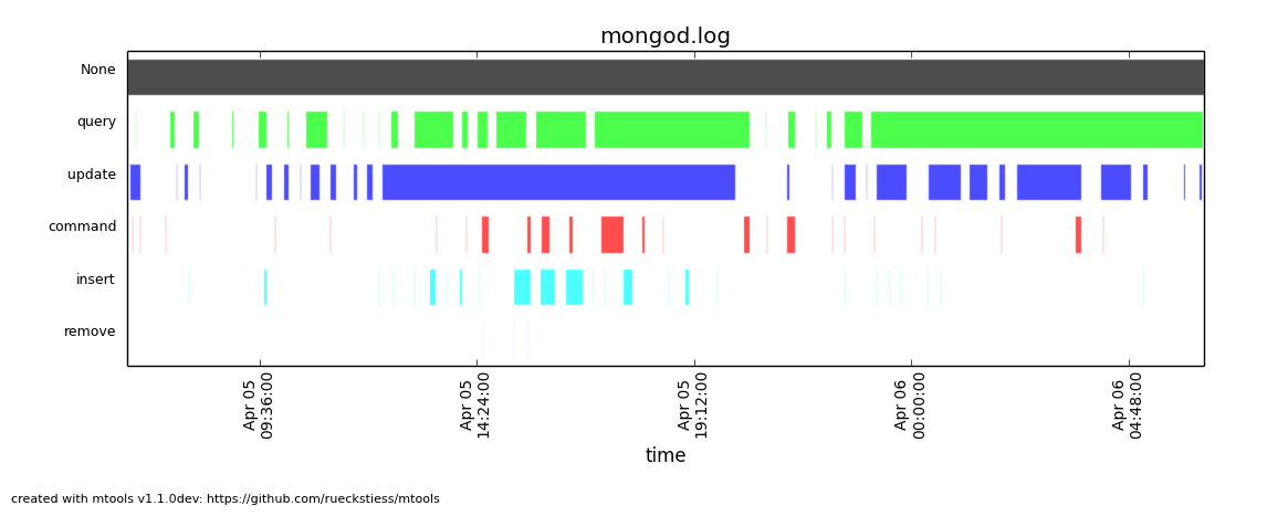
mplotqueries mongod.log --group operation
This command creates a scatter plot on duration (by default) and colors the operations (queries, inserts, updates, deletes, commands, getmores) in individual colors.
这个命令使用持续时间数据创建一个散点图,并组每个操作定义一个单独的颜色。
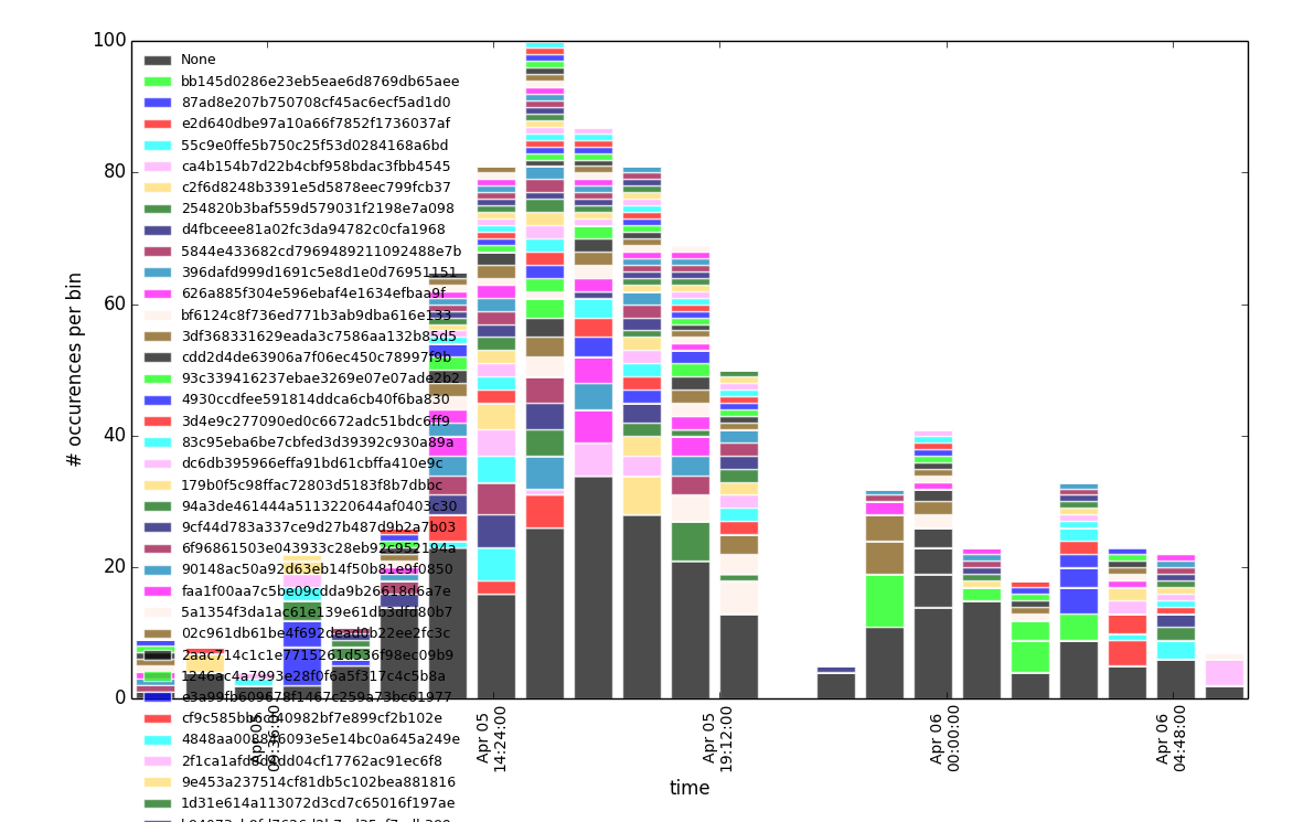
Example (示例)
mlogfilter mongod.log --operation update --namespace test.users | mplotqueries --type histogram --group "_id: ObjectId\('([^']+)'\)"This command combination creates a histogram plot on duration of all the update operations on the test.users collection and groups the updates based on the _idObjectId (extracted by the regular expression). If parentheses are present in the regular expression, then only the first matched group is being used as the group string (in this case, the 24 hex characters in the ObjectId). If parentheses are not present, the full regex match is being used as group string. Parentheses (and other reserved symbols) that need to be matched literally (like the parentheses inObjectId('...') above) need to be escaped with a \.
这个命令联合创建一个图表,使用所有 test.users 集合更新操作的持续时间并用_idObjectId (正则过滤到的) 分组。如果正则使用了圆括号,只有第一个匹配到的分组会被当成分组字符串(本例中是ObjectId中的24位哈希串)来使用。如果提取不到括号中的内容,会使用整个正则匹配到的数据来作分组串。括号(和其他保留符号)需要被直接匹配(如括号中的 inObjectId('...') )的,需要用反斜线 (\)转义。
If the number of groups is large, like in this example, it can be reduced with the --group-limit option below.
如果分组数特别多,如下例,可以用 --group-limit 选项限制它的数量。
Group Limits (分组限制)
--group-limit N
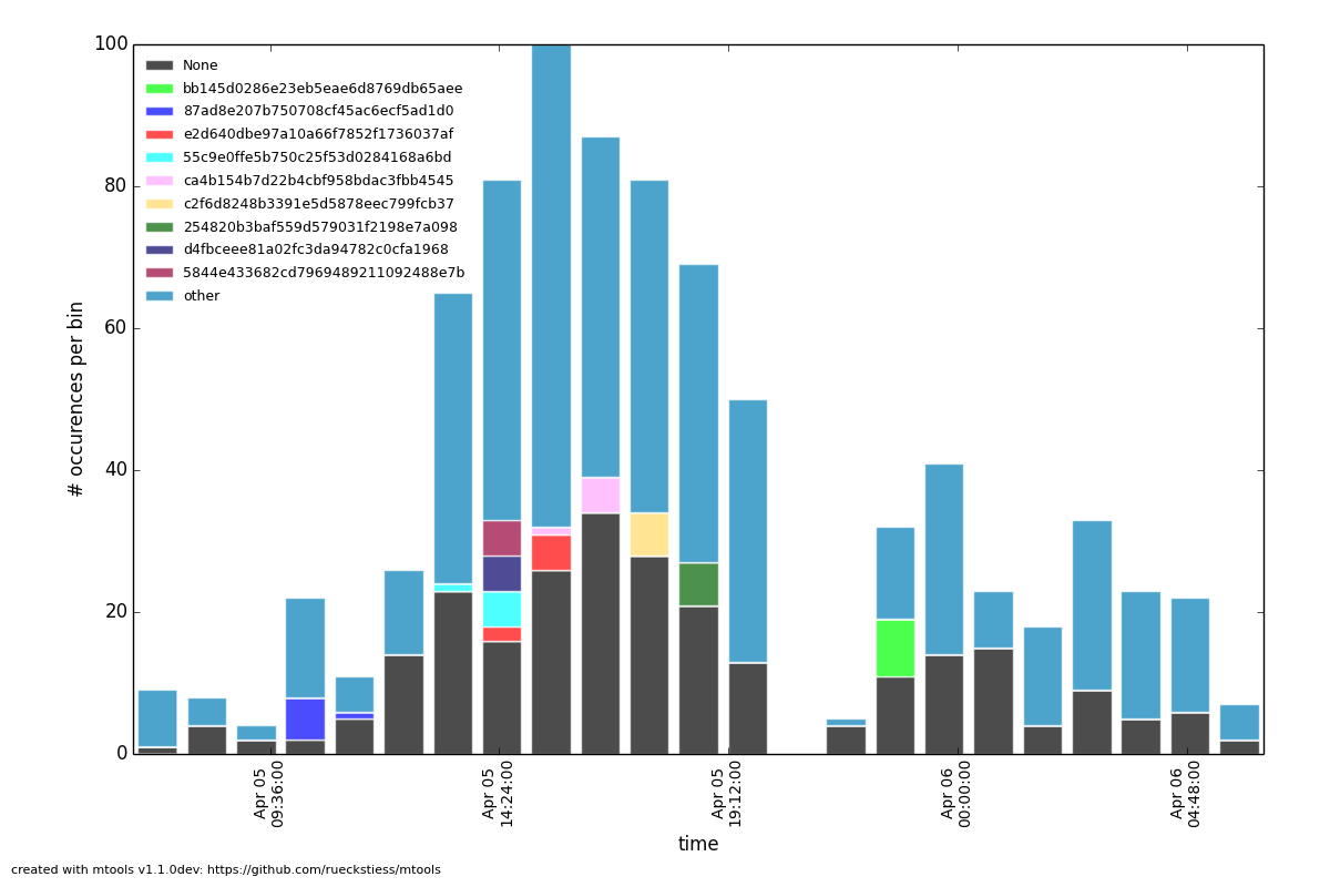
This parameter will limit the number of groups to the top N, based on the number of matching lines per group (descending). The remaining groups are then grouped together in a single bucket called other. This option is useful if the number of groups is very large, as repetitions in color (there are only 14 distinct colors) could otherwise make it hard to distinguish all the groups for some plot types.
此参数限制只显示前N个分组,基于每一个分组的匹配行数。其余的分组会合并成一个块取名为other。当分组特别多的时候,这就特别有用了,如果重复的颜色(最多支持14种颜色)太多,在一些图表中区分分组会比较困难。
Example (例如)
mplotqueries mongod.log --type range --group log2code --group-limit 10
This command creates a range plot, grouped on log2code, but only displays the 10 most frequently occurring log messages as separate groups. All others are plotted as one additional group others.
这个命令会创建一个图,用 log2code 分组,但是只有前10个最频繁的事件信息会被分开显示。其他的都合并在一个组里。
Plot Types(图像类别)
Scatter Plot(散点图,默认的)
--type scatter (default)A scatter plot prints a marker on a two-dimensional axis, where the x-axis represents date and time, and the y-axis represents a certain numeric value. The numeric value for the y-axis can be chosen with an additional parameter (--yaxis, see below). By default, scatter plots show the duration of operations (queries, updates, inserts, deletes, ...) on the y-axis.
散点图会把点绘制在一个二维区域里。x轴代表日期和时间,y轴代表某一个值。y轴上的数值可以在附加参数(--yaxis,参见下方)中被添加。默认的,散点图在y轴上显示操作的持续时间。
Available Groupings (有效分组)
Scatter plots use colors and additionally different marker shapes (circles, squares, diamonds, ...) to display different groups. The supported groupings for scatter plots are:namespace, operation, thread, filename (for multiple files), and regular expressions.
散点图使用颜色和不同的标记形状(圆,正方,菱形)来显示不同的分组。散点图支持的分组有namespace, operation, thread, filename (for multiple files) 和正则表达式。
Additional Parameters (可选参数)
Y-Axis Value (y轴值)
--yaxis FIELD
This parameter determines what value should be considered for the location on the y-axis. By default, the y-axis plots duration. Other possibilities are nscanned, nupdated,ninserted, ntoreturn, nreturned, numYields, r (read lock), w (write lock).
此参数确定y轴遵循的数据。默认情况,y轴绘制操作的持续时间。其他可用的有nscanned, nupdated,ninserted, ntoreturn, nreturned, numYields, r (读锁), w (写锁).
Example (例如)
mplotqueries mongod.log --type scatter --yaxis w
This command plots the time (x-axis) vs. the write lock values of all operations (y-axis). Only lines that have a write lock value present are considered for the plot. Note that the unit for read/write lock is in microseconds.
此命令在x轴上绘制时间。在y轴上绘制所有操作的写入锁花费的时间。每一条横行表示一个抽取出来的特定的写入锁的值。注意读写锁的单位是微秒。
Scan Ratio Plot (扫描比例图)
--type nscanned/nThe scan ratio plot is a special type of scatter plot. Instead of plotting a single field as the standard scatter plot, it will calculate the ratio between the nscanned value and the nreturned value, and uses that result as the value for the y-axis. This plot is very useful to quickly find inefficient queries.
扫描比例图是一种特殊的散点图。替代只有一个列的散点图,它会计算nscanned 和nreturned 之间的比率,并把它作为y轴上参照的值。这个图非常有用,用它可以快速找出无效的查询。
Example (例如)
mplotqueries mongod.log --type nscanned/n
Duration Line Plot (持续时间图)
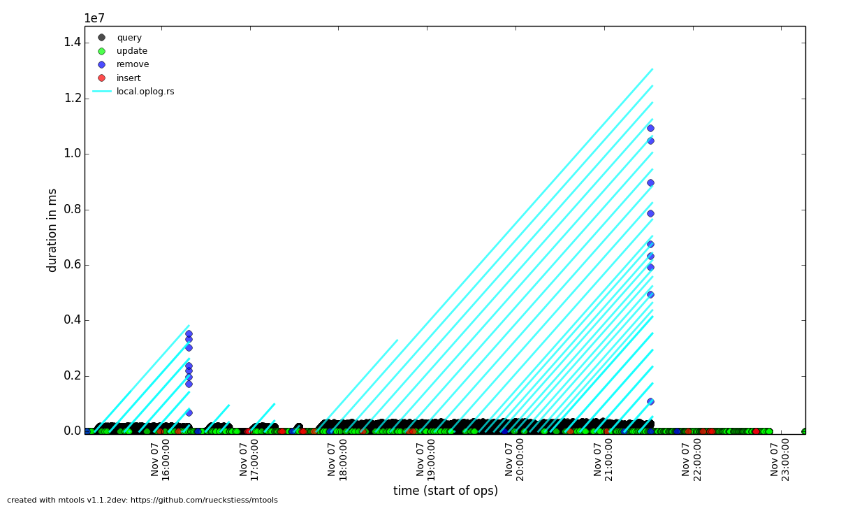
--type durlineThe Duration Line plot shows operations that have a duration (like queries, updates, inserts, commands, etc). It draws a diagnonal line from when the operation started (touching the x-axis) to when the operation stopped. This plot is especially useful to see when operations started and what impact they had on other queries during that time. It has the nice side-effect that all operations that started at the same time lie on the same diagonal line. Duration Line plots also make good plots to overlay with others.
持续时间图显示操作的持续时间。它会在操作的开始时间和结束时间中间画一条斜线。这个图在查看操开始后在执行期间受到其他哪些操作的影响时特别有用。它很好的显示了副作用,所有在同一个时间开始的操作都显示在同一条斜线上。
Example (例如)
grep "oplog.rs" mongod.log | mplotqueries --type durline --overlay mplotqueries mongod.log --group operation
This command plots long-running oplog.rs operations as duration lines, and overlays them with a scatter plot of all operations.
此命令把所有时间长的oplog.rs操作绘成斜线,并在上面覆盖所有操作的散点图。
Histogram Plot (柱状图)
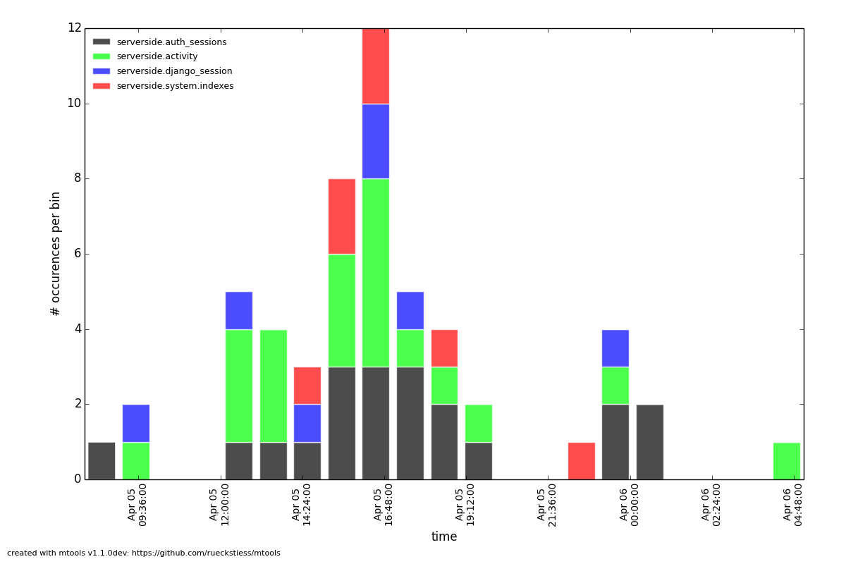
--type histogramHistogram plots don't consider a particular value in the log line (like for example scatter plots do), but rather bin the occurrence of log lines together in time buckets and present the result as a bar chart. The more occurrences of a certain log line (per group) in a given time frame, the higher the bar for that bucket. The size of a bucket is 60 seconds by default, but can be configured to another value (--bucketsize, see below). Unless one wants to know the total number of log lines per time bucket (which is not very useful information), this command should always be preceeded with a filter, for examplemlogfilter or grep.
柱状图不考虑日志中的特定值(像散点图那样),而是把日志中的时间加在一起,把结果显示成一个条块。发生的事件越多,显示的条块也越长。默认情况下一个条块表示60秒,但可以设置成其他值(--bucketsize,参见下方)。除非只想知道一个单位时间内的总数(不是非常有用的信息),否则这个命令总是和过滤器一起使用,如logfilter或grep。
Available Groupings (有效的分组)
Histogram plots use colors to display different groups. Each group gets its own bar, the bars are stacked on top of each other to also give an indication of the total number of matched lines per bucket. The supported groupings for histogram plots are: namespace,operation, thread, filename (for multiple files), log2code and regular expressions.
柱状图使用不同的颜色表示不同的分组。每一个分组一个条块,条块互相叠加,显示了每一个块匹配到的记录数。柱块图支持的分组有namespace,operation, thread, filename (for multiple files), log2code and 正则表达式.
Additional Parameters (附加参数)
Bucket Size
--bucketsize SIZE, -b SIZE (alias)
This parameter sets the bucket size for an individual bucket (bar). The unit is measured in seconds and the default value is 60 seconds. This needs to be adjusted if the total time span of a log file is rather large. More than 1000 buckets are slow to render, andmplotqueries will output a warning to consider increasing the bucket size.
此参数设置条块的尺寸。单位是秒默认是60秒。如果log日志文件非常大的话,有必要调整这个参数,如果条块大于1000个,渲染会非常慢,mplotqueries 会输出一个警告信息,提示条块尺寸需要调整。
Example (示例)
mlogfilter mongod.log --operation insert | mplotqueries --type histogram --bucketsize 3600
This command plots the inserts per hour (3600 seconds) as a histogram plot. By default, the grouping is on namespace.
此命令绘制每小时的插入量柱状图。默认情况下,按 namespace. 分组。
See this plot for another histogram plot example.
参见此图中的其他柱状图示例。
Connection Churn Plot (连接产生图)
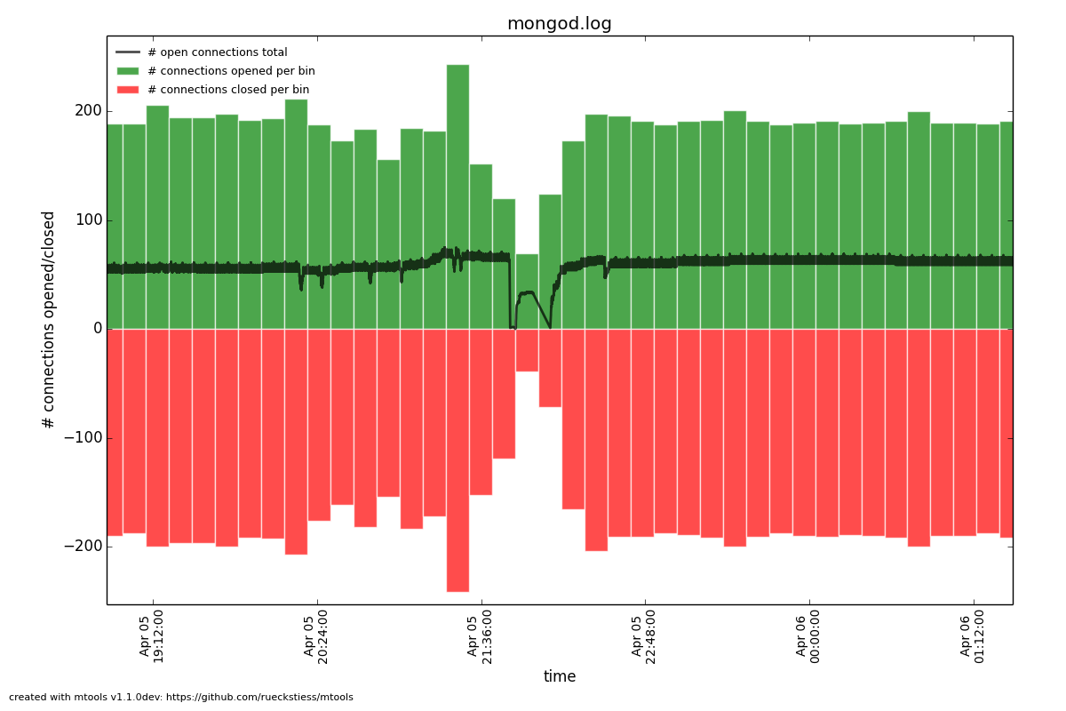
--type connchurnA connection churn plot is a special plot that only considers lines about opening and closing connections. It will then create an opened (green bars) vs. closed (red bars) plot over time, and additionally show the number of currently open connections (black line, only for MongoDB log files >= 2.2).
连接产生图是一个特殊的图表它只关心连接打开和关闭。它会创建一个图来显示随时间打开和关闭的连接数,并附加显示当前打开的连接数。
Available Groupings (有效分组)
No groupings are supported by this type of plot.
此类图不支持分组。
Additional Parameters (附加参数)
Bucket Size (块大小)
--bucketsize SIZE, -b SIZE (alias)
As with histogram plots, this parameter sets the bucket size for an individual bucket (bar). The unit is measured in seconds and the default value is 60 seconds. This needs to be adjusted if the total time span of a log file is rather large. More than 1000 buckets are slow to render, and mplotqueries will output a warning to consider increasing the bucket size.
就像柱状图,此参数设置条块的尺寸。单位是时间,默认值是60秒。当日志文件特别大的时候需要调整这个参数。超过1000个条块渲染会很慢,mplotqueries会输出建议增加条块尺寸的警告。
Example (示例)
mplotqueries mongod.log --type connchurn --bucketsize 600
This command plots connection churn per 10 minutes (600 seconds) as a bi-directional histogram plot, as well as the total number of open connections at each time (black line).
此命令用每10分钟内的连接数据生成双向柱状图,并显示每个时段内的连接数(黑线)。
Range Plot (区间图)
--type rangeRange plots are good in displaying when certain events occurred and how long they lasted. For example, you can grep for a certain error message and use the range plot to see when these errors mostly occurred. For each group, a range plot shows one or several (if the --gap option is used) horizontal bars, that go from beginning to end of a certain event. If no --gap value is provided, the default is to not have any gaps at all, and the bar goes from the time of the first to the time of the last line of that group. If --gap is used, then the bar is interrupted whenever two consecutive log lines are further apart than the gap threshold.
区间图擅长表现事件的发生和持续时间。例如,可以把异常事件信息过滤出来然后用区间图看它在何时发生的最多。每一个分组中,显示一条或多条横向条块,表示一个事件从开始到结束。如果没指定 --gap 值,默认情况下是没有空隙的,条块从分组中的第一个时间一直到最后一个时间。如果使用了 --gap ,在两个连续的日志间隔时间大于指定的时间时,条块中会显示空隙 。
Available Groupings (可用分组)
Range plots use colors to display different groups. Each group gets its own horizontal bar(s). The supported groupings for range plots are: namespace, operation, thread,filename (for multiple files), log2code and regular expressions.
区间图中有不同的颜色来区分分组。每个分组有自己的条块。区间图支持的分组有 namespace, operation, thread,filename (多文件中使用), log2code 和正则表达式。
Example (示例)
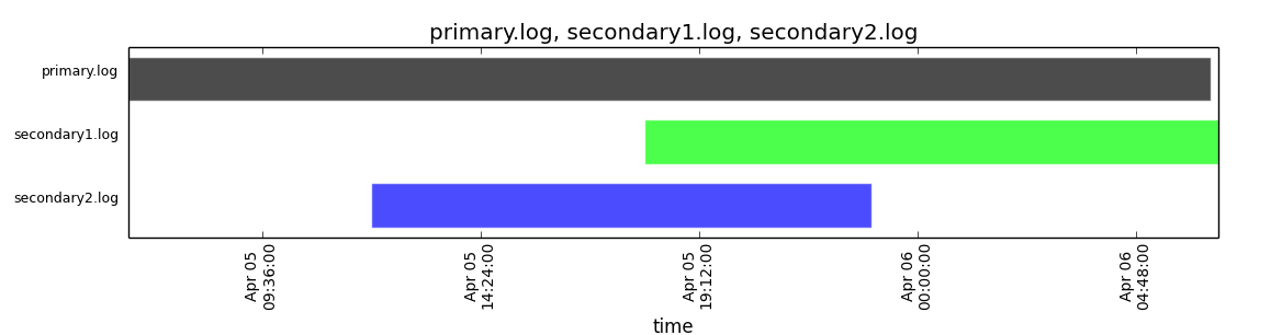
mplotqueries primary.log seconary1.log secondary2.log --type range
This plot shows for multiple files when they start and finish. By default, the grouping for multiple files is on filename, and as there is no gap threshold given, the bars range from the first two the last log line per file. This is useful to find out if and where several log files have an overlap.
此图用多文件中的开始和结束时间绘制。默认情况下多文件的分组是filename ,并且没使用间隔区间,条块中显示的是每个文件从开始真到结束的所有行。这在显示多个日志的重复区域时特别有有。
Additional Parameters (附加参数)
Gap Threshold (间隔空隙)
--gap LEN
If a gap threshold is provided, then the horizontal bars are interrupted when two consecutive events of the same group are further apart than LEN seconds.
如果指定了间隔空隙,在两个连续事件相隔超过 LEN 秒时,条块中会显示空隙。
Example (示例)
mplotqueries mongod.log --type range --group operation --gap 600
This plot shows ranges of contiguous blocks of updates where the gap threshold is 600 seconds (only gaps between two operations that are larger than 10 minutes are displayed as separate bars).
此图显示连续的更新块,间隔时间为600秒(只有两个连续的操作间隔时间大于10分钟时,才显示分隔块)。
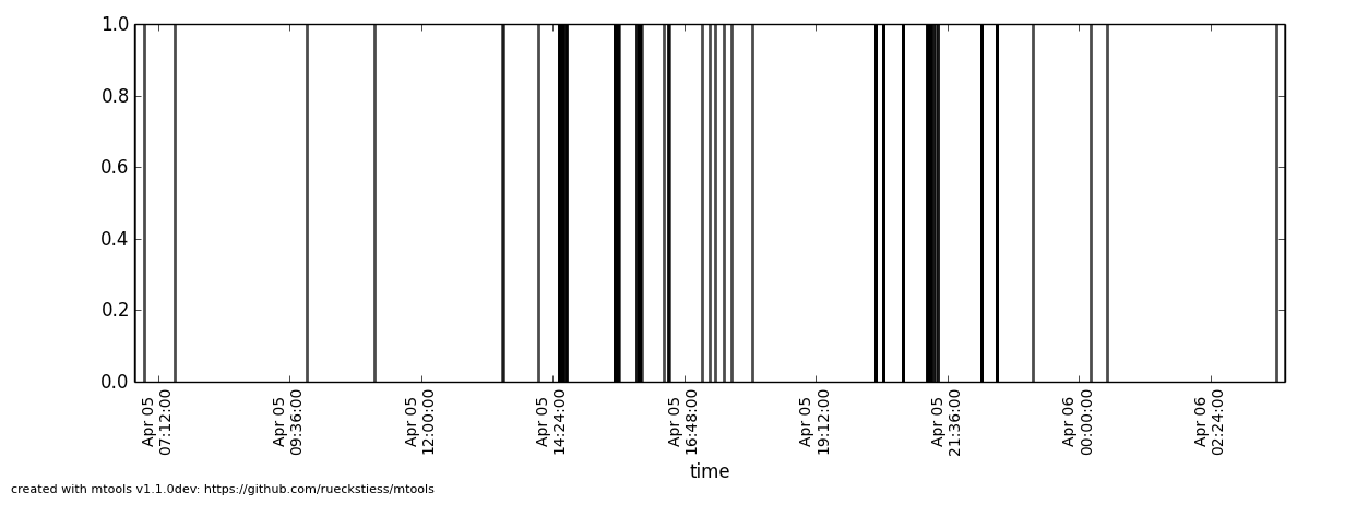
Event Plot (事件图)
--type eventEvent plots show the occurrence of certain events in a log file. They make sense mostly in combination with a preceeding filter, either mlogfilter or a grep. For each matching event, a vertical line will be plotted at the time the event occurred. If the number of events is very large, you may want to consider using a range plot instead.
事件图显示日志中的事件发生。它通常和一个过滤器一起使用,可以是mlogfilter或grep。在每个匹配到的事件的发生时间上画一条竖线。如果事件的数量非常多,可以考虑用区间图来替代它。
Example(示例)
grep "getlasterror" mongod.log | mplotqueries --type event
This plot shows the occurrences of all "getlasterror" events in the log file.
此图显示日志中的所有 getlasterror 事件。
Available Groupings (有效分组)
Event plots use colors and to display different groups. The supported groupings for event plots are: namespace, operation, thread, filename (for multiple files), and regular expressions.
事件图用不同的颜色来区分分组。事件图支持的分组有namespace, operation, thread, filename (多文件), 和正则表达式.
Additional Parameters (附加参数)
No additional parameters are supported by this type of plot.
此图不支持附加参数。
Replica Set State Plot (副本集图)
--type rsstateReplica set state plots are specialized event plots, that only consider lines about replica set state changes in a log file. They will display all changes of all replica set members (not just the node itself) with colored vertical lines, indicating different states. The most common states are PRIMARY, SECONDARY, ARBITER, STARTUP2, DOWN and RECOVERING, but other state changes are also displayed if found. This plot type helps to quickly determine any state changes at a given time. It is also useful to overlay this plot with a different plot, for example a scatter plot.
副本集状态图是种特殊的事件图,只给日志中的副本集状态改变画线。它会显示副本集中所有成员的所有状态改变,并用不同颜色的竖线显示不用的状态。最通用的状态有 are PRIMARY, SECONDARY, ARBITER, STARTUP2, DOWN 和 RECOVERING,但是如果找到其他的状态改变,也会显示出来。此图用于快速查看指定时间内的所有状态变化。它和其他图覆盖使用时也非常有用,例如和散点图覆盖使用。
Example (示例)
mplotqueries mongod.log --type rsstate
This plot shows the state changes of all replica set members found in the log file.
此图显示日志中能找到的成员的所有状态变化。
Available Groupings (有效分组)
No groupings are supported by this type of plot.
此图不支持分组。
Additional Parameters (附加参数)
No additional parameters are supported by this type of plot.
此图不支持附加参数。
Overlays (组合)
The overlay mechanism allows you to overlay several plot types in one graphic. This is useful to see correlations, match information from different plot types and create graphs that show events from different angles.组合机制允许把多个图合并成一个图。这在查看统计的时候很有用,从多个图中匹配信息并在多个角度显示信息。
Each of the plot types can in theory be used as an overlay, however some of them make more sense then others.
理论上每种图都可以用于组合,无论哪个图表显得更加突出。
Overlays are created just as normal plots, except they are stored on disk and do not render immediately. The first call to mplotqueries that does not add another overlay then will load all existing overlays added previously and render them on top of each other, matching the time axis.
组合只能创建标准图像,除非它们已经被储存并且非直接渲染。第一次调用mplotqueries不会添加其他图像的组合,还需要加载所有已经存在的图并一层层地渲染,用时间轴来匹配。
Overlays are stored globally and are persistent, independent of your current working directory. Therefore, if you no longer need to store added overlays, make sure that you remove them again or they will be added to your next call of mplotqueries.
组合对当前目录来说是全局存储的,并且稳定的,不依赖的。因此,因此如果不再需要存储组合图,请确认它们已经被删除了,否则它会在下次运行mplotqueries时被添加进去。
Plot types that are often used for overlays are: event, range, rsstate, and scatter.
常用于组合的图有:事件图,区域图,副本集状态图,散点图。
Creating Overlays (创建组合图)
--overlay [add]To create an overlay, run mplotqueries as you would normally, with all the command line arguments. In addition, specify the --overlay add argument. As add is the default for overlays, it can be omitted.
创建一个组合图,除正常使用 mplotqueries 命令和所有参数外,需要特别指定 --overlay add 参数。add 是组合的默认参数,可以省略。
Example (示例)
mplotqueries mongod.log --type scatter --overlay Created overlay: 18124963
This will add an overlay plot. The plot is not shown but saved on disk instead, and rendered with the next call without --overlay.
此命令会添加一个组合图。这个图不会被显示出来而是被存储在磁盘上,并且在下次不带 --overlay 参数时被渲染。
List Existing Overlays (已存在的组合列表)
--overlay listTo see if overlays are currently existing, you can use this command. A list of existing overlay identifiers will be returned. Currently, the indentifiers are not all that useful by themselves, but the command will show you how many different overlays exist.
查看组合是不是已经存在,可以使用这个命令。它会返回一个已经存在的组合的id列表。这时,这些标识并不是全部被使用,这个命令只是显示有多少不同的组合存在。
Remove Overlays (删除组合)
--overlay resetTo remove all overlays, you can use this command. It will delete all existing overlays, and the next (or current, if a log file is specified as well) call to mplotqueries will not show additional overlays anymore.
使用这个命令删除所有的组合。它会删除所有已经存在的组合,然后(或现在,如果日志文件已经被指定好了)调用mplotqueries 命令就不会显示添加过的组合了。

相关文章推荐
- [翻译]mongodb日志分析工具mtools之mplotqueries
- mongodb日志分析工具mtools之mplotqueries
- MongoDB 日志分析工具 mtools
- 使用Mtools分析MongoDB日志文件
- AWStats: Apache/IIS的日志分析工具--- 车东
- snort日志分析和管理工具(转贴)
- AWStats简介:Apache/IIS的日志分析工具
- 发现一款日志分析工具AWStats,能取代网站统计程序
- 发现一款日志分析工具AWStats,能取代网站统计程序
- POSTFIX上的邮件日志分析工具(pflogsumm)安装与配置
- AWStats: Apache/IIS的日志分析工具——在GNU/Linux和Windows平台上的使用简介
- Linux下日志分析工具Awstats安装笔记
- AWStats: Apache/IIS的日志分析工具
- Linux系统下常用日志分析工具:Logcheck简介
- Oracle日志分析工具的使用
- 日志文件分析工具—AWStats在IIS中的配置步骤
- AWStats: Apache/IIS的日志分析工具简介(ZZ)
- 强大的日志分析工具AWStats 推荐
- AWStats: Apache/IIS的日志分析工具
- Vs2005之简单日志工具的制作--2.根据功能分析进行系统设计